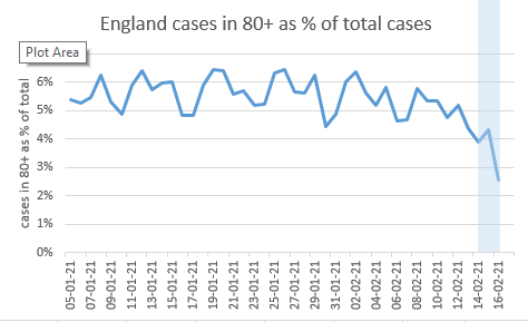
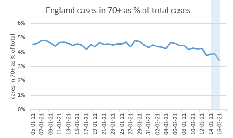
Adding one more to the pile of “probably a vaccine effect” charts: this is England cases for the over-80s, expressed as a % of total cases. Having been stubbornly static over the last month, it’s taken a clear turn down in the last week 1/6
Please note the data points in the blue zone are not yet filled in (this is the specimen date series) so are unreliable – in particular the one on the right hand end is subject to large revisions. But the one at the left-hand edge of the blue zone should be fairly reliable 2/6
Many have been asking; why have we seen clearer signals in deaths and hospitalisations ahead of cases? My theory: a weaker effect of lockdown in the over-80s (as seen in Lockdown 2) was pushing cases up in the group as a % of the total. 3/6
This neatly offset the vaccine effect that was emerging since mid-January, making it hard to see an effect in cases. But since the vaccine has a stronger (and possibly earlier?) impact on hospitalisation and deaths, the vaccine effect came through stronger in that data. 4/6
Now the vaccine effect is getting big enough to outweigh the lockdown effect that was hiding it in the cases series, so is becoming more visible, and should accelerate from here. 5/6

 Read on Twitter


