The Return of the Quadratic: a thread, in which I attempt to fix the theoretical issues with the quadratic model of vaccine effects (which had caused me to lose faith in it) and to apply the revised model to the latest data – with some (partial) success. https://twitter.com/JamesWard73/status/1358110559305097217?s=20
In doing this I’ve benefited from assistance and critique from several others including @alexselby1770 and @BristOliver which I’m very grateful for – but any errors or over-claims remain mine
By way of reminder, this was @BristOliver’s original thread setting out why the number of covid cases in a population undergoing vaccination should show a quadratic curve on a log plot https://twitter.com/BristOliver/status/1353270197935812608?s=20
I then applied that model to the over-80s population in the UK, and got rather excited when it turned out that the cases did indeed show a quadratic curve on a log plot https://twitter.com/JamesWard73/status/1355922171344908298?s=20
However, with hindsight I should have noted four key assumptions that were explicit or implicit in the model, and might not be true for that population:
1.We are assuming that the rate of vaccination, c, multiplied by the number of days we are looking at, n, is small
1.We are assuming that the rate of vaccination, c, multiplied by the number of days we are looking at, n, is small
2.We are assuming no immunity from infections
3.We are assuming that all vaccine-acquired immunity is sterilising i.e. does not permit infection or transmission of the virus
4.We are assuming that the population is ‘closed’ i.e. does not receive infections from outside
3.We are assuming that all vaccine-acquired immunity is sterilising i.e. does not permit infection or transmission of the virus
4.We are assuming that the population is ‘closed’ i.e. does not receive infections from outside
As it turns out, assumption 1 is not a major problem; c is in the order of 1%, we’re dealing with around 20-30 days of data, and the approximation of log (1-x) as -x works reasonably well in that range. We’d need to be careful if we projected forward much further, however.
Assumption 2 is also mostly fine. The level of existing immunity doesn’t affect the quadratic term, although it could add noise in the approximation if it gets high. And the rate of new infections is small relative to vaccinations (in the over-80s), so isn’t a big problem either.
Assumption 3 is a bit more tricky, but manageable. We hope that most of the immunity we get from vaccines will be sterilising, and data so far is encouraging. But we can also add some non-sterilising immunity to the model, and helpfully this doesn’t affect the quadratic term
Assumption 4 is the most challenging one. The over-80s are clearly not a closed population, and this matters, because the ‘quadratic’ effect depends on the vaccine driving down transmission inside that population. But if the over-80s are getting some of their infections...
...from a broader population that isn’t being vaccinated, then the quadratic effect will be weaker - and in the extreme case where they get all their infections from outside, there would be no quadratic effect at all.
So the question is, can we extend the model to estimate the quadratic coefficient when there is mixing between the over-80s and the broader population? And to cut a long story short, I think we can.
By some messing around with a spreadsheet model, and fitting the data that comes out of it, I have found that the quadratic coefficient is of the form: ( c. j^2 )/10 where j is the proportion of infections that over-80s get from other over-80s (in a pre-vax steady state), ...
and c is the daily rate of new sterilising immunity. I don’t have an elegant mathematical proof as to why the coefficient takes that exact form, so I’ll be very grateful to anyone able to supply one. But it's intuitively plausible, and I don’t think that stops us using the model
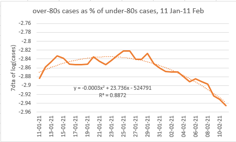
So, armed with my extended model, and aware of the issues we’ve had previously with the data, I set out to find a ‘clean’ a set of case data I could apply it to. The best I could find is this, which is the over-80s cases expressed as a proportion of under-80s cases:
(note the benchmarking to under-80s is designed to remove some of the distortions that we found previously e.g. due to changing lockdown compliance – on the assumption that these would affect all age groups similarly)
And we do find a quadratic curve, with coefficient 0.027%. Is this plausible? Well, our model implies that this means c. j^2 = 0.27%. The rate of vaccination in the relevant period was around 1.6% per day on average, and if we assume...
that ~60% of the people vaccinated acquired sterilising immunity (consistent with latest data I think), and that over-80s get ~50% of their infections from each other (a guess based on some limited data - corrections welcome), then we’d get 1.6% * 60% * (50%)^2 = 0.24%.
so we’re not far off – but I’d be careful not to read too much into that, there’s a good range of uncertainty in some of those parameters. There are also two other issues to note with the data:
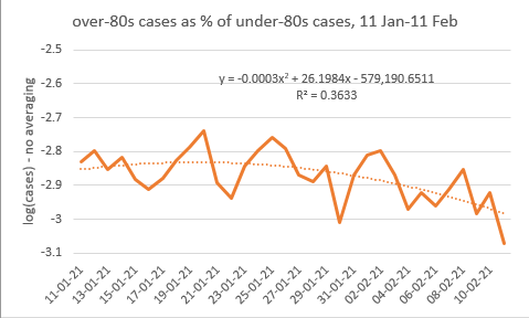
1) The graph you see above is using 7-day averages on the log data, which smooth things out but also make the fit artificially good. Without the averaging, we’d see this; which still has a quadratic shape with a similar coefficient, but it’s harder to see.
2) If we chunk the data up into different periods, we still get quadratic fits in each, but the coefficient isn’t very stable, and its variation doesn’t match the (lagged) rates of vaccination e.g. the coefficient is highest in late Jan, but then reduces in mid Feb
(note one possible reason for this is that when the rate of vaccination increases, it doesn’t just change the quadratic term, but also the linear term – hence steepening the decline on the log plot, which could make the quadratic coefficient appear artificially high)
So in conclusion, while the quadratic model is interesting, and probably is showing a vaccine effect in over-80s cases, it remains difficult to apply in the real world, where the noise and distortion in the data is at least as large as the effect we are looking for. /end

 Read on Twitter


