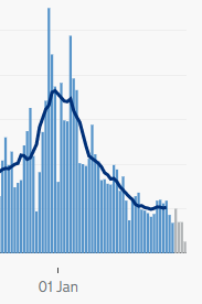
I still think everything's generally going Ok on a UK national level with the lockdown, and vaccines are starting to show their hand with deaths. But there's one nagging concern in terms of some of the case graphs, so here's some maths.
In some places, cases aren't falling as steeply as they were, and are maybe thinking of reaching a floor. It's harder to see on linear plots on the dashboard than log plots (insert usual rant here) but here are (in order) Scotland, Liverpool (HT: @AdamJRuby) and Edinburgh.
It might just be more testing. But what else could explain this? Suppose you have two types of people: people who can WFH and get R=0.8 under lockdown, people who can't and get R=1.05 (say).
Depending on the proportion of the two types of people in the overall population, you might well see a fall in cases early on, which then bottoms out, and eventually starts to grow.
For example 90% WFH gives the red curve, 70% WFH gives the green.
For example 90% WFH gives the red curve, 70% WFH gives the green.
But basically, the higher the proportion of people who can't WFH, the earlier the graph bottoms out, and the higher the level it bottoms out at. And it does feel like those places above might be places where fewer people are able to WFH than the UK average?
All numbers are made up for illustration, but it feels like it might be worth further investigation? ( @JamesWard73 has shown that R rates are higher in the bottom decile of local authorities for example).

 Read on Twitter


