Taking a break from hunting through covid data for vaccine effects, I decided to respond to the many requests (well, two) to update my model that explores the effects of immunity and deprivation at local level, to see if things had changed during wave3. TL;DR – they have changed
Warning: this is a long thread with some bits of algebra in the second half. But if you can cope with logs and exponential curves you should be fine, and most of the first half doesn’t need any maths at all.
Let’s start by looking at deprivation. You may recall that a few weeks back, my model showed that daily growth rates in the first half of January were much lower in affluent areas i.e. lockdown was working better in those places https://twitter.com/JamesWard73/status/1353826600186482690?s=20
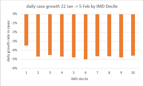
And is that still the case? Well, not exactly. Looking at the last couple of weeks, we see this pattern: (as always, my data relates to England only). So it looks like the growth rates have evened out, across all IMD deciles except for decile 1 – the most deprived areas
In those most deprived areas (decile 1), the daily growth rate is about -3.5%, which is more than 1 percentage point higher than the average (-4.7%) across the rest of the country.
In other words, while the R number nationally is around 0.79, it’s 0.84 in the most deprived areas. That might not sound like a big difference, but it still means that it will take considerably longer for cases to drop in those areas.
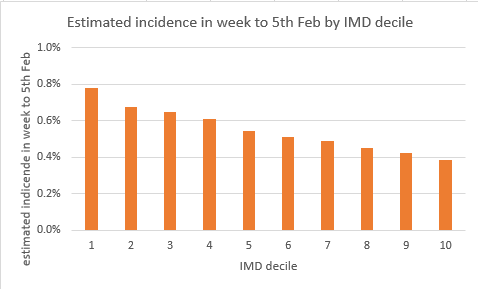
This also doesn’t mean that the case rates in deprived areas are suddenly the same as those in affluent areas. Indeed the incidence (number of cases as a % of population) in the most deprived areas is still almost exactly twice that in the most affluent areas
If these patterns continued, then in a month’s time the cases in the most deprived areas (which we’ve seen are falling more slowly than others) would be nearly 3 times those in the most affluent, in another month about 4 times, and another month over 5 times.
Hopefully the vaccines – on top of gradually moderating controls – will mean that by then, case rates are so low that we don’t need to worry about these differences.
But it may yet be an obstacle to removing controls uniformly across the country, if case rates remain stubbornly high in some of the most deprived local areas.
The regional patterns are also interesting. @VictimofMaths explored these a couple of days ago in a different thread, and my results are consistent with his. https://twitter.com/VictimOfMaths/status/1358747762767126531?s=20
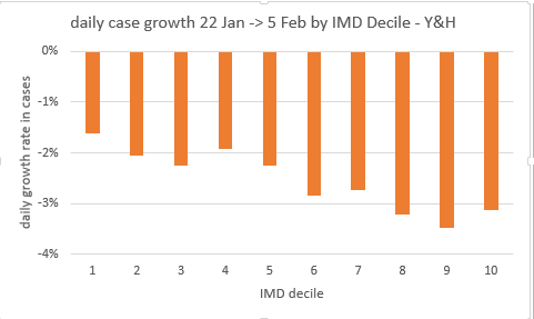
What we see is that in some regions –for example Yorkshire and Humber in the chart below – the pattern is still very much as it was a couple of weeks ago, with a clear link between more deprived areas and slower-falling covid cases (i.e. higher R)
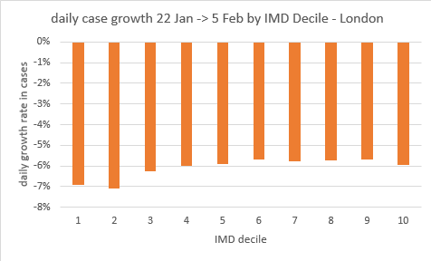
But in others – most notably London – the pattern has reversed, with the most deprived areas now seeing the fastest falls in cases (i.e. lower R).
What has changed? Well, maybe it’s immunity starting to play a role – as various others have speculated over the last few days. To explore this, we need to use the other part of my model. https://twitter.com/BristOliver/status/1359219453125423108?s=20
Regular readers will recall that I am using the data series of weekly case rates by local areas (MSOAs) helpfully provided by the PHE dashboard team – thanks once again to @statsgeekclare and @Pouriaaa for this
and multiplying this by a time-varying factor for case ascertainment borrowed from @ArtySmokesPS in order to estimate actual infections in each week – with big thanks to Arty as well. See more about his model here : https://twitter.com/ArtySmokesPS/status/1359663805756825600?s=20
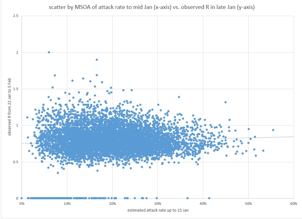
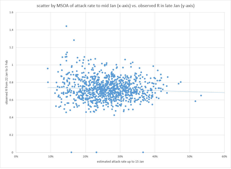
We can use this data to create a scatter plot, where the x-axis is the total attack rate (i.e. the % of the population in each MSOA that have had covid), and the y-axis is the observed R over the last couple of weeks (22 Jan to 5 Feb).
At first sight, there doesn’t seem to be a strong relationship between the attack rate and R in late Jan. So it’s not yet compelling evidence that acquired immunity is pushing down the growth rate in those areas that have been hit hard in waves 1, 2 or 3 (but see later!)
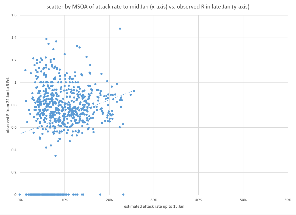
We can look in particular regions – e.g. here’s London – and see much the same effect, although maybe with a hint of a slight downward tilt towards the right (which would suggest a weak immunity effect)
Only the South West shows a particularly different pattern – and here we see a positive correlation between the attack rate and observed R, so even less evidence of an immunity effect (note this pattern is more similar to what we saw across England a few weeks back)
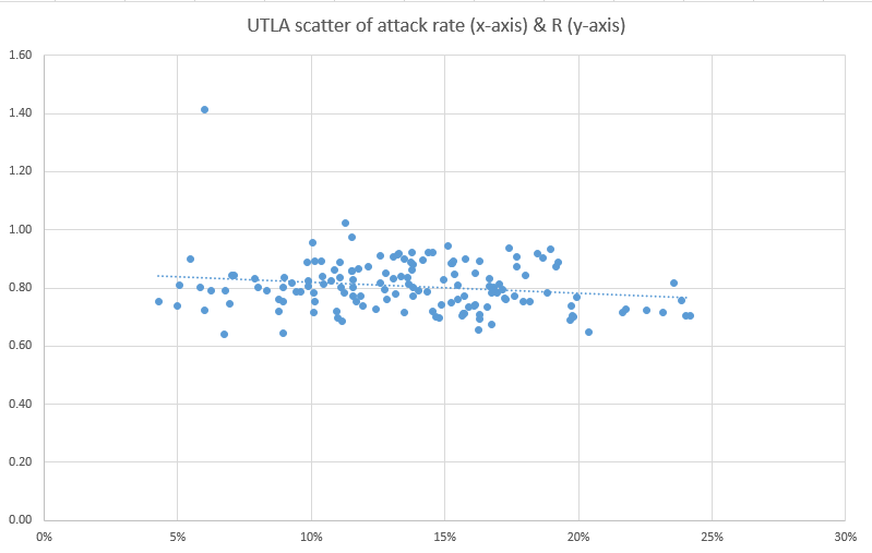
Some have suggested that doing this analysis at MSOA level is too granular, because the areas are too connected to each other (via population mixing) to see strong immunity effects – we need to look at larger areas. OK, so here are upper-tier local authorities, across England.
Not much difference, really, although again a slight downward tilt. (that outlier with R of 1.4 is Rutland, by the way. I think it was caused by a big outbreak in a prison– but please send questions to @ArtySmokesPS, he’s the local expert)
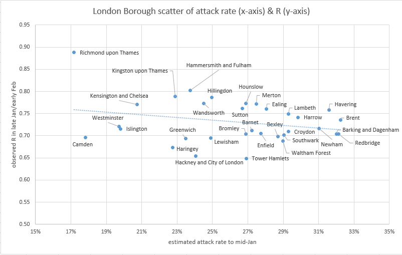
Let’s do that again within London – and here UTLAs are just the London Boroughs that we know and love. And OK, maybe we’re seeing a slight negative correlation between attack rate and observed R –
but I’ve had to zoom in on the y-axis to see it, and the fit’s not exactly great
but I’ve had to zoom in on the y-axis to see it, and the fit’s not exactly great
So yes, I think part of the story for why Tower Hamlets has such fast-declining cases (low R) is its high attack rate to date, and hence higher levels of acquired immunity. And the same at the other end for Richmond, which has much lower attack rates/immunity, and much higher R.
But there must be other local factors at play as well – otherwise Havering (which has an even higher attack rate than Tower Hamlets) wouldn’t have a higher R. And Camden, which has a similar attack rate to Richmond, has a lower R.
[Note: one possibility is that case ascertainment is worse in some areas than others, so we may be underestimating the actual attack rate in Tower Hamlets, for example, which could explain why it’s below the trend line. See for example https://twitter.com/ArtySmokesPS/status/1359700707755057152?s=20]
So we may be starting to see gentle evidence of immunity effects at a Borough level within London. But why don’t we see a bigger effect here, or at a national level?
And I think the answer is, much like in our hunt for vaccine effects in the case data, that we have the wrong benchmark in our heads. There is a big effect, but we’re not seeing it because its effect is to neutralise a different, offsetting effect and create a “flat” picture.
In our heads, we’re expecting to see immunity effects bring the R rate way down in those areas with high attack rates, and so when we don’t see that, we think there’s no immunity effect.
But the reality is not like that at all; without immunity, we should expect to see the R numbers *higher* in those areas with high attack rates. And the fact that they’re not – that the R is on average much the same, whatever the attack rate – is evidence of a big immunity effect
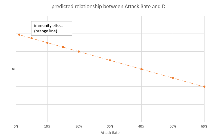
To explain why this is, I need to back up a bit, and introduce some maths. Let’s start with our intuition: the higher the attack rate, the more R should go down, due to immunity. So we should see a relationship like this, where R is related to (1 - attack rate) in each area
In fact specifically, for each 10% added to the attack rate, we should expect R to reduce by about 10% of its original value
But there’s another important effect here. Some areas just have a higher natural R than others – due to a combination of deprivation, population density, occupation mix and other factors. So the attack rate that we see in the initial waves will be a function of this natural R.
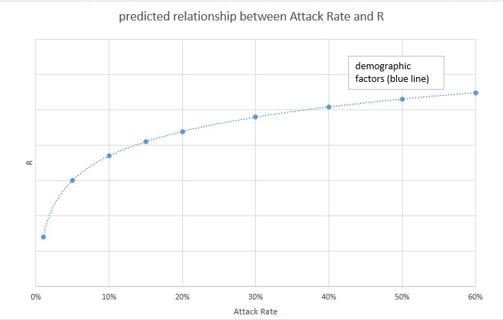
Specifically, we should expect the attack rate to be an exponential function of R. Conversely, we should expect R to be a logarithmic function of the attack rate – or in other words R = b x log (attack rate) + c , for some constants b and c
FOOTNOTE these constants will depend on – for example - how big the initial waves are, and the current set of lockdown controls. Mathematically astute readers will note that I’m skating over some complexity here: the size of the initial wave will be (approximately) an...
exponential function of the actual R at the time (depending on controls, behaviour etc.) – which I’m assuming is a linear function of the natural R for each locality. And the current R for each area will also be a (different) linear function of the natural R.
But that doesn’t really matter because a linear function of a linear function is still a linear function, and I don’t really care what the constants are – I’m just interested in the shape of the graph). END FOOTNOTE
Coming back to our graph, and ignoring immunity effects for a moment, we should expect to see a pattern like this, where the higher the attack rate, the higher the R (but with a slightly flattening profile as attack rates increase).
If that’s confusing, turn the chart through 90 degrees anti-clockwise and think of it the other way round : the higher the R, the higher the attack rate in the initial waves (and with an exponential increase in attack rate as R gets higher)
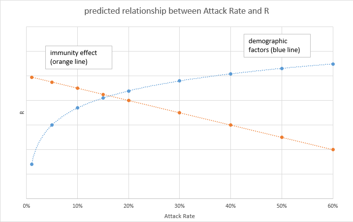
Right, now we need to combine the two effects on one graph. We can see they are in opposition – as the demographic (blue) curve is pulling R up, so the immunity line (orange) is pulling it down.
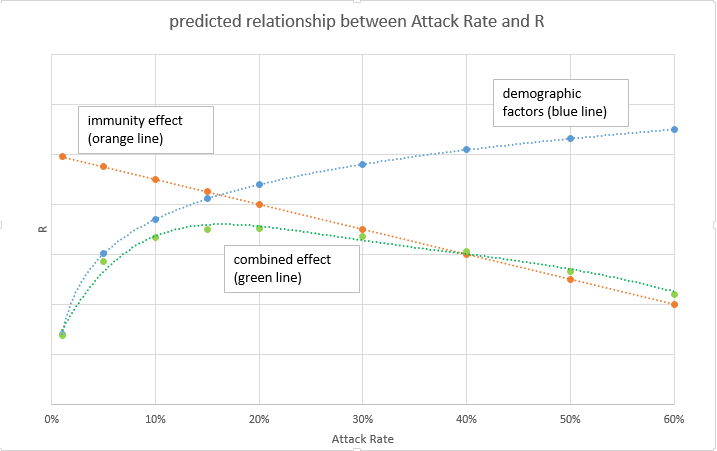
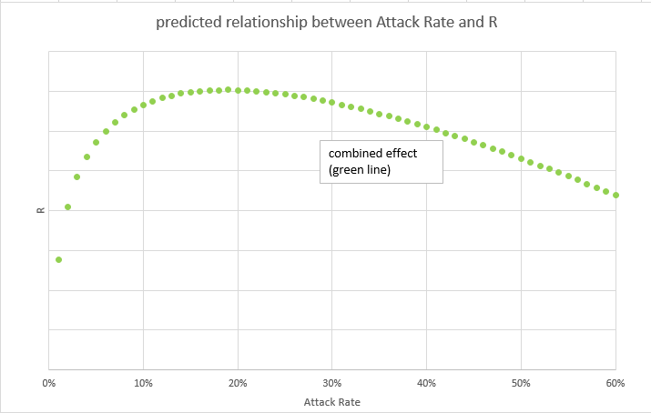
But what will be the combined effect? To do that we need to multiply the two effects together, creating a curve which has the mathematical profile: R = (1- X) (b. log X + c) where X is the attack rate. Which looks like the green curve on this chart:
It’s a bit easier to see without the orange and blue bits in the way; our curve goes up quickly for low attack rates, then flattens out, and then declines more gently as attack rates increase.
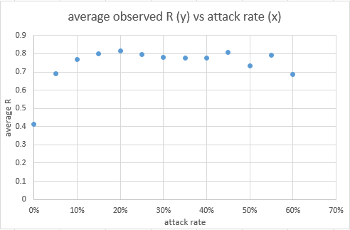
So far this is just theory. But does it match what we see in the data? Well, yes it does, I think. If I take the MSOAs and bucket them by attack rate, and calculate the average R for each, I get this curve, which looks suspiciously familiar in shape: (with a bit of noise)
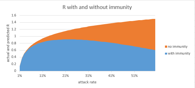
With a bit of mathematical juggling, I can fit a logarithmic curve to that data and re-project what we expect the R to be, on average, for a given attack rate. Using our model, we can also make an informed guess as to what the actual R might be now, in the absence of immunity...
...just by dividing the current R by (1 – attack rate). So we’d see a curve more like the top one in this graph: the orange area is then shows the size of the “immunity effect”
To take some specific examples, without immunity effects Tower Hamlets might have an R of 0.9 rather than 0.65. London’s R would be 1.0 rather than 0.73. And at a national level, England’s R would also be very close to 1.0 rather than 0.79
So if this model is correct, immunity effects really are making the difference between lockdown 3 working well, and hardly working at all. They may not be quite offsetting the increase in transmissibility of the new variant, if this is c.+40%, but they’re making a big dent in it.
(note my model is estimating an attack rate of around 20% to mid-Jan in England as a whole, and 27% for London. Other models have higher rates e.g. I believe MRC was around 25% for England and 37% for London – it depends what you think case ascertainment has been in each wave)
So what does this mean for our scatter plots? Well, it implies that in the early stages of the epidemic, when most local areas are still on that upward-sloping bit of the green curve, with relatively low attack rates, we’ll see a positive correlation between attack rate and R
(and note we still see this today in the South West, which has the lowest attack rate of all English regions)
Then when we reach the middle stages of the epidemic (roughly where we are today at national level), we get a mostly flat profile, with little clear relationship between attack rate and R
And then in the later stages – if we were allowed to get there naturally, without vaccines – we would see a stronger negative correlation between attack rates and R. We’re seeing hints of this already in the data for London, which has the highest incidence of the regions.
So now I think we can see clearly that the lack of a strong relationship between attack rate and R is not evidence that immunity isn’t helping to bring case rates down. In fact, it’s evidence that immunity is having a significant effect –
because if it wasn’t doing this, there would be a clear positive correlation between attack rate and R. The *removal* of that positive correlation is the evidence of immunity doing its thing.
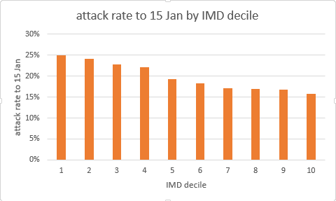
And coming back to where we started, what does this mean for our deprivation graph? This may not be the whole story, but given that we know that the most deprived areas are also those with the highest attack rates (see chart), it seems very likely that
the main reason that lockdown is now working nearly as well for deprived areas as for affluent ones is that the deprived areas have had more covid, and that immunity effects are now bringing things back into balance.
This doesn’t quite explain why this immunity effect hasn’t worked for the most deprived areas (decile 1). But if we look back to the previous analysis, we can see that the growth rate in the most deprived areas was a lot higher than in the other deciles https://twitter.com/JamesWard73/status/1353825388514963457?s=20
And the difference in attack rates between deciles 1 and deciles 2 is not that big – decile 1 is higher, but only by a little bit:
So probably the extra immunity effect of that slightly higher attack rate in decile 1 isn’t enough to overcome the (much larger) relative difference in growth rates.
But that’s odd: if the natural R of the most deprived areas (decile 1) is noticeably higher than in decile 2, hence driving a higher growth rate in early January, we’d expect the attack rate in decile 1 to be significantly ahead of decile 2, not just very slightly so.
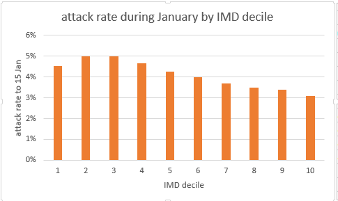
And the answer to that comes down to the regional patterns of deprivation. Attack rates during wave 3 have been highest in London, which actually has very few local areas in IMD decile 1. London has lots of areas in deciles 2, 3 and 4 – but decile 1 is dominated by areas in...
...the North West, Yorkshire and West Midlands, which haven’t been so badly hit in wave 3. So the attack rate in decile 1 during January has in fact been lower than in deciles 2 and 3.
Hence the improvement in growth rate due to immunity effects, over the last few weeks, is less pronounced in decile 1 – and that, finally, explains why we still see growth rates in decile 1 higher than in other deciles.
I’m conscious that was a VERY long explanation of a simple graph of the R by IMD decile, so well done to anyone who made it this far. Hopefully you learned something along the way – I certainly did. / end

 Read on Twitter
