Quick cautionary tale. We're all desperate to find a vaccine effect. But I think there's a genuine danger that 100 people with Excel spreadsheets will find all kinds of bogus effects within the noise, if we all go looking for every possible effect.
Here's how I allowed myself to be fooled by randomness earlier. I had a sensible idea: we vaxxed care homes first, right? Care homes are a big proportion of total deaths, so as of lately non-hospital deaths should drop faster than total deaths. The logic makes sense, we can check
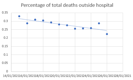
I can take 12 recent days of deaths by date of occurrence off the dashboard, and hospital deaths on corresponding days off the NHS spreadsheet, and calculate the fraction. Wow, here's a serious result. It's dropping, just like our model said!
I could have got 50 RTs and 200 likes off that graph easily, if I didn't have something I like to call "standards". So here's what I think is happening: I reckon hospital deaths get reported faster than non-hospital deaths, and so later points will get revised up in due course.
But actually I can check that, by going back in time. Thanks to the dashboard magic and URL guessing I can download the same datasets as they would have looked 10 days ago, and plot the same graph. Oh. It looks pretty much exactly the same.
Worse still, the data point on the far RHS of the new graph (22% on 26/1/21) actually appears on the old graph, where it is now 35% on 26/1/21, precisely because of the way it got revised in due course.
Moral: more checking, less plotting, and be patient.
Moral: more checking, less plotting, and be patient.

 Read on Twitter


