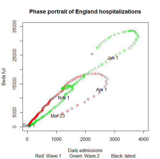
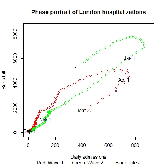
Said I wouldn't do the phase plot every day, but it's kind of metronomic at the moment, and we all need all the good news we can get.
Interesting point on the LH plot: hospitalizations coming down 20% or so per week, more or less the rate they went up at.
Interesting point on the LH plot: hospitalizations coming down 20% or so per week, more or less the rate they went up at.
FAQ: black dot is far ahead because it is latest day only, so up-to-date but noisy, green dots are 7 day averages, so smooth but laggy.
So for example, on Day 100:
black dot is Day 100
last green dot is average of Days 94-100
previous dot is Days 93-99 etc
So green dots overlap
So for example, on Day 100:
black dot is Day 100
last green dot is average of Days 94-100
previous dot is Days 93-99 etc
So green dots overlap

 Read on Twitter


