Thread: I want to tell you a story. A tale of two cities. This is a fairy story with no relevance to us, so there's absolutely no need to chip in and tell me how my assumptions are unrealistic and the world isn't like that, and how I'm missing out on various second order effects.
The city of Novaxia (population 1 million) has been hit by a disease. At the moment, 10000 people have it. They've agreed to go into lockdown, but they all come out every 5 days to get food. When that happens, every 10 people infect 9 new ones. Sick people get well a week later.
On day 5, these 10000 people infect 9000 and then get better. On day 10, these 9000 infect 8100. On day 15, these 8100 infect 7290, on day 20 there are 6561 patients. This is fine, the disease is gradually going away, but it's going to take a while, and people are getting fed up
We can plot this on a graph. You can see that the numbers are falling, but the fall is gradually flattening out.
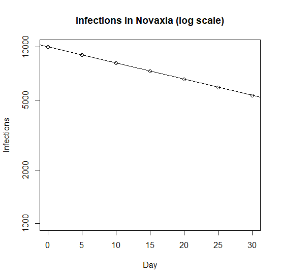
We also plot it on a weird graph where we squash up the axis in the right way to turn the curve into a straight line.
The "numbers get multiplied by the same amount" (90%) each time and the squashed up axis turns that into "points fall on the graph by the same amount" each time
The "numbers get multiplied by the same amount" (90%) each time and the squashed up axis turns that into "points fall on the graph by the same amount" each time
The city of Bigpharmia have the same disease and the same situation. But they've managed to design a special hat that protects you from the disease. Each day, the people of Bigpharmia are able to sew 10000 of these hats, and the King gives them to random members of the public.
So, on day 5, 50000 of the population have a hat. That's 5% of the population, so instead of 9000 people being infected, only 95% of the number who would otherwise have been infected actually are. That's 8550.
By day 10, 10% of the population have a hat. So, instead of the 8550 passing it on to 7695 (nine tenths of 8550), they pass it on to 6925 (10% smaller than that). By day 15, 15% are protected and so on.
We can plot Novaxia and Bigpharmia's cases on the same graph. It's clear that Bigpharmia are doing quite a bit better and the hats are really helping.
But the really cute thing is to plot them both on the squashed up axes. Instead of seeing a straight line, because Bigpharmia's numbers are multiplied by a better number each time, on the squashed up axes you see a bigger drop each time.
This is obviously a made up and simplified story. But the moral is: we want to know if we live in Novaxia or Bigpharmia, to know quite how well our vaccine is working, and what percentage of people are newly protected.
And the right way to do this is to plot cases (or eventually hospitalizations or deaths) on the squashed up axes and look for a curve.

 Read on Twitter


