An extraordinary resource: https://inequality.org/facts/global-inequality/
@inequalityorg has assembled hundreds of data points, graphed them, and made them all available via Creative Commons license so the rest of us can be storytellers with their data.
And damn... the story is a harsh one.
@inequalityorg has assembled hundreds of data points, graphed them, and made them all available via Creative Commons license so the rest of us can be storytellers with their data.
And damn... the story is a harsh one.
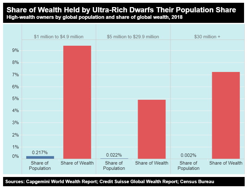
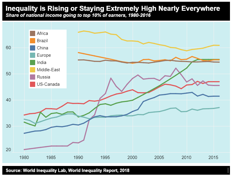
Sure, millionaires, especially those with $30M+ are a tiny sliver of the world's population that dominate its wealth, but is there anywhere wealth inequality is improving?
Nope.
Nope.
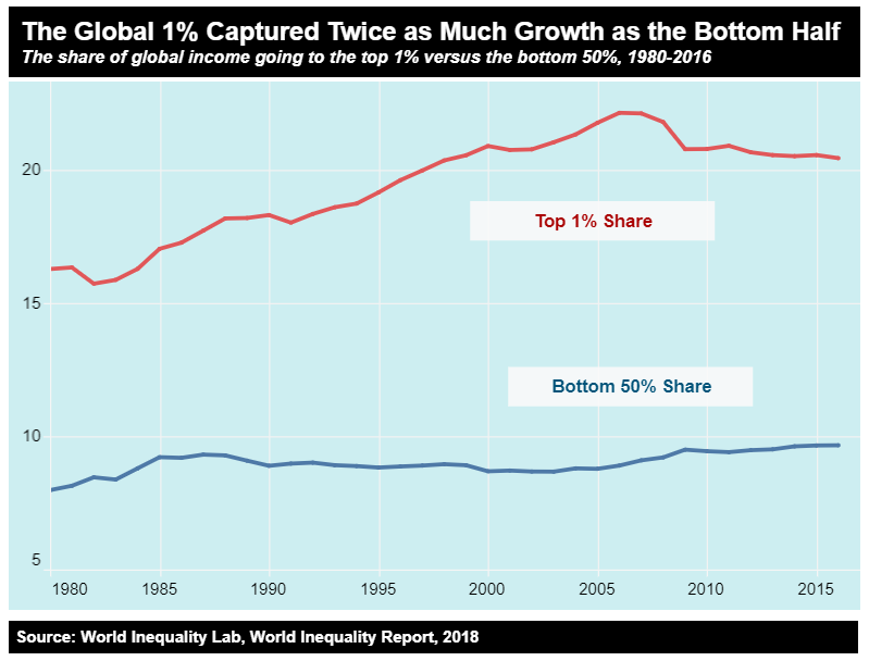
As the world's economies have grown massively the last 40 years, surely the bottom 50% of wealth owners have made some gains?
Barely at all.
Barely at all.
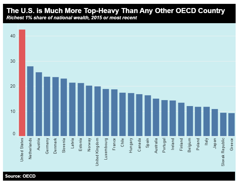
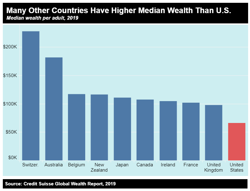
OK, but on this global scale, how bad is the US?
Not just bad... It's the worst of all wealthy countries.
Not just bad... It's the worst of all wealthy countries.
In fact, if you had to choose a country in which to be born to a random family, the US would not be all that high on the list.
Median wealth (and a host of other factors from health to education to life expectancy) are not great here.
Median wealth (and a host of other factors from health to education to life expectancy) are not great here.
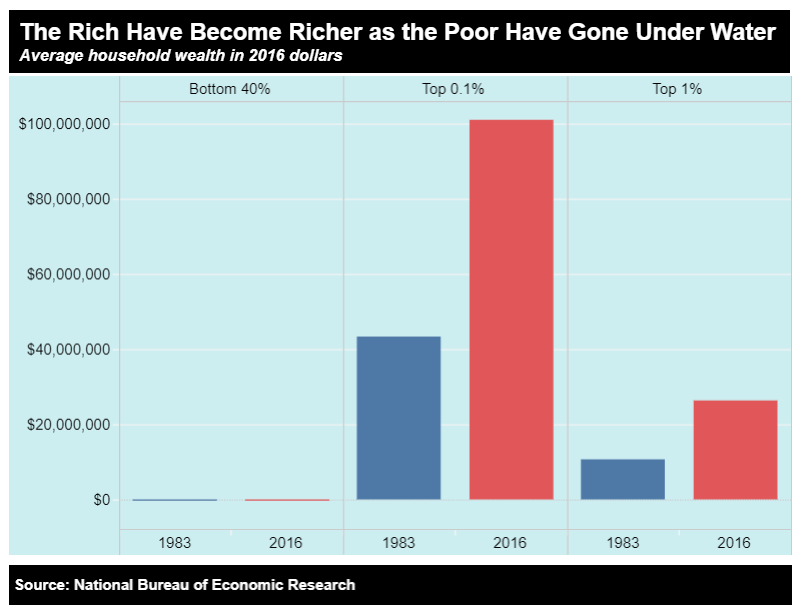
For 50 years, American inequality improved. For the last 40 years, it's devolved to near-gilded-age levels.

 Read on Twitter