There's been a bit of confusion about the shape of some of the ONS modelled infection estimates, and subsequent updates to the curves - even from people who spend a lot of time looking at COVID data. So what might be doing on? A thread... 1/ https://twitter.com/ChrisGiles_/status/1319620517796741120
First, a disclaimer: I don't work on the ONS infection survey, so these are just my independent observations, based on my reading of the methods and grappling with similar datasets in the past (so don't @ me as if it's my model/graphs!) 2/
The ONS infection survey involves random sampling of UK households (more here: https://www.ons.gov.uk/peoplepopulationandcommunity/healthandsocialcare/conditionsanddiseases/methodologies/covid19infectionsurveypilotmethodsandfurtherinformation#study-design-sampling). This generates an individual-level dataset with characteristics like age & location, as well as test result (e.g. positive/negative) 3/
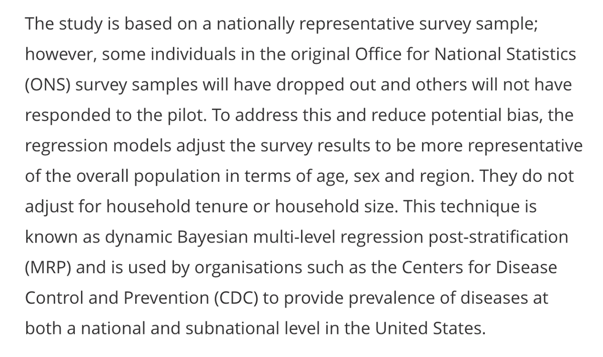
But how are these raw data converted into an estimate of infection levels over time? After all, the daily data will be very noisy, and potentially not representative if certain groups have/haven't responded. There are two steps the infection survey uses to address this... 4/
First, the model adjusts for factors like age & region to try and ensure that estimates are representative of the wider population. Second, it uses a 'spline' to try and extract the underlying trend over time from the noisy raw data. (More on methods: https://www.medrxiv.org/content/10.1101/2020.07.06.20147348v1) 5/
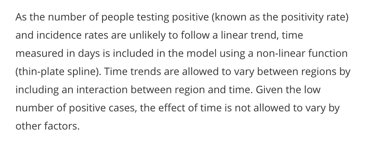
In essence, a spline is a series of curved sections, linked by 'anchor points'. If you've ever used the 'curve' tool in powerpoint, you'll have an conceptual sense of what this involves. 6/
The question is how many anchor points to include – with a large dataset, there's a risk of 'overfitting' and adding loads, which produces a very up-and-down curve that isn't a sensible representation of the underlying epidemic. Here's more on splines: 7/
To avoid overfitting, the ONS model uses a 'thin plate' spline with a limit to the number of curved sections. Imagine a thin metal sheet that can bend, but has a limit to how many ups and downs it has in its shape (hence the name 'thin plate' spline). 8/
Because a spline basically consists of a series of curves, it tends to curve up or down eventually. If infection levels accelerate, then slow slightly, I suspect the spline may add an 'anchor point' to switch from curve that swoops up steeply to one that will eventually peak. 9/
As more data comes in, the spline may update its shape – particularly where it puts the anchor points – and hence whether it ends in a curve that swoops up or down... 10/
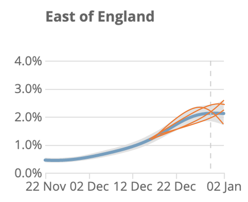
This brings us back to the ONS curves. The model doesn't actually calculate a single spline to estimate the trend - it calculates a range of curves that could plausibly fit the data. Some may swoop up, and others down, and the overall curve is the average. 11/
Here's a cartoon illustration of what the underlying splines (orange) could potentially look like, compared with recent data (blue). Note I've just made up the orange lines - the actual fits may look different, but hopefully it makes the point. 12/
In summary, it's challenging to extract trends from noisy data, and I suspect two main sources of confusion with the ONS curves are: a) underlying spline has some constraints in possible shapes it can take & b) the range of plausible curves isn't shown in published graphs. 13/
Again, I didn't develop above ONS model, but given recent Twitter observations by @Dr_D_Robertson @ChrisGiles_ @TAH_Sci @JoshBiostats @apsmunro and others, thought it would be useful to try and elaborate a bit on possible methodological considerations. 14/14
Footnote – plot below shows how central estimate for prevalence has changed over time. And note that this is prevalence (% currently infected) not incidence (i.e. rate newly infected – previously modelled, but not currently shown in reports) https://twitter.com/JoshBiostats/status/1348341155482791945?s=20

 Read on Twitter


