1/ We have two sources of information about the spread of the new variant. The most reliable is genomics data, but this has a lag period, and most samples can't be tested in this way.
The second is "S dropout", but it doesn't uniquely identify B.1.1.7
Graph below and short
The second is "S dropout", but it doesn't uniquely identify B.1.1.7
Graph below and short

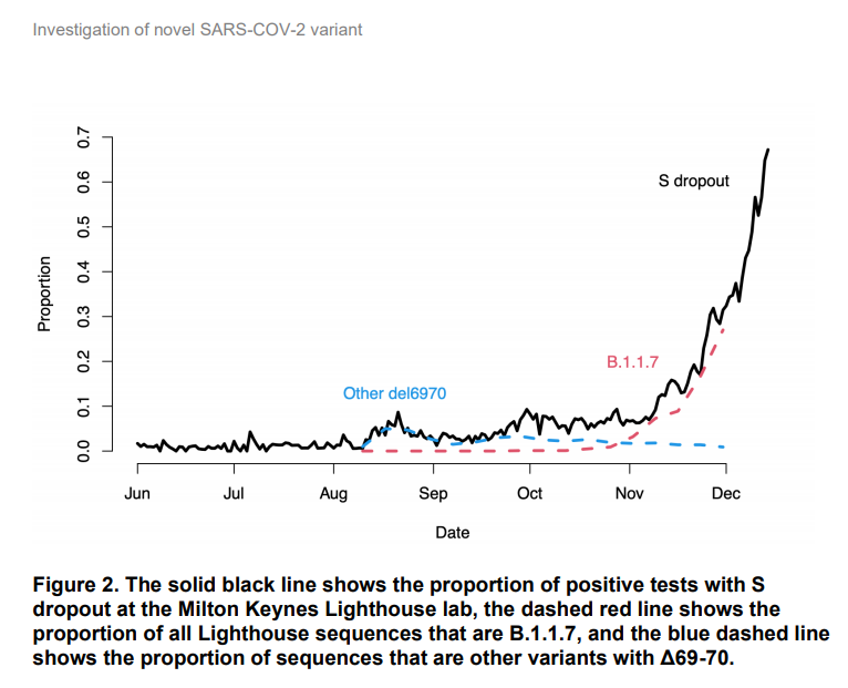
2/ B.1.1.7 has a deletion of 6 letters of RNA in the S gene, which happens to make one of the three PCR tests performed on each swab sample in the Lighthouse labs give a negative result. So these "S-negatives" can be a proxy for B.1.1.7.
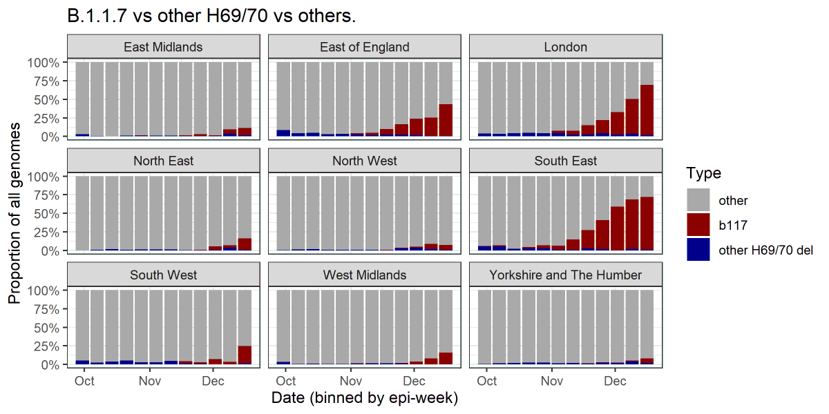
3/ BUT there are other strains that also have this same "H69/70 deletion" variant. Indeed the first was seen in the UK in April, long before B1.1.7. The graph above shows these in blue. The graph represents the percentage of all genomes sequenced in these areas at various times.
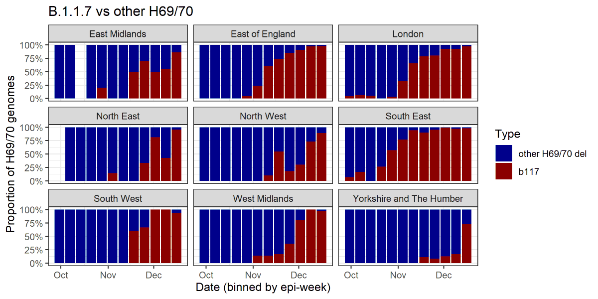
4/ We can also look at just the H69/70 deletion genomes and see what proportion of them are B.1.1.7.
This represents, to a first approximation, the proportion of S-dropout PCR tests that might be due to B.1.1.7:
This represents, to a first approximation, the proportion of S-dropout PCR tests that might be due to B.1.1.7:
5/ We can see that, for example in Yorkshire, until very recently most S-dropout sequences were *not* B.1.1.7. Unfortunately this may explain why from this S-dropout data, S-dropouts have not appeared to be increasing very rapidly in this area. https://twitter.com/chrischirp/status/1343526617755361282
6/ The PHE report also provides a nice breakdown of this, which better accounts for anything else that might also cause S-dropout (but it's not split by area) https://assets.publishing.service.gov.uk/government/uploads/system/uploads/attachment_data/file/947048/Technical_Briefing_VOC_SH_NJL2_SH2.pdf
By now it is likely that in most areas of England S-dropout likely indicates B.1.1.7. But this is a result of its apparent growth advantage, which seems to have allowed it to outcompete other variants, including the other H69/70 del variants.
9/ As with all genomic graphs I show, all data credit goes to @CovidGenomicsUK and any processing errors are mine alone.
10/ A very nice analysis of the same data: https://twitter.com/TWenseleers/status/1343575693544796160
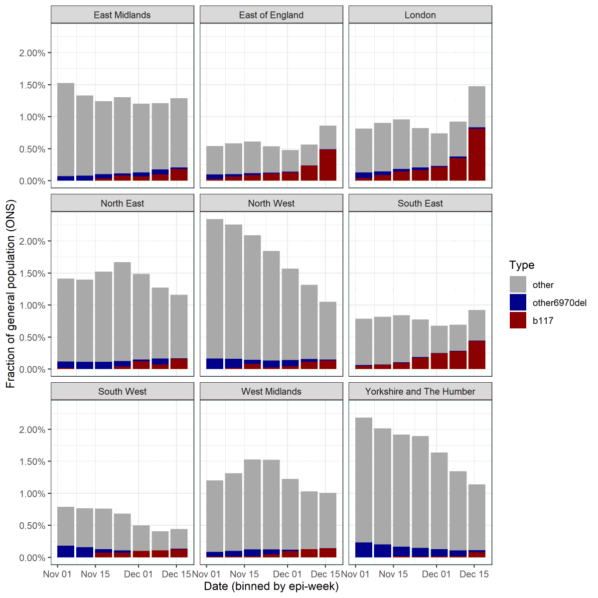
11/ The ONS now provide percentages from their infection survey that are S-dropout vs those that are not. In theory we can divide the S-dropouts into B.1.1.7 and other 69/70 del using the proportions above.

 Read on Twitter


