1/ THREAD
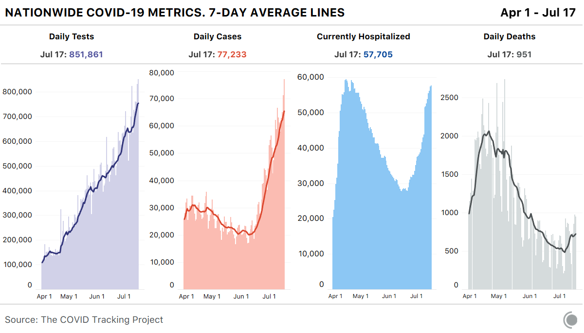
I see a lot of misinterpretation/misuse of this set of 4 figures, and it's bugging me. (spoiler: it's the ORANGE figure that's causing the problem...)
I see a lot of misinterpretation/misuse of this set of 4 figures, and it's bugging me. (spoiler: it's the ORANGE figure that's causing the problem...)
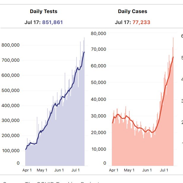
2/ PURPLE: shows number of daily tests, rising linearly. No issue with this one. Good to see we keep increasing the number tests.
Although:
--> Still need more tests
--> Most importantly, need faster *turnaround time* on tests so the results are actionable
Although:
--> Still need more tests
--> Most importantly, need faster *turnaround time* on tests so the results are actionable
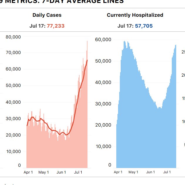
3/ ORANGE: *this* is driving me crazy. Yes, the cases are rising, and this is concerning, don't get me wrong, but the figure is being misinterpreted.
These are *confirmed* cases, but we know testing was lower early on (see PURPLE)
These are *confirmed* cases, but we know testing was lower early on (see PURPLE)
4/ What should the 'shape' of the ORANGE graph look like, if adjusted for the testing data in the PURPLE graph? The first hump would be MUCH larger (eg,NYC had 2M cases in Mar-Apr, determined from seroprev studies, that don't show up in the ORANGE figure).
5/ Should we be tracking cases? ABSOLUTELY.
We need to track cases closely, and by region, as a leading indicator.
My beef with the ORANGE figure is not with tracking cases, it's those using that graph to talk about changes OVER TIME on a national level.
We need to track cases closely, and by region, as a leading indicator.
My beef with the ORANGE figure is not with tracking cases, it's those using that graph to talk about changes OVER TIME on a national level.
6/ The right hand side of the ORANGE graph, which is not really impacted by testing prevalence, *is* deeply concerning. The slope is steep - cases are rising fast. (Breaking it out by state, instead of a national look, is even more telling.)
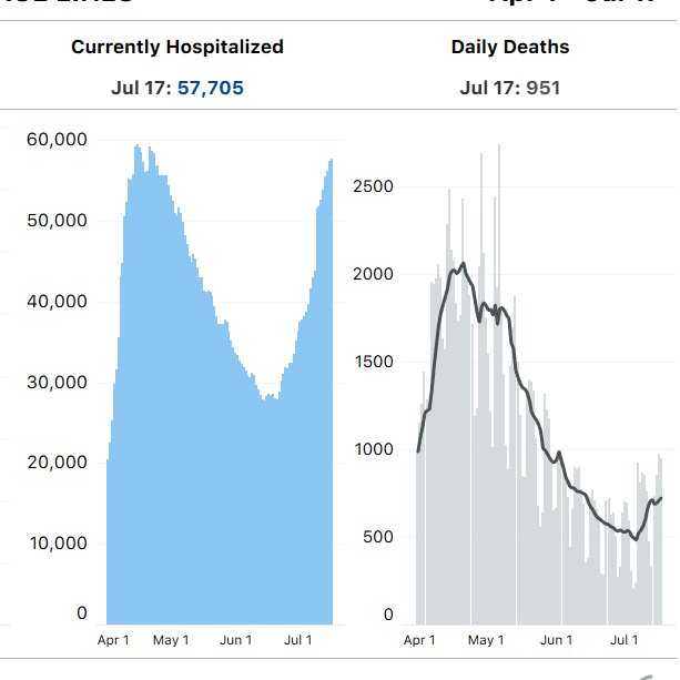
7/ BLUE: *this* is the graph you should look at to compare trends in impact over time because it offers a fair comparison (ie, hospitalizations aren't impacted by # of tests). And it tells a daunting story. Today matches the peak from early on in the pandemic. Not good.
8/ GRAY: this one is also interesting. Wondering why lower deaths now (GRAY) but similar # of hospitalizations as April (BLUE)?
--> time lag from hosp to death, so GRAY will keep rising (see @nataliexdean on this in @PostOpinions yesterday)
--> time lag from hosp to death, so GRAY will keep rising (see @nataliexdean on this in @PostOpinions yesterday)
9/ The GRAY deaths tally will also be impacted by other factors - better treatment and therapeutics, earlier detection, younger age distribution of cases (that is, until they infect older)
Make no mistake, though, the deaths will rise.
Make no mistake, though, the deaths will rise.
10/ Overall, it is important that we track these metrics nationally, but more important that we interpret them cleanly (they are being weaponized by both sides)
11/ Last thoughts (links to references in following posts):
--> deaths not the only impact (see excellent @edyong209 story on long-haulers)
--> better to look at graphs stratified by age and region
--> overall, graphs tell us that we need to act RIGHT NOW to slow the spread.
--> deaths not the only impact (see excellent @edyong209 story on long-haulers)
--> better to look at graphs stratified by age and region
--> overall, graphs tell us that we need to act RIGHT NOW to slow the spread.
12/ REFERENCES:
Figure: @COVID19Tracking (they *do* have these graphs stratified by region. Go take a look. Terrific resource.) https://covidtracking.com/
Figure: @COVID19Tracking (they *do* have these graphs stratified by region. Go take a look. Terrific resource.) https://covidtracking.com/
13/ "Trump loves the ‘low’ daily death rate for covid. It won’t last. Fatalities are always a ‘lagging indicator. And diagnosed infections are skyrocketing."
by @nataliexdean https://www.washingtonpost.com/outlook/trump-loves-the-low-daily-death-rate-for-covid-it-wont-last/2020/07/17/1cdfe752-c79d-11ea-b037-f9711f89ee46_story.html
by @nataliexdean https://www.washingtonpost.com/outlook/trump-loves-the-low-daily-death-rate-for-covid-it-wont-last/2020/07/17/1cdfe752-c79d-11ea-b037-f9711f89ee46_story.html
14/ "COVID-19 Can Last for Several Months. The disease’s “long-haulers” have endured relentless waves of debilitating symptoms—and disbelief from doctors and friends."
by @edyong209
--END-- https://www.theatlantic.com/health/archive/2020/06/covid-19-coronavirus-longterm-symptoms-months/612679/
by @edyong209
--END-- https://www.theatlantic.com/health/archive/2020/06/covid-19-coronavirus-longterm-symptoms-months/612679/

 Read on Twitter


