A look across some key US states, June 19th
1. It's key to use the same Y-axis. Here are new cases graphs. The only ones with a big N and at pandemic peak are Texas, Florida and Arizona. You can see others being declared as in trouble, but at a far different level of N
1. It's key to use the same Y-axis. Here are new cases graphs. The only ones with a big N and at pandemic peak are Texas, Florida and Arizona. You can see others being declared as in trouble, but at a far different level of N
2. For hospitalizations, many states don't provide their daily data. For the ones above there is no trend of increase to go along with the jump in cases since late in May.
3. But there is a trend of increase in deaths (all on same Y-axis) in several of these states, particularly in Texas and Arizona.
4. I'm not including states that have been steadily increasing in cases all along, since seeing an impact of reopening would be more difficult, examples here
5. Finally, I think this is a better way to present to data that at nytimes and other sites
data from @scrippsresearch https://outbreak.info thanks to my colleagues @andrewsu and @K_G_Andersen and their team
data from @scrippsresearch https://outbreak.info thanks to my colleagues @andrewsu and @K_G_Andersen and their team
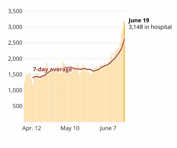
One notable exception for hospitalizations, the increase (peak pandemic) in Texas today, via @Okanaganer
confirmed here: https://txdshs.maps.arcgis.com/apps/opsdashboard/index.html#/0d8bdf9be927459d9cb11b9eaef6101f
confirmed here: https://txdshs.maps.arcgis.com/apps/opsdashboard/index.html#/0d8bdf9be927459d9cb11b9eaef6101f

 Read on Twitter


