Thread: I taught diagrammatic technique and critique to UX students over the weekend. In 35 diagrams critiqued, I saw the same five problems over and over again.
So ...if your diagram is a mess, listen up I have five lessons to share

 (1/7)
(1/7)
So ...if your diagram is a mess, listen up I have five lessons to share

 (1/7)
(1/7)
#1: STOP crossing lines  -- diagramming tools have for years been trying to solve for the “line-jumping” feature but the reality is that crossed lines add cognitive load for the viewer that can often be traded for more time in diagramming by the maker. (2/7)
 -- diagramming tools have for years been trying to solve for the “line-jumping” feature but the reality is that crossed lines add cognitive load for the viewer that can often be traded for more time in diagramming by the maker. (2/7)
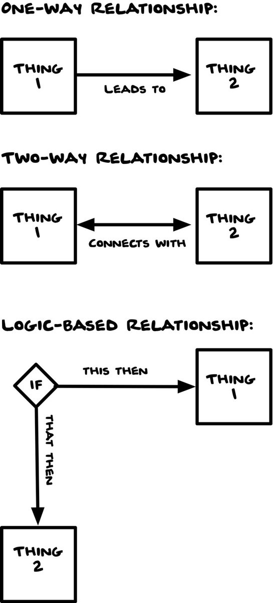
#2: Learn about decision diamonds  -- if your diagram is begging you to represent the concept of “if” -- you will want to know about this incredibly powerful and effective element that is a relative standard of flow-charting. (3/7)
 -- if your diagram is begging you to represent the concept of “if” -- you will want to know about this incredibly powerful and effective element that is a relative standard of flow-charting. (3/7)
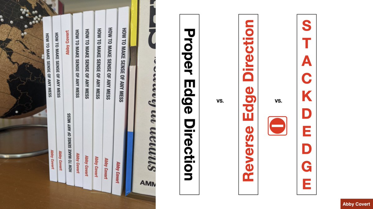
#3: Don’t work against typography  -- especially when it comes to readability. STOP centering your body copy. STOP using reverse and stacked edge vertical orientations. STOP trusting diagramming tools default visual styling of type, it isn’t good by default. (4/7)
 -- especially when it comes to readability. STOP centering your body copy. STOP using reverse and stacked edge vertical orientations. STOP trusting diagramming tools default visual styling of type, it isn’t good by default. (4/7)
#4: Label absolutely everything  -- even things you think are obvious. Keys, headlines, icons, connection lines are, in my experience critiquing student work, the most often unlabeled elements. Also beware of lengthy or unclear labels. (5/7)
 -- even things you think are obvious. Keys, headlines, icons, connection lines are, in my experience critiquing student work, the most often unlabeled elements. Also beware of lengthy or unclear labels. (5/7)
#5: Think about structure before styling it  -- We can distract ourselves with the look and feel of the diagram and completely miss the making sense part of it. Keep it low fidelity until the structure works for your purpose, then pursue the right style. (6/7)
 -- We can distract ourselves with the look and feel of the diagram and completely miss the making sense part of it. Keep it low fidelity until the structure works for your purpose, then pursue the right style. (6/7)
/thread
I’m currently writing a book about diagramming, so if you found these five lessons helpful and want to support my work in this area, I have a few diagramming products for sale in my Etsy shop. http://www.etsy.com/shop/abbytheia (7/7)
#howtodiagram
I’m currently writing a book about diagramming, so if you found these five lessons helpful and want to support my work in this area, I have a few diagramming products for sale in my Etsy shop. http://www.etsy.com/shop/abbytheia (7/7)
#howtodiagram

 Read on Twitter


