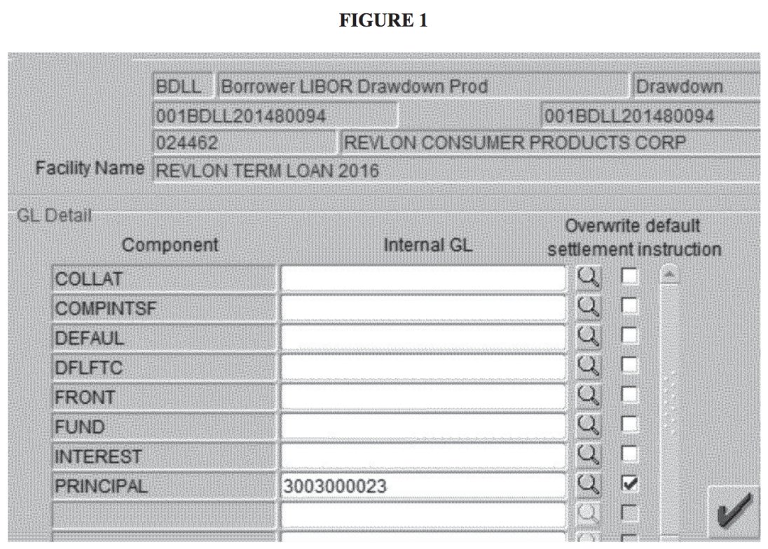
The value of good design? Preventing a $900 million UX error. https://www.bloomberg.com/opinion/articles/2021-02-17/citi-can-t-have-its-900-million-back
See that "Overwrite default settlement instruction" column of checkboxes?
It looks important, but doesn’t actually *do* anything.
It looks important, but doesn’t actually *do* anything.
Users had to check two *other* boxes to prevent funds from being sent out.
Because this was so unclear, Citi gave away $900 million to hedge funds... by accident! And they can't get it back.
All because of bad UX design.
Because this was so unclear, Citi gave away $900 million to hedge funds... by accident! And they can't get it back.
All because of bad UX design.
You may remember a similar case in Hawaii a few years ago when this warning was sent to *everyone* in the state:
https://en.wikipedia.org/wiki/2018_Hawaii_false_missile_alert
https://en.wikipedia.org/wiki/2018_Hawaii_false_missile_alert
It was also sent out because of bad UX design: the "interface" to administer the warning system was just a poorly ordered series of text links.
(I don't think all those CAPITAL LETTERS helped)
(I don't think all those CAPITAL LETTERS helped)
It's tempting to say the problem here isn't "bad" UX design so much as it is "no UX design at all."
But these systems and their interfaces were designed by someone. Even if they didn't think of themselves as a "designer".
What if they did?
But these systems and their interfaces were designed by someone. Even if they didn't think of themselves as a "designer".
What if they did?
What if the person at Citi took ownership of designing that interface and invested the time to understand its users, their jobs, and their constraints?
What if their manager supported them in taking time to understand the risks involved and reduce them?
What if their manager supported them in taking time to understand the risks involved and reduce them?
But these people are part of an organization. What if Citi saw that person not as a cost center—a salary that needed to be paid—but invested in them as a *profit* center?
When done well, that's what design can be.
When done well, that's what design can be.
But designers need to make the case—even if you don't think of yourself as one.
Because someone who's close to the problem needs to take ownership over the experience of its solution.
That someone should be you.
Because someone who's close to the problem needs to take ownership over the experience of its solution.
That someone should be you.

 Read on Twitter


