Top of the morning Twitter & happy Thursday ! 
How to choose colours to create a website layout ?
A little how-to guide with practical guidance to make a good choice

.
#100DaysOfCode #WomenWhoCode #Design #color #palette
1/12

How to choose colours to create a website layout ?

A little how-to guide with practical guidance to make a good choice


.
#100DaysOfCode #WomenWhoCode #Design #color #palette
1/12
The 1st step when creating the website is to see if there already is a branding / logo associated to your client / your project.
Indeed, if such is the case, then it is best to link your choice of colours to the existing visuals which will reinforce a brand link and image.
2/12
Indeed, if such is the case, then it is best to link your choice of colours to the existing visuals which will reinforce a brand link and image.
2/12
If there's a logo, the best is often to go for some of the main colours, or hues found there.
A great palette is one that's voluntarily restricted: less is more. By selecting 2-3 colours, you focus the attention.
More can be distracting & create a "Christmas tree" effect.
3/12
A great palette is one that's voluntarily restricted: less is more. By selecting 2-3 colours, you focus the attention.
More can be distracting & create a "Christmas tree" effect.
3/12
I would recommend having a main colour, with eventually a hue of it, and an additional tone.
It is important for the main colours to have contrast and not be too close to one another, in order to create legibility. They need to stand out from each other.
4/12
It is important for the main colours to have contrast and not be too close to one another, in order to create legibility. They need to stand out from each other.
4/12
A good way to maintain this contrast is to make sure these colours aren't too close to one another when converted to levels of grey (else, there will be weird "vibrancy" effect that will be hard on your visitor's eye.
No logo & no brand for the project ?
How to choose ?
5/12
No logo & no brand for the project ?
How to choose ?
5/12
Ask some basic questions:
- What's it going to be about ? (Clothes, services...)
- What's the message you are trying to pass ? (Ecology, tech, info...)
- What's the FEEL you are trying to create ? (fun, luxurious, serious...)
- Most importantly, who is your audience ?
6/12
- What's it going to be about ? (Clothes, services...)
- What's the message you are trying to pass ? (Ecology, tech, info...)
- What's the FEEL you are trying to create ? (fun, luxurious, serious...)
- Most importantly, who is your audience ?
6/12
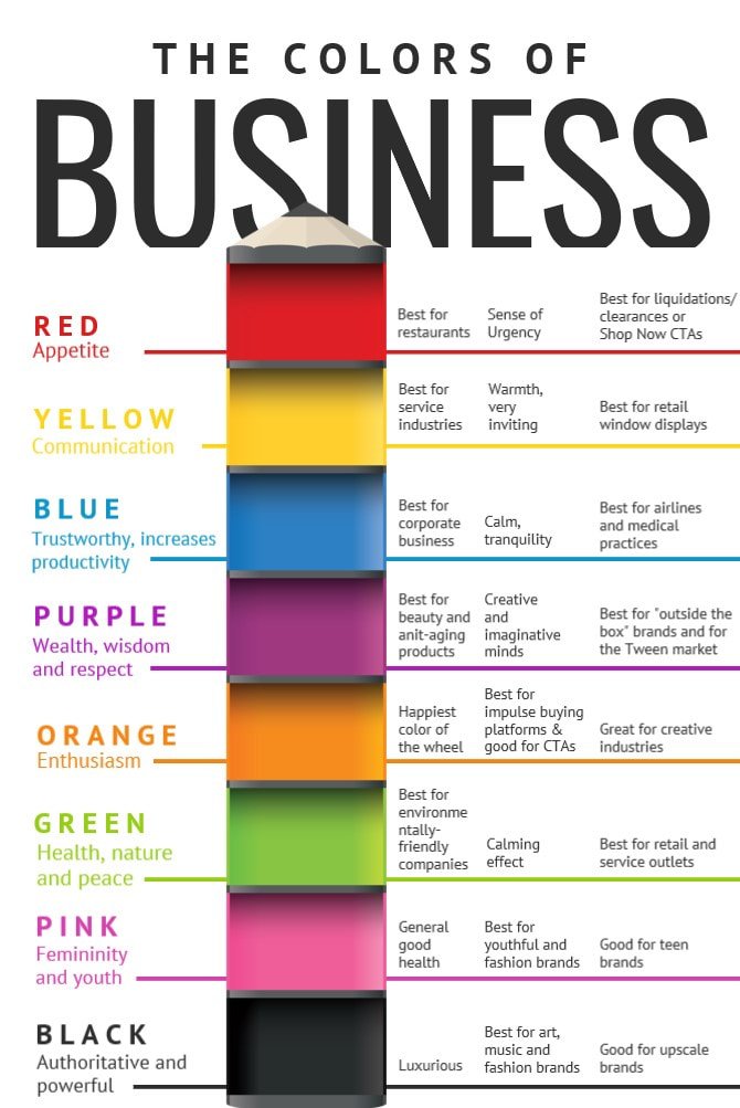
These may seem like basic questions, however they will help you give direction to your choices: based on these, you can refer to the psychology of colours to find the most appropriate choices.
7/12
7/12
These questions will also be precious indications on where to start with the layout you are creating (a luxury clothes brand website won't look the same as an informative page obviously)
8/12
8/12
Doubts ?
Check what is done in this branche / niche.
This can help you create something totally unique, as well as conform, if you so wish, to existing codes.
The more information you have on your project, the more this is going to help you make great choices.
9/12
Check what is done in this branche / niche.
This can help you create something totally unique, as well as conform, if you so wish, to existing codes.
The more information you have on your project, the more this is going to help you make great choices.
9/12
If you have to find your colours from scratch, you can also use online guides, or turn to Pinterest, find interesting schemes of tints that go well together.
An great tool is:
https://color.adobe.com/create/color-wheel
- You can apply colour theories to your choices & get #hex codes too.
10/12
An great tool is:
https://color.adobe.com/create/color-wheel
- You can apply colour theories to your choices & get #hex codes too.
10/12
Looking to add a little depth ?
Why not try a light gradient on your main colour blocks ?
Don't be afraid to check combinations when you prepare your colour code, & to ask a couple of opinions about what works and what doesn't, if in doubt. Nothing wrong with that.
11/12
Why not try a light gradient on your main colour blocks ?
Don't be afraid to check combinations when you prepare your colour code, & to ask a couple of opinions about what works and what doesn't, if in doubt. Nothing wrong with that.
11/12
I do hope this little guide brings some insights, as this may not be an easy task when creating. I often leave colours to the final stages of my work, so I can focus on the design.
Questions, comments ?
I'll gladly answer & talk with you ! Don't hesitate
12/12
Questions, comments ?
I'll gladly answer & talk with you ! Don't hesitate

12/12

 Read on Twitter


