the mcdonald’s rebrand (packaging and design systems, not logo) first announced in november 2020 just dropped. as always, commenting on rebrands on the day of their unveiling is akin to rating an album after a single listen. so i’ll pick apart the press release instead.
“bringing personality to life”
the most personality-driven aspects of the mcdonald’s brand are a) the classic characters, and b) the more modern collaborations with artists like travis and balvin
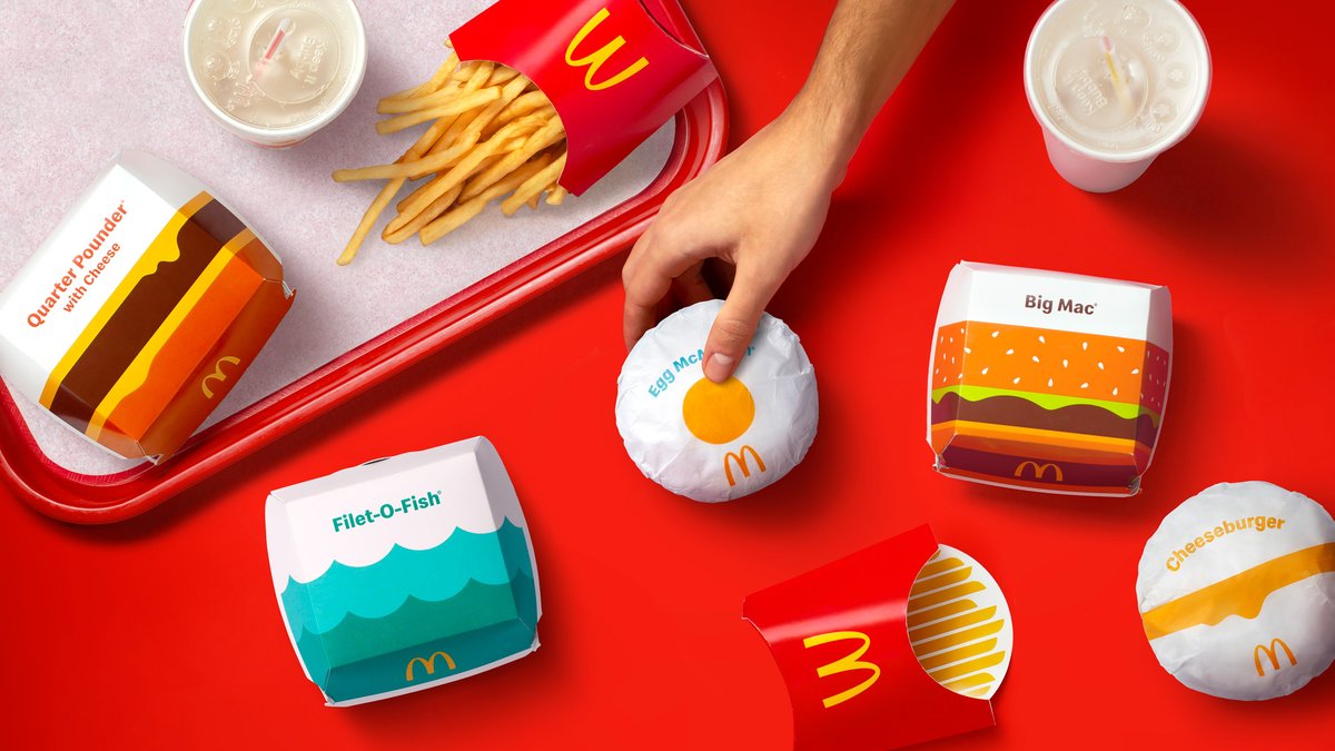
distilling food into abstract forms ≠ bringing ‘personality’ to life
the most personality-driven aspects of the mcdonald’s brand are a) the classic characters, and b) the more modern collaborations with artists like travis and balvin
distilling food into abstract forms ≠ bringing ‘personality’ to life
“functionally unique, easy to identify”
draplin-style ‘thick lines’ illustrations are not unique, and if you took some of the product names away, they wouldn’t be functional/recognizable. waves for filet o fish? nah. yellow circle for egg mcmuffin? maybe, but
draplin-style ‘thick lines’ illustrations are not unique, and if you took some of the product names away, they wouldn’t be functional/recognizable. waves for filet o fish? nah. yellow circle for egg mcmuffin? maybe, but

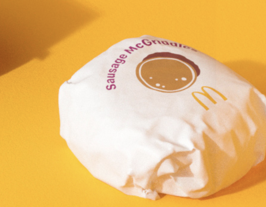
this sausage mcgriddle illustration that’s almost tucked out of view is... strange. they can’t use the side profile of a sausage, because that implies hot dogs. none of the other illustrations really have any 3d layering/depth or detail so this doesn’t feel cohesive or consistent
“most importantly, emotionally joyful”
i don’t think there’s anything emotionally joyful here. some of the cheese drip curves feel a bit animated, but otherwise, it’s about as soullessly minimal and clinical as you can go. bright colors and bold shapes aren’t always fun/joyful
i don’t think there’s anything emotionally joyful here. some of the cheese drip curves feel a bit animated, but otherwise, it’s about as soullessly minimal and clinical as you can go. bright colors and bold shapes aren’t always fun/joyful
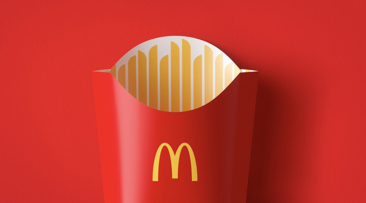
the new fries box.
my first thought was, huh, this is kind of an optical illusion. i legit think people might go to reach for a fry, only to realize they’re just reaching for empty cardboard, which is kinda funny, but actually creates a genuine moment of negative emotion
my first thought was, huh, this is kind of an optical illusion. i legit think people might go to reach for a fry, only to realize they’re just reaching for empty cardboard, which is kinda funny, but actually creates a genuine moment of negative emotion

“an expressive, visual system”
expressive of... what? some of it doesn’t even effectively achieve the goal of representing the food inside. if it doesn’t do that, and doesn’t elicit joy, then... what?
this animation is pretty lit tho
expressive of... what? some of it doesn’t even effectively achieve the goal of representing the food inside. if it doesn’t do that, and doesn’t elicit joy, then... what?
this animation is pretty lit tho
so, yeah, i don’t like it — sheerly from a subjective aesthetic perspective. ROI will speak louder. i’m just a dude who wrote one adweek article about the coughclearlysuperiorcough burger king rebrand
anyway, go buy from your local independent burger joint
anyway, go buy from your local independent burger joint


 Read on Twitter