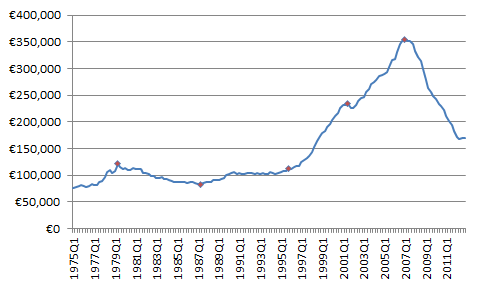
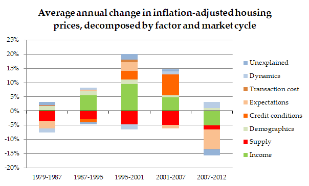
People often use charts with nominal prices over decades. They are worse than useless, however, so please avoid! The below chart summarizes what drove Irish housing prices by market cycle 1979-2012. I'll explain more below, but the key point is that supply lowers prices! (1/9) https://twitter.com/JosephPKilroy/status/1361700972452597763
The standard reaction of someone who lived through the Celtic Tiger is "hang on, the country was building lots in the mid-2000s and prices were going up". Indeed, it was this very paradox that got me interested in this and the graph above is from my doctorate on the topic. (2/9)
The problem with simplistic charts that show one factor (like supply) against nominal prices is that this doesn't control for anything/everything else that can also move housing prices. First and foremost (in a graph going back decades) is general price inflation. (3/9)
So let's look at "real", i.e. inflation-adjusted, housing prices and the picture changes right away! You can see, for example, in the case of Ireland that real housing prices were essentially flat between the 1970s and the 1990s. (4/9)
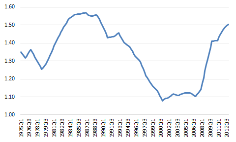
Now, with wider inflation stripped out, it's much easier to think of housing prices as a "fight" between demand and supply. The graph below shows that fight in the real economy: for each euro of income enjoyed by Irish residents, how many euro of housing stock was there? (5/9)
You can see that, compared our real incomes, housing supply was increasing during the 1980s but then started to fall. Note, though, that during the early 2000s, all those huge increases in supply were only just enough to keep track with real incomes in the economy. (6/9)
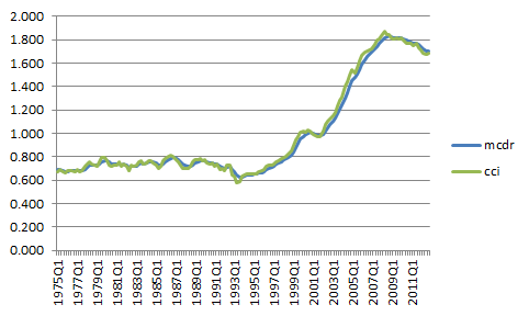
So if incomes and supply were fighting each other to a draw in the 2000s, what was happening? The key factor in Ireland's case was credit conditions. This graph shows the ratio of mortgage credit to deposits, one way of getting at how loose mortgage lending has been. (7/9)
You can see from that graph and the original one (repeated below) that credit conditions were largely stable in Ireland from the 1970s to the 1990s but then relaxed in an extraordinary fashion. This is what drove prices up, despite lots of new supply. (8/9)
But as those red bars on that graph show, there hasn't been a single year or market cycle over recent decades where supply hasn't lowered Irish housing prices. The problem is not that supply doesn't work. The problem is that there's not enough of it! (9/9)

 Read on Twitter


