NYC has released vaccination data by ZIP code and it reveals really stark disparities by race, ethnicity, education and income. It's not remotely surprising, but I do think it's worth documenting.
Here is what I found when I linked the city data to the American Community Survey.
Here is what I found when I linked the city data to the American Community Survey.
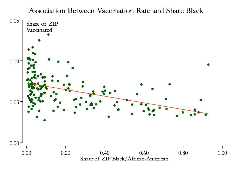
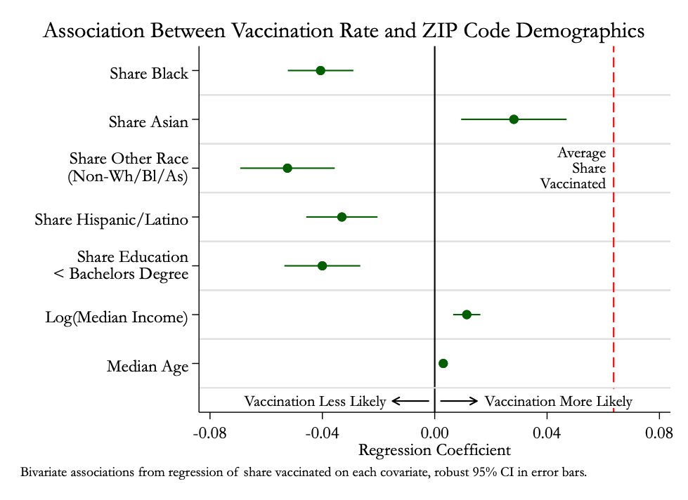
ZIP codes with higher shares of Black people have lower vaccination rates. For each 10 percentage point rise in the share of the population that's Black, vaccination rates are 0.4 percentage points lower.
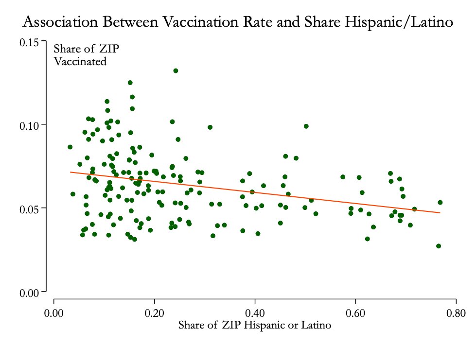
The disparity is similar when looking at the share of the ZIP code that identifies as Hispanic or Latino.
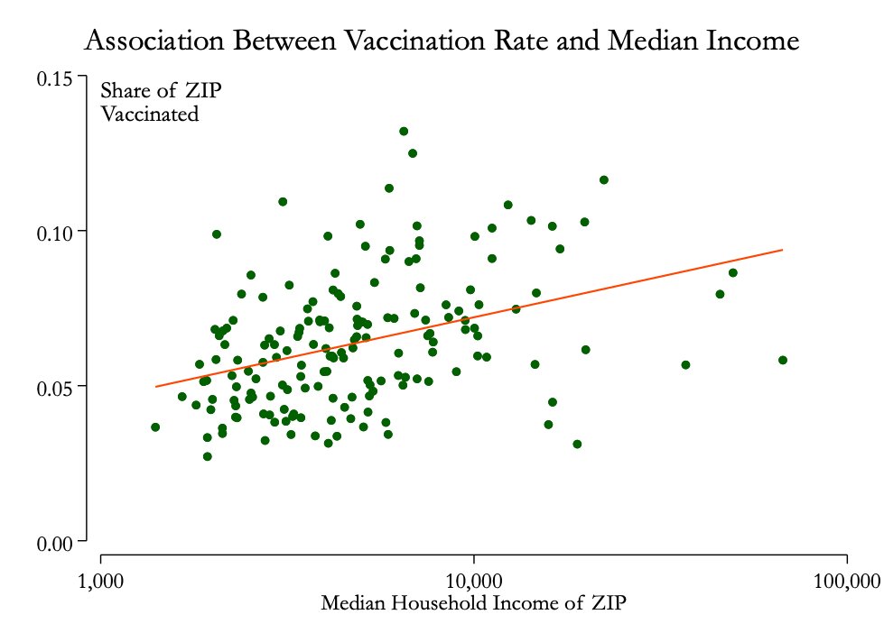
Higher income ZIP codes have higher vaccination rates – for each 10% rise in a ZIP code's median income, vaccination rates are about 1 percentage point higher.
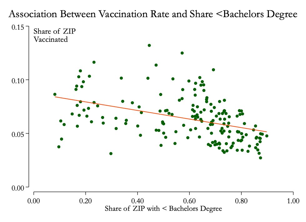
ZIP codes where people are less likely to have finished college tend to have lower vaccination rates (I'm defining college here as having a bachelor's degree).
Here's are the associations for each of the factors I've lookedr. This is what you get when you look at each explanatory factor one-by-one (specifically, a bunch of bivariate linear regressions).
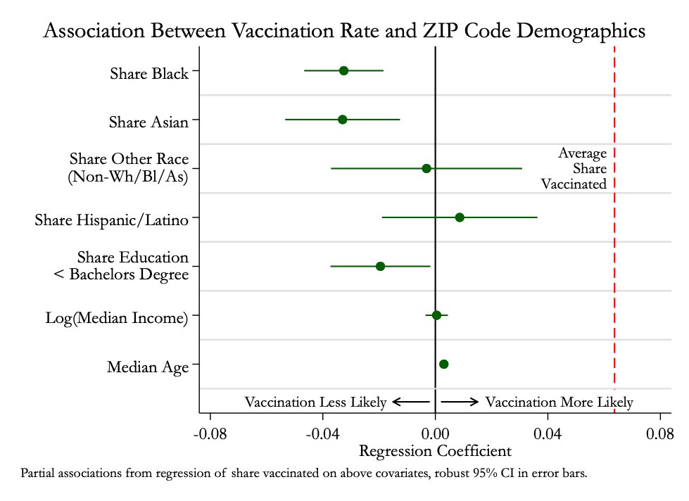
And these are partial correlations – associations between vaccination and each factor, controlling for all the other ones. Race and education remain significant predictors (age is enormously strong). You can explain about 2/3 of the variation in vaccination rates w/ these factors
Some notes
- 3 ZIPs had vaccination rates >= 20%, which seemed anomalous. I removed them.
- I'm actually using ZCTAs not ZIPs!
- Vaccination data from @nycHealthy ( https://www1.nyc.gov/site/doh/covid/covid-19-data-vaccines.page)
- ZIP data from @ipums @nhgis ( https://www.nhgis.org )
- 3 ZIPs had vaccination rates >= 20%, which seemed anomalous. I removed them.
- I'm actually using ZCTAs not ZIPs!
- Vaccination data from @nycHealthy ( https://www1.nyc.gov/site/doh/covid/covid-19-data-vaccines.page)
- ZIP data from @ipums @nhgis ( https://www.nhgis.org )

 Read on Twitter