Today’s lesson №14  continuing the GT Academy Sans Uppercase series
  We’re looking at the next character group: letters consisting of straight horizontal and vertical strokes.
 continuing the GT Academy Sans Uppercase series
  We’re looking at the next character group: letters consisting of straight horizontal and vertical strokes.
Let’s get started with the H, another foundational letter of the uppercase. And now you finally understand our friend @OHnoTypeCo’s name! The letters OHno contain the most important proportions of both upper- and lowercase.
This pseudo-scientific  animation shows you why the H should be a little less wide than the O. An additional factor is that round letters work a little differently, visually, than straight-sided ones. But long story short: the counters of H and O should feel balanced.
 animation shows you why the H should be a little less wide than the O. An additional factor is that round letters work a little differently, visually, than straight-sided ones. But long story short: the counters of H and O should feel balanced.
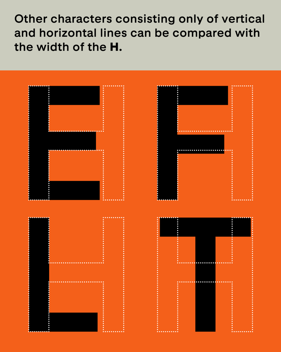
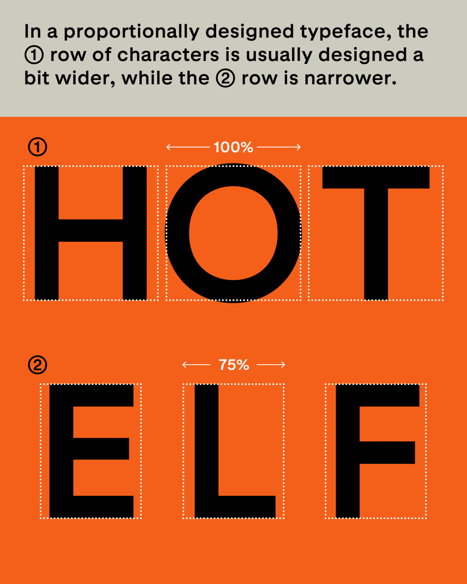
With the H you already have all the necessary ingredients for E, F, L, and T. These widths aren’t absolute rules, just a starting point. Be prepared to adjust them to your own designs!
But anything is possible! This animation shows really well how the feeling of your typeface will change depending on these grouped decisions on proportions. Just make sure you apply these choices across the board.
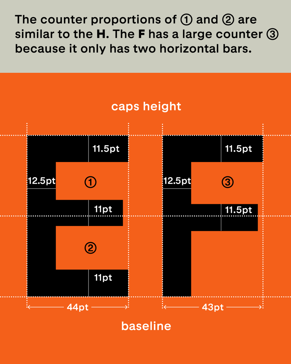
Balance, balance, balance! The E is the perfect example of how a number of tiny adjustments across the letter make all the difference. In more humanistic designs, the bottom bar can be a bit longer than the top one as well.
This isn’t a necessary adjustment, but a nice side effect: shorter middle bars on E and F allow for tighter type setting for display-oriented designs.
What may seem like an insignificant adjustment can make a big difference. The L’s width should be fine-tuned to look -just right- compared to the other letters in this group. Usually that means just a tad less wide than the E.

 Read on Twitter


