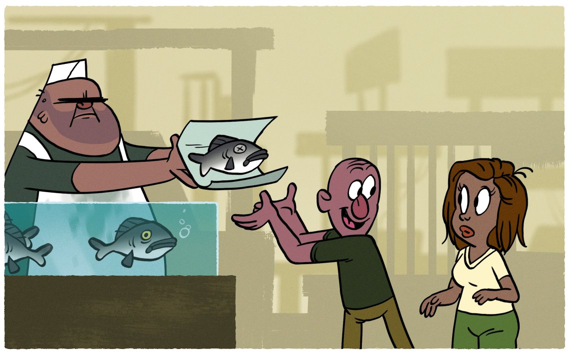
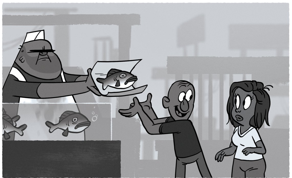
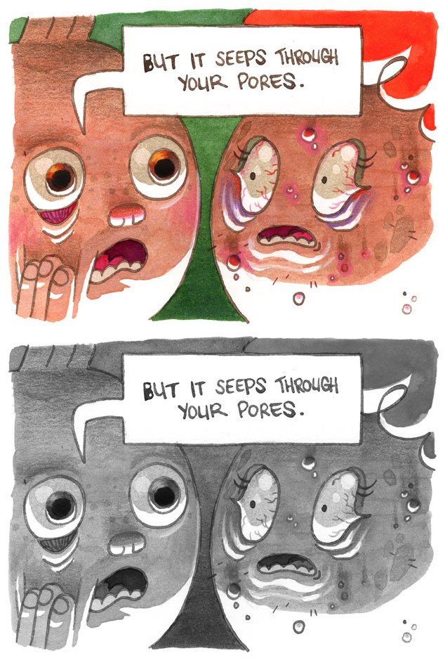
Color is hard. Value is one way to reassess your work. Are your values separating in clear ways that tell your story? Have you grouped your values clearly? Is there value hierarchy to guide the audience's eye to where you want it?
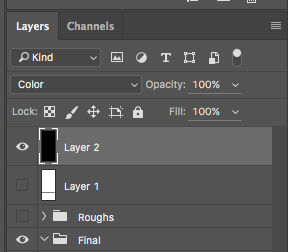
I recommend putting a layer filled with black and set to "color" on top of your PS document. It's easy to click on/off while you wrestle colors, bending them to your will. I picked this trick up from @evelmiina (thank you so much!)
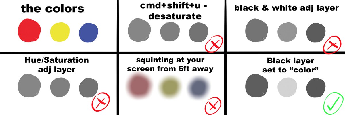
Hue and saturation are dirty, filthy LIARS. I'm no scientist, but here is red blue yellow at their highest saturations. Colors are their most saturated at DIFFERENT values (yellow high value, red mid value, blue low value).
PS color layout (and anybody that uses this style layout) is set up in a rather unintuitive way that doesn't address this. But you're smarter than the avg bear. If you wanna learn more, save yourself college tuition and read up on Munsel Color Charts: https://en.wikipedia.org/wiki/Munsell_color_system
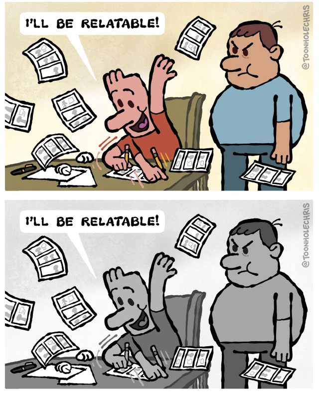
Anyway, here's a comparison. I didn't pick the deepest blue, but it's value is still darker than the red. Desaturating is the worst, black & white adj layer is only slightly better, and black layer set to color most true rep of values:
And it was a bad, dumb joke but squinting and figuring out values using YOUR EYES and not relying on computer algorithms to tell you what values are = V important. Your eyes are tools to develop/trust, just realize that these programs can definitely lie to you
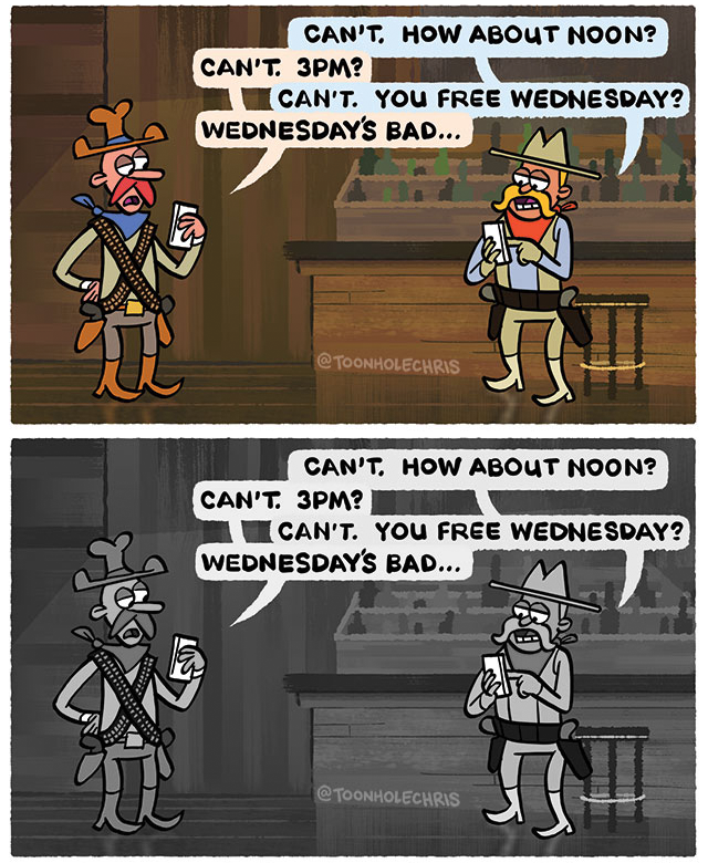
There are no rules, and these are just things to consider when something ISN'T working. If you're getting lost in the weeds, one simple trick is to try dark characters on light background or light characters on dark background:
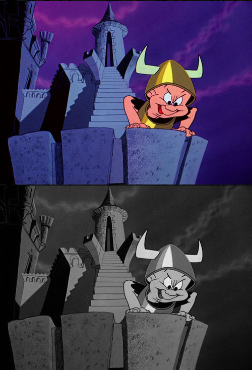
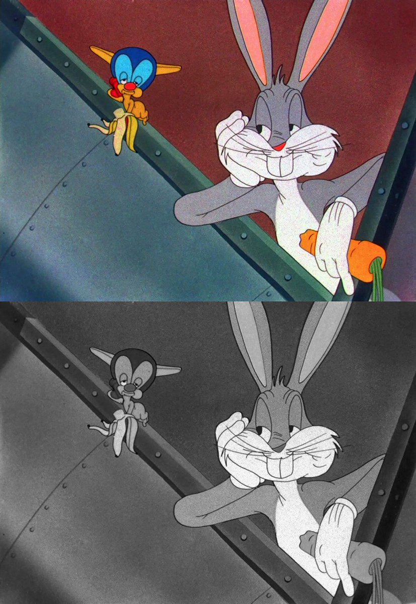
There are many ways to lead the eye, but the strongest is often value contrast. Looney Tunes are great examples. Whites and Blacks are often saved for the main characters or framing the characters. Establishing good value hierarchy is one way to lead the eye
To illustrate the 'no rules, just tools' mantra, sometimes you use the concepts but dial in how much value separation for desired effect. U can pull back on contrasts (in the case of this torchlit witch burning) or dial the contrast to 11 (in this dramatically lit closeup dialog)
Contrast isn't the only way to separate elements in your image, it's just probably the most basic. There are other elements, like color saturation, to make certain things pop out and certain things recede. Like @MadyGComics said in a recent comment, it's about color relationships

 Read on Twitter