THREAD: So New Jersey's 21 counties all have the worst flags possible. I spent exactly ten minutes, no more, no less, redesigning all 21 into something with a bare shred of dignity. Let's do it 


ATLANTIC COUNTY: Straight up doesn't have a flag. Hell of a start. I found this deep in the bowels of google images and redesigned it to this baby. Blue is for the ocean, white is for strength (whatever). Tip: if you want to put a seal on the flag get a high quality seal image
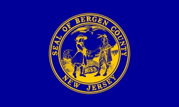
BERGEN COUNTY: Built on the Palisades over the Hudson River. Blue for the river, white for the cliffs, gold is something corny - the spirit of the people? Seal is super racist and has got to be changed but I stuck it on so this tricolor didn't get confused for a sovereign nation.
BURLINGTON COUNTY: Look at this monstrosity. I made this one so the flag designers who are apparently in the pocket of big Seal-on-Bedsheet can see that you can do that style flag while still meaning something. Thin blue stripe is for the western border on the Delaware River.
CAMDEN COUNTY: See the sun-over-green-hills motif in the seal? I tried to conceptualize that as a flag. I'm not really sure if it worked but at least I'm taking creative risks and not trying to brand Camden New Jersey as a wild west saloon.
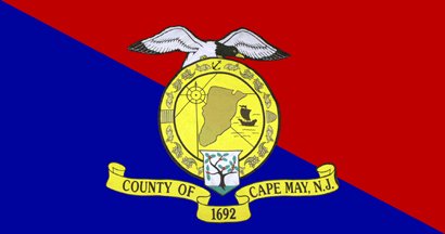
CAPE MAY COUNTY: Did you know you can have a decent idea and then ruin it with random seagulls and ribbons all over the place? The angle of the text really stresses me out but I don't have the design skills to tilt it.
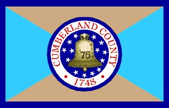
CUMBERLAND COUNTY: Holy hell. The buff and blue is for the Continental soldiers uniforms. Awesome. The dark blue is for the Delaware and bay. Solid. Then this guy just concocted his own ridiculous seal to slap on top of it? Not even real. He just invented it to ruin his own flag.
ESSEX COUNTY: The thing about this one is it's almost good until you look at it for more than one second and realize that this intensely awful optical illusion of a flag has an obvious simplification. I made it. Also for god's sake can we get some high quality seal images?
GLOUCESTER COUNTY: I made a flag out of a simplified version of the arms on the seal instead of slapping the entire seal onto a weirdly colored sheet. You wouldn't think that's such a radical idea would you?
HUDSON COUNTY: Hudson has such a clear Good Flag Concept and they just totally bungle it with these ridiculous frilly seals and lack of border concepts. Clean up those lines and get a high-quality seal image and look what you can do.
HUNTERDON COUNTY: Okay this is just ridiculous. This seal on sheet isn't even the real seal. You know what is? A single bushel of wheat with two stars. Nothing at all to work with. So I took the buff and the maroon and slapped the Hunterdon Stars on there. Liberty and Prosperity.
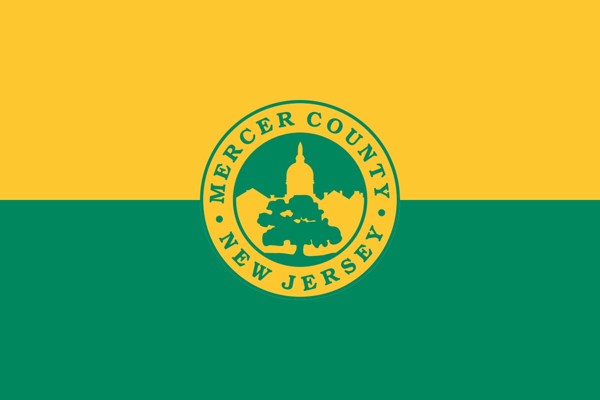
MERCER COUNTY: The fact that I think this nonsense is good is evidence of how far we have fallen in this exercise. Once again, a high-quality seal image goes a hell of a long way.
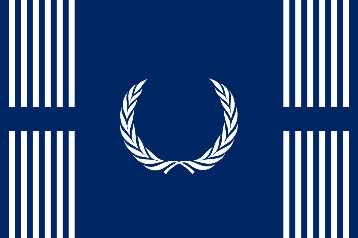
MIDDLESEX COUNTY: Okay so this is the worst flag I've ever seen in my life. Every time you look at it it gets worse. So I took the laurel wreath (?), trashed everything else, added 24 lines (+wreath) for the municipalities, and added negative space for the Raritan river.
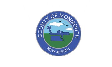
MONMOUTH COUNTY: I'm not sure what I think of the new seal slapped on the new flag but I do like the symbolism of a half-plowed field conceptualized as a flag. Also for god's sake stop whacking random seals on sheets and when you change your seal change your flag!
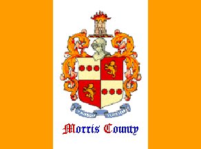
MORRIS COUNTY: What started all this!! If you have a perfectly lovely coat of arms on the seal, make the coat of arms into the flag. No need to stick random stripes and helmets and decorations where they're not needed.
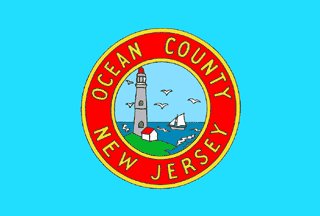
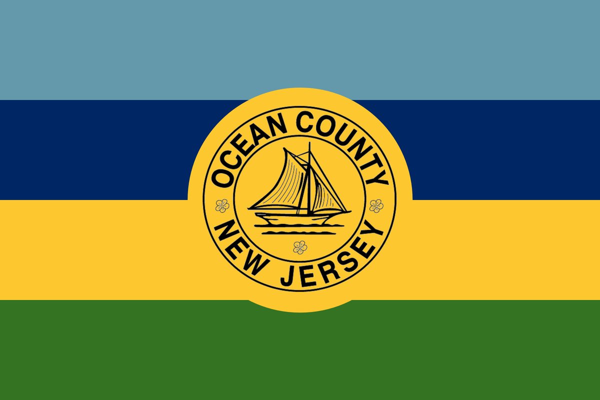
OCEAN COUNTY: Are NJ counties addicted to using cartoonish fake seals to ruin their own flags? Yes. The green is for grass, gold for sand, navy blue for sea, blue for sky. Supposed to look like your perspective looking at the ocean but it kinda looks like a hard seltzer brand
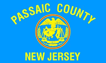
PASSAIC COUNTY: Way too much text and a low quality seal! Again! Plus if you have a county that looks exactly like two diagonal checks why not give the flag some checks?
SALEM COUNTY: 15 apples for 15 municipalities. Garden state baby. I will confess I am running out of ideas but I do think this is a bit better than Blob Tree on Sheet
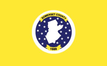
SOMERSET COUNTY: This is really the best flag there is which is insane. I made the background less bright gold bedsheet and organized the 25 stars for municipalities
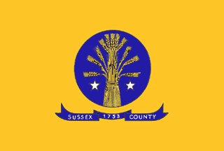
SUSSEX COUNTY: Okay I got creamed by my own 10-minute limit here because I couldn't find a decent wheat image. But if you have a perfectly nice green seal with gold wheat on it that would make a great flag, why make up a new, uglier seal to hurl onto a bedsheet?
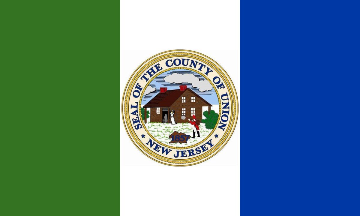
UNION COUNTY: Gonna go with the Burlington playbook here because clearly if your flag wasn't your seal on a huge goddamn bedsheet you would go insane. At least make an interesting bedsheet. Green for the lovely lands of Union, Blue for New York Harbor, white for like, love idk

 Read on Twitter

