Greeking is a 500 year old term that refers to any use of placeholder text or images in design, mockups, or samples.
There are many more options for greeking than just “lorem ipsum” and in fact that should almost never be used. Read on to find out why.
1/
There are many more options for greeking than just “lorem ipsum” and in fact that should almost never be used. Read on to find out why.
1/
People use the term greeking for typical placeholder text because it derived from a piece of apparently-nonsense text that usually starts "Lorem ipsum dolor sit amet, consectetur adipiscing elit…”
2/
2/
It was first used in typography sample books, as the old version of "The quick brown fox jumps over the lazy dog."
Since then, its use slowly transitioned to becoming common for general placeholder text.
3/
Since then, its use slowly transitioned to becoming common for general placeholder text.
3/
The reason people call it greek likely relates to the phrase “It was Greek to me,” which first appeared in Shakespeare’s in 1599, and coincided with a decline of Greek-language instruction in England. But I am not sufficiently well-versed in etymology to dig into this more.
4/
4/
Anyway, it’s not the only method for greeking.
If you zoom out far enough in many design programs, the text will turn into gray lines or boxes.
5/
If you zoom out far enough in many design programs, the text will turn into gray lines or boxes.
5/
That’s also a legitimate design choice for placeholder. I think you can categorize as about 5 methods of greeking.
6/
6/
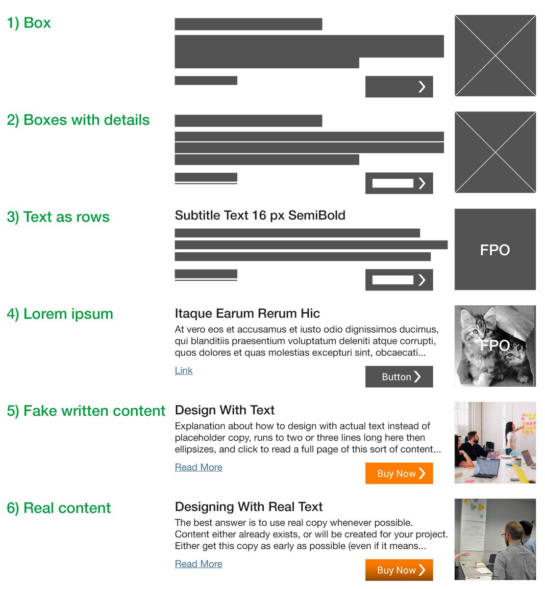
The Box— Text is an area that we expect the content will occupy. Paragraphs are boxes, with a shorter last line to make it clear that it is a box of text versus some other content or UI element. Images are also boxes, usually with Xs.
7/
7/
Boxes with details— Similar, but indicates things like individual lines of text for sizing and interactive elements get underlines or look more like buttons.
8/
8/
Text as rows—Paragraphs stop being boxes, each line of text is scaled to the right size but a bar the right length. Stagger to show alignment or not. Titles often become actual text, but just labels for what they are.
9/
9/
Lorem Ipsum—All words are in their final display size and often their actual style, and images are placed. But little or nothing is real and the /lorem ipsum/ text is used instead.
10/
10/
Fake written content—Do the best you can with what you have. Take a stab at labels, titles. Use marketing brochure text or the goals in the PPT for the project as placeholder. Find a proper photo on the internet.
11/
11/
Which one is best? Real text! Start with actual content, before going any further than whiteboard.
Why?
12/
Why?
12/
I mean, why not? Why are we designing if it’s divorced from real content anyway?
And… there are a bunch of specific reasons:
13/
And… there are a bunch of specific reasons:
13/
Greeking is a specialized design language.
Many times the project team won’t understand this and you have to explain “oh no, those will be words.” That’s not helping the project at all.
14/
Many times the project team won’t understand this and you have to explain “oh no, those will be words.” That’s not helping the project at all.
14/
Repetitive text leads to reading errors.
Most designers and all the tools that like lorem ipsum default to using exactly the same fake content every time.
• Lorem ipsum.
• Lorem ipsum.
• Lorem ipsum.
That’s not what the final design will look like so is pointless.
15/
Most designers and all the tools that like lorem ipsum default to using exactly the same fake content every time.
• Lorem ipsum.
• Lorem ipsum.
• Lorem ipsum.
That’s not what the final design will look like so is pointless.
15/
Greeked text doesn’t fit in the same way as real text. Latin has neither the same cadence—that is, the average length of words—nor occurrence of letters as English.
16/
16/
Because the words are not words in the designer’s native language, we don’t treat them as words. For example, it’s common for designers to truncate and add an ellipsis to greeked text, but they become impossibly short phrases.
• Lorem ips…
• Explore m...
17/
• Lorem ips…
• Explore m...
17/
NO ONE reads Latin. So no one else on the project team, or usability study (yes, seen it) will evaluate the design right. No one will notice readability and legibility issues until real content gets there.
18/
18/
I can go on and on about this, and do! Read my latest @UXmatters column, for all this and more on designing with real content instead of greeking.
https://www.uxmatters.com/mt/archives/2021/02/greeking-versus-designing-with-actual-content.php
19/
https://www.uxmatters.com/mt/archives/2021/02/greeking-versus-designing-with-actual-content.php
19/

 Read on Twitter


