Due to the weird way we’re doing sponsors this season (is just drawing it out of a hat) I thought it be interesting to look at how sponsors can either help make or break a shirt.
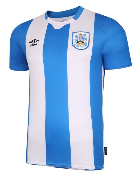
Sponserless shirt is technically the offical one and to be used as a reference 1/4
Sponserless shirt is technically the offical one and to be used as a reference 1/4
> Kirklees college is a classic from the L1 days love it
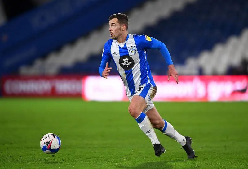
> Magic rock is a brilliant brewery would have looked better just the logo and name rather than big circle
> LEC is just a no from me
> Magic rock is a brilliant brewery would have looked better just the logo and name rather than big circle
> LEC is just a no from me
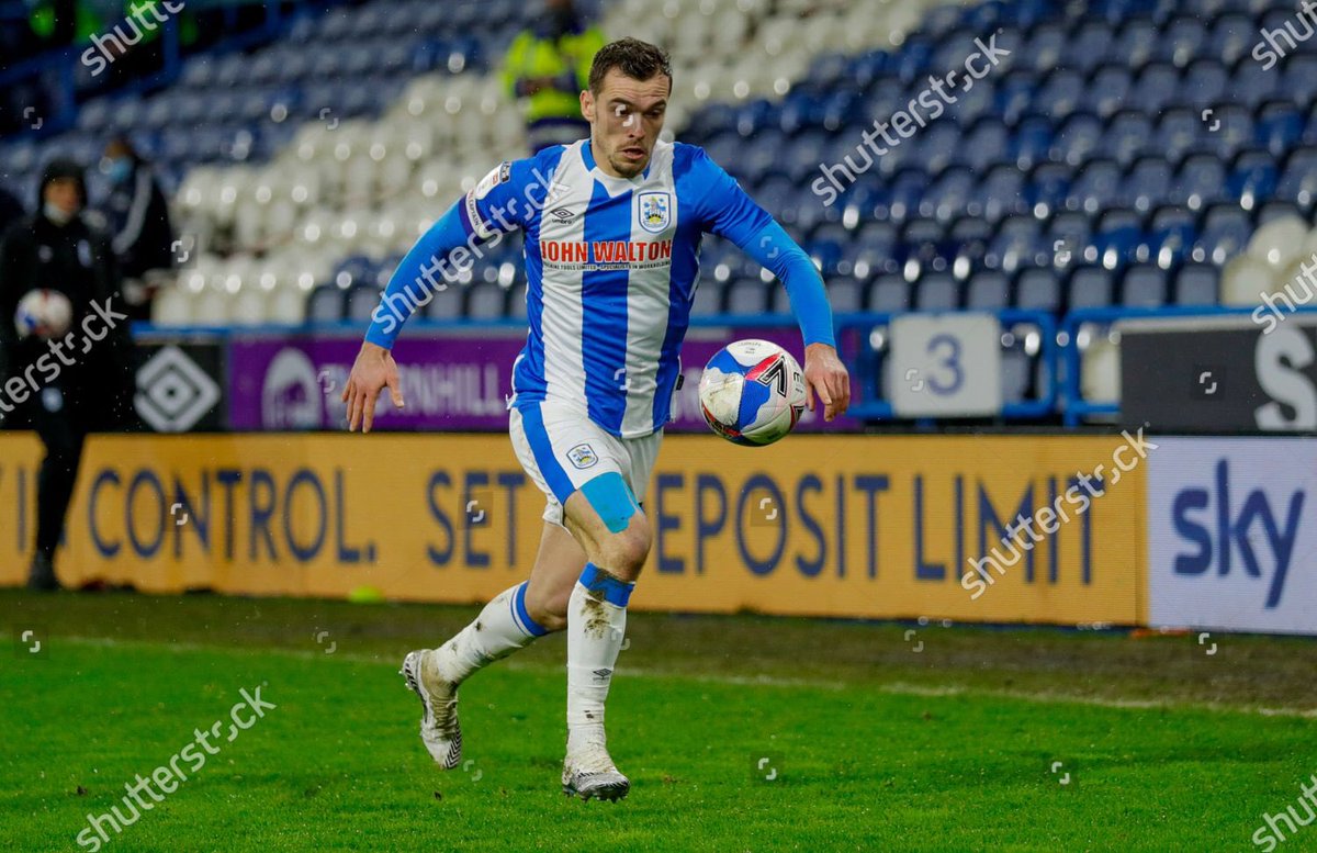
> John Walton I think the red really works well
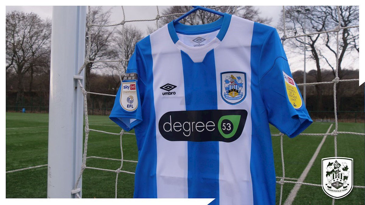
> degree 53 probably the worst
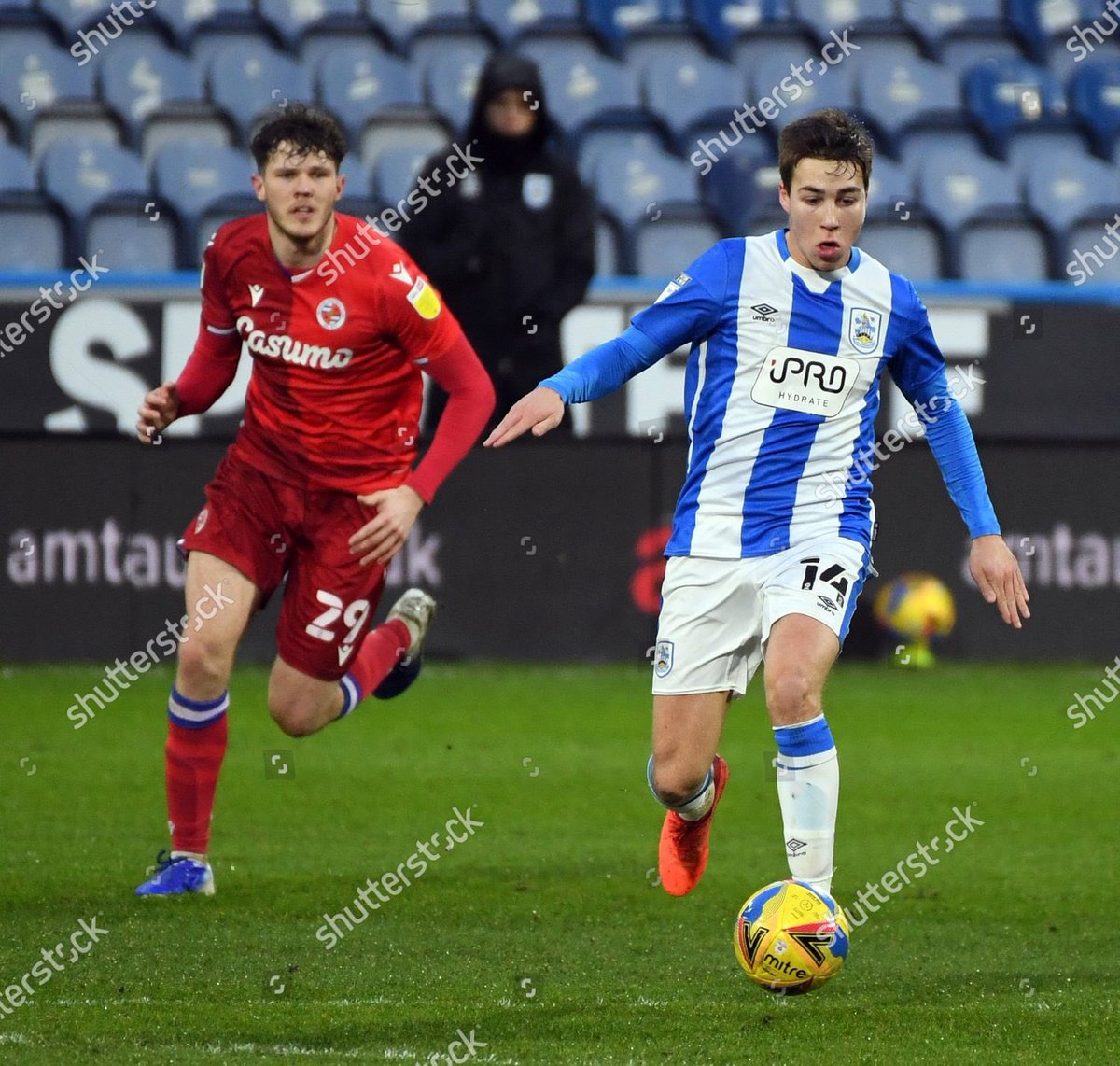
> Ipro doesn’t look great...
> degree 53 probably the worst
> Ipro doesn’t look great...
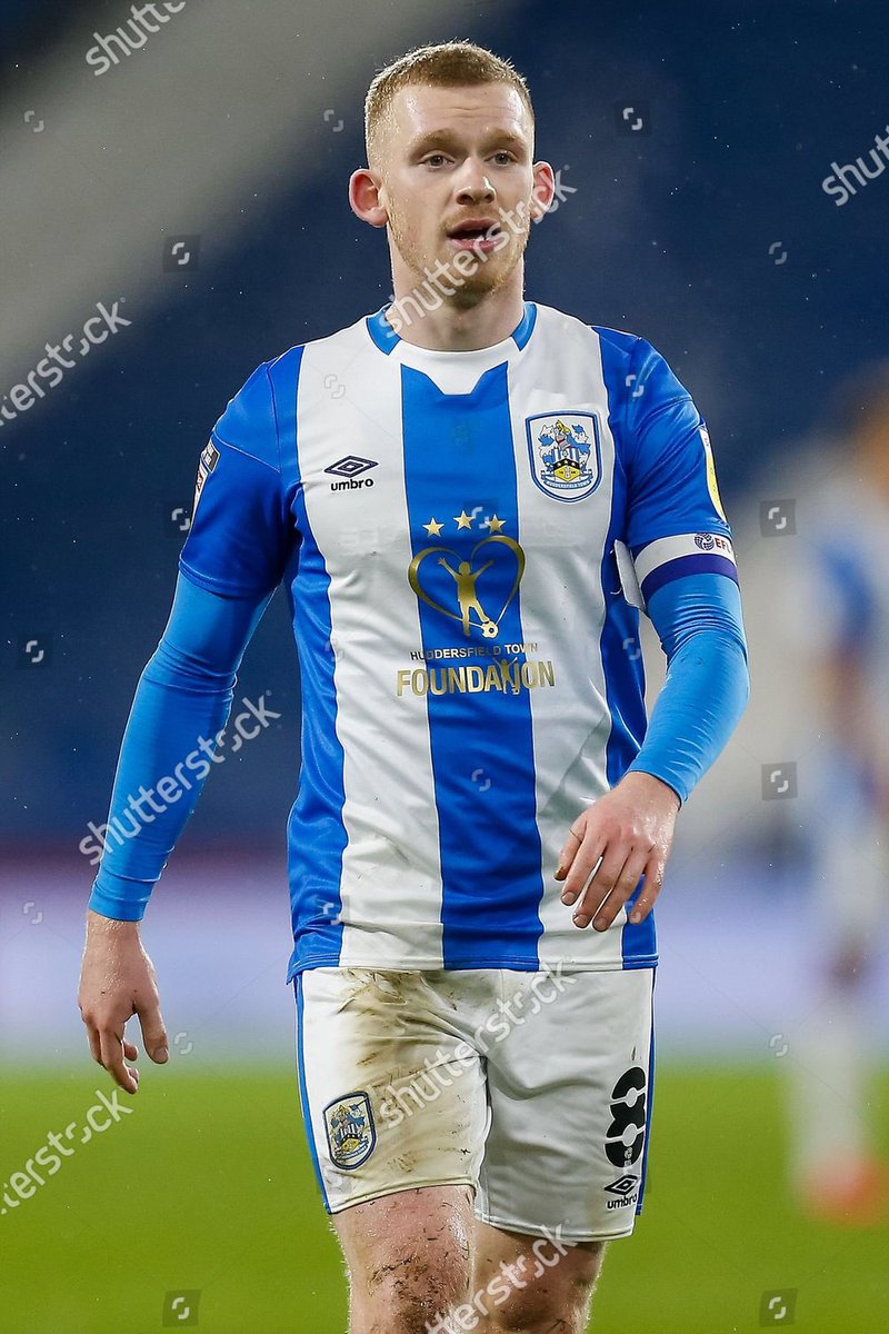
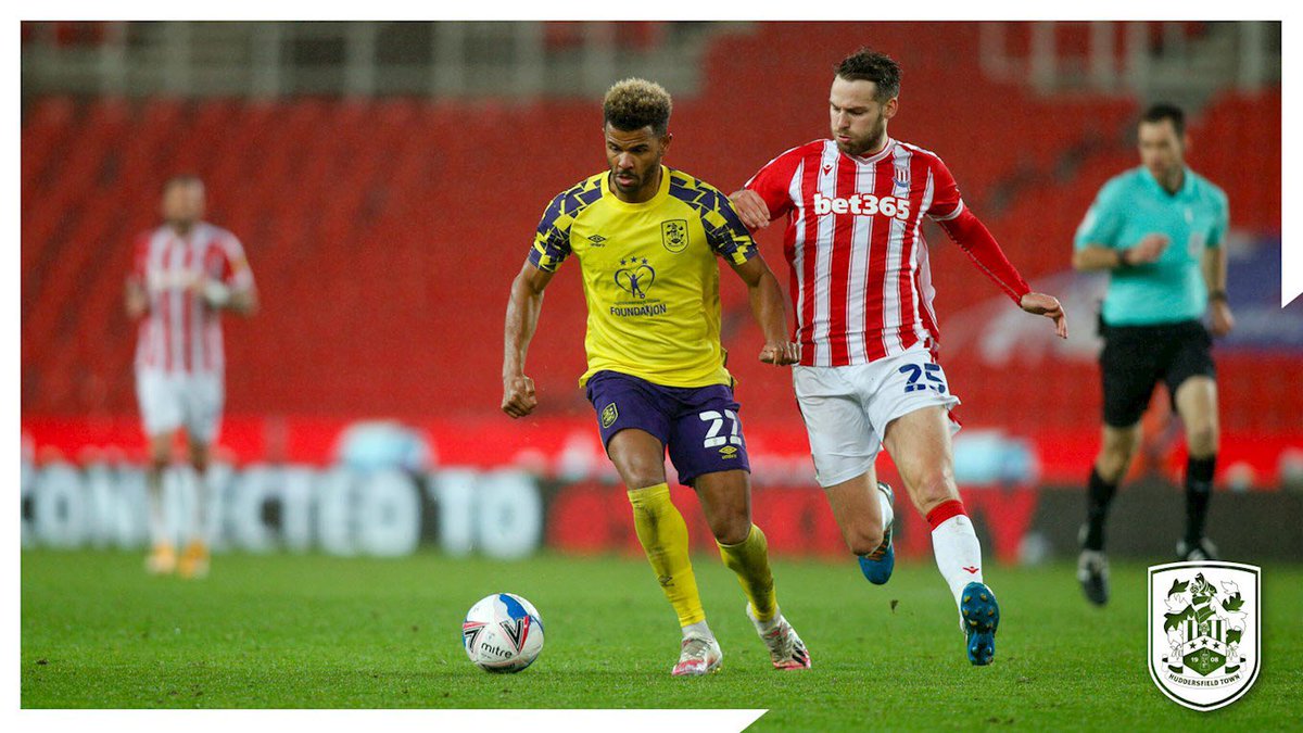
> town foundation is a brilliant charity but dont think it works well here just too big, could be modified to look great though!
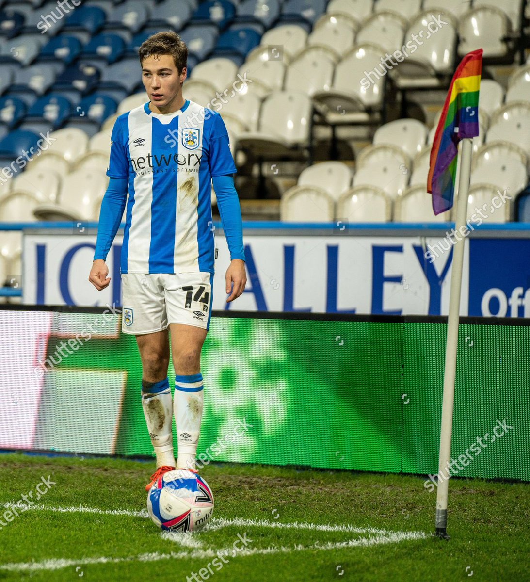
> both networx and Logic look like standard sponsors, but apathetic to both doesn’t make it better but don’t particularly make it worse either
> both networx and Logic look like standard sponsors, but apathetic to both doesn’t make it better but don’t particularly make it worse either
My top 3 no particular order
> kirkless college but that may just be the L1 nostalgia talking
> sponserless, I just love sponserless shirts but unfortunately not really economically viable for clubs to do
> John Walton I don’t know why but just think the red works
> kirkless college but that may just be the L1 nostalgia talking
> sponserless, I just love sponserless shirts but unfortunately not really economically viable for clubs to do

> John Walton I don’t know why but just think the red works

 Read on Twitter