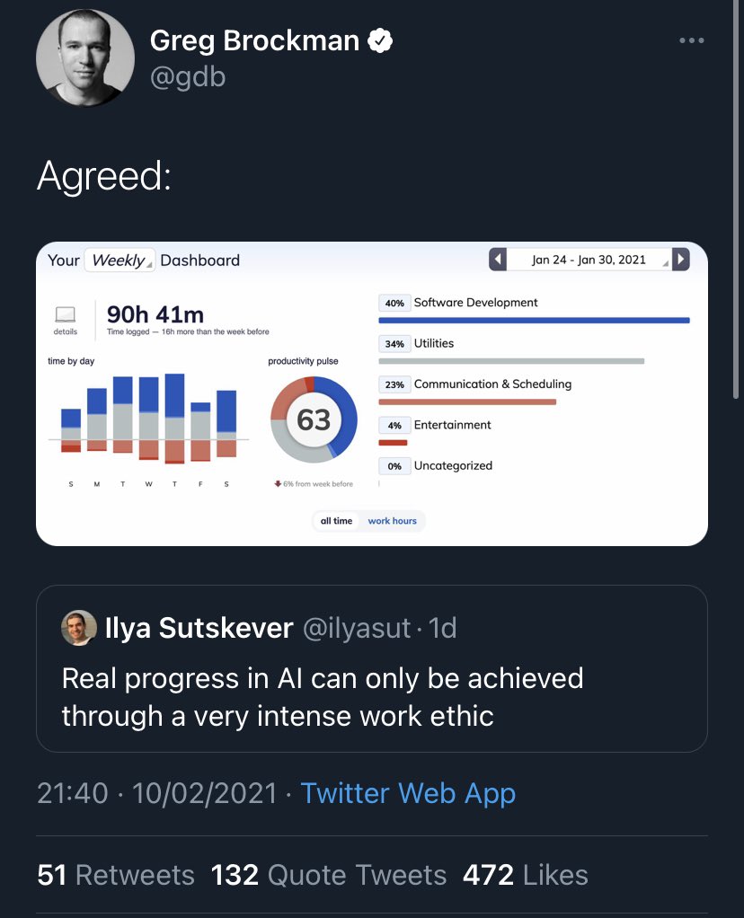
That’s a horrible example to set, 90h a week is not sustainable at all. But that aside, here’s another good example of inaccessible data viz 

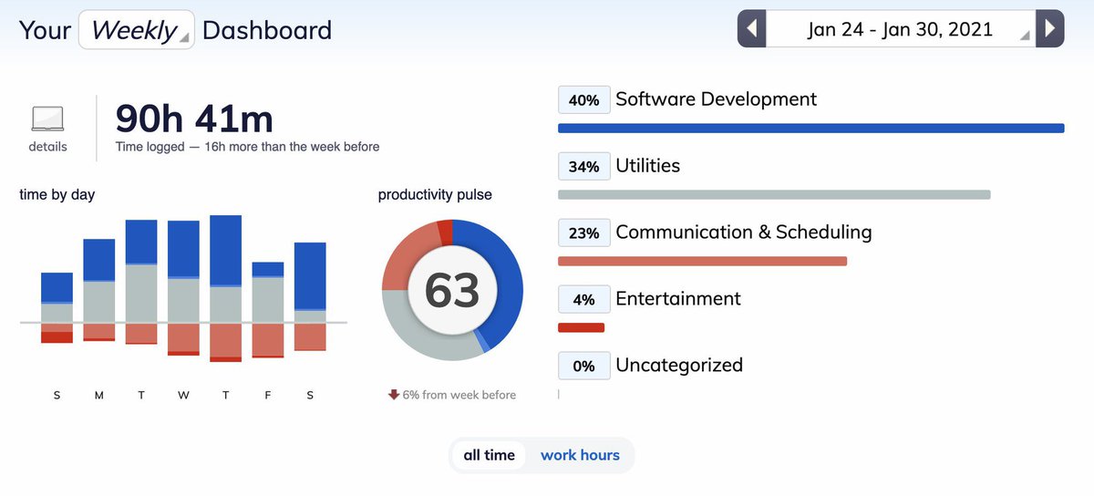
 That unlabeled stacked bar chart on the left. Yeah I can see that the different colors vary across different days of the week.
  But I have to look at a graph on the right to see what the different colors stand for?
 Why can’t I see the numbers? No labels on the y axis.
 I’m on my phone so can’t easily check contrast & color blind simulation, but I think at least the gray, light red and light blue that they use in several places fails contrast.
 Does the color have a meaning? In my head red is danger (bad), does that mean the red hours are unproductive? Maybe? It looks like it might be negative because it’s below the x-axis in the bar chart, but again, that one isn’t labeled either so who knows.
 What the hell is a productivity pulse? Why is the number 63? Is that a percentage? Amount of hours? A random score based on random factors? What does it mean? Why is it inside of a donut chart?
 What on earth even is that donut chart? The only description it has is “Productivity Pulse” with a nr 63 in the middle. Again, the colors are labeled only in another graph, no numbers, and the colors seem to have no relation to the number inside (cont)
The blue and gray area combined seems to be 75%-ish of the donut. 70-75% of 90h40m is 63, so it could be that? But I actually needed a calculator to figure that out, and it’s still just an educated guess. It shouldn’t be a guess. The graph should say so.
 Why is the breakdown on the right only showing percentages? I’m guessing you can hover to get the amount of hours, but why would I want to do that if it could just be written next to it? Same for the “6% down from last week” under the donut chart.
 Another comment wrt the color that I only just noticed right now: The labels for the dark red, dark blue, gray and light red can be found in one of the graphs, but there’s no label anywhere for the light blue.
Unless that’s “uncategorized” but I can’t see which colors that one has because it’s at 0% so doesn’t show up in the one graph that has labels, which also makes me guess that light blue is not uncategorized. So what is it then?
 Sidenote but the design and copywriting seems to be focused on wanting to work more than the week before. The productivity pulse (which I assume are hours, it’s not specified) is at 63 with a red down arrow saying it’s less than the week before.
Not everyone wants to work themselves into a burnout, we don’t need to do more hours than last week. In that case you *could* interpret the down arrow as a good thing, but red (and down arrows) are often read as something being negative. Is it negative that your hours are less?
 I’m sure there are more issues with it, but leaving it at this for now. Go read my dataviz articles
  https://fossheim.io/writing/tag/dataviz
Also new dataviz a11y article coming up, will be released early on Patreon in the next few days  http://patreon.com/fossheim
 http://patreon.com/fossheim

 Read on Twitter


