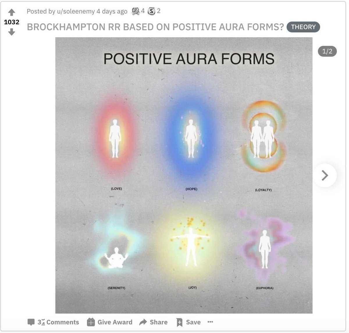
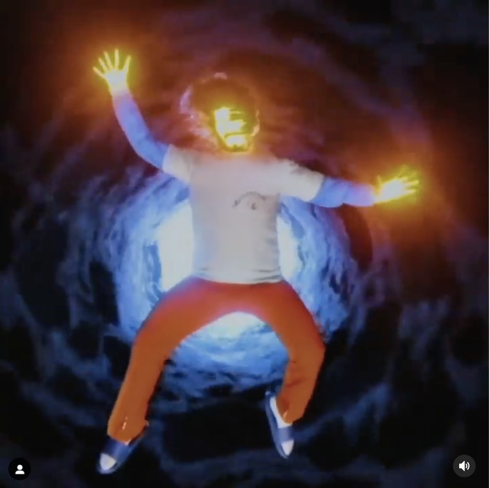
let's just look at the difference between saturation era and iridescence era.
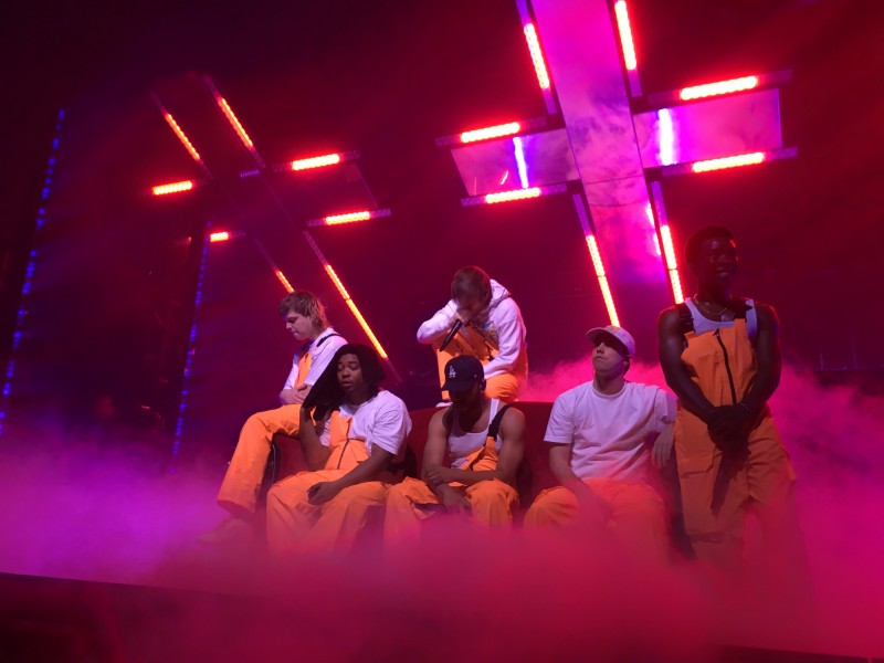
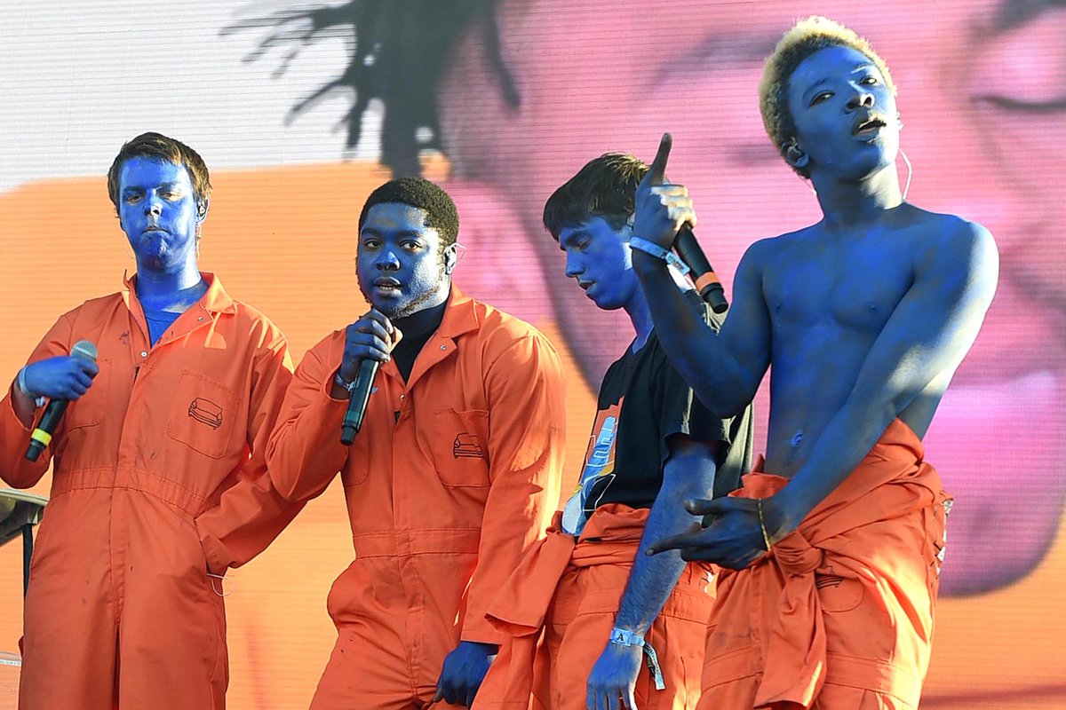
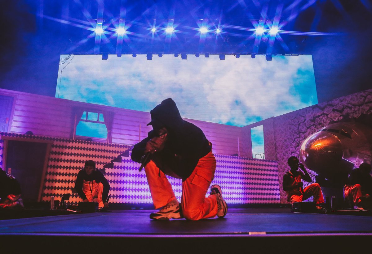
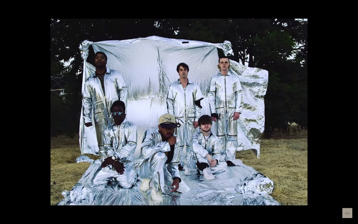
the initial use of blue paint plays off the masculine associations of the color. using orange, the exact opposite of blue, for the jumpsuits emphasized the 'saturation' themes
the initial use of blue paint plays off the masculine associations of the color. using orange, the exact opposite of blue, for the jumpsuits emphasized the 'saturation' themes
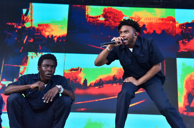
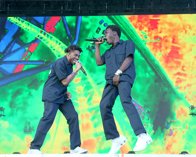
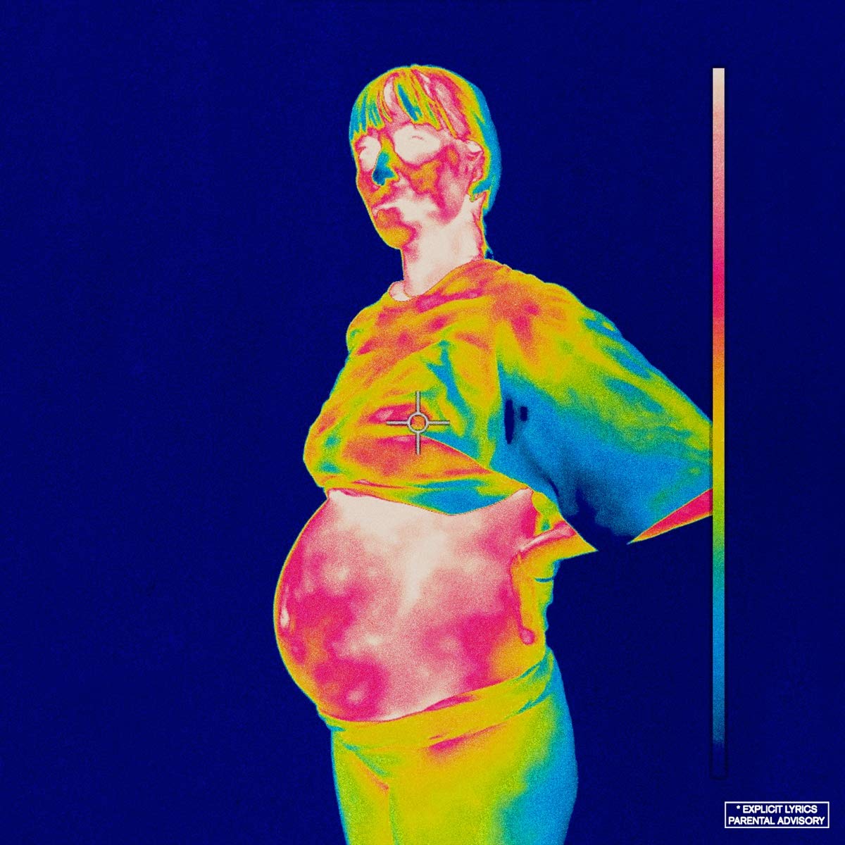
then, as fame brought them to new heights, they faced scandal and painful inner struggles. the color they adopted for themselves became a darker blue - but the lights put on them, the lens, became more radioactive, heatseeking - reflective of the way they were being perceived
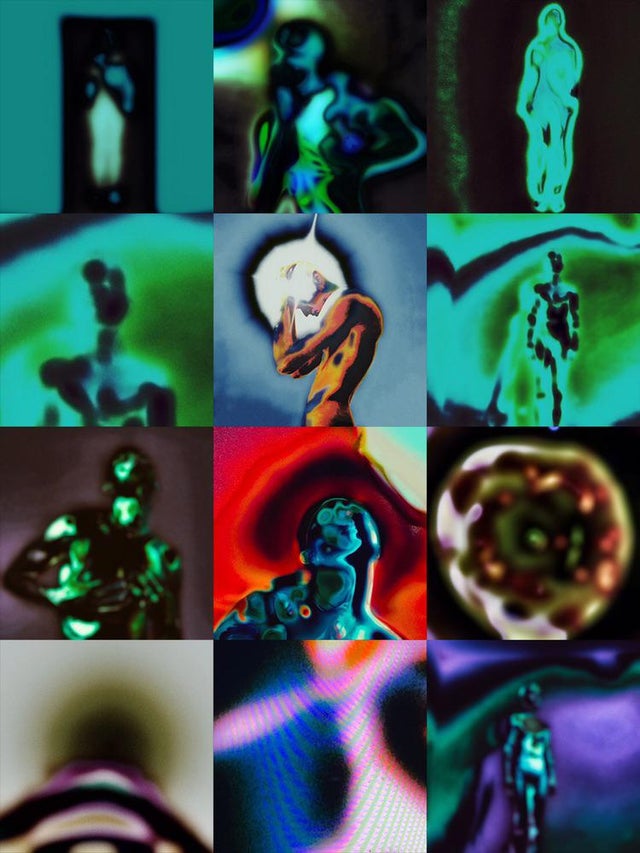
ginger's colors convey coming to peace, enlightenment, clarity, and REFLECTION - all while retaining the ability to find heat/energy, conveyed with red pops of color (or orange jumpsuits again)
also, planes & passport imagery indicate expansion of perspective + reference bleach
also, planes & passport imagery indicate expansion of perspective + reference bleach
whatever is coming with RR in 2021 from them, seems to be a forwardly conscious wielding or implementation of color/energy. i can't wait

 Read on Twitter
