As I’m still extending my icon set, I have to make sure they all look like they belong together. A few constraints help me keep a consistent look across the full set.
This thread gives you a peek behind the curtain.
This thread gives you a peek behind the curtain.

 Size
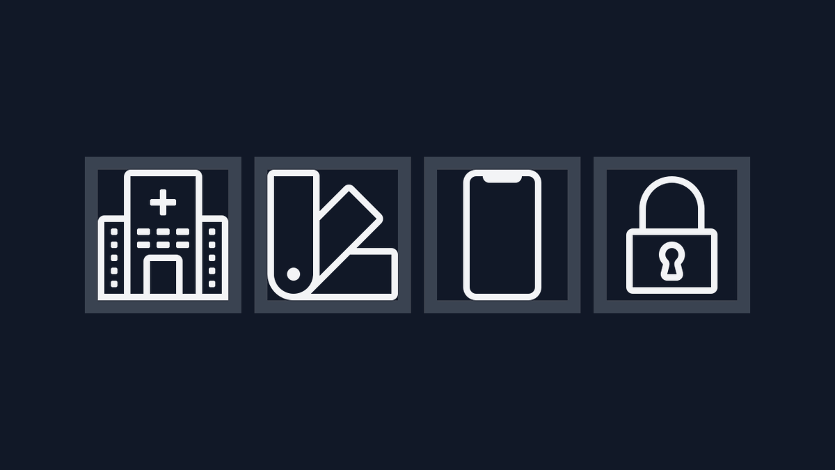
SizeI draw all icons on a 24×24 pixel grid. The outer 2px are a reserved zone that most icons don’t reach into, leaving a 22×22 pixel “safe zone”. Many icons don’t even need that space.
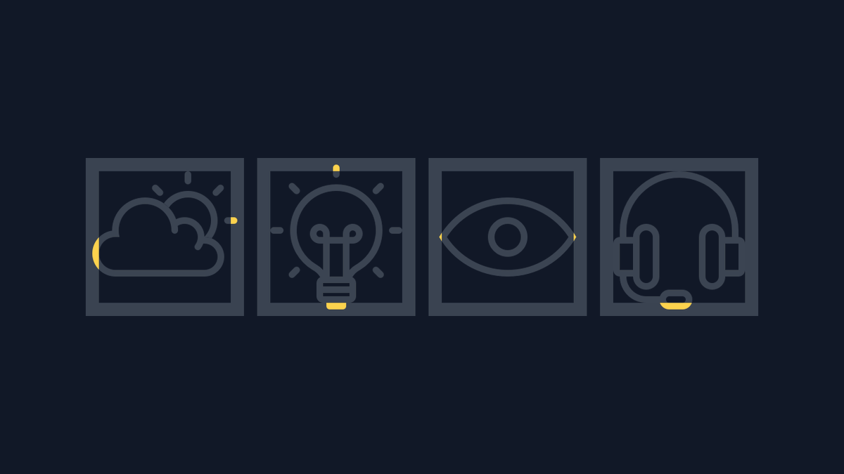
 Extra space only when I really need it
Sometimes, an icon needs that little extra bit of space to work well. In those situations, they can reach beyond the safe zone. Ideally, only a few minor details make it into the reserved space.

 Border radius
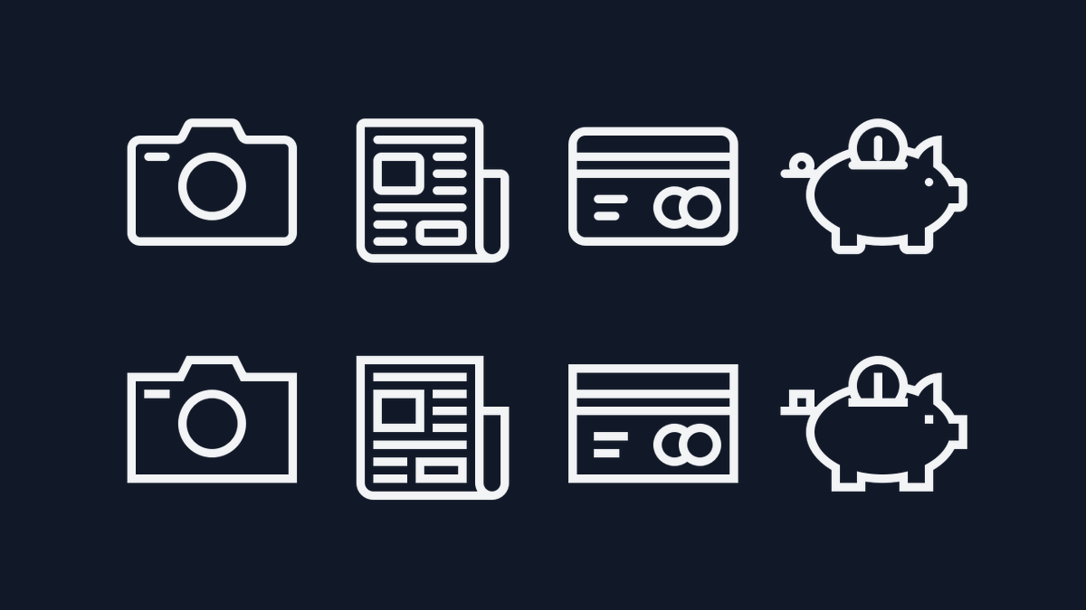
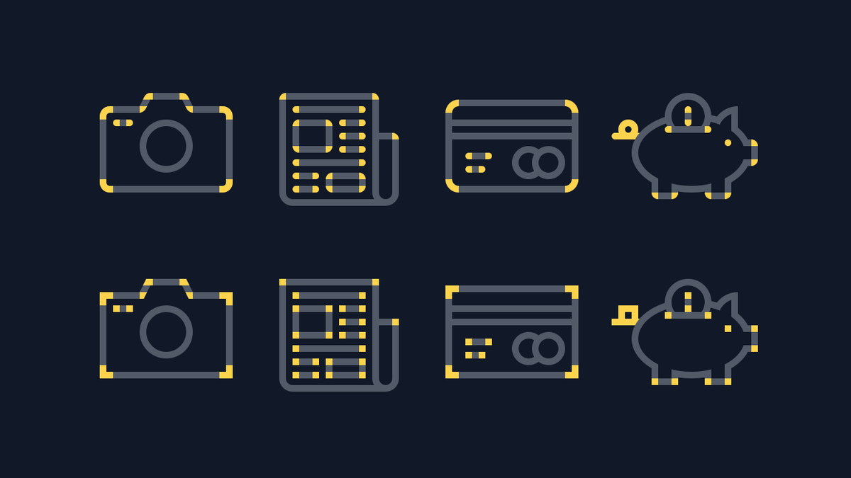
A big part of what makes the icons look similar are their rounded corners. The corners are slightly rounded off, with either a 1px or a 2px radius. With sharp corners, the set would give off a different vibe.

 Look at those corners again
The only difference between the two rows is in what’s highlighted here. Many small details like these make a huge difference in the overall appearance of an icon.
 No inner border radius
The corners are only rounded on the outside. An inner border radius wouldn’t be super obvious at small sizes, but becomes more apparent as the icon is enlarged. The icons all need to feature the same type of rounded corner.
 Re-re-re-REMIX!
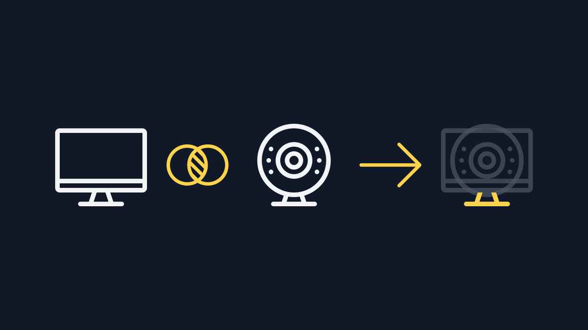
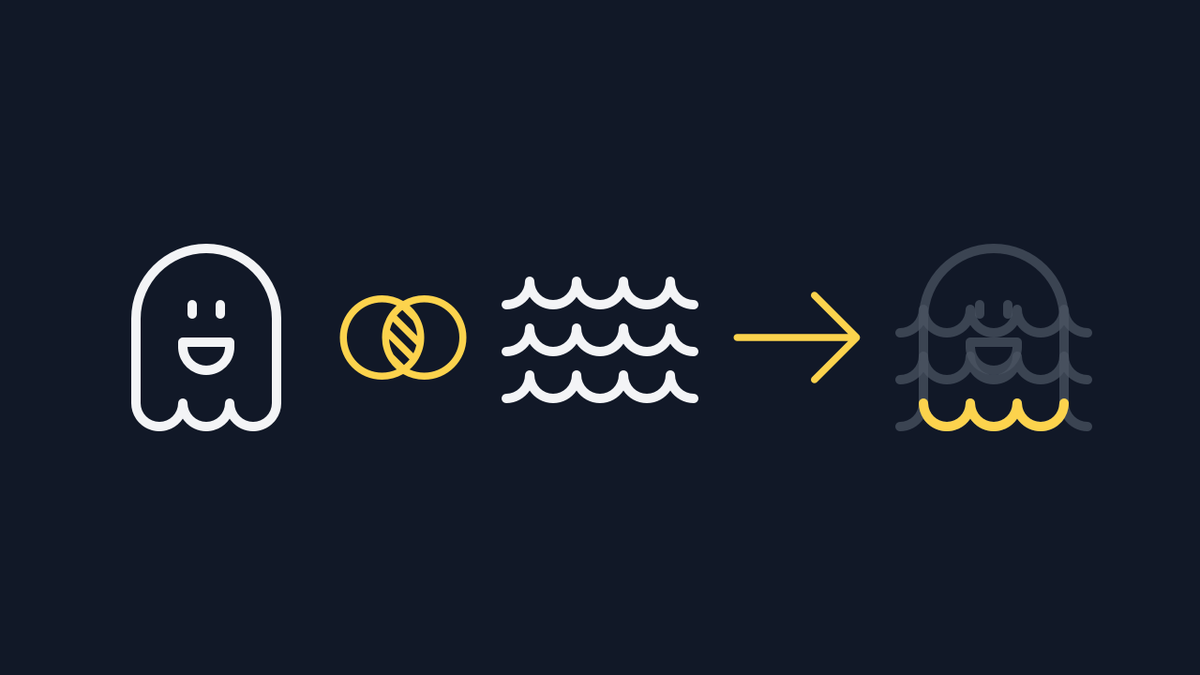
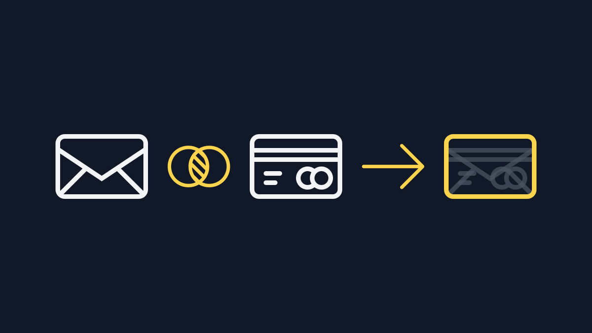
The biggest shortcut to fitting new icons into the set is to remix parts of existing icons into new ones. The desktop and webcam share the same stand, and the feet of the ghost are really part of the waves icon.
 I send neat little tricks like this to my newsletter once a week. This thread went out to the list last week; you can read it in the archive on my website. https://islovely.co/newsletter/archive/the-constraints-behind-consistent-icons
 If you have not signed up to my newsletter yet, I’d love to have you! https://islovely.co/newsletter

 Read on Twitter