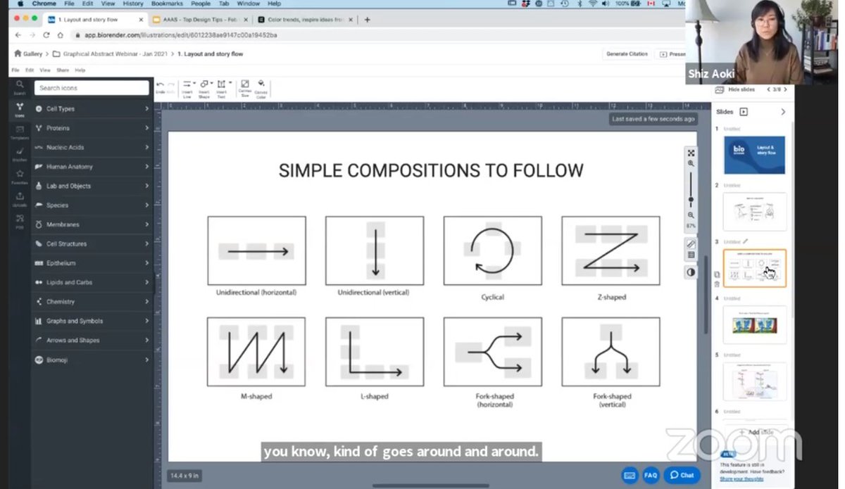
Just attended a workshop in #AAASmtg about making effective visuals/Figures by Shiz Akiko of #Biorender. Follow me to read this  for some key pointers... #Workshop #SciComm #VisualsInSciences
 for some key pointers... #Workshop #SciComm #VisualsInSciences
Let's start with the take-home message: Make sure that your figures/visuals are able to communicate broadly and are acting as unifiers! (Also, Acknowledge that you might need help/collaborations to boost your visual communications and reach out!)
Four aspects to focus on- 1. Layout 2. Colors 3. Arrows and Lines 4. Declutter
All good visuals have a starting point and that may come through by optimizing your storyline i.e flow of events. Start simple, perhaps by sketching a rough outline and follow 1 of these patterns.
All good visuals have a starting point and that may come through by optimizing your storyline i.e flow of events. Start simple, perhaps by sketching a rough outline and follow 1 of these patterns.
1. Layout- Think about whats the main story vs side-stories and then make sure to follow the flow of associated events in your step-wise narration of the complex model. A tip -use a proper, user-friendly, and consistent numbering system.
2. Color - a. selective and strategic use of color b. think about inclusivity so shy away from red-green color palettes c. keep "associated" things in similar colors d. use warm vs cool color choices for bad vs good characters e. highest contrast and saturation-focal point contd.
Pro-Tip: 1. Contrast check- make sure to convert your figure into greyscale and see if all the parts are visible if not, time to fix the issues by using the change in color/ opacity/contrast/brightness. 2. Use the labels to assist the storytelling
Pro-Tips contd : 3. Repeat elements (shapes, colors, types of connections) to keep the flow and consistency 4. Create a visual hierarchy to attract viewers' attention in the right order of events 5. Make differences look obvious and distinct
3. Arrows and lines - Universal shapes to show connections/flow/directionality but needs to be used properly! Pro tip:make your labels count by using a. lines with dot ends (not arrow pointing towards a tiny object in the figure!) b. parallel,1-2px thick and evenly spaced. contd.
Pro tip contd: 2. Dotted lines have different meanings - generally speaking, used to depict weaker signals/ less confirmatory results or future/past states 3. size & thickness of arrow=strength/volume/quantity/conc 4. fading = flow/movement
4. Decluttering - a. start by highlighting the new/novel thing by creating visual hierarchy b. stay consistent in style choices c. order should follow natural motions d. don't be afraid of white space
additional tools mentioned - http://colors.adobe.com for complementary color spiders, http://learn.biorender.com for learning tutorials (End of  ).
).
 ).
).
@_SciComm @iamscicomm @massivesci @WSUBioSci @istemcare @Stempeer15 @UTK_BCMB @Neuro_musings @MayuriRege @AlexGelle @ElyseTheGeek @NCIResearchCtr
@ShizAoki the session was fantastic! Sorry for mis-spelling your name! Apologies!

 Read on Twitter


