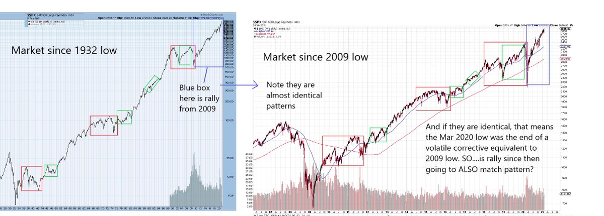
1/ Chart Study from Dragon's Den. Been a while, but this is just a short one. Let's start with the BIG picture. Entire rally from 1932 and rally from 2009 are IDENTICAL. It's a nested pattern
2/ So if nesting, the rally from Mar 2020 low should again be like pattern from 2009. Just one degree smaller. I think it is close.
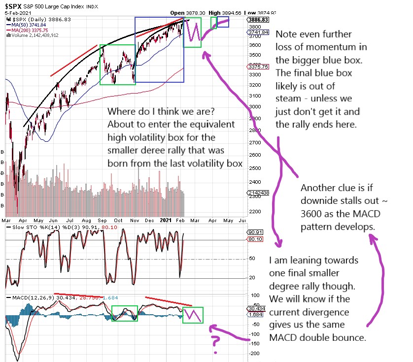
3/ Here is a close up of move from 2020. Same pattern but one difference. We are losing momentum. Do we have one more smaller cycle left? Maybe
4/ This is the current final rally out of late Jan. Same abc-x-abc pattern. If true, it leads us to major reversal OR volatility box to prep for final move up which loses momentum even further.
5/ Not shown, but this exact same nest series can be seen in S&P and even things like the Transport Index. It's uncanny their identical nested pattern nature.
6/ I'll finish with this. You all already know where I think this is going. But here is one more clue on why we are about to peak major
7/ Outside of charts, the evidence is all around. Stocks like TSLA with P/Es approaching 2000. Garbage stocks pumped 1000% or more in weeks or even days. BTC - logically, why is ANYONE paying $40k for imaginary currency, unregulated, untracable, no govmt would support
8/ Home prices are astronomical, yet half the population can't see past their next paycheck. Absolutely none of this is sustainable, not even with the FED. The ~90 year economic cycle goes back to 1929. Like it or not, at a min, we are going to enter next Great Depression soon.
9/ Part of the challenge in identifying the "top" is that as active investors in the market, we are looking for day trades or swing trades. The big picture eludes us and it's easy to say "you're a dope" or "you're wrong".
10/ But the last 3 years, if compared to the last 90 is like maybe a week's worth of chart patterns for most. I'm pretty certain of the end result but trying to get that detailed back and forth structure will be meaningless once it happens

 Read on Twitter


