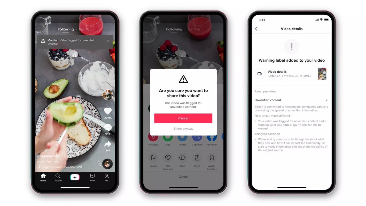
When misinformation is seen by millions of people, the way we label it matters. Want to understand more? Let’s take a deep dive into TikTok’s new design. 

First up: noticeability.
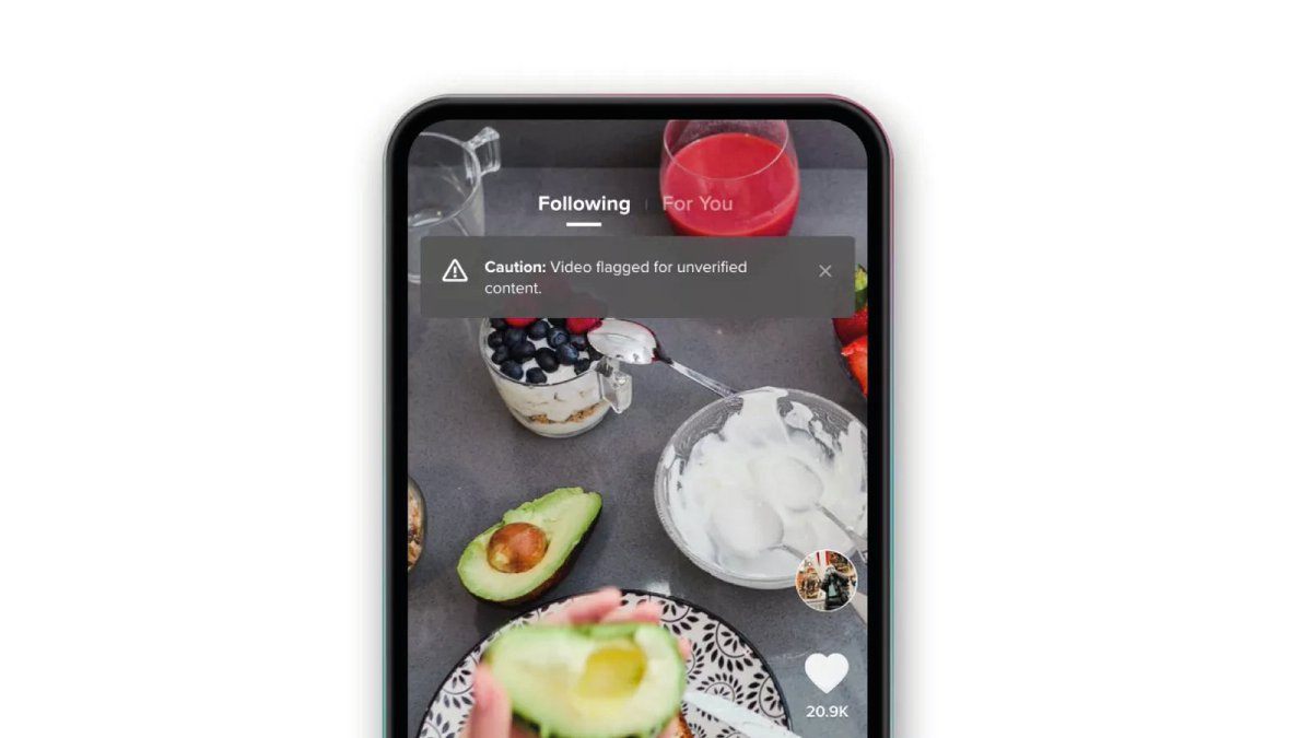
A tricky line to tread here: too obvious, and you’ll attract attention to misinformation; too subtle, and people won’t notice the label.
TikTok is clever here: grayscale, so not attention-grabby, but up top, so if you watch the video, you’ll see it.
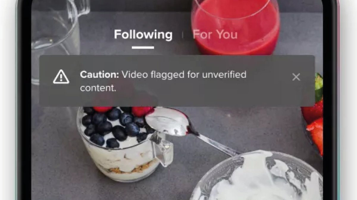
A tricky line to tread here: too obvious, and you’ll attract attention to misinformation; too subtle, and people won’t notice the label.
TikTok is clever here: grayscale, so not attention-grabby, but up top, so if you watch the video, you’ll see it.
Second up: language.
It’s important not to alienate people. First, TikTok opts for ‘video flagged’ to downplay who flagged it. It then avoids judgemental language by opting for ‘unverified’, preferring to say what it isn't, rather than making a claim about what it is.
It’s important not to alienate people. First, TikTok opts for ‘video flagged’ to downplay who flagged it. It then avoids judgemental language by opting for ‘unverified’, preferring to say what it isn't, rather than making a claim about what it is.
Third up: nudges.
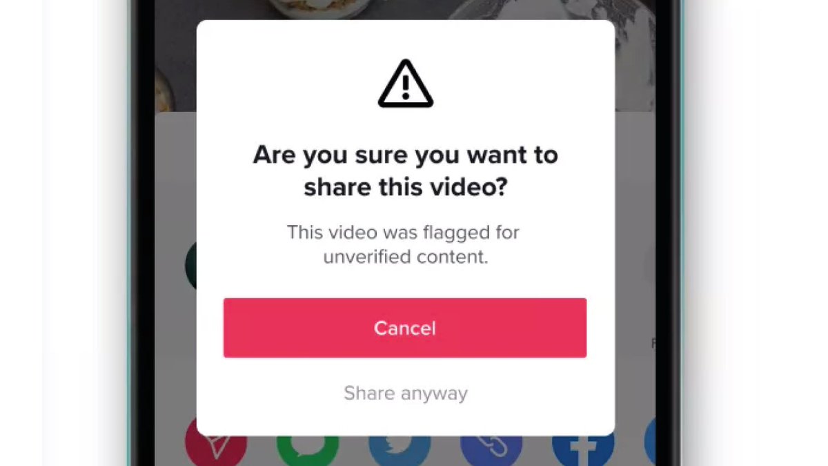
Nudges have been shown to help people think critically about what they’re sharing and reduce the spread of misinformation.
TikTok nudges users towards pressing ‘Cancel’ with a strong red. The alternative says ‘share anyway’, and it's gray-ed out.
Nudges have been shown to help people think critically about what they’re sharing and reduce the spread of misinformation.
TikTok nudges users towards pressing ‘Cancel’ with a strong red. The alternative says ‘share anyway’, and it's gray-ed out.
Labels won’t solve all our problems, and design is only one part of them: Just as important is what gets labelled, and why.
But getting features like noticeability, language and nudges right is a critical piece of the puzzle.
But getting features like noticeability, language and nudges right is a critical piece of the puzzle.
Learn more about @FirstDraft’s and @PartnershipAI’s work on misinformation labelling in our recent paper: https://arxiv.org/abs/2011.12758

 Read on Twitter


