5 Ways to Make Your Carrd Site Better
•••THREAD•••
•••THREAD•••
1. Adjust Your Mobile View
No ONE adjusts their mobile view!
~60% of your site's visitors will come from mobile viewers.
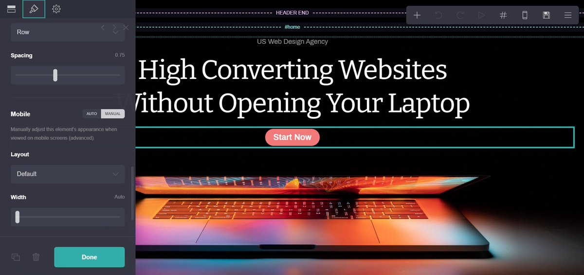
By scrolling down the settings of every element, you can adjust the mobile view by switched the settings to manual.
Go to the top right and click mobile.
No ONE adjusts their mobile view!
~60% of your site's visitors will come from mobile viewers.
By scrolling down the settings of every element, you can adjust the mobile view by switched the settings to manual.
Go to the top right and click mobile.
2. Use a Clear CTA
Too many people hide the CTA in their site.
I'm not saying you need to use bright colors all of the time, but using a...
- blue
- yellow
- green
- red
- orange
...CTA will automatically bring up the number of clicks you get.
Too many people hide the CTA in their site.
I'm not saying you need to use bright colors all of the time, but using a...
- blue
- yellow
- green
- red
- orange
...CTA will automatically bring up the number of clicks you get.
3. Use Different Fonts
People can often get lost in your site with so much information.
Using two different fonts looks better and helps to separate your ideas better.
On this site, I used a different font for the headings (Bitter) than the body text (Archivo).
People can often get lost in your site with so much information.
Using two different fonts looks better and helps to separate your ideas better.
On this site, I used a different font for the headings (Bitter) than the body text (Archivo).
4. Give it Some Personality
Don't let you site be another boring Carrd site!
Make it stand out by using...
- gradients
- different color backgrounds for sections
- code to add borders in
Anyway you can make it stand out, do it. You don't want yours blending in with others.
Don't let you site be another boring Carrd site!
Make it stand out by using...
- gradients
- different color backgrounds for sections
- code to add borders in
Anyway you can make it stand out, do it. You don't want yours blending in with others.
5. Only Use High Quality Images
Especially for your hero image like below, you can't afford to cheap out and use low quality.
It's the first thing people see when they open your site, make it count!
I use http://unsplash.com and http://freepik.com to get graphics.
Especially for your hero image like below, you can't afford to cheap out and use low quality.
It's the first thing people see when they open your site, make it count!
I use http://unsplash.com and http://freepik.com to get graphics.
Add these elements and your Carrd site will be 5x better than most others.
If you'd like to learn more, I just released all of my Carrd secrets in a new guide.
 35 pages of secrets
 Hours of tutorials
 Watch me build a site https://gum.co/jqrgw
If you'd like to learn more, I just released all of my Carrd secrets in a new guide.
 35 pages of secrets
 Hours of tutorials
 Watch me build a site https://gum.co/jqrgw

 Read on Twitter


