BE Album: A Thread
The Graphic Design Process for Print & Packaging Design
#gvfx_resources #askGVFX (by
 )
)
The Graphic Design Process for Print & Packaging Design
#gvfx_resources #askGVFX (by

 )
)
Planning Stage (Brainstorm, Logo Concept etc)
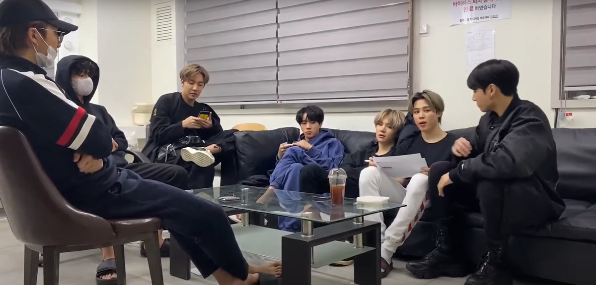
This is where the concept for the album is formed and the music is also put together and formed into a tracklist. The album artwork and design will be linked to the music produced. We got a unique insight into this production +
This is where the concept for the album is formed and the music is also put together and formed into a tracklist. The album artwork and design will be linked to the music produced. We got a unique insight into this production +
process for the BE album through BTS’s vlogs on Youtube in 2020 as well as interviews, comeback countdown and their comeback live.
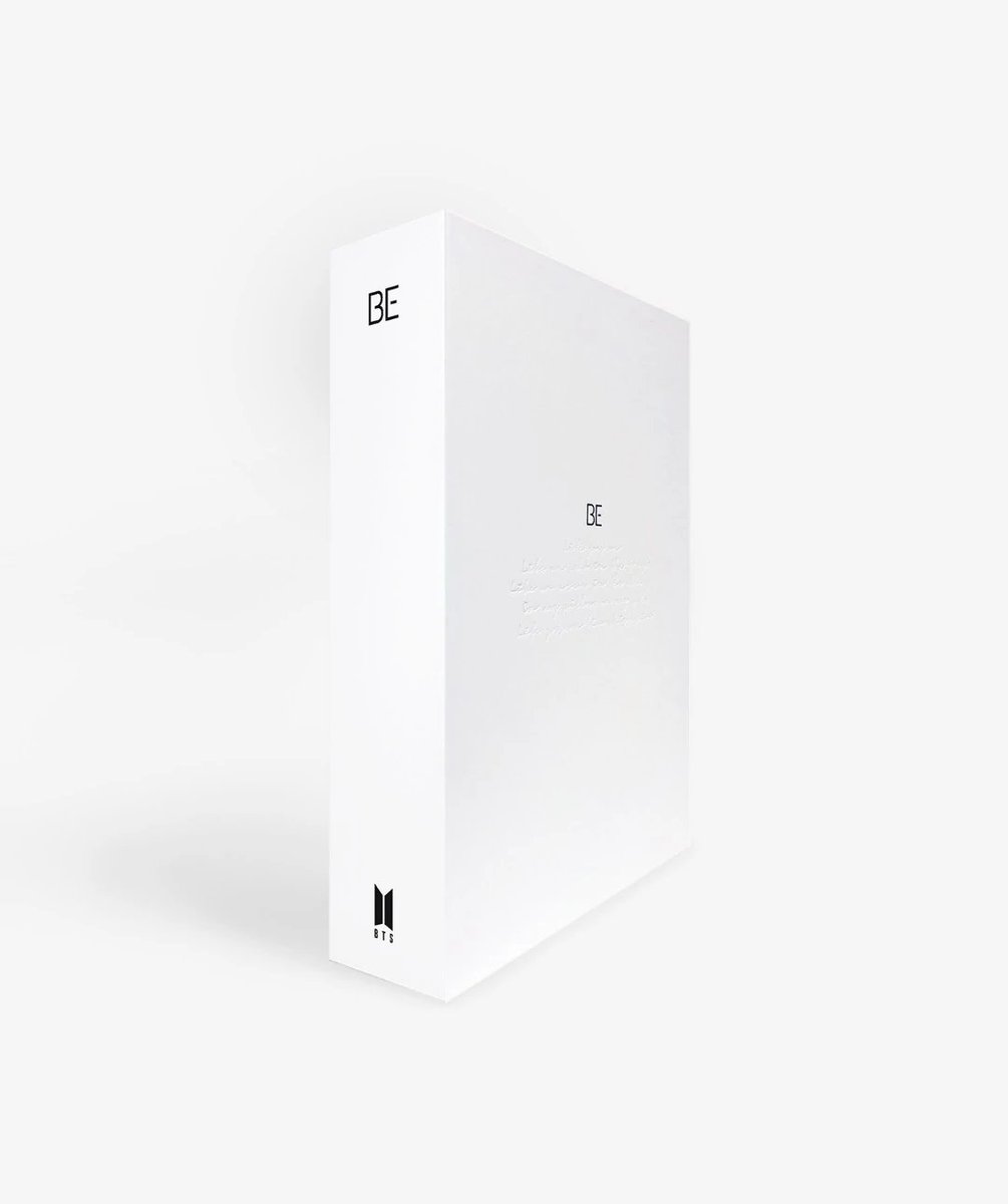
Once the concept is realised, the design team get to work on the designs for what will be included within the album, as well as the outbox designs.
Once the concept is realised, the design team get to work on the designs for what will be included within the album, as well as the outbox designs.
Arguably, some of the best album artwork designs, capture the message and feeling of the album at first glance.
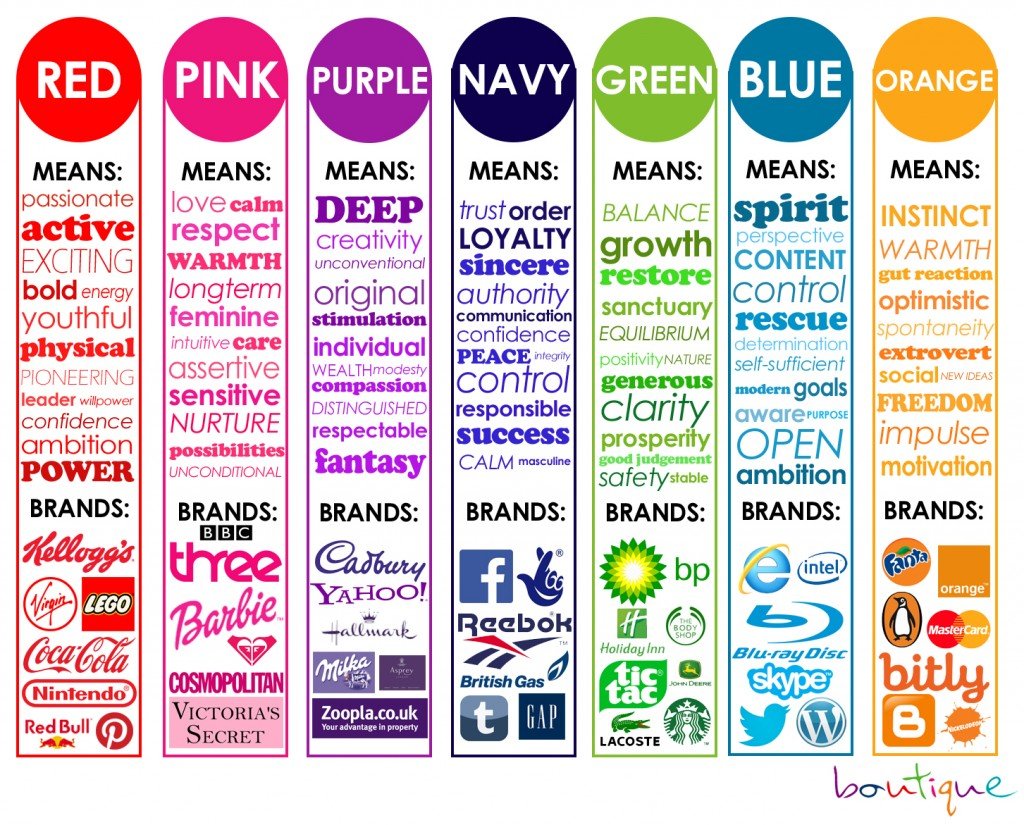
There are many ideas considered for the design to give a subconscious message/feeling that might be hard to put into words, but it has been carefully thought out +
There are many ideas considered for the design to give a subconscious message/feeling that might be hard to put into words, but it has been carefully thought out +
by the designers, through the psychology of the design. This also includes the colour scheme, layout and typography used. On occasion there may be custom typefaces made, or modified specifically for the concept. It has not been officially confirmed,
Packaging Trials
Alongside the graphic design process, are the tests for the practicalities of the design through mockups, dummy prototypes and trials to make sure all parts of the design will fit together in the physical format. +
Alongside the graphic design process, are the tests for the practicalities of the design through mockups, dummy prototypes and trials to make sure all parts of the design will fit together in the physical format. +
Even the colours are tested for the prints to make sure the right hues are printed (Pantone is a great help with this).
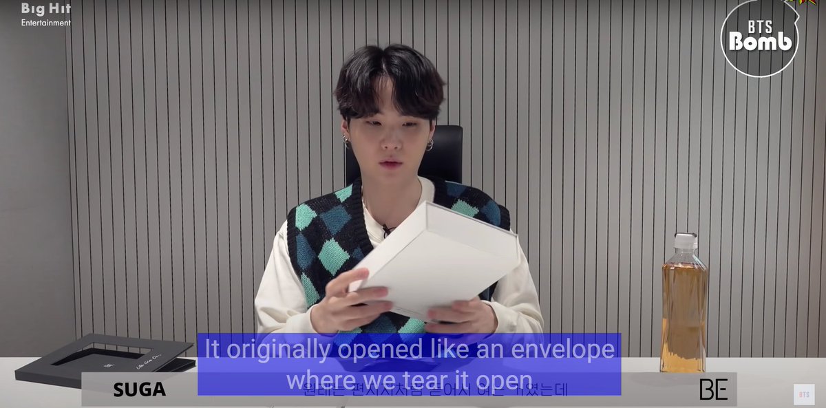
Yoongi briefly mentioned in his unboxing that BTS had another idea for the outbox, but they realised this would be impractical for a reproducible album. +
Yoongi briefly mentioned in his unboxing that BTS had another idea for the outbox, but they realised this would be impractical for a reproducible album. +
The final outbox works quite effectively as it does feel like a memory/treasure box that people keep to store all their memories over time. It can be customised and decorated, as BTS themselves showed in their videos.
Design Stages for Printing
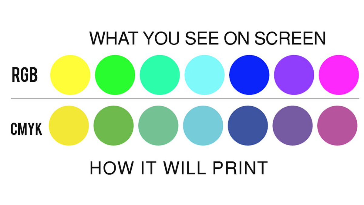
The designs are produced and prepared for print, such as ensuring all the documents are set to CMYK colour format and at least 300DPi resolution (this will ensure the design is clear when printed), crop and bleed marks also added and for example +
The designs are produced and prepared for print, such as ensuring all the documents are set to CMYK colour format and at least 300DPi resolution (this will ensure the design is clear when printed), crop and bleed marks also added and for example +
on the posters, at least 3mm bleed (so that the design won’t be cut inaccurately). A common printing process for posters is litho printing.
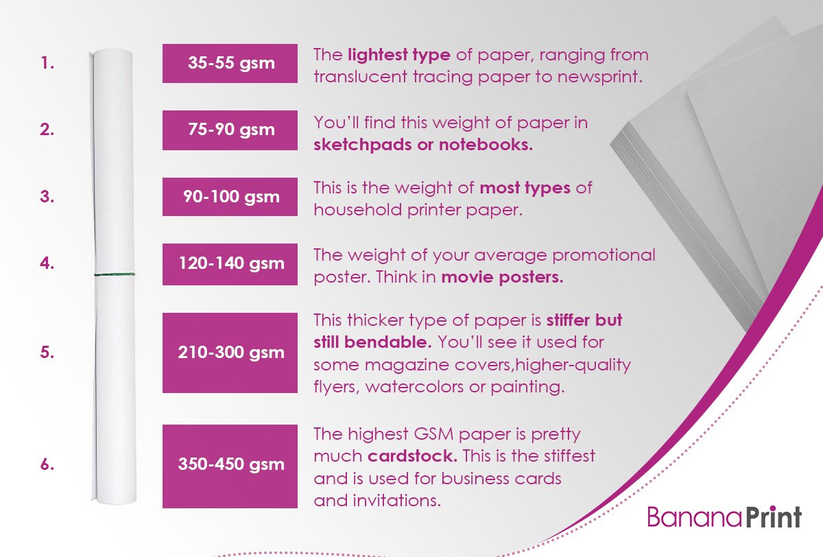
The materials for the outbox and the weight and paper type also needs to be considered as this affects the look of the prints and how +
The materials for the outbox and the weight and paper type also needs to be considered as this affects the look of the prints and how +
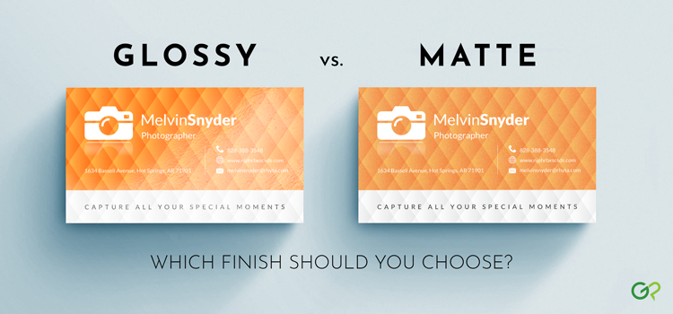
heavy the whole album package will be altogether. Paper weight is measured in gsm (grams per square metre). The material used for the photobook, postcards, photocards, making book and posters are all matte (softer to the touch and are not reflective like a gloss/satin finish).
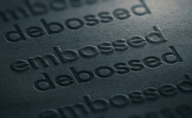
The outbox material has a nice texture and debossing was also used to emphasise the life goes on lyrics, as though they had been written into each outbox individually, still maintaining the personal feeling whilst reproducibility was also considered.
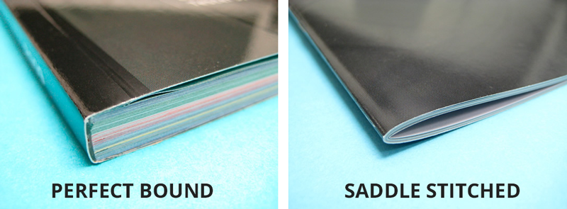
The photobook for BE is produced uniquely, they are two books in one, both perfect bound, the second doesn’t have a cover so the pages can be pulled out and it is fitted within the first book. The perfect binding for the second book was made with an adhesive holding the pages +
together in a way that can easily be removed with enough force (gently) one at a time, without damaging the individual pages. There are also a range of materials used within the photo books including opaque translucent paper, it really feels so personal.
The making book is stapled together which is also called saddle stitch binding. This is a common and efficient way of binding smaller books that don’t have a lot of pages.
(Perfect binding uses a flexible adhesive).
(Perfect binding uses a flexible adhesive).
There are personal touches across the whole album, through the music, production and within the design. The little doodles, notes and handwritten lyrics within the album items make this feel so BTS-esque.
Any questions? Feel free to reply! Thanks for reading!
Check out some of our references here + more about printing/album production: https://docs.google.com/document/d/1q247a3KW0XIsYSEbu54Qpy1mnMxpRkWbx1r-NCPGCEg/edit
Check out some of our references here + more about printing/album production: https://docs.google.com/document/d/1q247a3KW0XIsYSEbu54Qpy1mnMxpRkWbx1r-NCPGCEg/edit
Learn more about Graphic Design here: https://gvfxarmy.carrd.co/#graphicdesign

 Read on Twitter