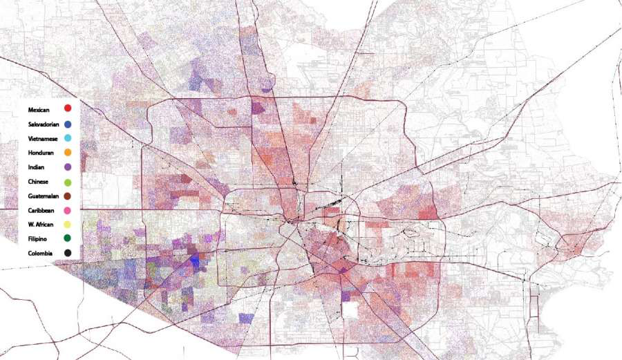
 Here’s the start of a thread about The Houston Arrow. Please add to it if you have maps/facts that demonstrate The Houston Arrow.
 What is the Houston arrow
It’s an arrow that’s visible on almost any map of Houston with social data (a fancy way of saying measurable information about our lives) layered on top of it.
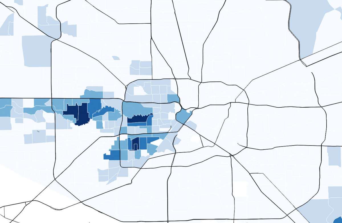
@Jdharden wrote about the arrow for the Houston Chronicle in 2015 calling it, “the outline of an arrow in the city's western half that pushes through Memorial and points to downtown.”
Here’s the map Harden shared with average earnings by census tract. The darker the blue the richer the residents.
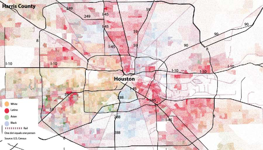
Of course, the racial wealth gap shows up. The arrow shows where white folks live in Houston and tells the story of the westward white flight within city limits.

 Read on Twitter


