 Thread with some WebGL/Front End development stuff from http://kacper.ch .
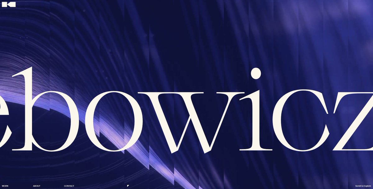
The cool subdivision that happens on the header is made by changing the `uv.x` position of a Plane geometry in a Shader. You can basically do a `for` loop and divide it by 15, then translate on `+= x`, this will make the output of the shader split in multiple columns.
The hover effect of each one of the case studies is made entirely in a shader, looks simple but I've used the green channel to delay shapes:
float transition = range(uTransitionHover, 0.0, 1.0, 0.0, 1.95);
color.b *= mix(0.0, 1.0, clamp(transition - mask.g, 0.0, 1.0));
float transition = range(uTransitionHover, 0.0, 1.0, 0.0, 1.95);
color.b *= mix(0.0, 1.0, clamp(transition - mask.g, 0.0, 1.0));
The cube animation was Kacper's idea, he's a genius. All projects are a `Box` geometry, I'm just scaling it in `z` when the animation happens and making it fit the screen, that's one of my favorite animations from the website.
I've used only CSS transitions from the Home → Case Study, it makes possible to have this kind of behavior which the user is not blocked when going from one page to another. This made the website feel much more responsive I think.
All the cool websites nowadays have this kind of distortion on scroll. To achieve that I've updated the Box shader to distort with the following line of code that takes the scroll speed in:
newPosition.z += sin(newPosition.y / uViewportSizes.y * PI + PI / 2.0) * abs(uStrength);
newPosition.z += sin(newPosition.y / uViewportSizes.y * PI + PI / 2.0) * abs(uStrength);
This shape is only CSS!  I've created a <div> with a background and used an `:after` selector to make the circle inside of it. Then I just mapped the current scroll with how much I want to grow the shape, included a `lerp` on it that matches the scroll position, done!
 I've created a <div> with a background and used an `:after` selector to make the circle inside of it. Then I just mapped the current scroll with how much I want to grow the shape, included a `lerp` on it that matches the scroll position, done!
The shape rotates when the user drag the infinite slider. I don't use any frameworks, but to achieve that I just use an `EventEmitter` instance and transform the scroll position of the slider into a `${scroll}deg` and sum it to the original rotation of the background.
If you notice there's a small delay between each one of the letters when you mouseover the text. I'm trying to use more CSS instead of JS animations to make things more responsive, so every letter is wrapped in a `span` and have a `transition-delay` with `&:hover` in a SASS loop.
NO MIX BLEND MODE in the menu. (I've learned this one with @baptistebriel.  ) But it's possible to achieve this kind of mask effect by duplicating the menu and translating a wrapper with `translateY(-10px)` while the original element is `translateY(10px)`.
 ) But it's possible to achieve this kind of mask effect by duplicating the menu and translating a wrapper with `translateY(-10px)` while the original element is `translateY(10px)`.
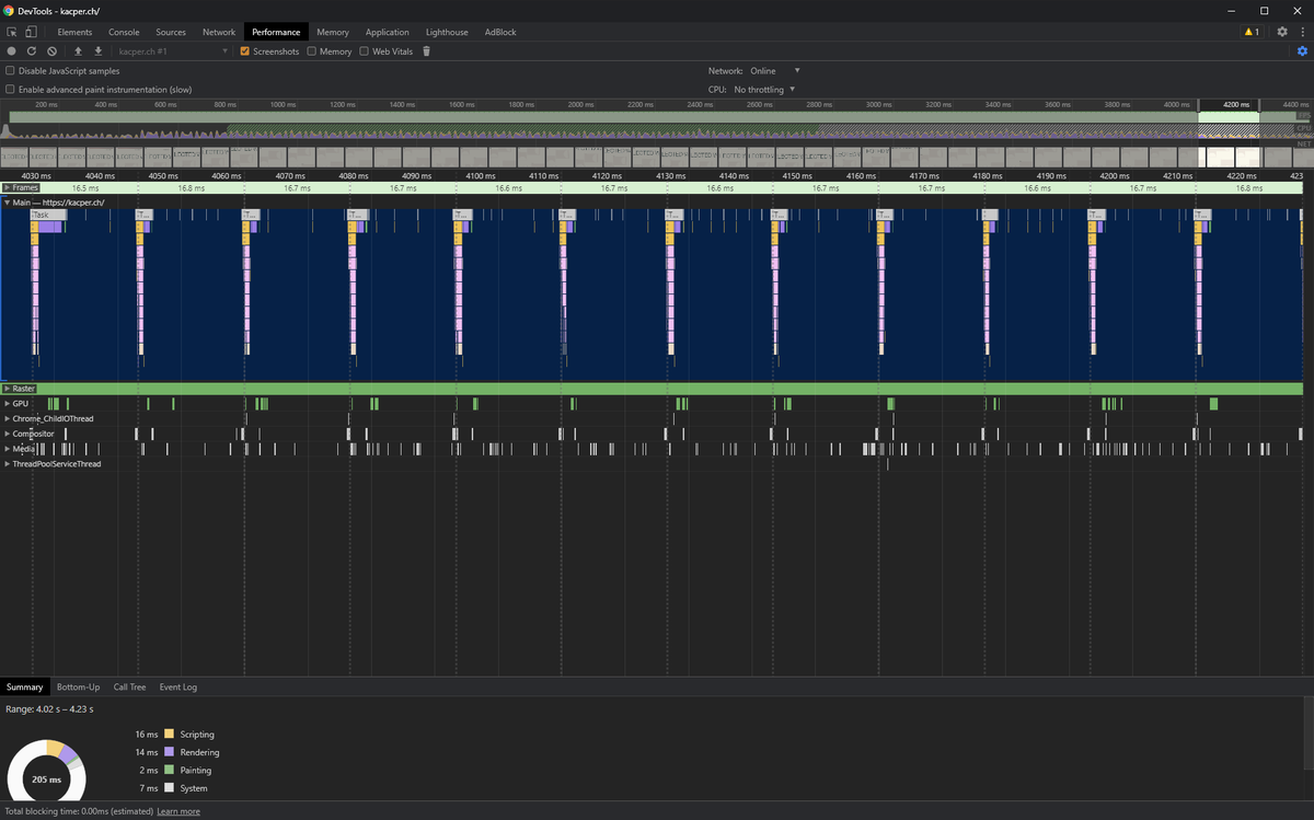
Most important thing from this project: performance profilling by removing things that can cause layout repaint/reflow, if you compare with my first projects, it's ABSURD. (Left: newest / Right: oldest).
I think that's it, not sure if it was useful for everyone, but I've tried! 


 Read on Twitter


