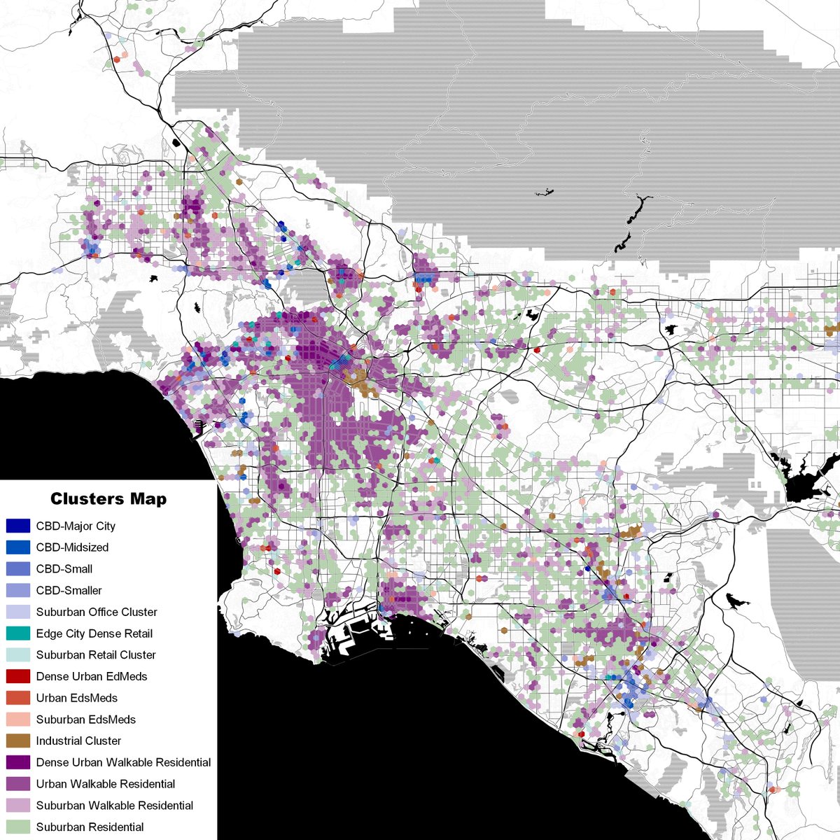
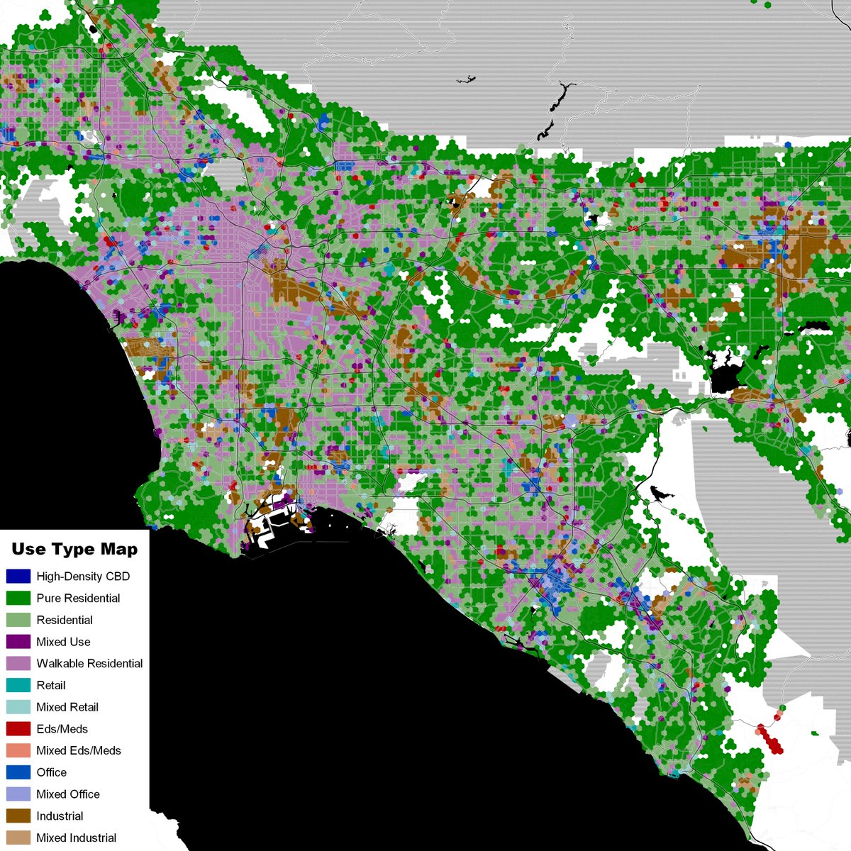
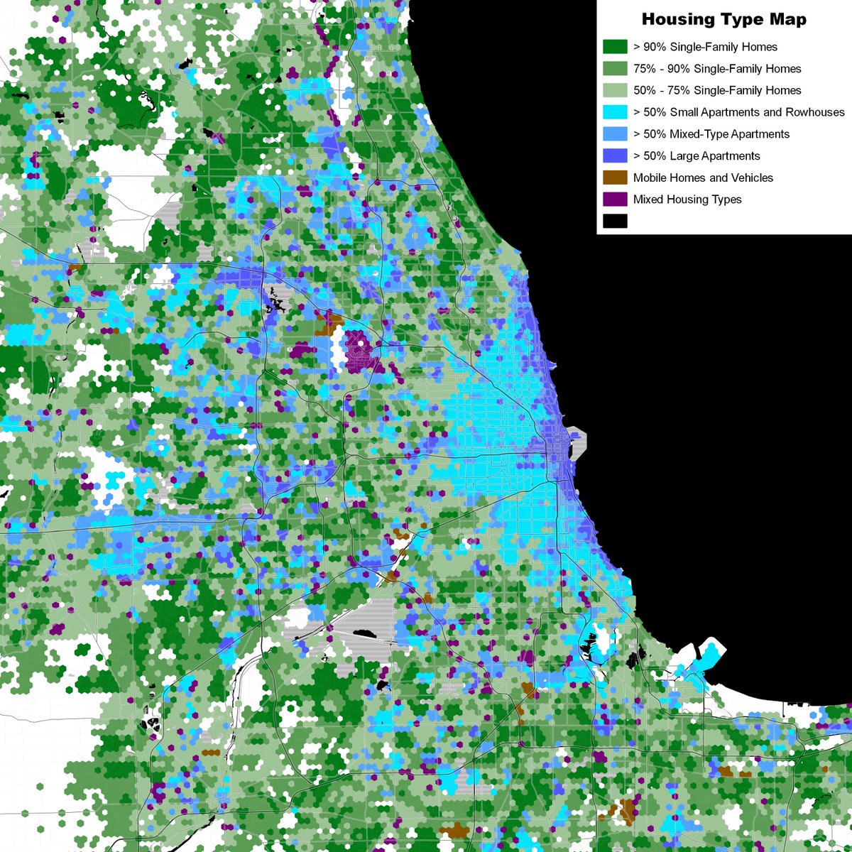
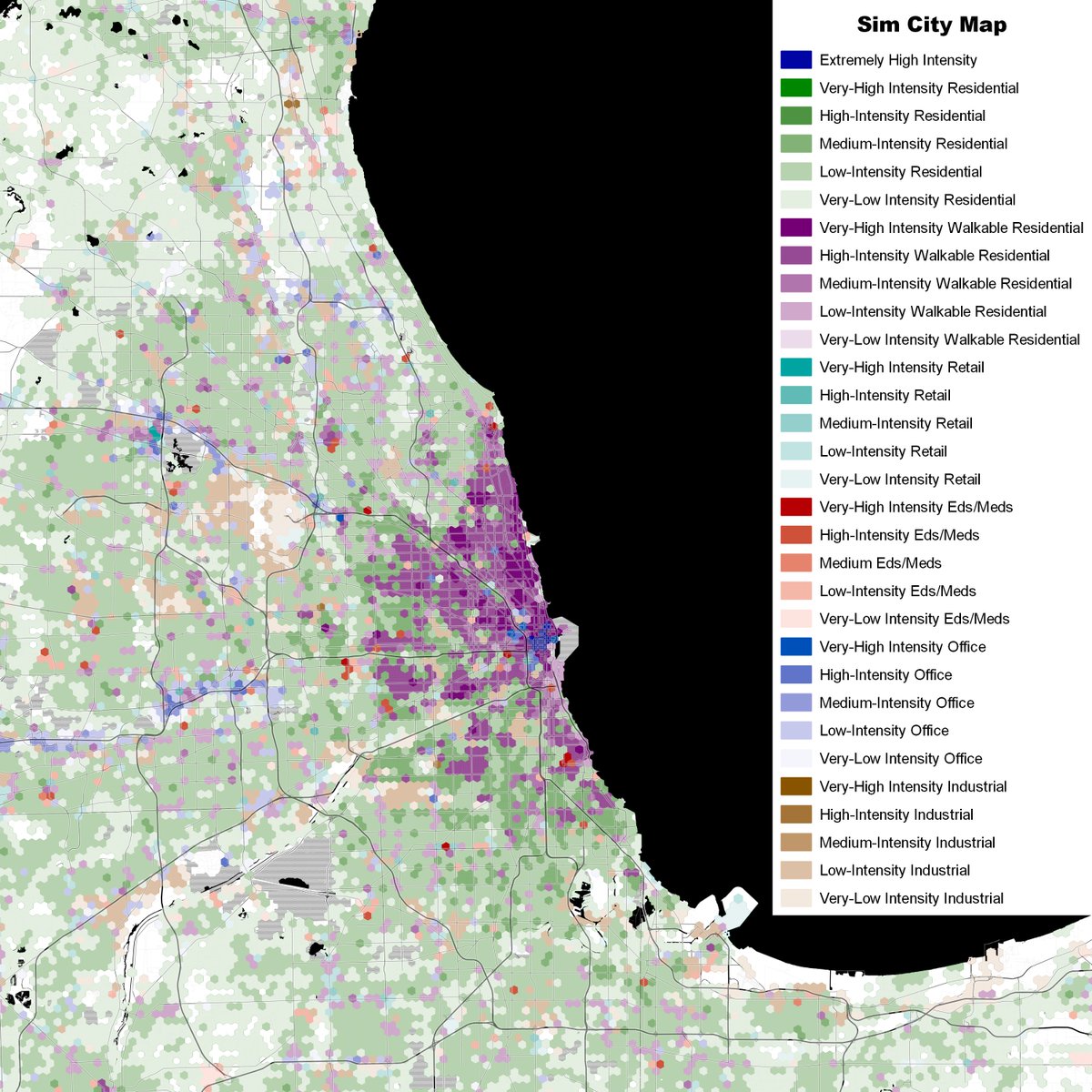
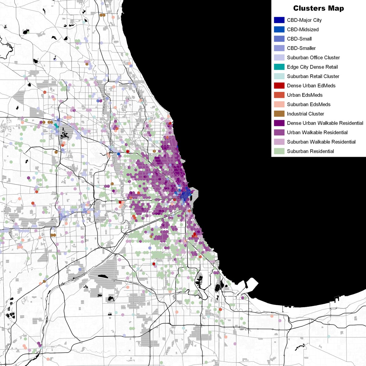
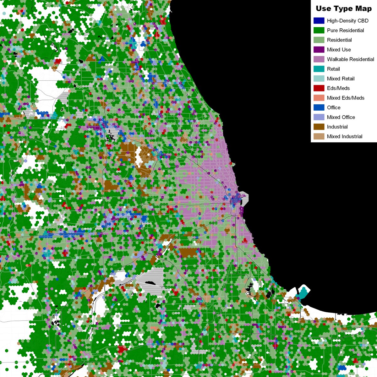
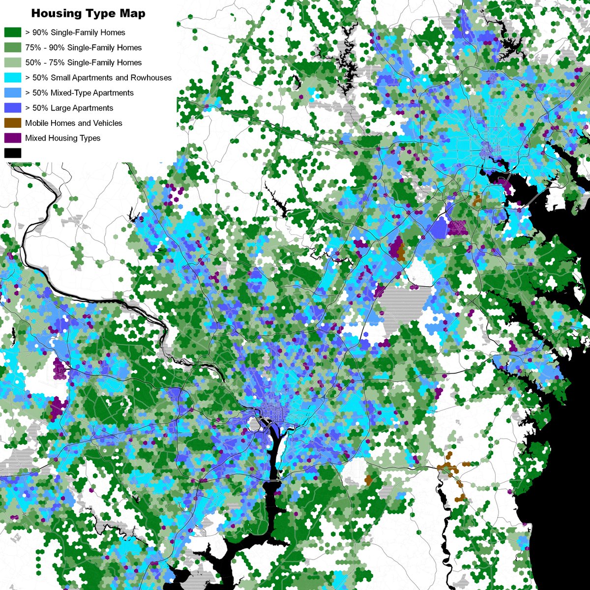
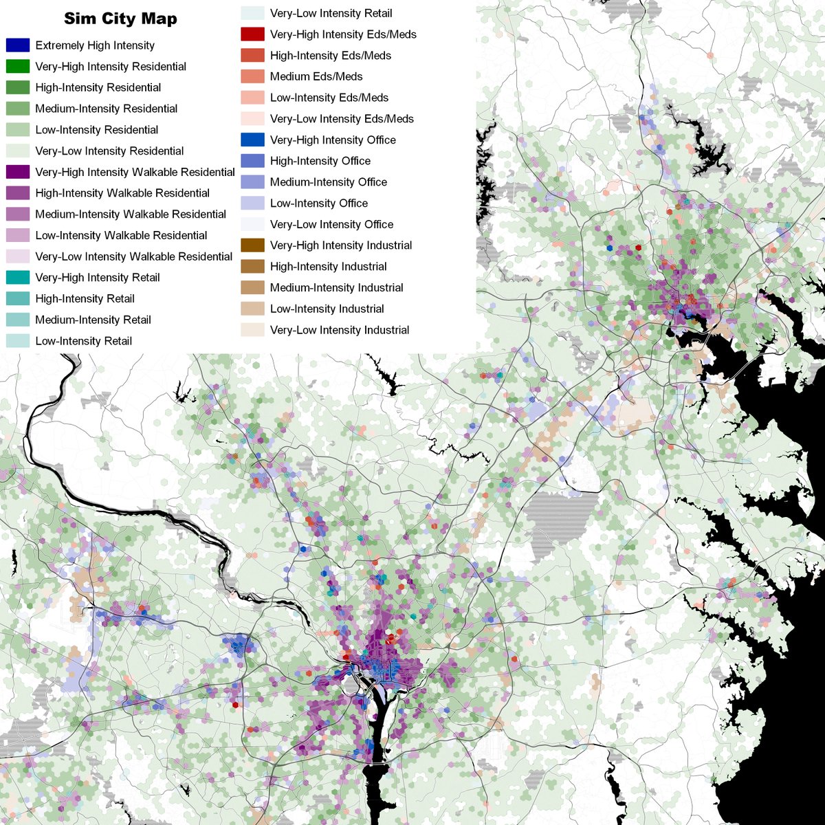
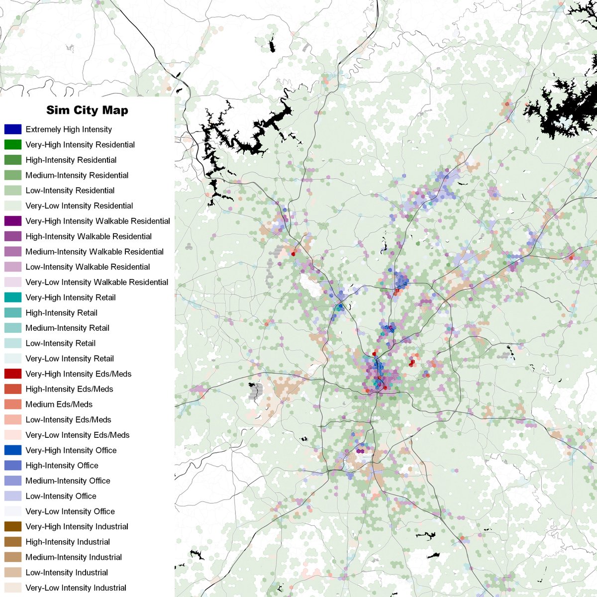
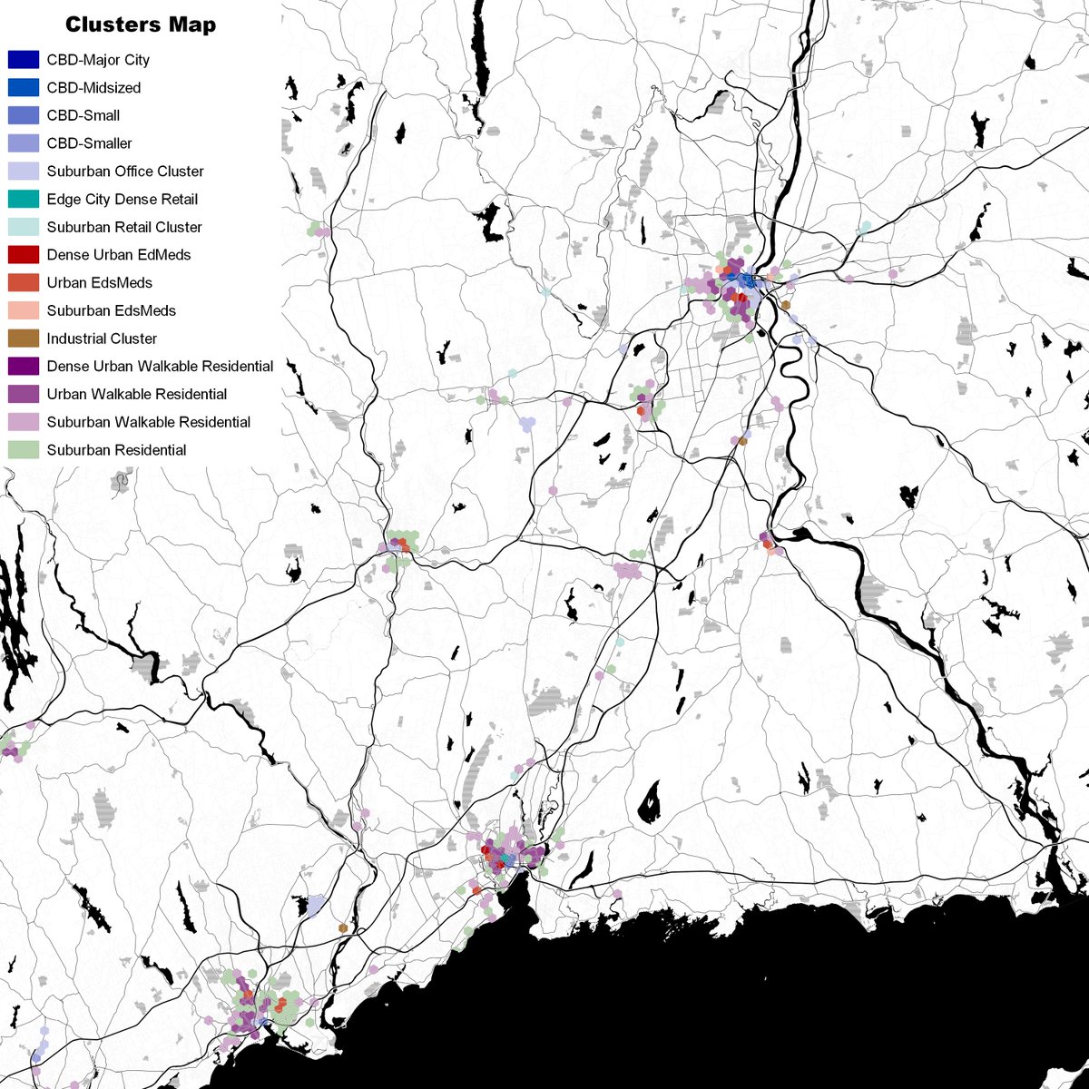
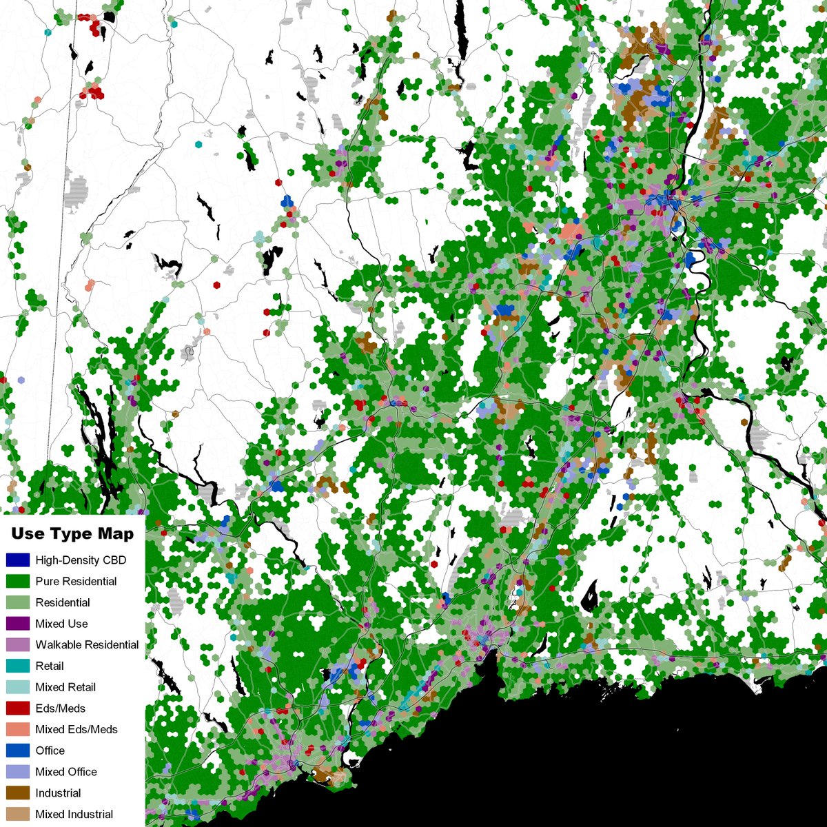
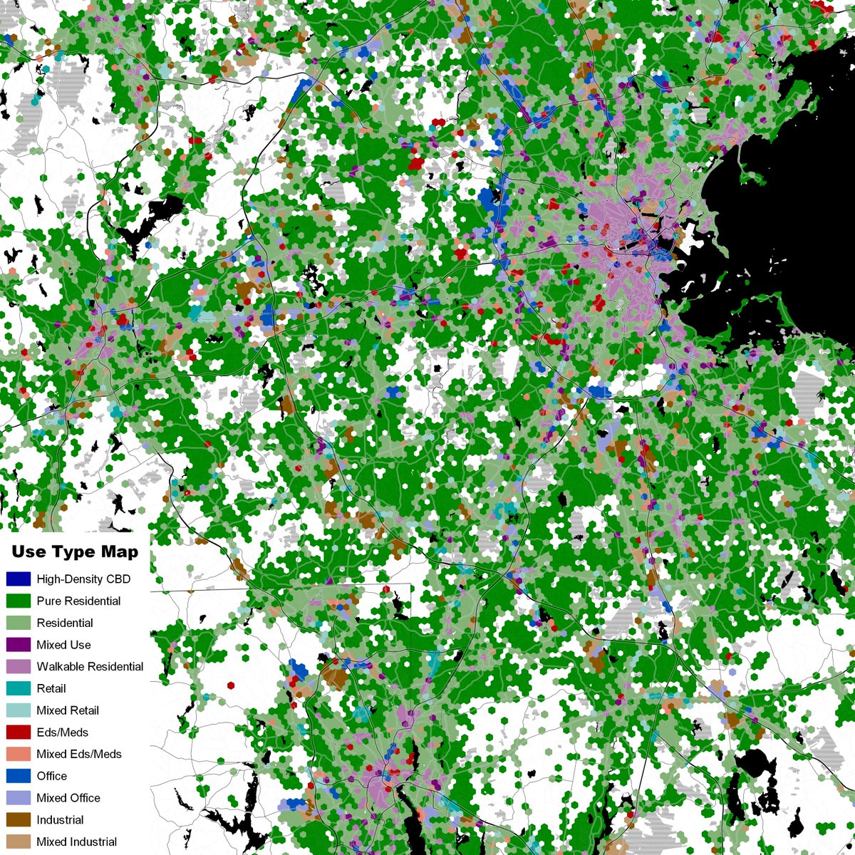
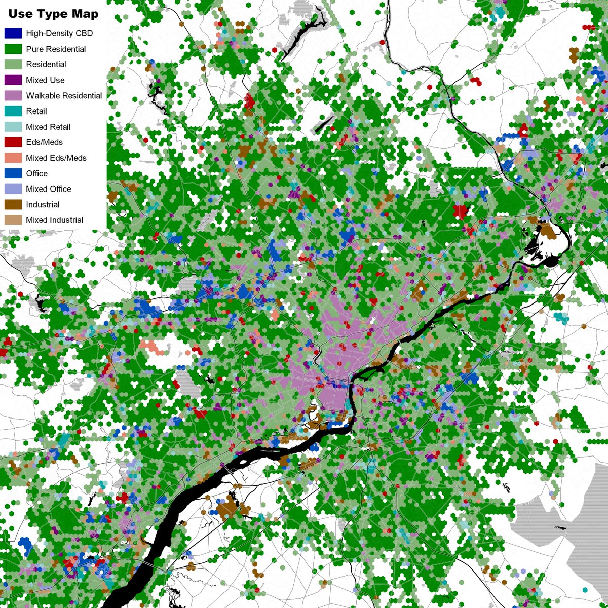
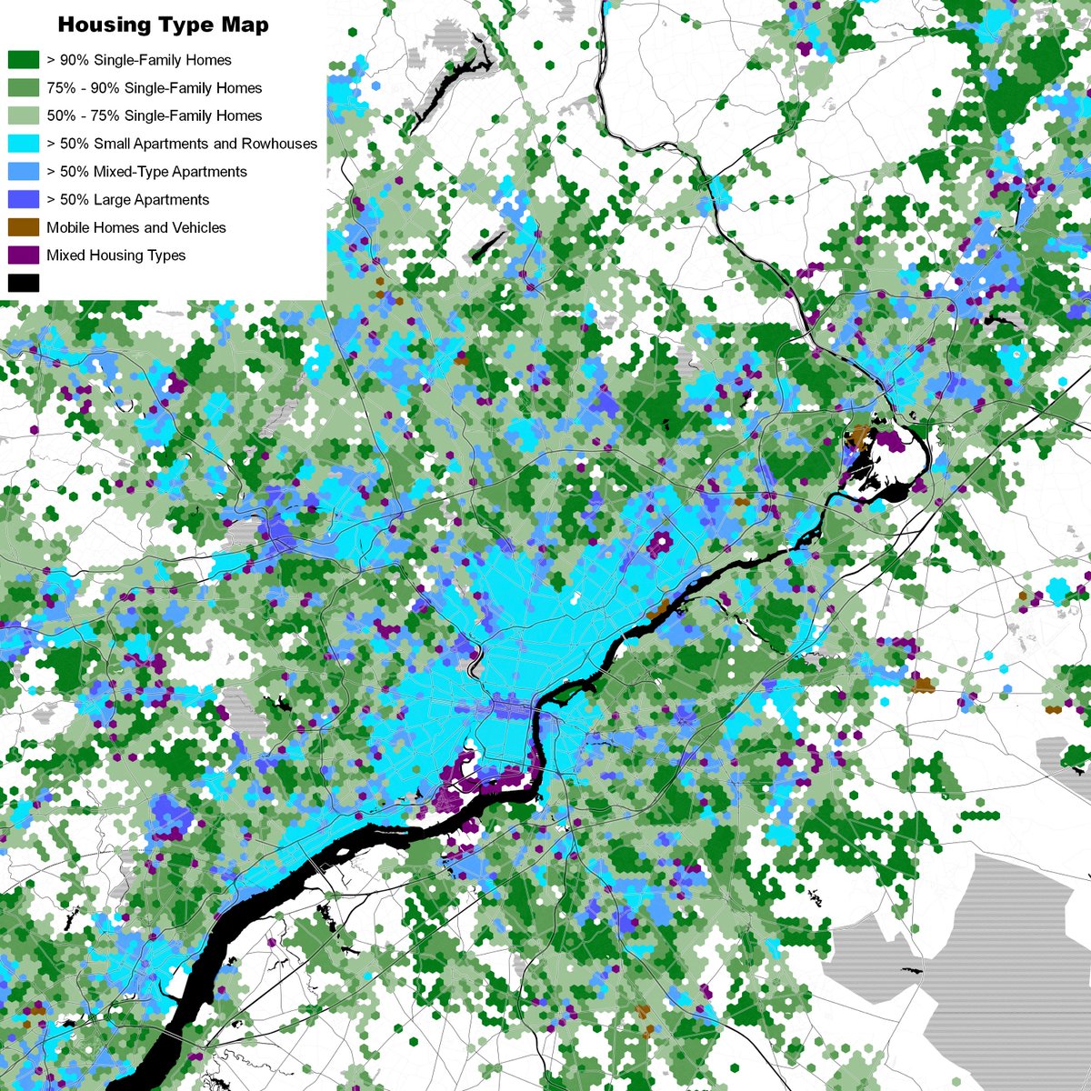
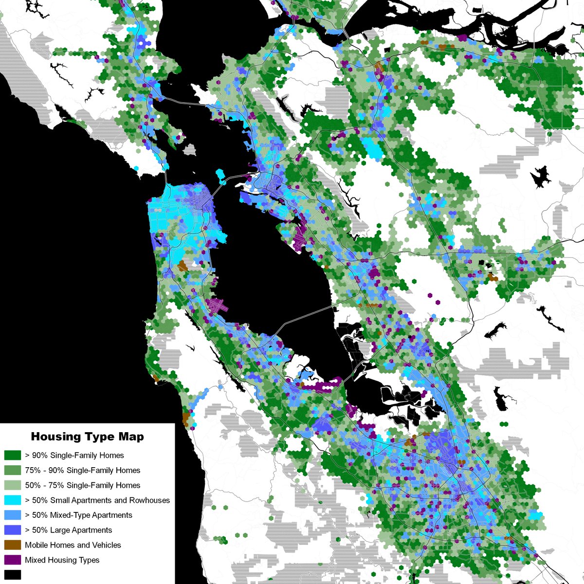
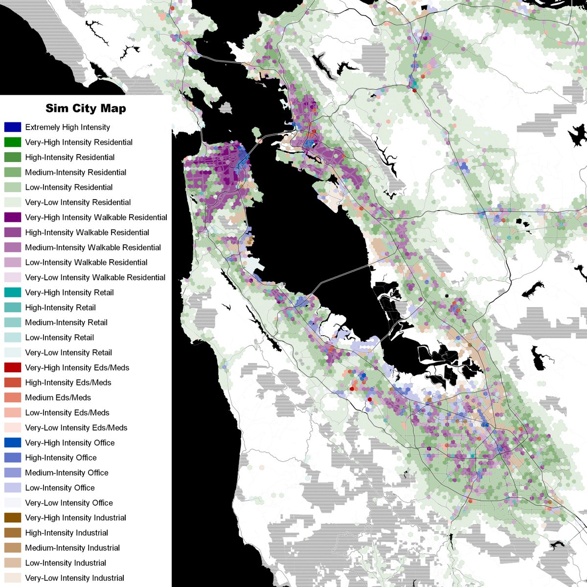
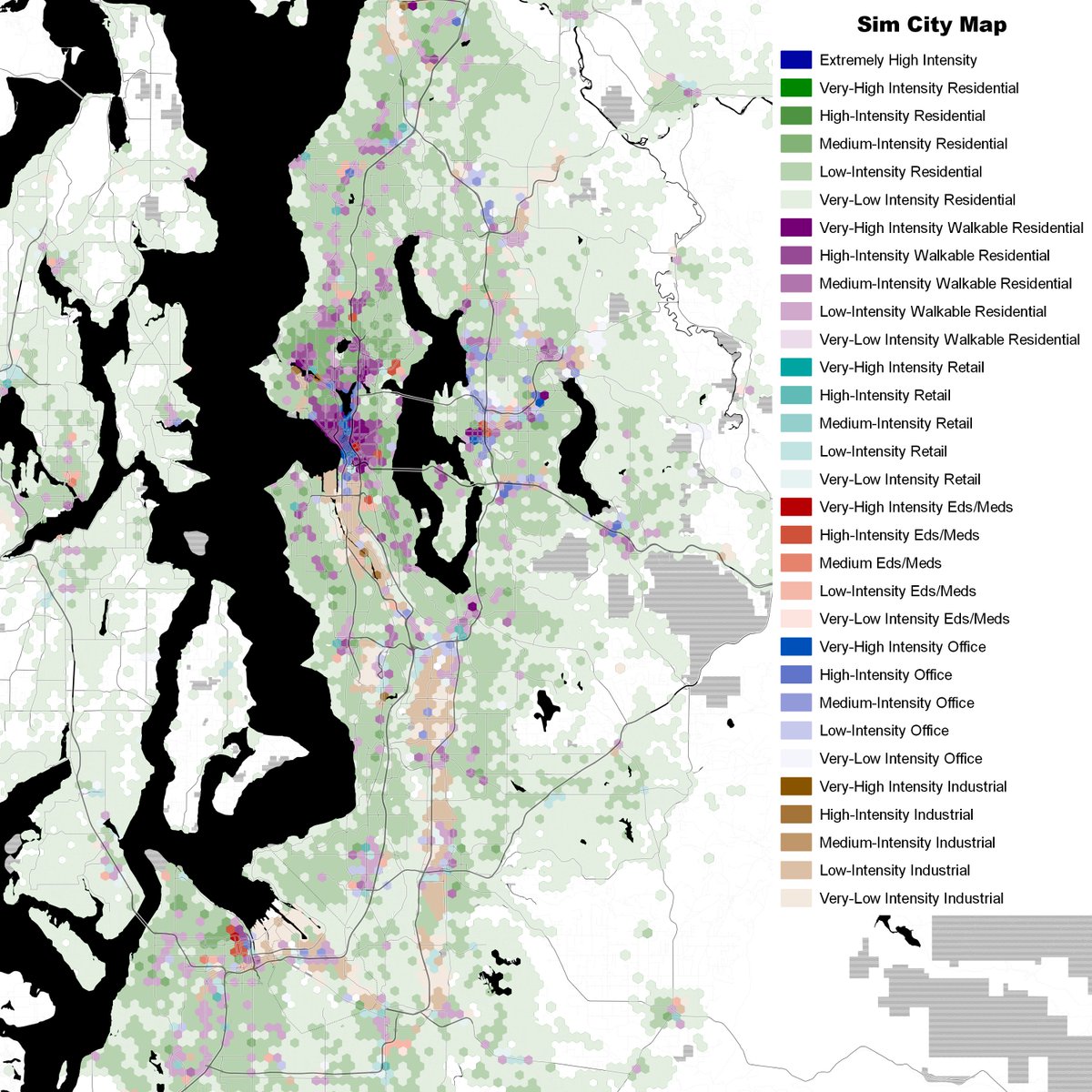
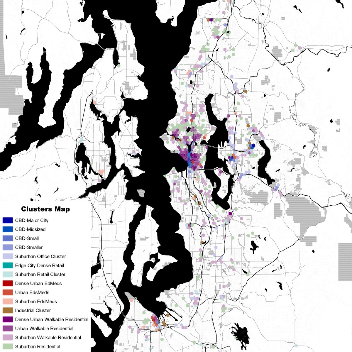
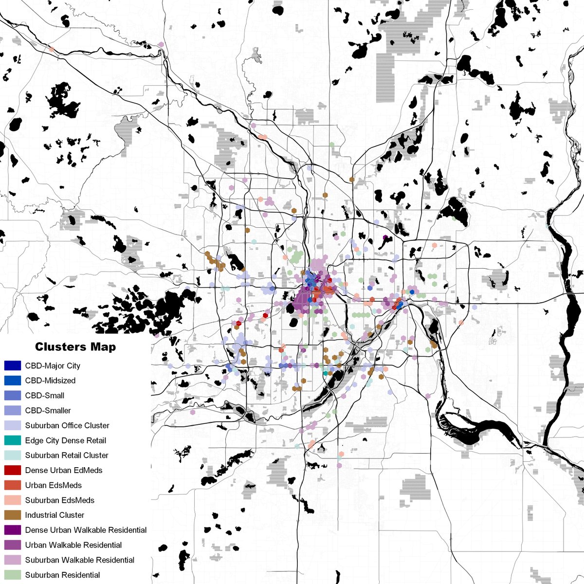
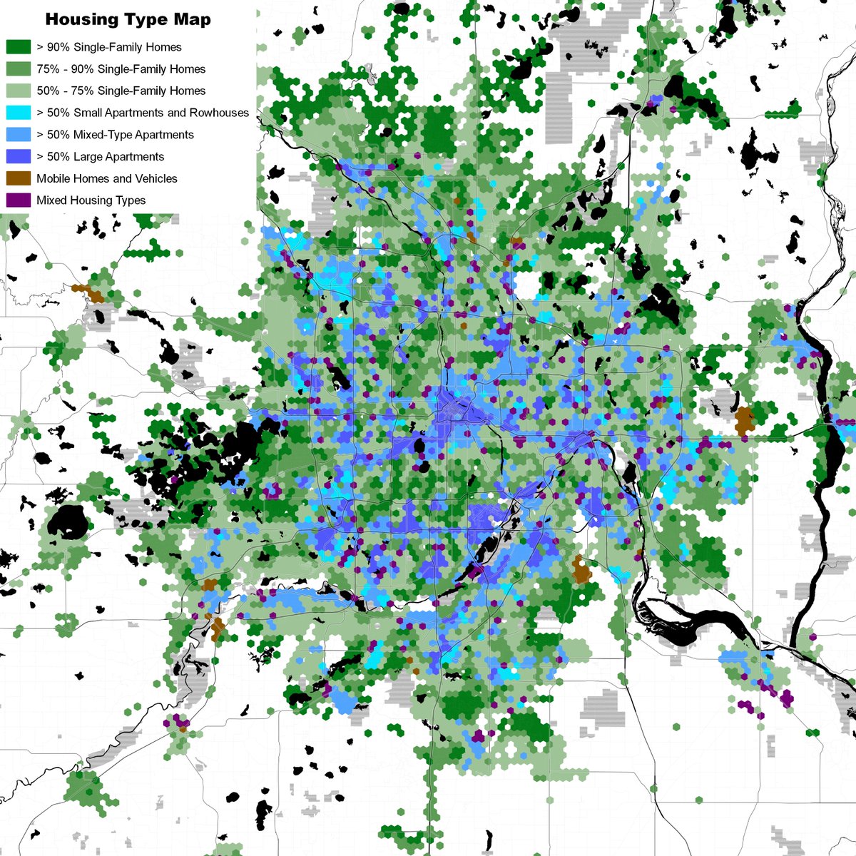
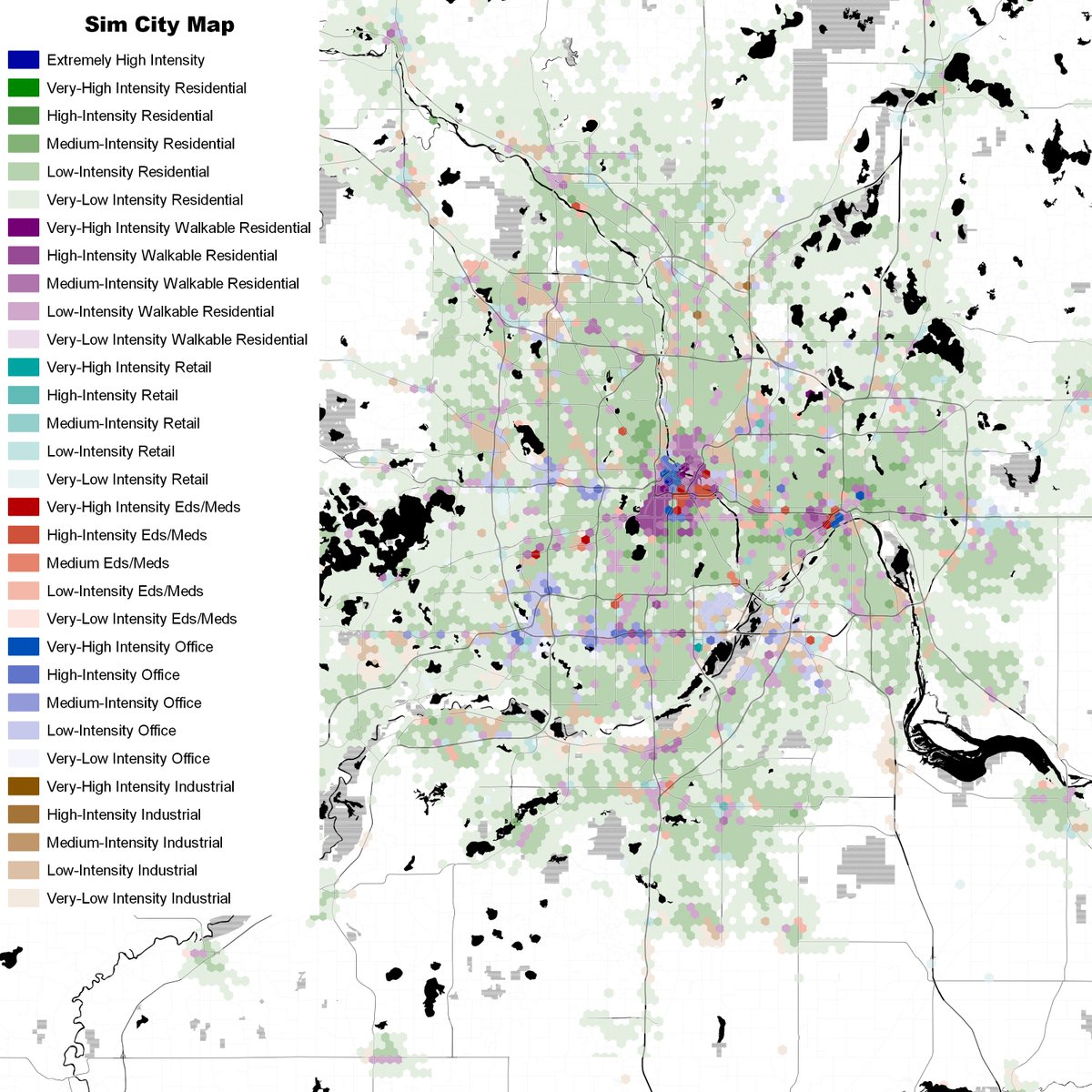
It's time for another round of maps from my Master's project with @dillonm, @AMReese07, and @Ericjstokan at @GesUmbc. The following maps are all based on 500 k-means clusters covering all neighborhoods of at least 500 activity (jobs plus residents) per square mile in the US.
Along with the density/connectivity maps I made before, I now have four new types:
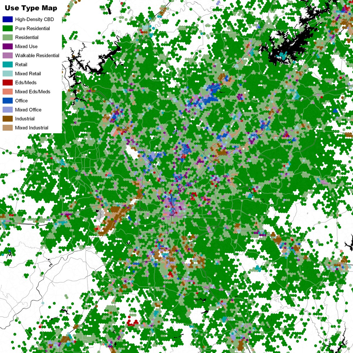
-- use type, which shows land use without density
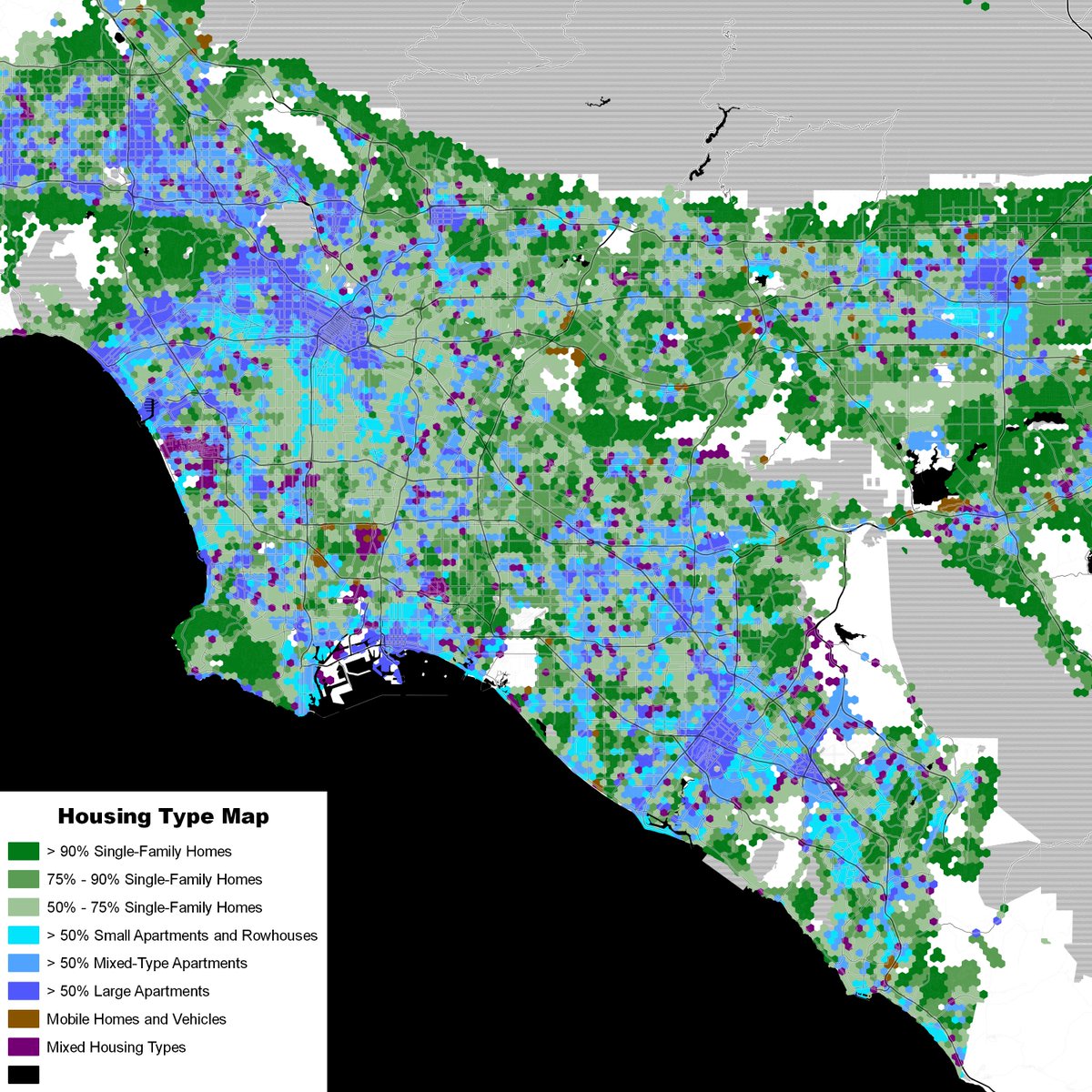
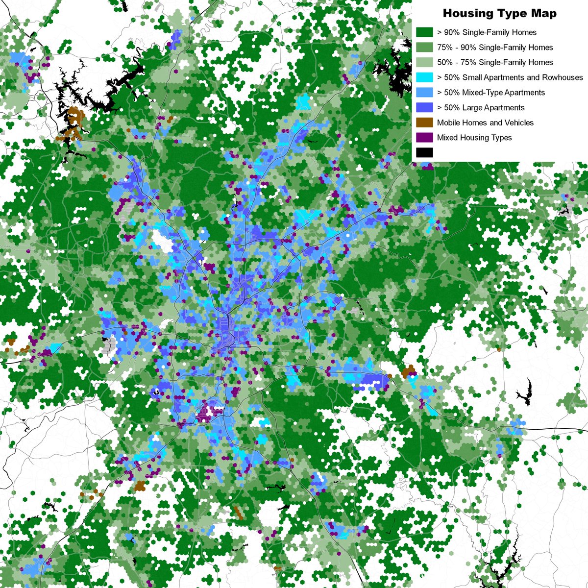
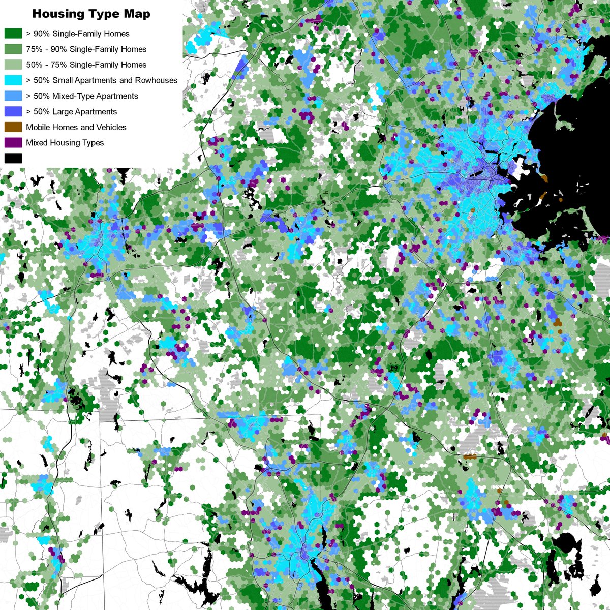
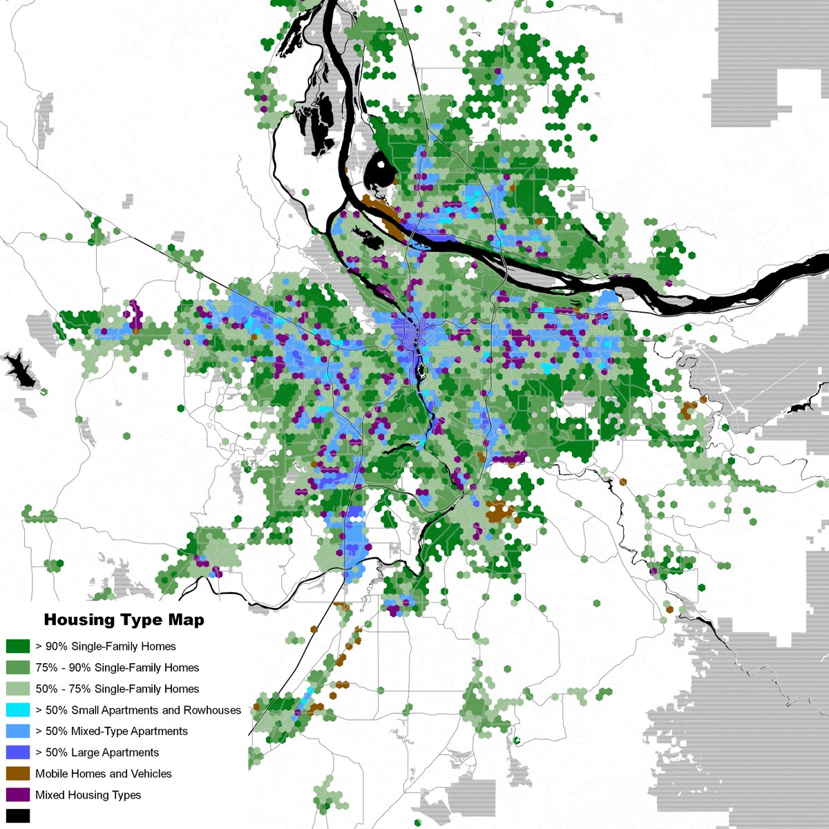
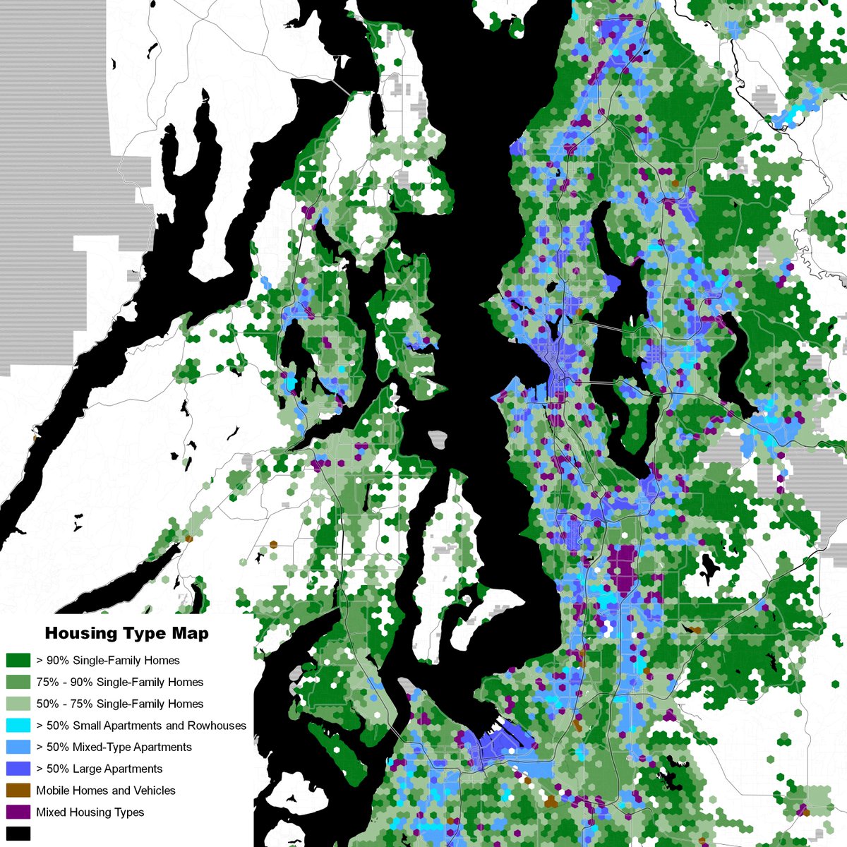
-- housing types, which shows dominant types of housing unit (note that rowhouses and small apartments are lumped together)
-- use type, which shows land use without density
-- housing types, which shows dominant types of housing unit (note that rowhouses and small apartments are lumped together)
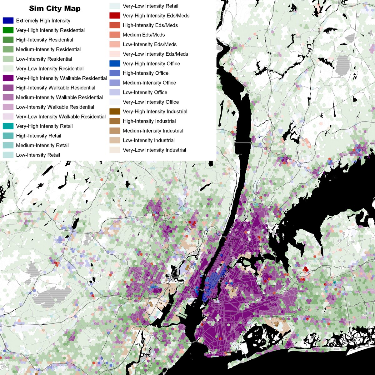
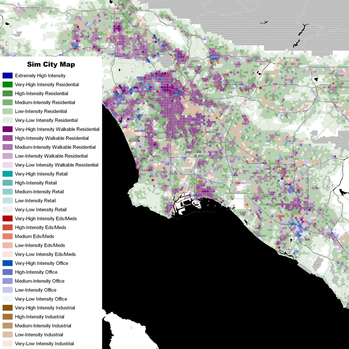
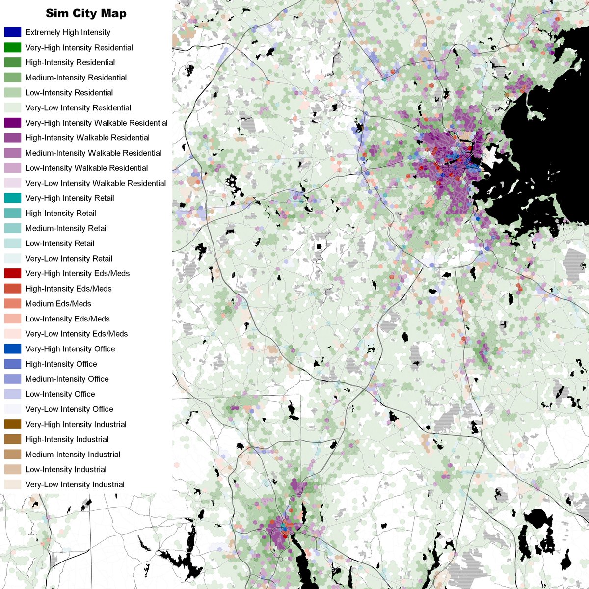
-- "SimCity" maps, which show land use types (with some types combined) with shading indicating density/connectivity.
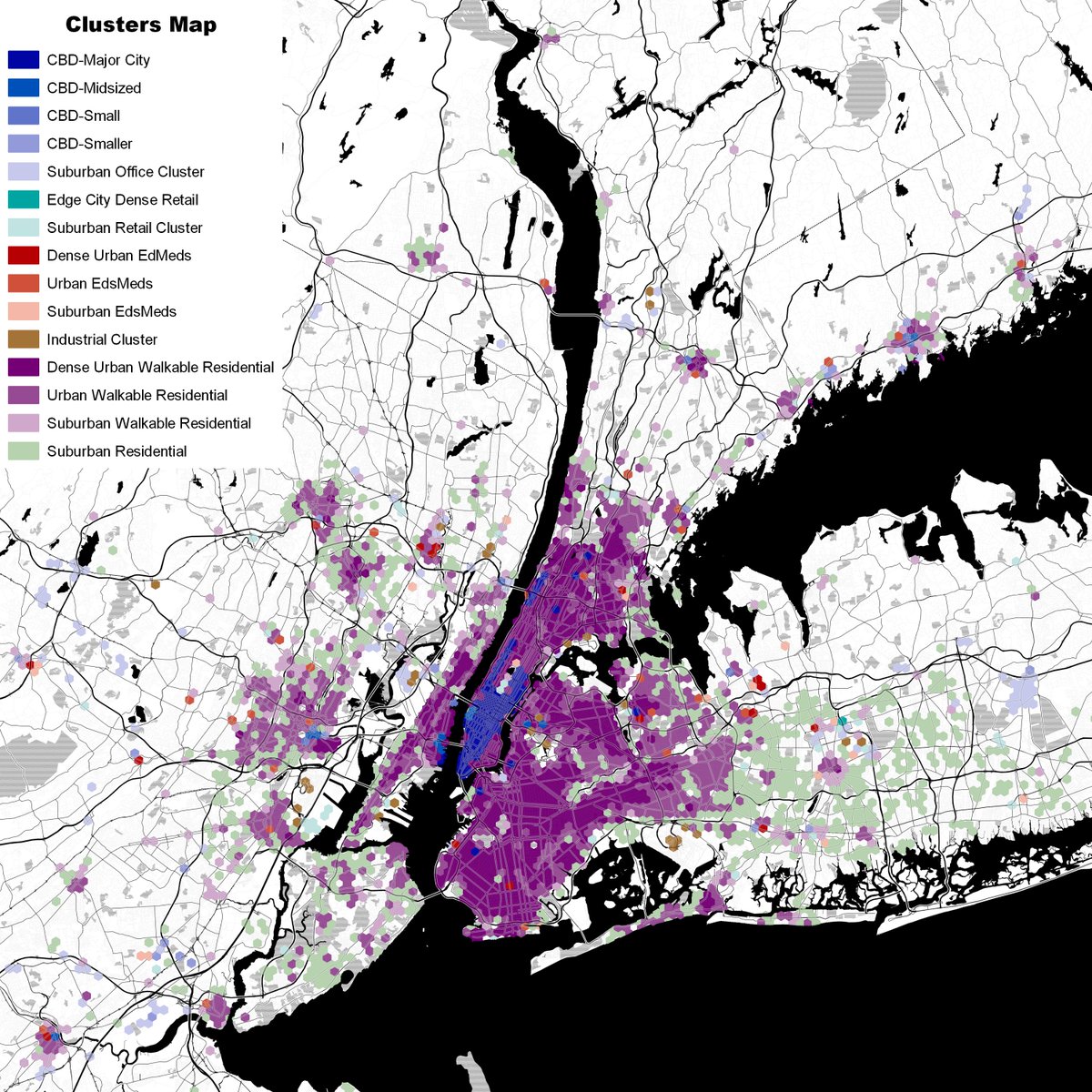
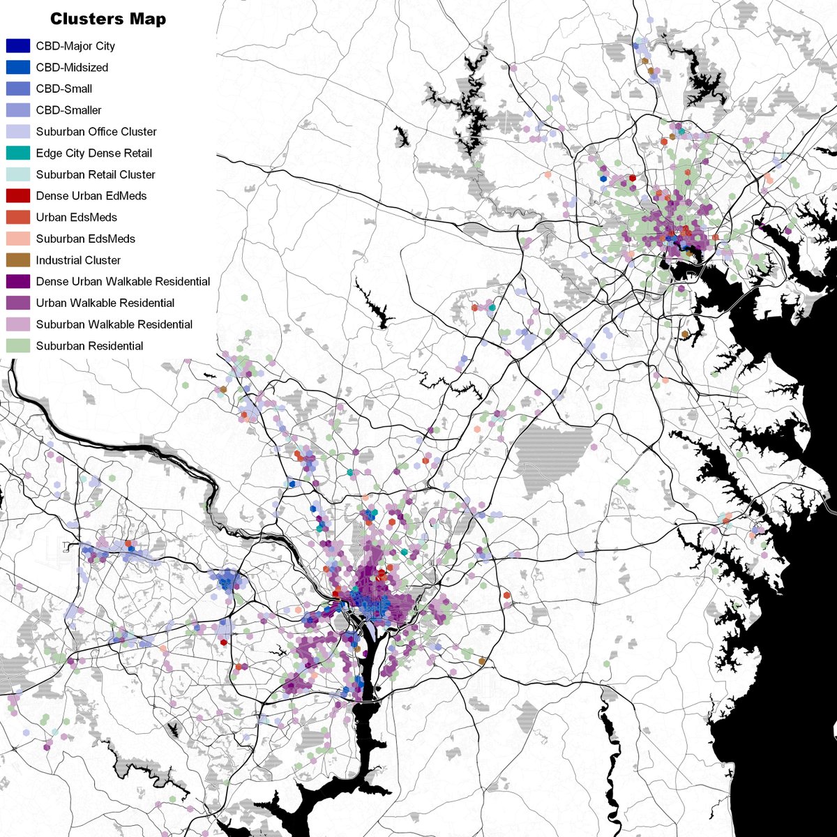
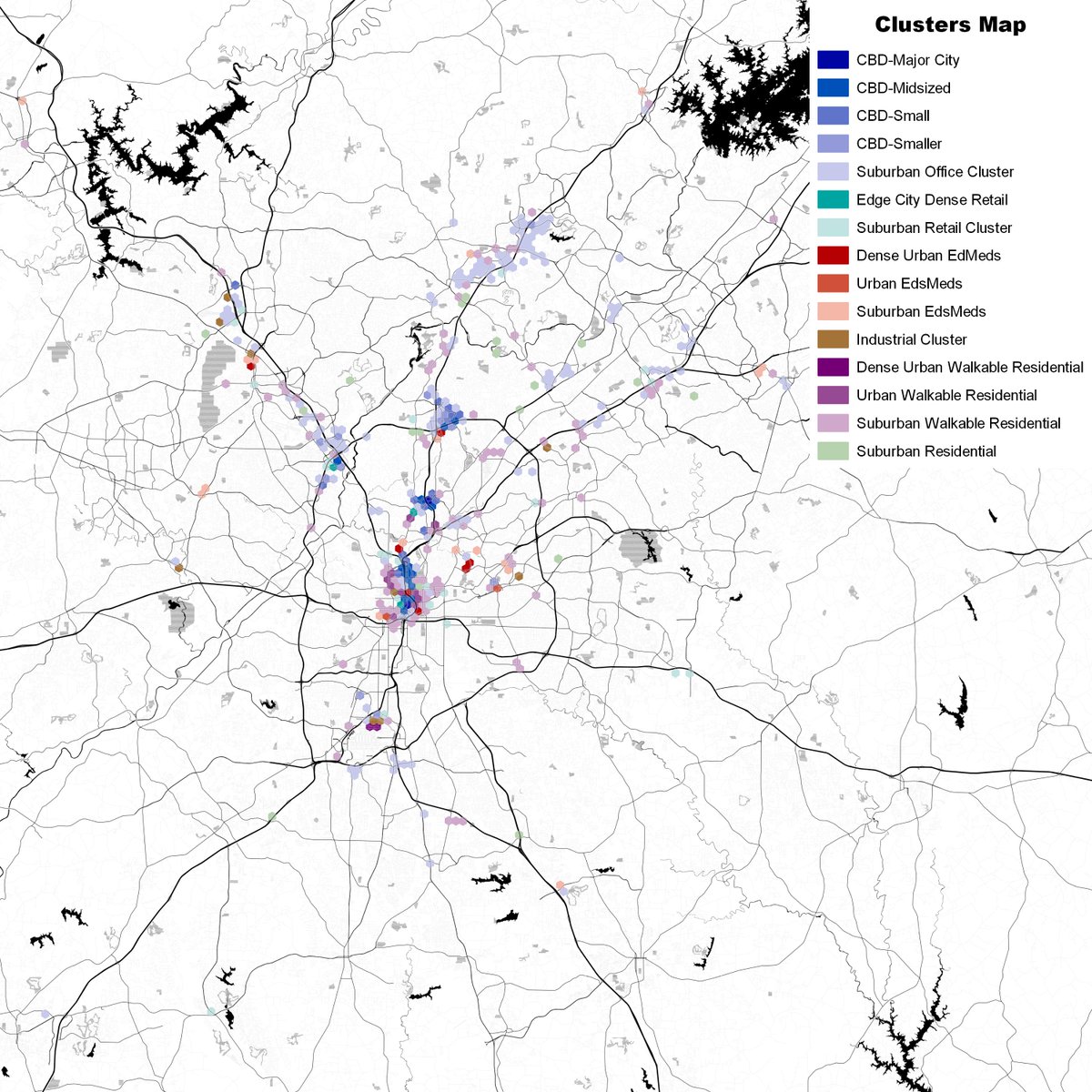
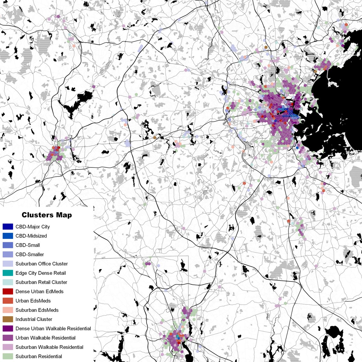
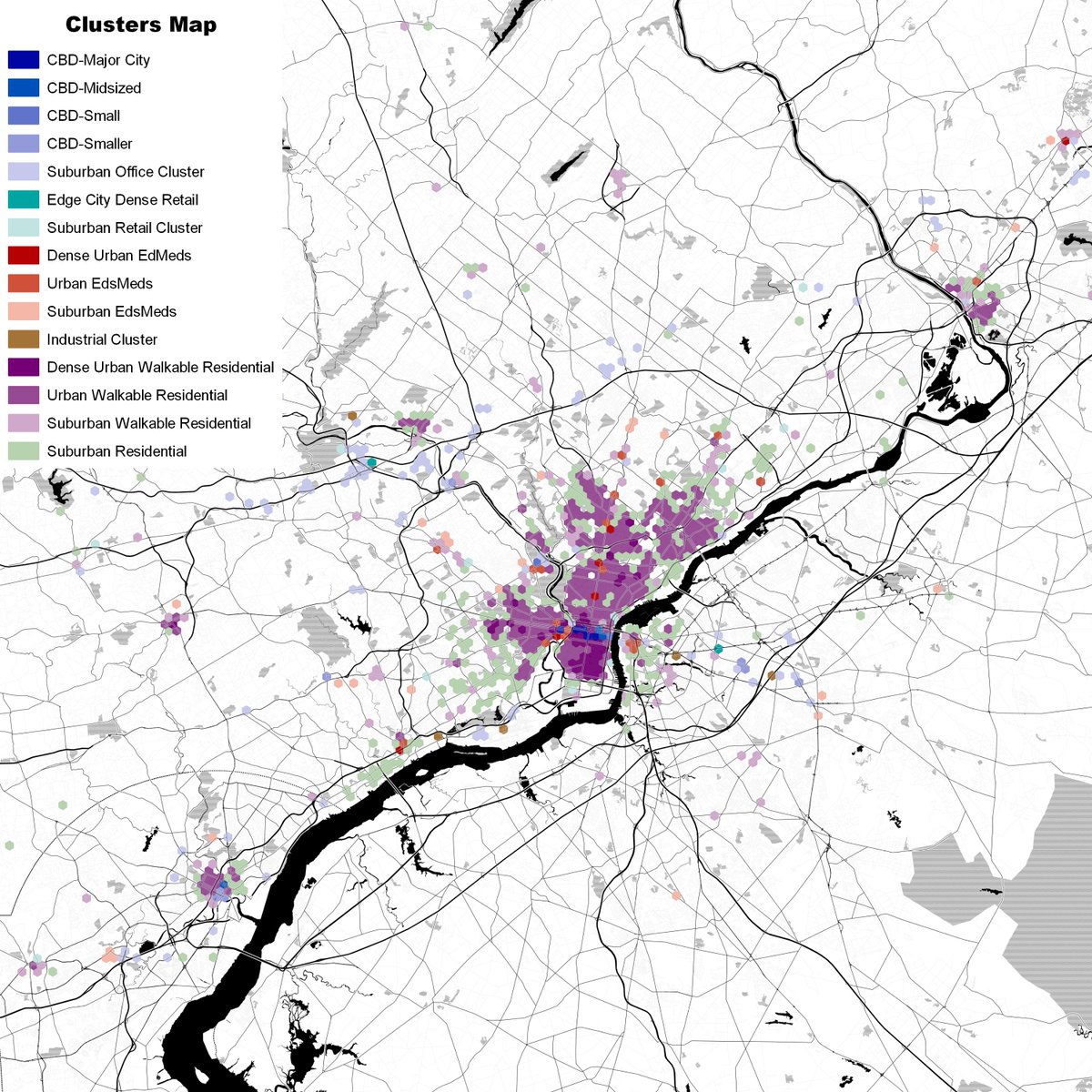
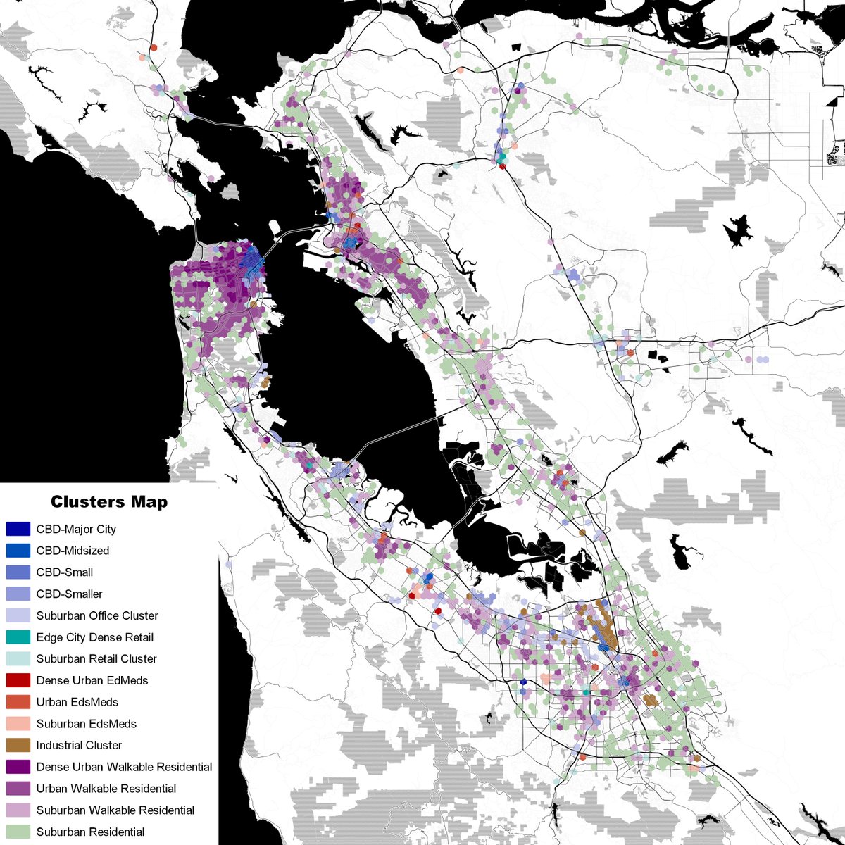
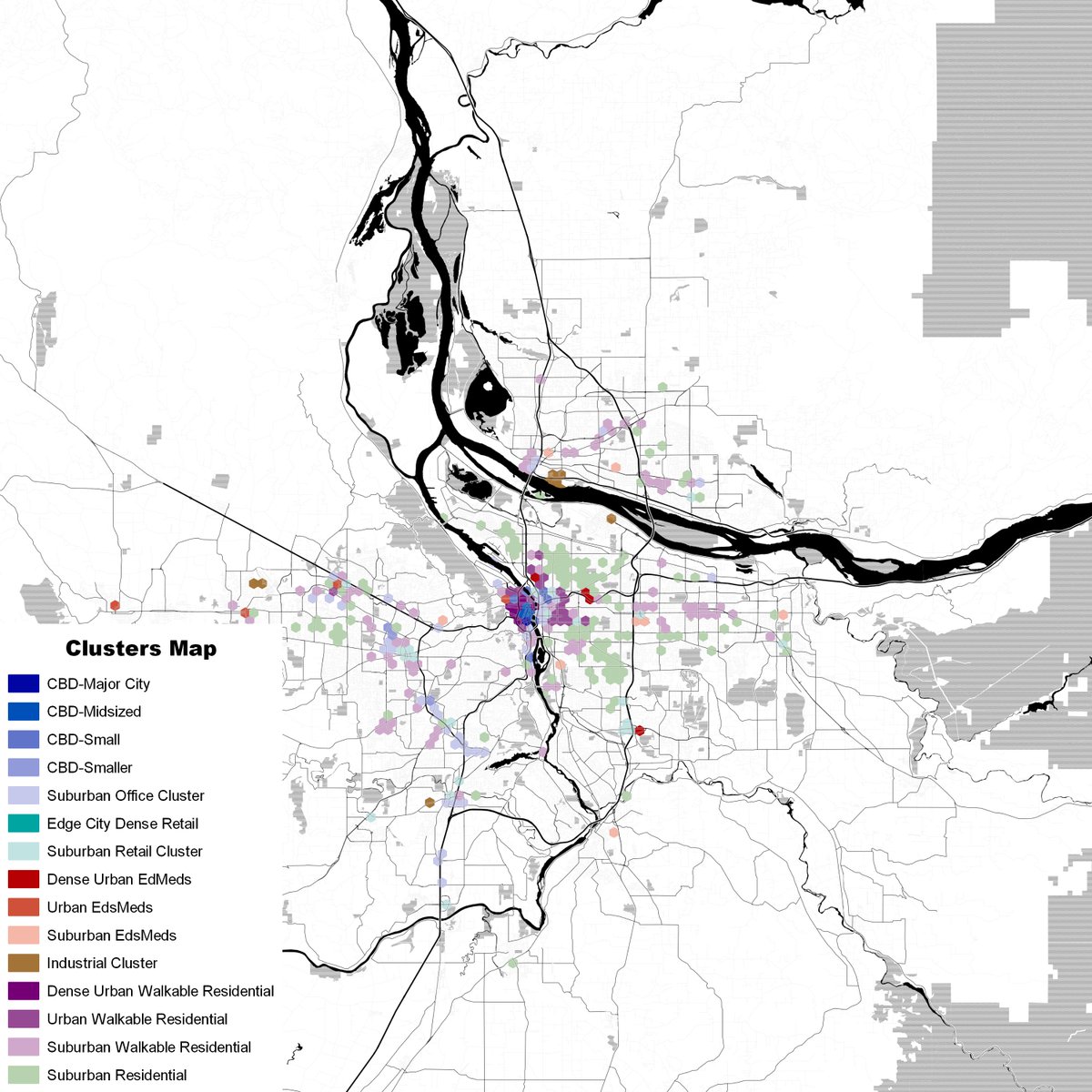
-- "Cluster Types", which only shows the 58 clusters with densities of at least 10,000 activity per square mile coded in types I'll use to typologize metro areas.
-- "Cluster Types", which only shows the 58 clusters with densities of at least 10,000 activity per square mile coded in types I'll use to typologize metro areas.
Note that the "cluster types" maps only show hexes of 10,000 activity units per square mile because this has been suggested as a cut-off of sufficient density for transit.
@foxandcity, @PlanningAutumn, @justupthepike, @lohplaces, @benbeansprout, @skyqrose, @Tallakahath...
@foxandcity, @PlanningAutumn, @justupthepike, @lohplaces, @benbeansprout, @skyqrose, @Tallakahath...
Here's New York. We can see just how much dense city there is, including in some suburbs. Note also that most of Manhattan gets coded as CBD because everywhere else in the country near that density is a CBD and my clustering algorithm lumps it in despite use type differences.
There is a lot of Los Angeles, too, but it's a lot less-organized, has much less dense commercial core, and is less continuously at urban densities (which I define as 10,000 activity units per square mile).
And here we have Baltimore-Washington. It's notable how much of West Baltimore is relatively dense but not walkable due to no retail...can anyone say "food apartheid"? Also, I was impressed by how visible Columbia Pike in VA is: I really need to walk it someday.
Northern Virginia's edge cities are very visible on the DC map. Now have a look at Atlanta. It's disturbing just how little "city" there is there once you limit it to reasonably dense places...but there is a decent amount of commercial density in the edge cities to the north.
Honestly, I'm not sure this view of Central Connecticut has much less "city" than Atlanta. cc @PlanningAutumn and @ColinVParker
Boston and---surprisingly to me, Providence---have rather more in the way of urban cores, though Boston's ring of mill town suburbs that deserve better commuter rail service are mostly off the map.
Philadelphia is another example of a decent amount of walkable residential. But it clearly has a lot less commercial core than DC or Boston, and helps me understand why it's often classified as having a "diffuse" development type. More LA-like than I'd realized.
@5thSq
@5thSq
San Francisco is interesting because it gives us a look at actual pre-War urbanism in San Francisco/Oakland, and then sprawl masquerading as the second largest city in California to the south.
Heading north, we have Portland, which does well for a city of its size, but has a lot less in the way of walkable urbanism than you'd think given its reputation. cc @surlyurbanist, who I should have tagged earlier i this thread.
Anyway, I hope you all enjoyed these maps! Comments and suggestions are welcome.

 Read on Twitter