Almost a year ago, I wrote about the complexity of #COVID19 case data. Today, the world is watching the cumulative dose curves of vaccinations.
New to vaccine data? Here are 9 considerations to be a more critical reader of vaccine trackers. #dataviz https://medium.com/nightingale/demystifying-vaccination-metrics-cd0a29251dd2
New to vaccine data? Here are 9 considerations to be a more critical reader of vaccine trackers. #dataviz https://medium.com/nightingale/demystifying-vaccination-metrics-cd0a29251dd2
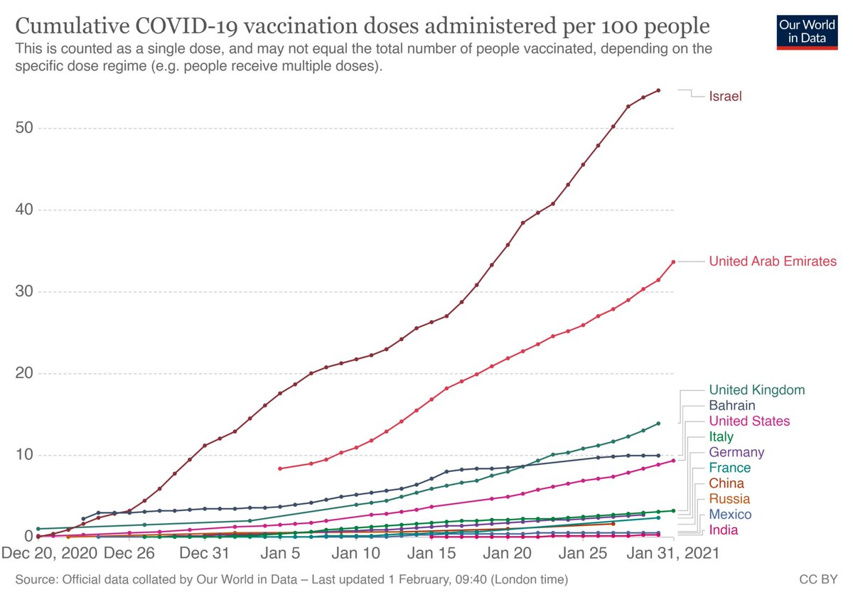
The quickest charts to emerge counted doses delivered. As with any cumulative chart, we expect the line to just keep climbing. That's why we need other metrics about vaccine supply & administration to understand the vaccine rollout. Chart: @OurWorldInData https://medium.com/nightingale/demystifying-vaccination-metrics-cd0a29251dd2
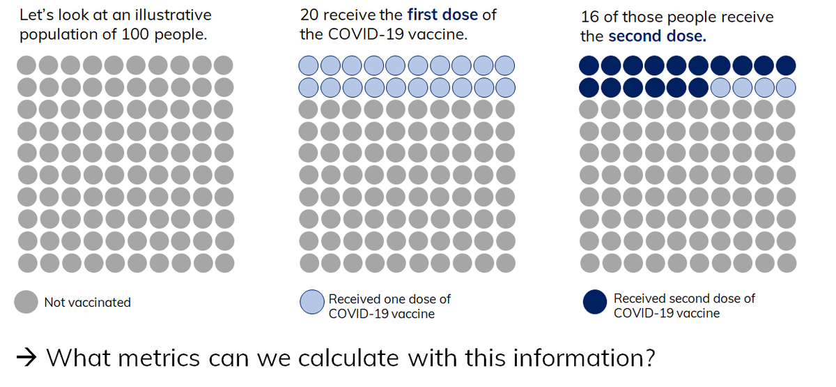
With two dose vaccine regimens, doses are not the same as people fully immunized. Looking at an illustrative population, we can think through what metrics we can calculate with doses administered data for the approved two dose regimens. https://medium.com/nightingale/demystifying-vaccination-metrics-cd0a29251dd2
We also need to understand % fully vaccinated in a population. Why? We compare coverage against estimates for COVID-19 herd immunity thresholds, which are likely to inform re-opening decisions. More on thresholds & uncertainty: https://www.nytimes.com/2020/12/24/health/herd-immunity-covid-coronavirus.html
https://medium.com/nightingale/demystifying-vaccination-metrics-cd0a29251dd2
https://medium.com/nightingale/demystifying-vaccination-metrics-cd0a29251dd2
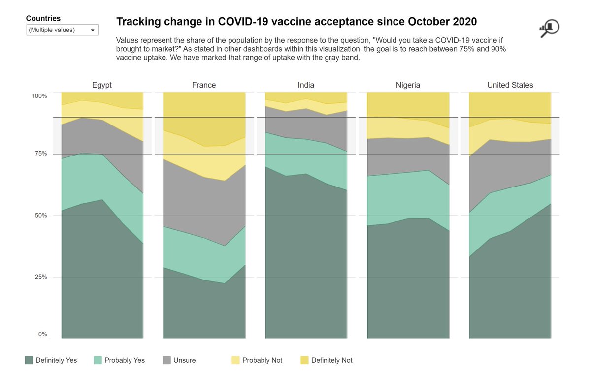
Herd immunity threshold estimates are helpful as benchmarks not just for coverage, but also for vaccine acceptance data. Note the *band* rather than a reference line, indicating the range of herd immunity estimates.
Chart from @JohnsHopkinsCCP
https://medium.com/nightingale/demystifying-vaccination-metrics-cd0a29251dd2
Chart from @JohnsHopkinsCCP
https://medium.com/nightingale/demystifying-vaccination-metrics-cd0a29251dd2
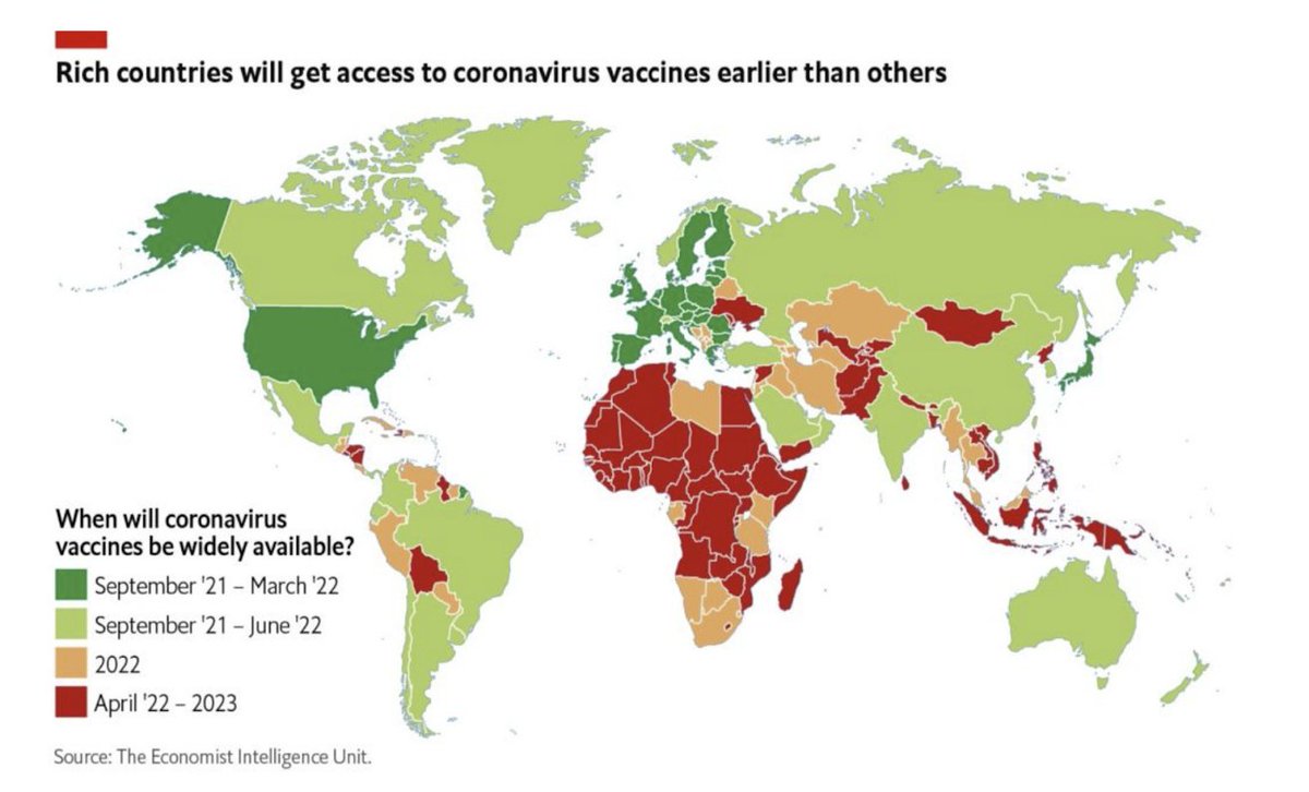
Issues of equity are global: it could be 2022 or 2023 before some countries have widespread access to COVID19 vaccines. This raises ethical issues with wealthy countries buying up supply, and is short sighted in a globally connected society.
https://medium.com/nightingale/demystifying-vaccination-metrics-cd0a29251dd2
https://medium.com/nightingale/demystifying-vaccination-metrics-cd0a29251dd2
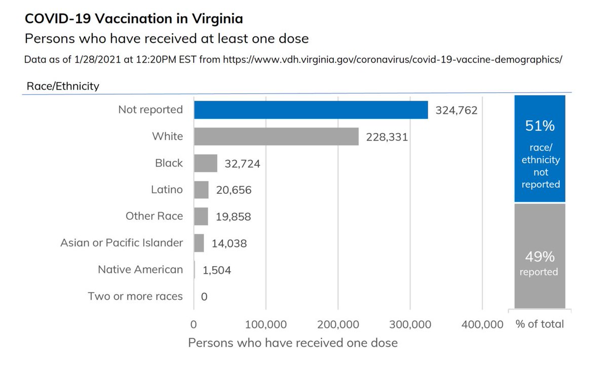
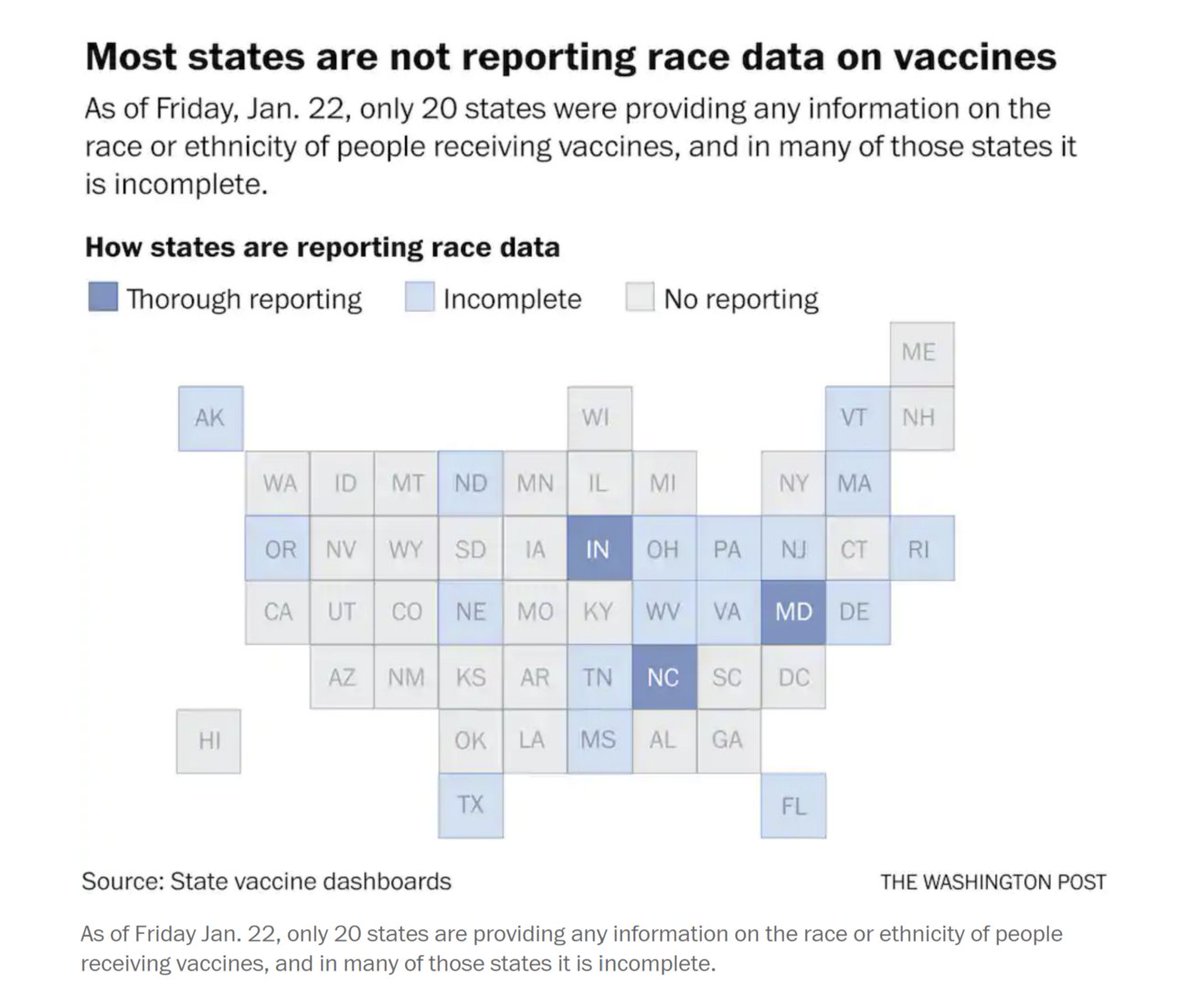
In the US, reporting on people vaccinated by race is limited. Less than half of states are reporting race disaggregated data, and in many of those states the data is remarkably incomplete.
Tile map from @washingtonpost; Virginia chart data from VA DPH.
https://medium.com/nightingale/demystifying-vaccination-metrics-cd0a29251dd2
Tile map from @washingtonpost; Virginia chart data from VA DPH.
https://medium.com/nightingale/demystifying-vaccination-metrics-cd0a29251dd2
As readers of charts, we should be thoughtful in the information we're consuming. Yes, let's celebrate successes! But let's also demand more complete information on issues of equity, and be curious about intersections of supply and demand metrics. https://medium.com/nightingale/demystifying-vaccination-metrics-cd0a29251dd2
As designers, we must be cautious and thoughtful if tasked with visualizing vaccine data. These numbers will eventually be used to justify reopening & return to work decisions that could have life or death consequences if made prematurely. #vizresponsibly https://medium.com/nightingale/demystifying-vaccination-metrics-cd0a29251dd2

 Read on Twitter