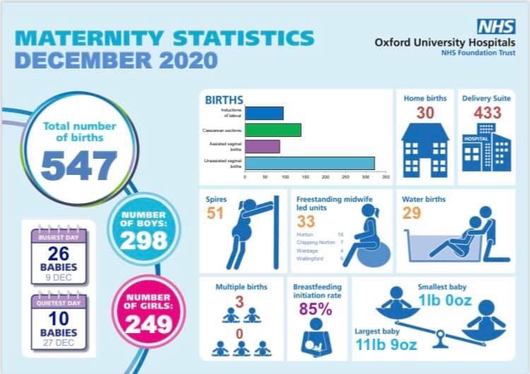
This #maternity stats infographic has been shared by @TeamOUHMat @OUHospitals & @OxfordshireM as OUH Trust has joined numerous others in producing these each month. This thread asks some Qs of such infographics & discusses issues that they reflect within maternity services.1/19
The #maternityinfographic from @TeamOUHMat is incredibly misleading as it ‘forgets’ to mention that women can’t opt for an elective #caesarean in Oxfordshire. There is no mention that #womensrights to an ELCS are actively destroyed in Oxfordshire. #humanrights 2/19
Without making this clear on such communications, parents-to-be are misinformed & the caesarean stats provided are misleading. Where’s the no who were declined ELCS? Where’s the no forced to birth in another county? 3/19
Other than misinforming the public, what is the real purpose of these stats? Is it another opportunity to reinforce ‘natural/normal birth’ ideology? #normalbirth #NoSuchThingAsNormalBirth 4/19
How can infographics like this be shared so positively despite the recommendations from @DOckendenLtd’s review of maternity services? We know that the drive to lower #caesareanrates is causing avoidable harm yet the option for a CS is denied to women in Oxfordshire. 5/19
We know that Ockenden’s Review highlighted the horrific results of women pressured to attempt vaginal births after caesarean (VBAC)- horrific outcomes that were AVOIDABLE. 6/19
We know that mums and babies are harmed when the ‘natural/normal birth’ rhetoric ensures women are denied access to CS, as repeatedly highlighted by Ockenden. Yet here we have a ‘celebration’ of home births/water births & no mention of withholding access to CS! 7/19
So what is the real purpose of these infographics? Maternity depts able to show off their low CS rates/ high homebirth rates? But what about the data parents-to-be need to see- how many transfers from MLU? Birth injuries? How many home births were planned? 8/19
Were families happy with their experience? How many families had to use the bereavement service? How many families were recommended to use the Birth Afterthoughts service? How many families made complaints? These infographics look pretty but where’s the data that matters? 9/19
(And on the note of looking appealing- why the pink/blue gender tosh? Can we not reinforce gender stereotypes at every opportunity  ). 10/19
 ). 10/19
Whoever designed/signed off this infographic needs to revisit the Ockenden Review & consider the messaging, & the way women are patronised by the portrayal of data like this. We deserve to be fully informed. Mothers & babies are being unavoidably harmed & still... 11/19
...there is this eagerness to celebrate ‘normal/natural birth’ at any cost & for pats on the back to be given for low CS rates/ high BF rates with no acknowledgement of injuries or harm that may be happening as a result. Until then the reflective learning that is...12/19
...so needed in maternity services will not happen- and the worst part is that that is, sadly, intentional. If further evidence is needed of this in action it can be seen in comments on other maternity services infographics- praise for low CS rates & increased home births. 13/19
Keenly aware that the poor quality of antenatal educ is in part to blame- programmes (e.g. NCT) that place ‘natural/normal birth’ on a pedestal & encourage mothers to write ‘birth plans’ with that goal in mind & to avoid intervention at any cost need to be held accountable. 14/19
What does that do to the mental/physical health of the large % of mothers who then go on to need medical support? Why are antenatal/maternity services so ableist that they prioritise the ‘experience’ of those who don’t experience any complications? 15/19
So ableist that those who need interventions don’t get to have a high quality environment to birth in, but, instead, are offered the worst environment of the delivery suite? Just compare Spires to Delivery Suite! Disgusting that SES & health can...16/19
...be the deciding factors on the quality of environment intentionally made available to you during a life-changing experience & when you are, arguably, most vulnerable. 17/19
So, yes, these infographics may well look pretty & might be viewed as an achievement for whoever knocked up the template & added the data but #maternityservices please acknowledge the impact of prioritising/celebrating mode of birth. It’s causing #intentionalharm. 18/19
@NadineMontgmery @JamesTitcombe @BirthTrauma @catherineroyuk @RuthAnnHarpur @BTCanada @CfSaferBirths @NatMatVoicesorg you might be interested in this thread re mat infographics & the issues related to their data choices. #Birthrightsarehumanrights #maternitysafetymatters 19/19
@PNDandMe would be interested in your thoughts as to whether any of the issues discussed feature regularly when mothers discuss their experiences with postnatal depression.

 Read on Twitter


