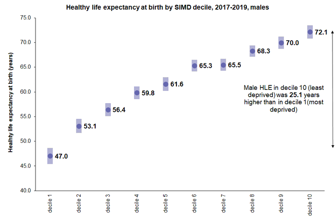
Earlier this week @NatRecordsScot published new estimates of Healthy Life Expectancy for Scotland for 2017-19 showing huge inequality between areas.
Which reminded me to have a look at the most recent (2016-18) estimates for the whole of the UK that @ONS publish.
THREAD/
Which reminded me to have a look at the most recent (2016-18) estimates for the whole of the UK that @ONS publish.
THREAD/
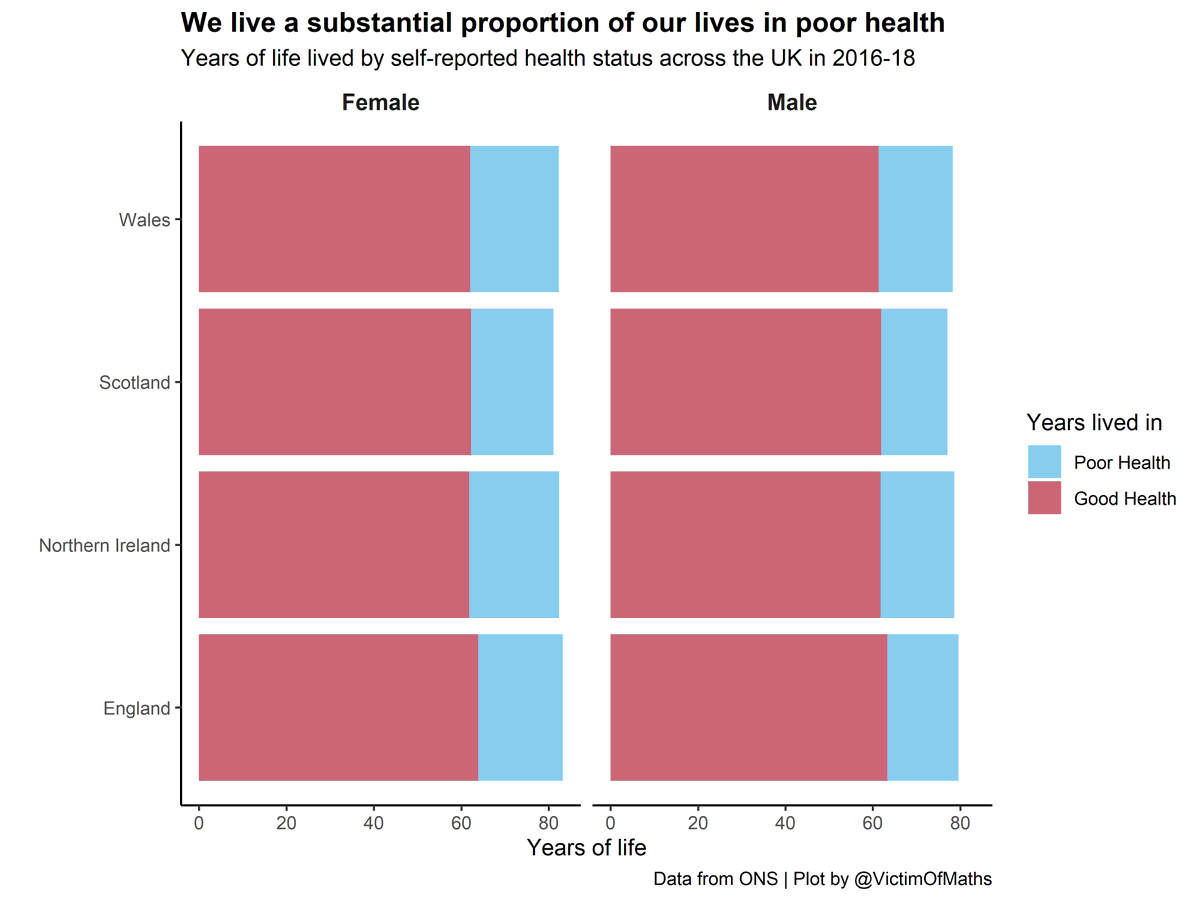
We calculate Healthy Life Expectancy (HLE) as the number of years of life lived, on average, in what we self-describe as 'good' or 'very good' health. We can compare it to overall Live Expectancy (LE) to get a measure of how many years we live in poor health.
On average in the UK, men spend 16.2 years of their lives in poor health, compared to 19.3 years for women. So although women live around 3 years longer, those additional years are generally spend in poorer health.
This plot also shows that there isn't a *huge* amount of variation in LE and HLE between the UK nations. LE is slightly lower for both men and women in Scotland and HLE is slightly higher in England.
But we can see *much* bigger differences when we compare Local Authorities.
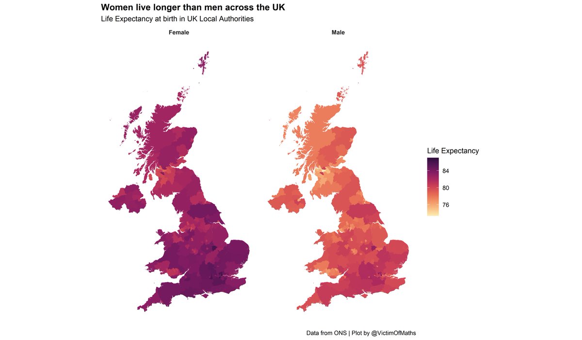
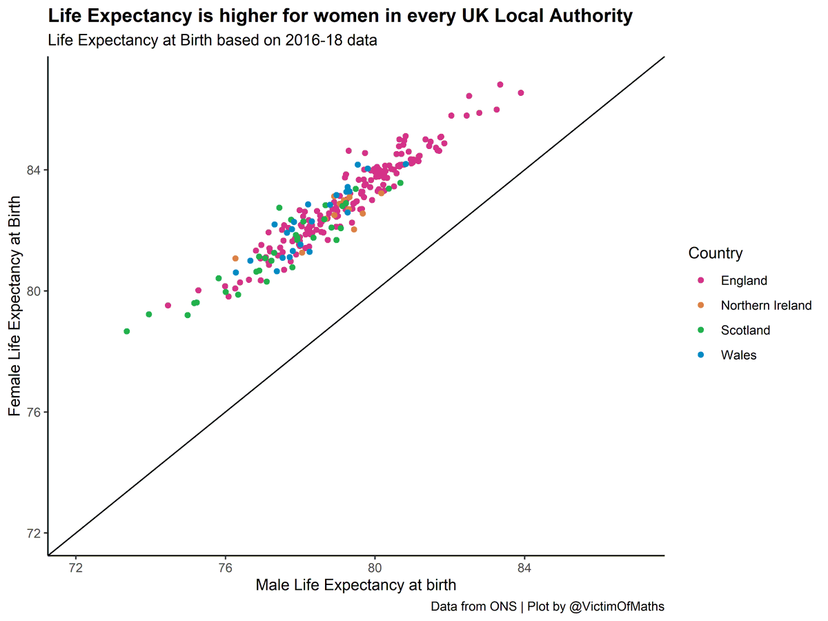
LE for women varies between 78.7 in Glasgow City and 87.0 in Camden. For men the range is between 73.4 in Glasgow City and 83.9 in Westminster. These are big differences.
LE for women varies between 78.7 in Glasgow City and 87.0 in Camden. For men the range is between 73.4 in Glasgow City and 83.9 in Westminster. These are big differences.
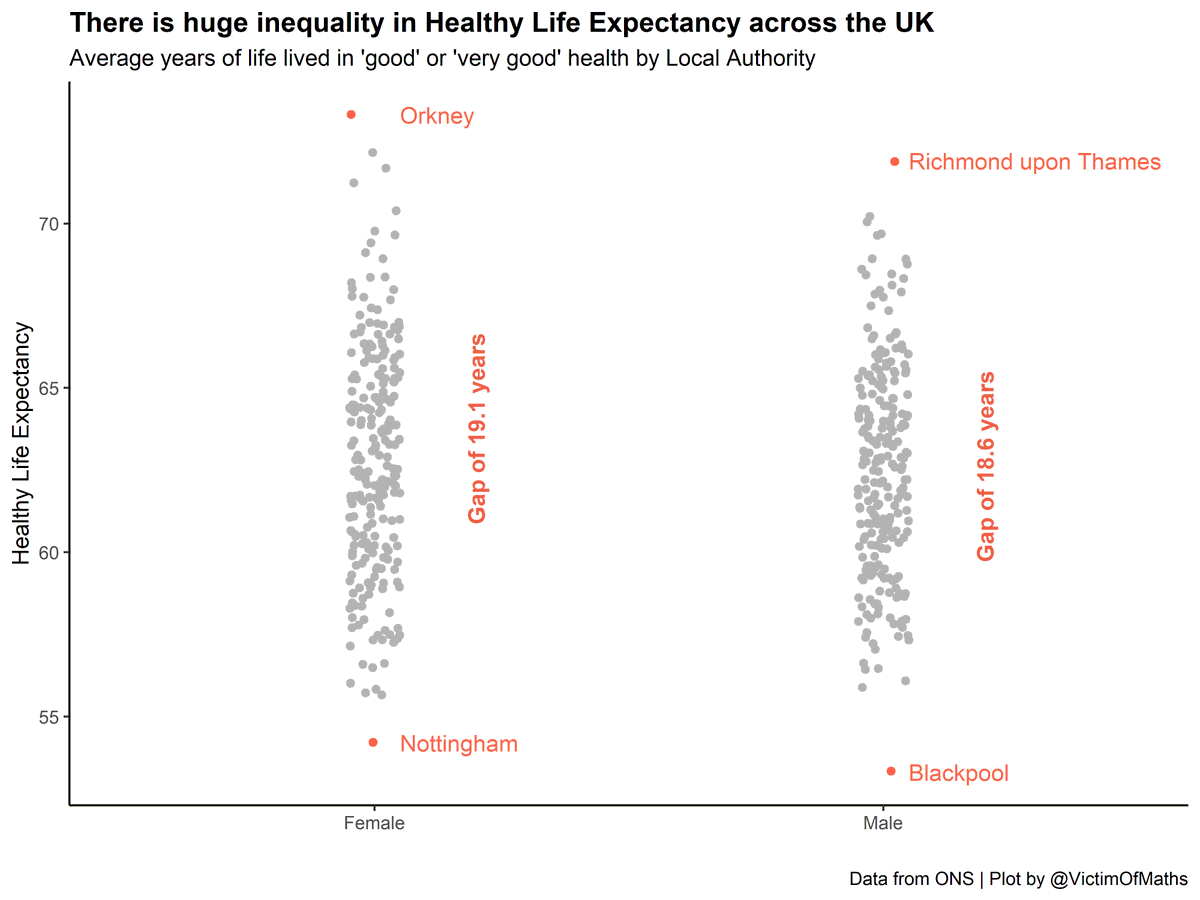
The gap in Healthy Life Expectancy between the best and worst Local Authorities in the UK is ~ 19 years for both men and women.
Inequality in HLE is much greater than inequality in LE. So if we only focus on inequalities in how long people live, we are failing to capture the even deeper inequalities in the quality of that life.
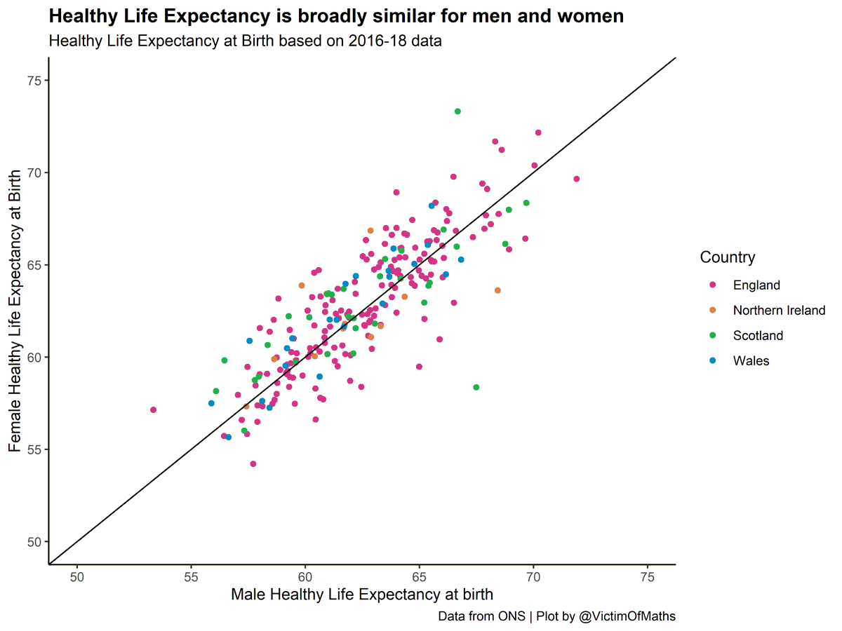
It's also striking from those maps that the gender divide in LE doesn't seem to be replicated for HLE.
I wondered if that was just an artefact of the differences in the ranges of the scales, but it isn't. HLE really is broadly similar for men and women.
I wondered if that was just an artefact of the differences in the ranges of the scales, but it isn't. HLE really is broadly similar for men and women.
One final point. The Scottish figures I tweeted yesterday seem to suggest even greater inequality than I've highlighted here, with a gap of 25.1 years between the most and least deprived deciles in Scotland...
This is because deprivation is very strongly associated with health, and I'm comparing Local Authorities, which themselves will include areas of high and low deprivation. So if you zoom in on the most and least deprived areas in the country and compare them...
...it's not surprise you find even greater inequality. Although the magnitude of that inequality is still absolutely shocking.
R code for these plots is here:
https://github.com/VictimOfMaths/Maps/blob/master/HLEbyLAv2.R
The ONS data is here:
https://www.ons.gov.uk/peoplepopulationandcommunity/healthandsocialcare/healthandlifeexpectancies/datasets/healthstatelifeexpectancyatbirthandatage65bylocalareasuk
and the newer NRS figures are here:
https://www.nrscotland.gov.uk/statistics-and-data/statistics/statistics-by-theme/life-expectancy/healthy-life-expectancy-in-scotland/2017-2019

 Read on Twitter