Have you ever wondered which country has the lowest carbon footprint for (cattle) milk production? We just published a report looking at that!
The report is available here: https://www.dairynz.co.nz/media/5794059/report_final.pdf
A (long but worth it) thread below:
The report is available here: https://www.dairynz.co.nz/media/5794059/report_final.pdf
A (long but worth it) thread below:
Life Cycle Assessment (LCA) studies are hard to compare. Researchers have different goals for each study, science and methodologies are always evolving. Furthermore, LCA studies are time-consuming, so it is rare to have country-level approaches.
How to make a robust and reliable comparison?
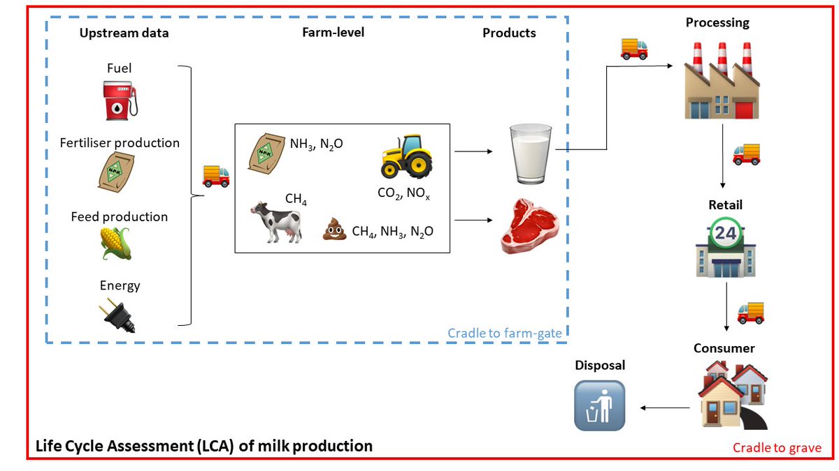
First things first: the boundary selected was “cradle-to-farm-gate” (the blue-dashed one in the Figure). The main reason is that most greenhouse gas (GHG) emissions (from 75 to 85% of total) are found at this boundary.
First things first: the boundary selected was “cradle-to-farm-gate” (the blue-dashed one in the Figure). The main reason is that most greenhouse gas (GHG) emissions (from 75 to 85% of total) are found at this boundary.
About being representative: most LCA studies are done comparing two different managements, as e.g. organic vs conventional milk, and those are usually done with few farms that don’t represent the footprint of the country.
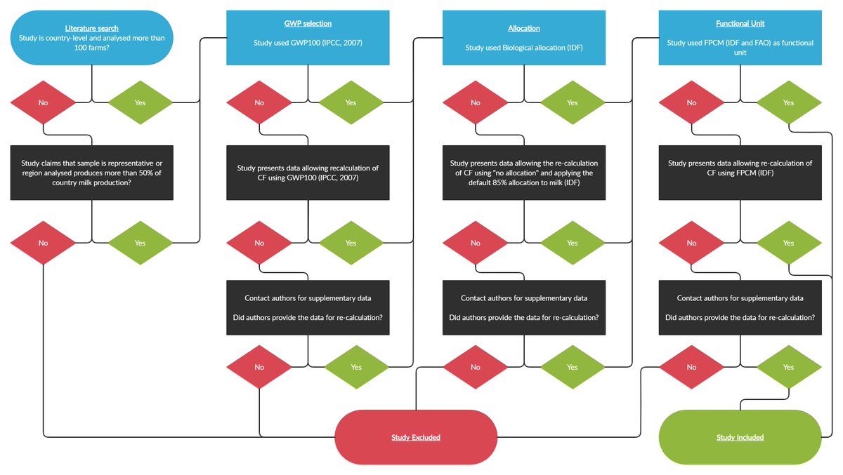
We’ve selected peer-reviewed studies that performed LCAs at country or region level, and were (or claimed!!) representative of the countries milk production. That was the first criteria, but we also had to look at 3 critical factors
Allocation: dairy farms produce both milk and beef (or animal to be sold), so emissions need to be allocated between those two products. We chose the biophysical allocation.
Functional unit: A footprint is the total emission of greenhouse gases divided by something (the functional unit!). In the case of milk, it can be litres, kg, etc. We chose fat-and-protein-corrected-milk (FPCM).
Global Warming Potential (GWP): this is the conventional method to convert different GHG to one standard metric (yes, there are discussions about it…we will get there!). We selected the GWP values from 2007 (or AR4 if you know what I mean).
But what if the study used a different option than the one selected? Then we searched the paper for data that allowed us to recalculate the footprint using the option chosen. If not data was available, we got in touch with the authors, asking for supplementary data.
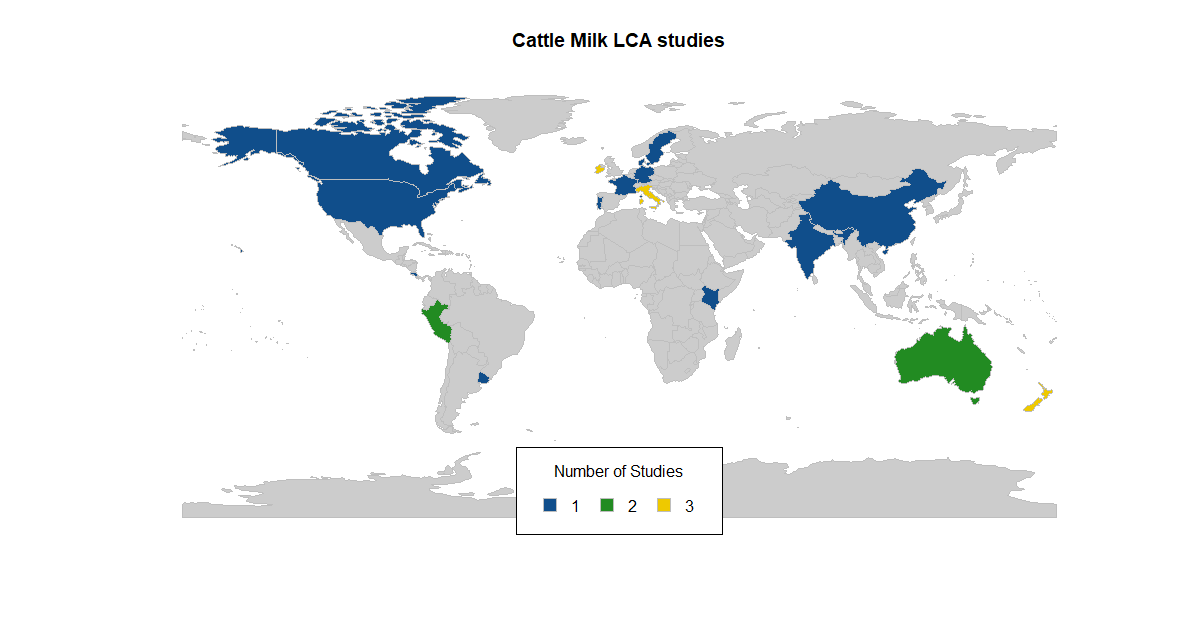
Our initial search resulted in 86 papers, and after going through the flow diagram, the final result was 24 papers, with a fair distribution over the world, with one at least one paper per continent.
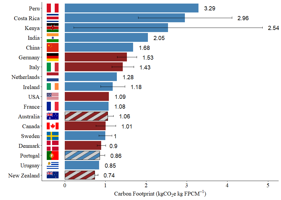
Here is the ranking, based on the data available. A lot to unpack in this Figure! First, you see the ranking of the countries, with NZ showing the lowest footprint. Developing countries had higher footprints.
Second, there are blue and red bars. When recalculating the footprints, we noticed that the allocation had a strong effect. The red bars represent studies that used the biophysical allocation (so we didn't have to perform recalculations!)
The third thing in the Figure is that Portugal, Australia and NZ are marked with patterns. This is because those countries are using their National Inventories methodologies and (mostly) specific emission factors. Why is that important?
Emission factors are coefficients that allow us to transform activity data in emissions. There are default factors, but if you have region-specific available, you are encouraged to use it! So what happens when you use the default factors?
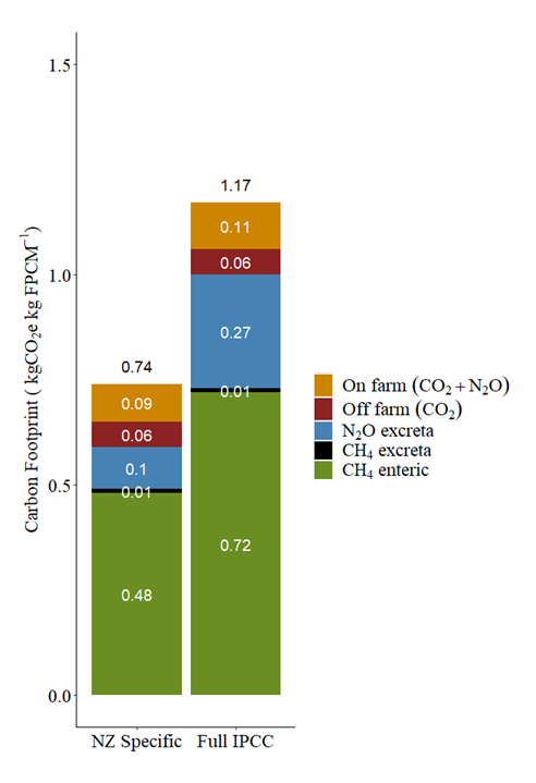
To illustrate, we’ve recalculated the NZ footprint using only default factors, and the difference is clear, especially for emissions of nitrous oxide (N2O) but also for methane (CH4).
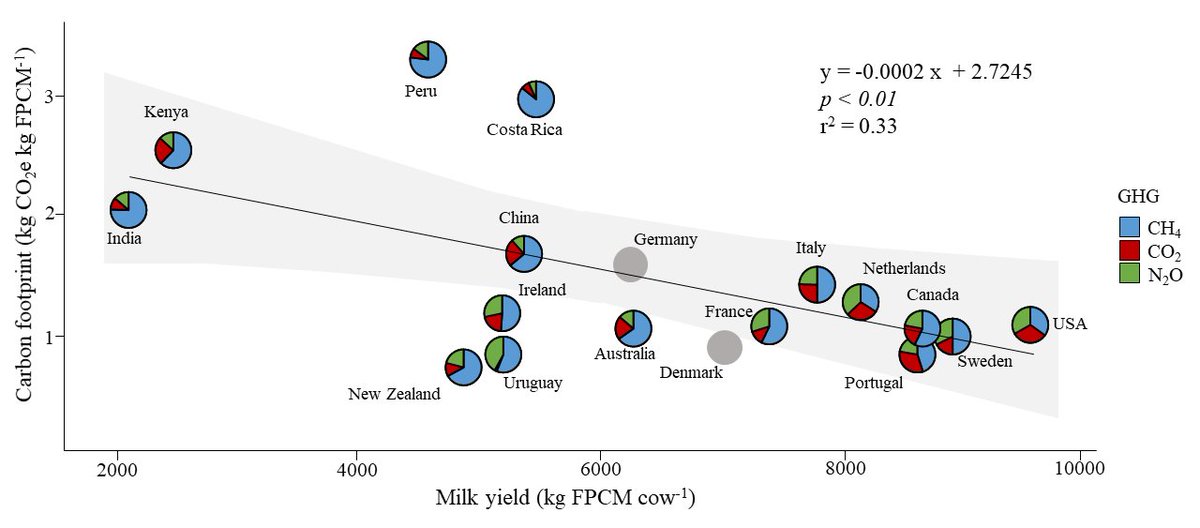
The last important part is the GHG profile, i.e., the share (or %) of each GHG for the final footprint. This is important given the new metrics being proposed recently, especially giving less weight to CH4.
So here it is (what I like to call) the scatter-pie plot. Basically a scatterplot in steroids, showing the breakdown of the footprint for each GHG. Since it is important, I will take you step-by-step:
This group in the corner has a low footprint and high milk production. They have in common the winter and the fact that animals have to remain indoors, increasing CO2 emissions from feed and N2O emissions from manure management.
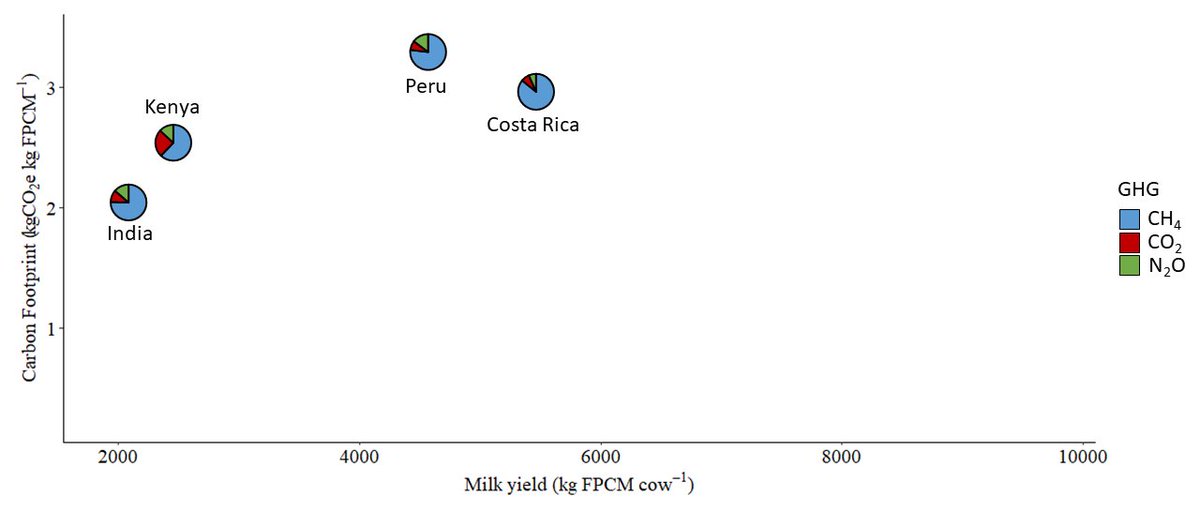
We see mainly developing countries on the other side of the spectrum, with a high footprint and low to average milk production. But the difference in the share of GHG is remarkable. CH4 is the main GHG, accounting for 75 to 85% of the total. Pasture-based is the key-word here.
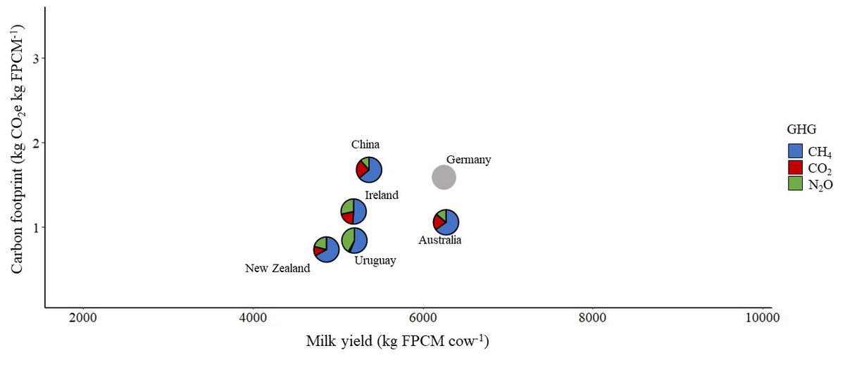
Finally, the group with low footprint and average production. NZ, Australia, Uruguay and Ireland are well known for their quality producing milk. They show a good profile with CH4 representing 65 to 75% of the total. Also pasture-based, but more efficient!
Summarising: NZ showed the lowest carbon footprint, the allocation method matter, always use region-specific emission factors (if you can!) the GHG profile is important, which is relevant when considering the new metrics being suggested, especially for CH4
We are currently working on the peer-reviewed publication and I will link it here when available!
If you prefer video, here is the presentation recorded summarising the report:

 Read on Twitter