Unsolicited, hopefully helpful, open feedback on @tweetbot v6:
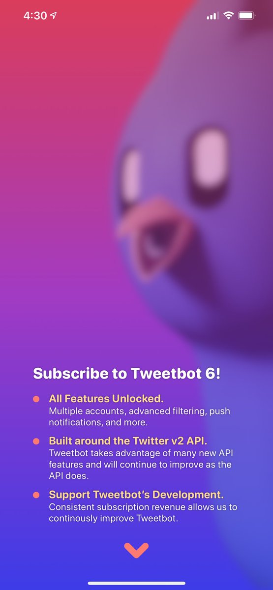
Landing Screen
Gorgeous. But wait... what are the features?
What’s “all features” and “Twitter v2 API”? Which filtering is advanced and what pushes are even possible?
Landing Screen
Gorgeous. But wait... what are the features?
What’s “all features” and “Twitter v2 API”? Which filtering is advanced and what pushes are even possible?
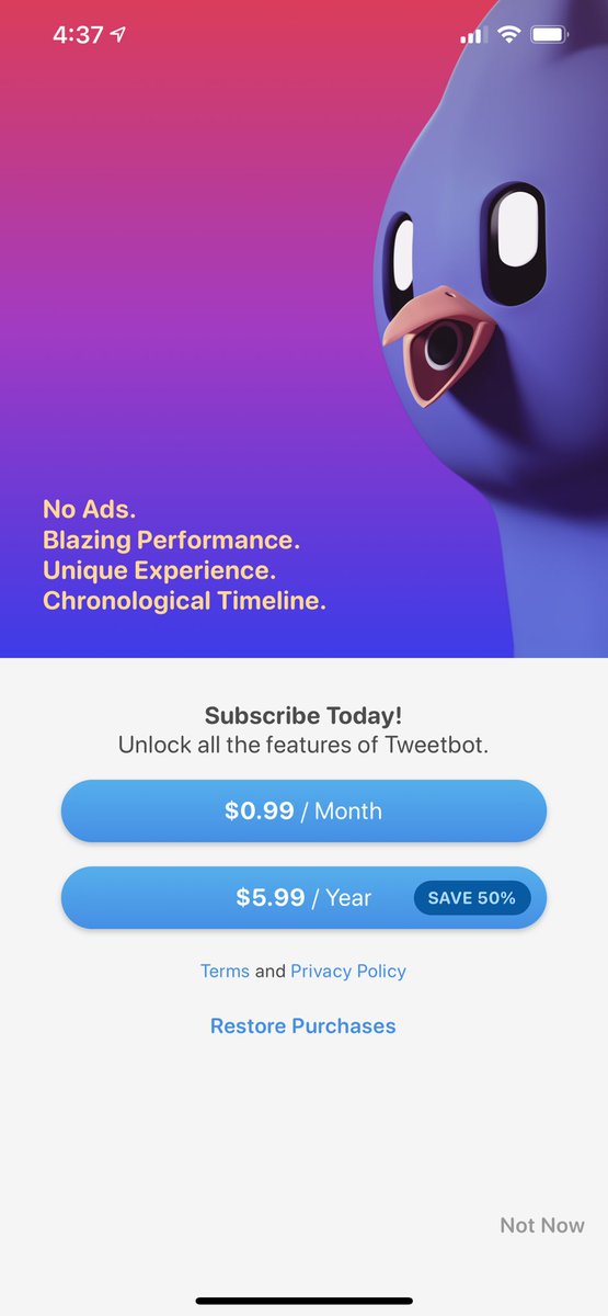
Scrolling down is... alright.
Now I get 4 new value props... hmm. Does that mean I get Ads, if I don’t Subscribe?
Again with “unlock all the feature”...
Don’t love the “Not Now” location, but it’s okay.
Awesome buttons!
Now I get 4 new value props... hmm. Does that mean I get Ads, if I don’t Subscribe?
Again with “unlock all the feature”...

Don’t love the “Not Now” location, but it’s okay.
Awesome buttons!
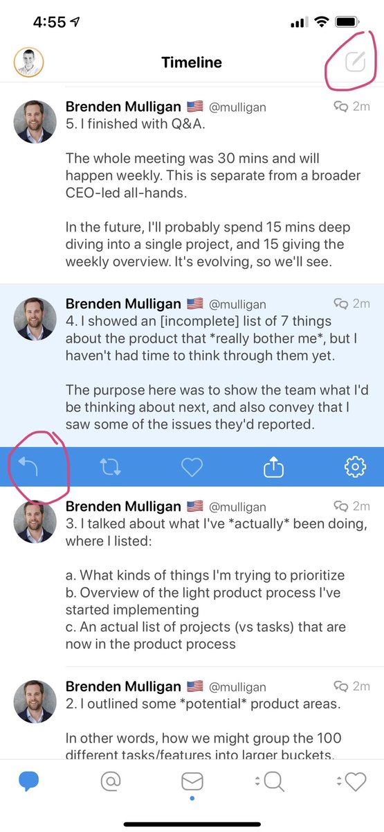
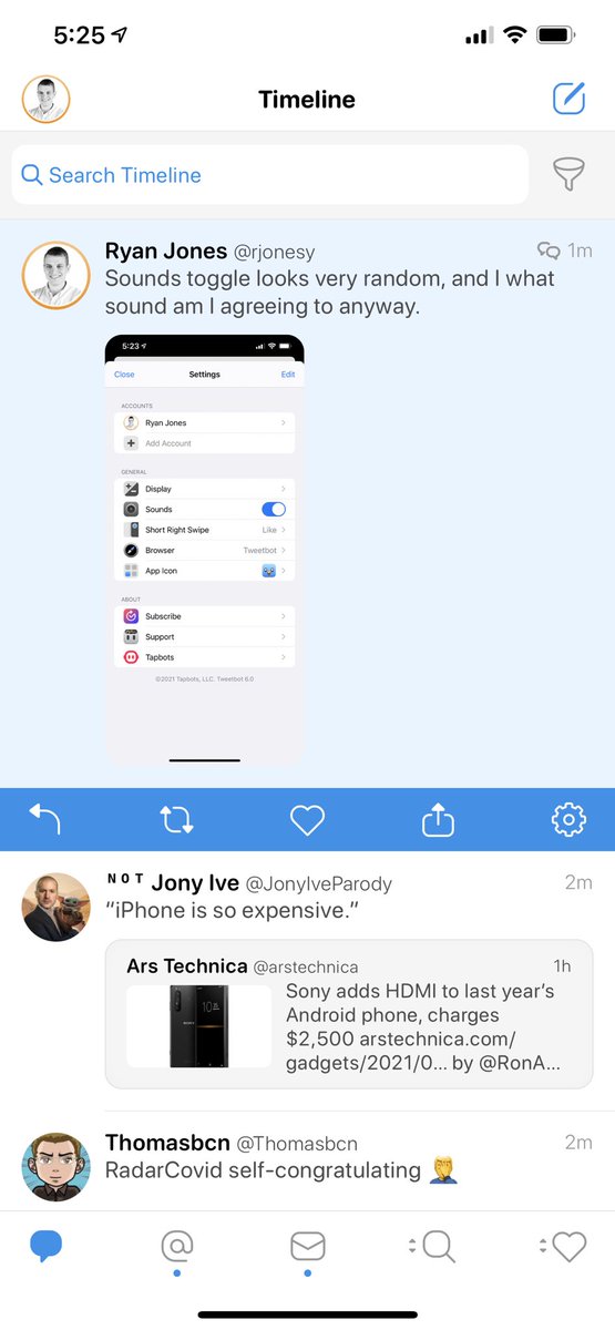
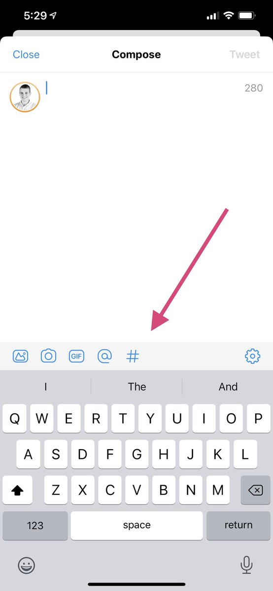
WUT. I can’t TWEET without subscribing!?
Reply and Tweet appear to be disabled. And when I tap them nothing happens.
You mmmmight want that on the paywall. And show something when I tap it to explain.
Reply and Tweet appear to be disabled. And when I tap them nothing happens.
You mmmmight want that on the paywall. And show something when I tap it to explain.
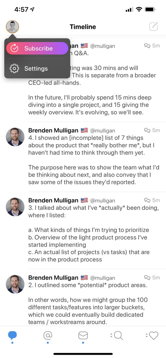
Awesome background gradient on the button, but why is the Subscribe icon a... “go back in time to check” (?) icon.
Oh maybe that’s Restore Purchase. Weird.
Oh maybe that’s Restore Purchase. Weird.
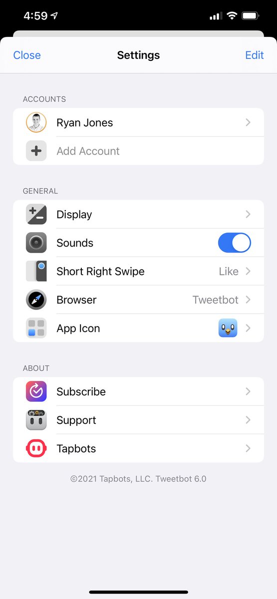
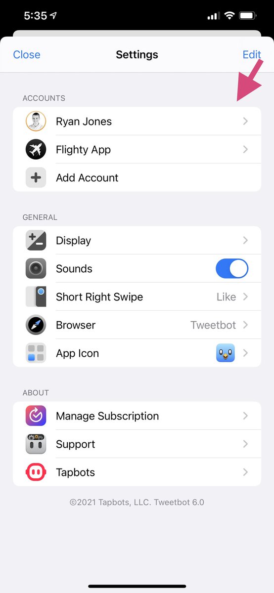
I remember that multiple accounts is a Subscription feature, so I guess paid features are just disabled? And do or show nothing when tapped.
Add a PRO label or at least explain what’s going on.
Add a PRO label or at least explain what’s going on.
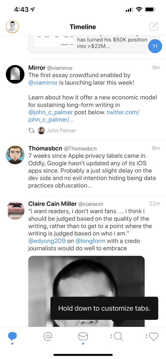
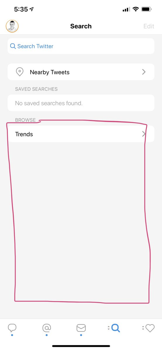
I love the uniqueness of straight edges on the magnifying glass and @ symbol.
But why not on the Tweets icon and a tad bit on the heart? And the tab spacing looks a little off, like it was made in cross platform tools?
But why not on the Tweets icon and a tad bit on the heart? And the tab spacing looks a little off, like it was made in cross platform tools?
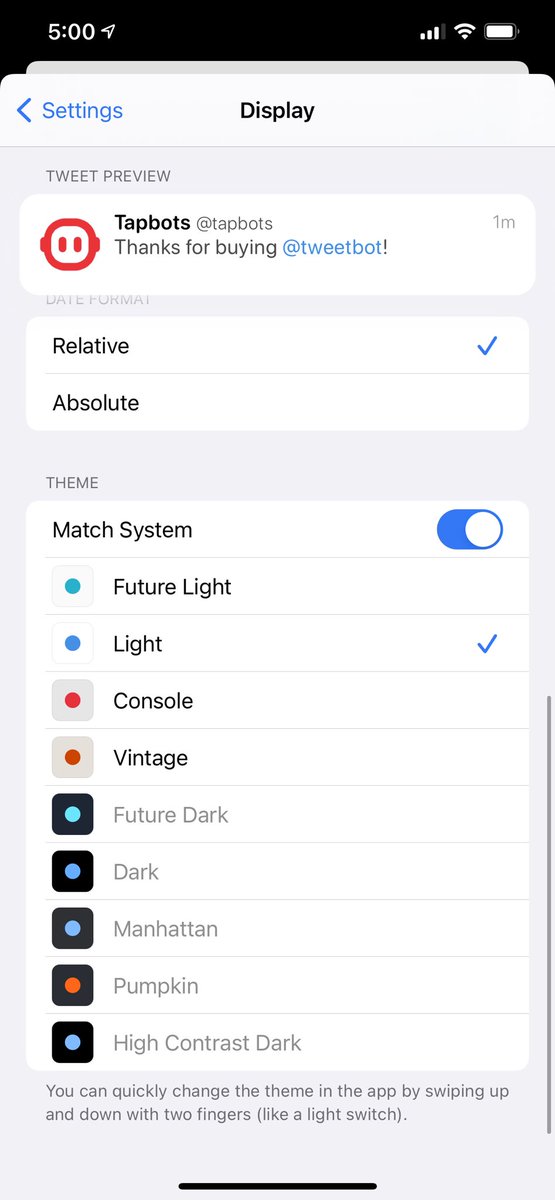
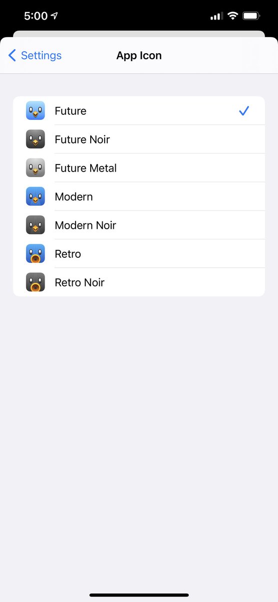
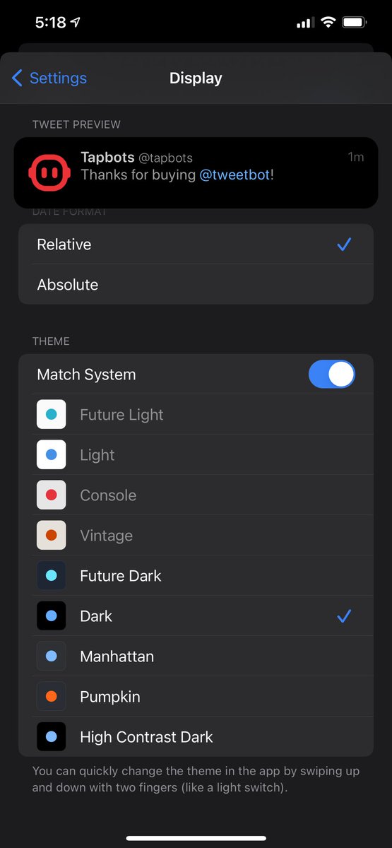
I honestly have no idea how the Theme section works. How can I had match system AND only a light theme selected? 
And apparently dark themes all silently require a Subscription.

And apparently dark themes all silently require a Subscription.
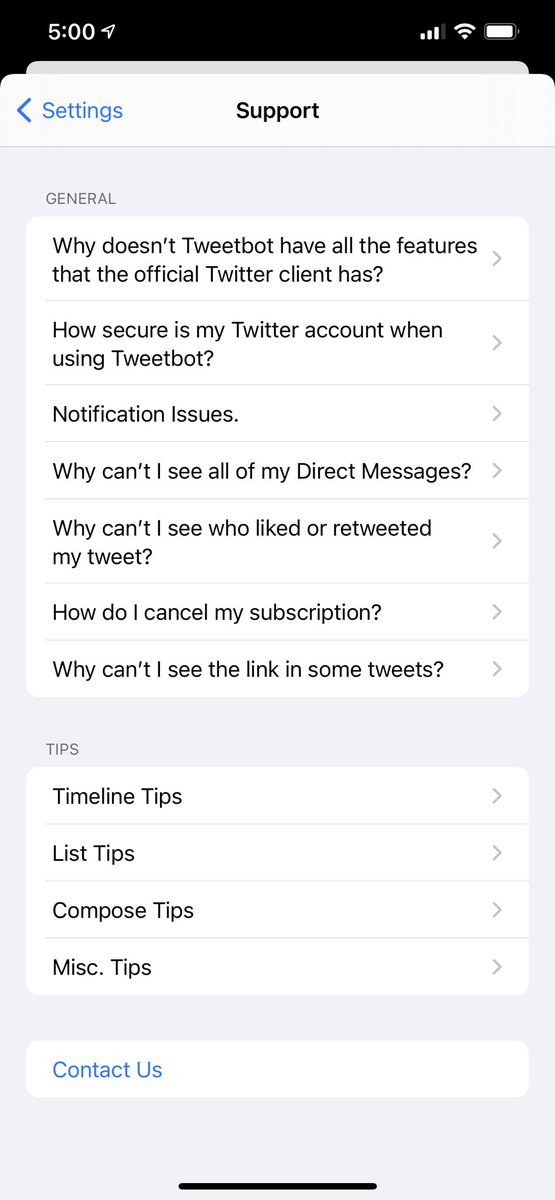
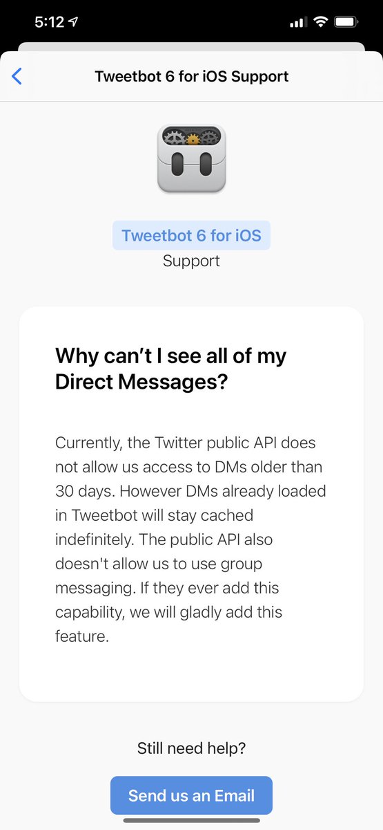
Love the FAQ section - nice clean layout, short titles. I wish the answers opened accordion style but I know that’s harder and the answers look long.
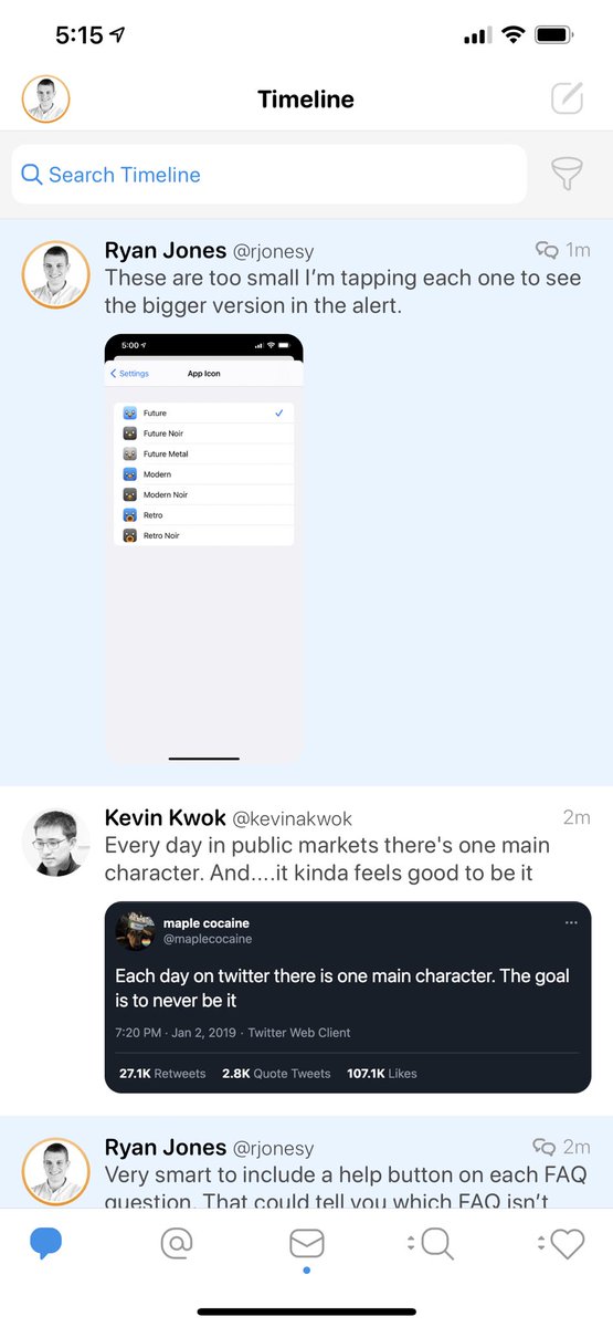
Very smart to include a help button on each FAQ question. That could tell you which FAQ isn’t working well.
I guess all filters are paywalled? It’s gray and again does nothing. I thought it was only “Advanced” ones though.
Ohhhhh wow, to pick a dark theme you have to go into dark mode. 
The footnote doesn’t mention this, it looks identical to paywalled features, and tbf... it’s just not gonna fly.
What about letting us pick every theme, then show it and “Previewing...5,4,...” toast.

The footnote doesn’t mention this, it looks identical to paywalled features, and tbf... it’s just not gonna fly.
What about letting us pick every theme, then show it and “Previewing...5,4,...” toast.
Wait wut, there’s a 7-Day Free Trial? That’s never mentioned.
Hm, I’m starting to think this was rushed out.
Hm, I’m starting to think this was rushed out.
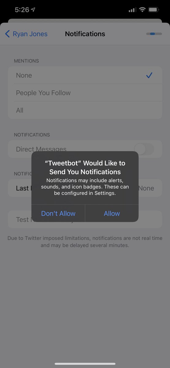
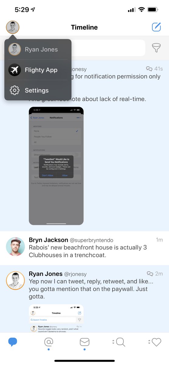
Great job asking for notification permission only when I open it.
And great footnote about lack of real-time.
And great footnote about lack of real-time.
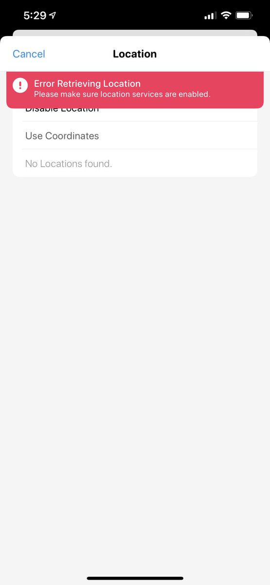
Deselecting “Precise Location” Insta-crashed the location permission box and shows this error.
(Again, seems the app was rushed out. Which is fine, there are business reasons for that. But you gotta take your lumps if you do.)
(Again, seems the app was rushed out. Which is fine, there are business reasons for that. But you gotta take your lumps if you do.)

 Read on Twitter