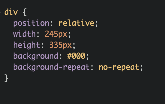
Inspired by @Chrizzly42 and his CSS image, I created another single-div illustration! I will explain to you how to do this. 
Thread #100DaysOfCode #CSS #CodeNewbies 1/11

Thread
 #100DaysOfCode #CSS #CodeNewbies 1/11
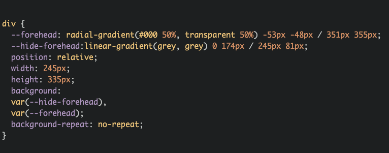
First of all, we need to create a forehead. It's a radial-gradient a little bit bigger than our boundaries. 3/11
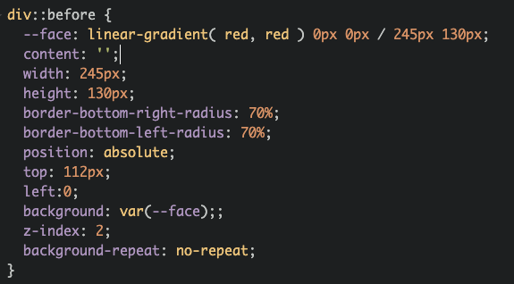
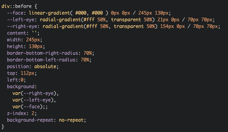
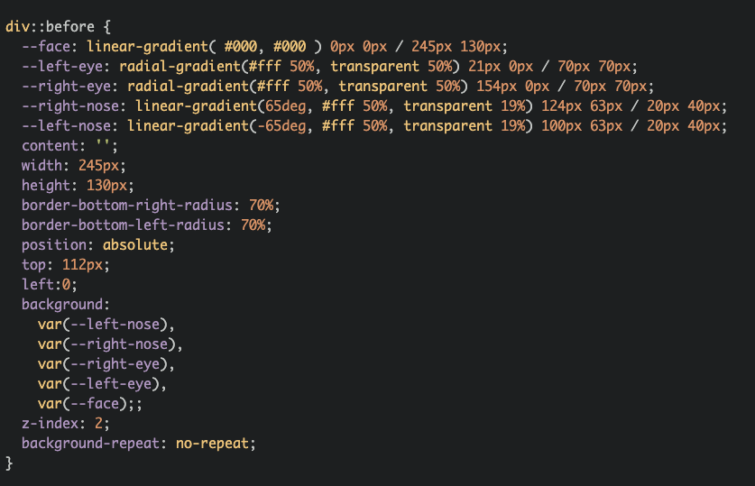
Let's create a ::before element for a face. A simple rectangle with border-radius. Don't forget to change the colour to black.  5/11
5/11
 5/11
5/11
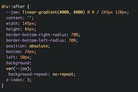
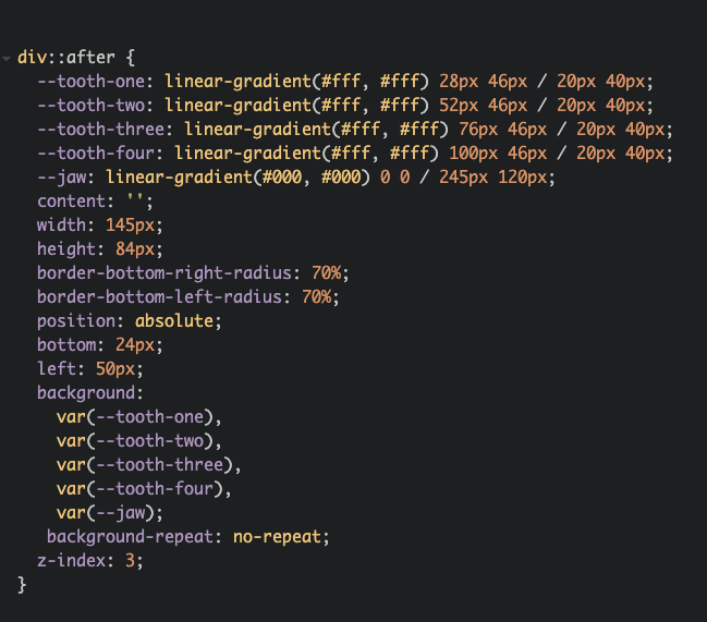
Almost over! Now I created ::after pseudoelement to make a jaw. Another rectangle with border-radius 8/11
And that's it! Our skull is finished! If you want to read more about single-div images, check out my article:
https://www.albertwalicki.com/fall-in-love-with-single-div-images
Here I'm creating a simple house and explain how to create background-triangles.
10/11
https://www.albertwalicki.com/fall-in-love-with-single-div-images
Here I'm creating a simple house and explain how to create background-triangles.
10/11

 Read on Twitter









 by
by 

