Okay, I've seen this thread come up a few times and it's driving me nuts.
It's been confirmed as a deliberate design decision, and as a graphic designer I could have told you that from the start.
Let's talk about this a little bit, shall we? https://twitter.com/brennanoonan/status/1353238344927383552
It's been confirmed as a deliberate design decision, and as a graphic designer I could have told you that from the start.
Let's talk about this a little bit, shall we? https://twitter.com/brennanoonan/status/1353238344927383552
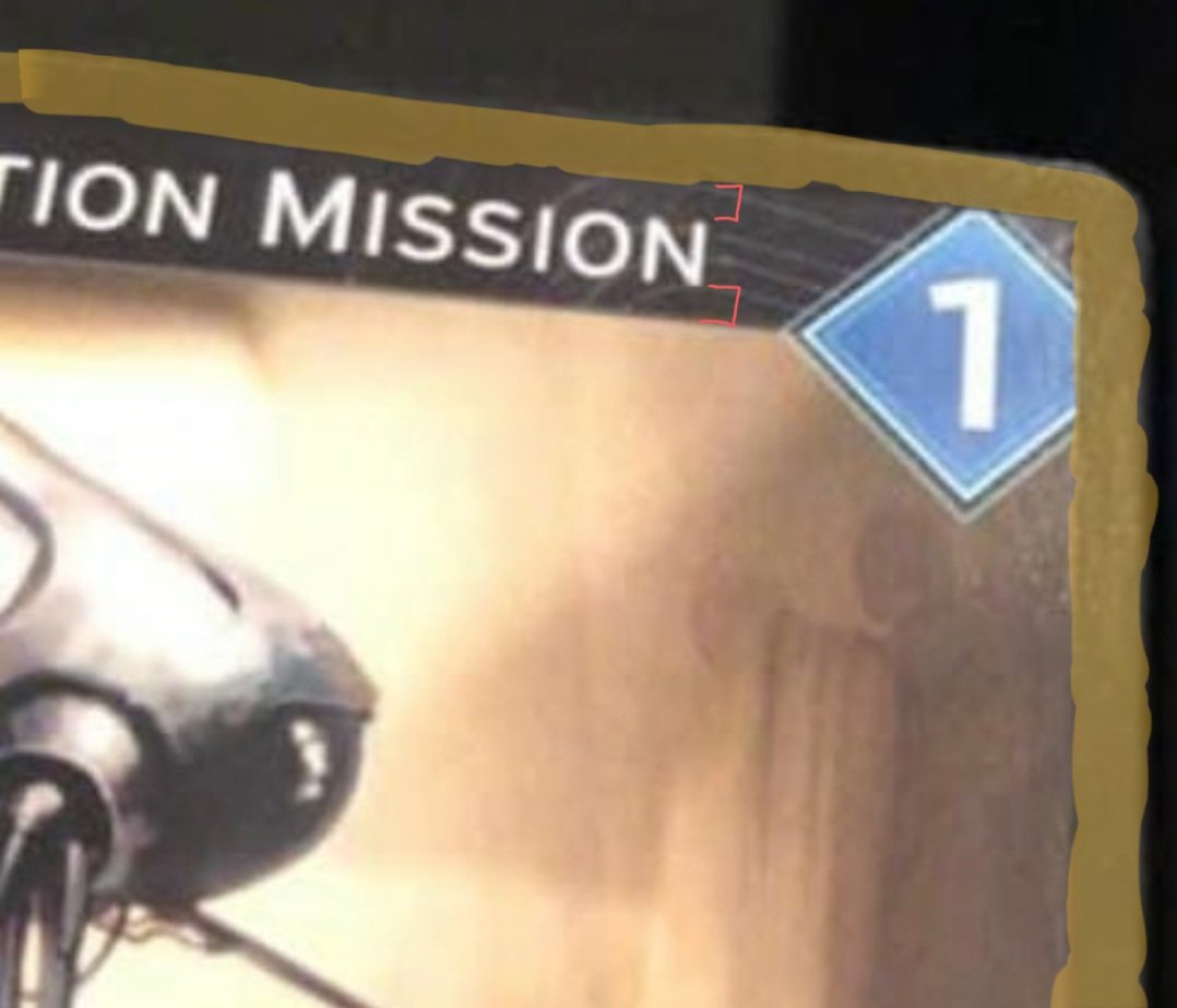
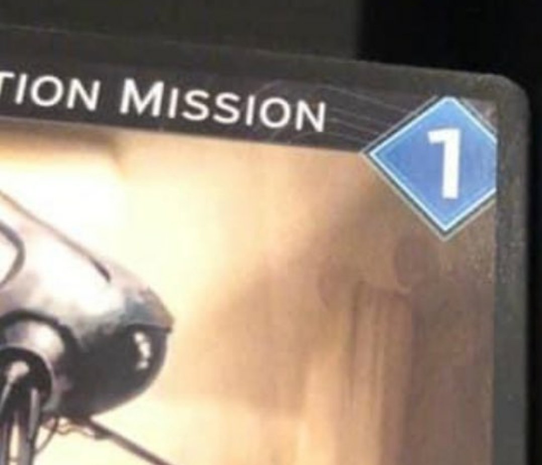
Okay, here's the side by side comparison of the screen shot. The person here believed it to be a printing or design "error," I assume.
Emphasis on the assume.
But look at the text! It's perfectly centered in the header! If it was an error that wouldn't be the case.
Emphasis on the assume.
But look at the text! It's perfectly centered in the header! If it was an error that wouldn't be the case.
Also, it's hard to see, but it looks like there's the tiniest drop shadow underneath that border.
Highlighted in yellow is the border of the card. Want to know why basically every card game has a border like that?
It's for bleeding!
Well, bleed as in ink bleed.
See, cards aren't just printed one at a time, they're printed on huge sheets and then cut out.
It's for bleeding!
Well, bleed as in ink bleed.
See, cards aren't just printed one at a time, they're printed on huge sheets and then cut out.
And that border is important! That border of plain black ink will make it so that if there IS an error, there won't be a problem. Imagine that deck of cards got cut a half millimeter to the left, it'd still be playable, albeit a little off center.
Also, from a user experience perspective, by having all the cards have a bit of a border, you can make it so that you can't easily see what card is next if the deck is misaligned slightly, since ink travels through part of the paper. This could let some players cheat!
Now, in the regimented world of TCGs, where consistency is absolutely crucial, this isn't as big of an issue. More modern TCGs (FoW comes to mind) have less of this, as card sleeves become more popular (most tournaments require them!), but classic TCGs still use that border!
Now, TCGs can get away with this because they're mass produced on a scale that board games are not, and also because, well, the cards are the only part to them. In a game, where you collect and trade cards, they gotta be top notch to maintain their value.
But board games have so much more going on! So many components, boards, pieces, plastics, dice, all in addition to the cards! So, it's a good design principle to include a border for consistency in the lower quality printing/cutting.
Now, you don't have to explicitly make it a black border. You can use a solid color or just art you don't care about getting cut off.
This is where the safe area comes in!
This is where the safe area comes in!
Check this diagram out. Everything between that red and purple line has the potential to be cut. It varies from printer and medium, but every printing company will have that no-man's land of printing.
So to play it safe, designers keep everything in the safe area!
So to play it safe, designers keep everything in the safe area!
(you can tell I'm getting excited cause I'm using exclamation points now  )
)
 )
)
So, at the end of the day, I can take one look at that card and instantly recognize it as a design decision.
But is it a good one?
Yeah, it is, at least in my opinion. It looks good!
But is it a good one?
Yeah, it is, at least in my opinion. It looks good!
Not only does having the shape further to the side allow for longer card titles, the shape has been made more interesting by cutting off a side of the diamond while still allowing it to contain the numerical value it needed to.v
Even better, we see that number as centered even though it's technically not!
Our brains fill in the gap because we know the full shape is a diamond, so we naturally assume it's in the center, despite the actual center of what we can see being to the left.
Our brains fill in the gap because we know the full shape is a diamond, so we naturally assume it's in the center, despite the actual center of what we can see being to the left.
"But of course it looks centered, that's how shapes work."
-Angry person, probably.
Yeah, that just meant that the designer were able to move it further to the side without compromising anything.
-Angry person, probably.
Yeah, that just meant that the designer were able to move it further to the side without compromising anything.
"Okay, but why not move it up as well if you can chop off the side you can chop off the top."
Ahhh, but that would have misaligned it with another element, making it look lopsided. Look where that leftmost point lines up, perfectly on the line.
Ahhh, but that would have misaligned it with another element, making it look lopsided. Look where that leftmost point lines up, perfectly on the line.
This helps guide your eye from the title to the mana cost (or whatever that number in the blue means lol)
Photographers/Artists do this all the time. Look at any good photo and trace the edges of things and see how they point to the most interesting part of the picture.
Photographers/Artists do this all the time. Look at any good photo and trace the edges of things and see how they point to the most interesting part of the picture.
This whole alignment talk doesn't even talk about the beautiful texture work done behind the text, the fantastic borders done around the diamond, the excellently readable font that fits the vibe wonderfully, the subtle glow that makes the diamond pulse with power...
So yeah. The graphic designers over at @direwolfdigital absolutely crushed it.
They did their job right, they did their job well, and in the end I can tell this game was, at least visually from this tiny picture, designed perfectly.
Well done y'all.
They did their job right, they did their job well, and in the end I can tell this game was, at least visually from this tiny picture, designed perfectly.
Well done y'all.
Also, just because someone might say something:
You wouldn't move it in away from the edge because it'd cover up the artwork you'd much rather be looking at, plus it'd make the design much more cluttered by having too many things closer to the center. It's already a big element.
You wouldn't move it in away from the edge because it'd cover up the artwork you'd much rather be looking at, plus it'd make the design much more cluttered by having too many things closer to the center. It's already a big element.
Also also, if this looks weird to you because you only see a fourth of the card:
Take a picture of only one fourth of your face and tell me it doesn't look just a tiny bit off.
Take a picture of only one fourth of your face and tell me it doesn't look just a tiny bit off.
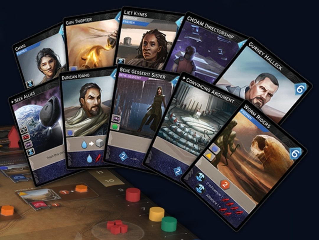
I dug around a bit and found this is their Dune game, and here's what the full cards look like. Would've gotten the OK from me if this came across my metaphorical desk.
Y'all only noticed it because it was pointed out. In graphic design land, we're constantly doing things like this. Invisible things you'll never notice, until they're pointed out. Otherwise very few, if not nobody would have had an opinion on this. Including me!
If anything I have an issue with those MASSIVE gray boxes at the bottom of the cards. Y'all could have used a transparent black backdrop with white text and it'd have looked fantastic while still being legible.

 Read on Twitter


