If you have a good design system, you can hide the fact that you're not very good at interaction design.
Case in point: @MicrosoftTeams "start new call" window. At first glance, it looks well-organized and easy to operate. Can you see what isn't working here? (Hint: Fitts's law)
Case in point: @MicrosoftTeams "start new call" window. At first glance, it looks well-organized and easy to operate. Can you see what isn't working here? (Hint: Fitts's law)
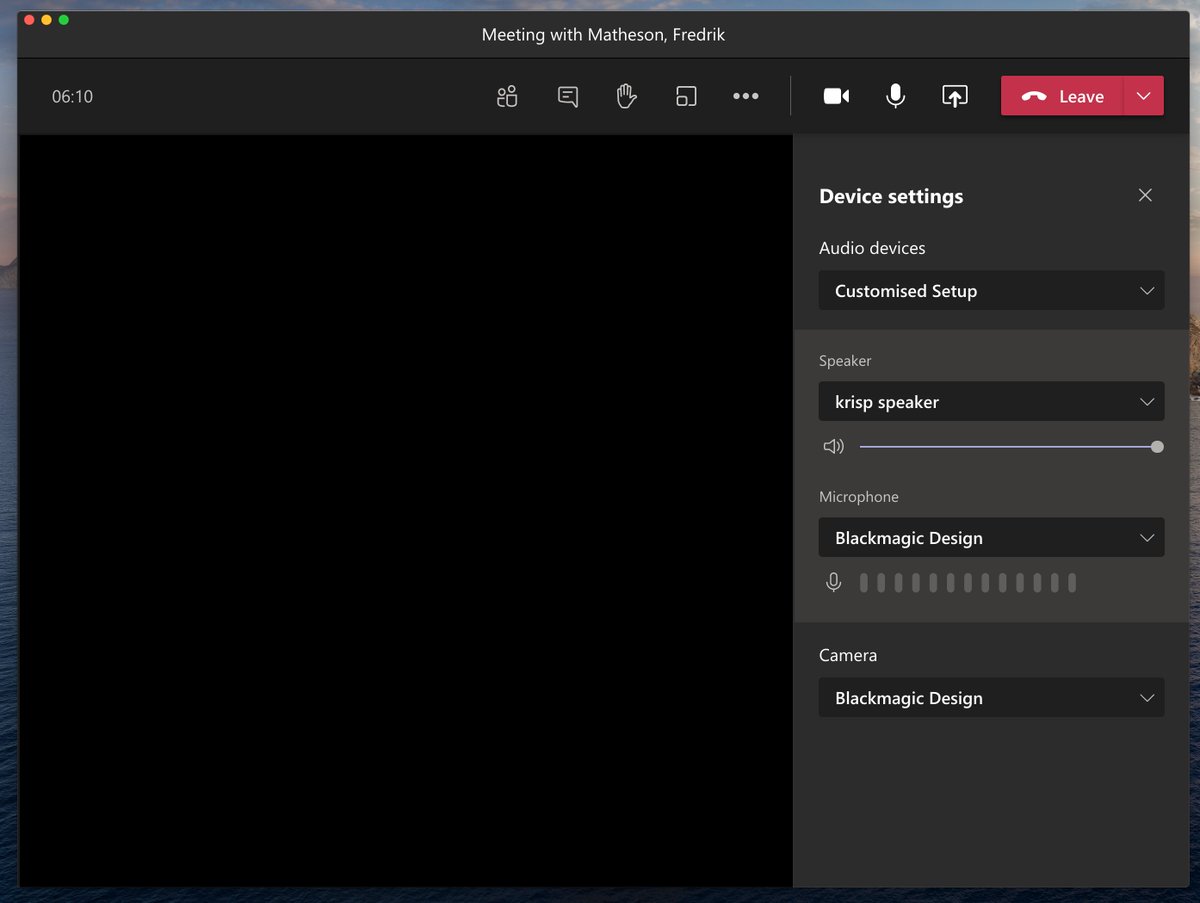
And here's another fail. Do you see it? Let's say I made a mistake when joining the call. Tough luck. You have no way of knowing that the only way to reveal the settings for mic and camera … are to make the window bigger.
Finally. You make the window bigger and see Device settings. You can select speakers and mics, etc. This looks really good, until someone says "We can't hear you" and you try to figure out what's wrong.
Quick: are you using Computer audio or Room audio for this meeting?
Quick: are you using Computer audio or Room audio for this meeting?
OK, so you are trying to figure out what is wrong here. Why aren't they hearing you? Now, let's look at this dropdown. It's worthy of a case study. What is currently selected? Is this the mic or the speaker setting?
Oh, right. When you open the dropdown, the microphone icon (which is below the field label ) is obscured so your brain sees the speaker icon. OK, this is the speaker!
No it ain't.
 ) is obscured so your brain sees the speaker icon. OK, this is the speaker!
 No it ain't.
Anyway. Grouping matters. Labelling matters. States matter hugely in UX. Testing your completed design in production with real users under real conditions is essential. Without this, your lovely design system merely conceals the squalor.
Let's make things better for users
Let's make things better for users

Oh yeah, you were wondering about how Fitts’s law fits in with this. https://twitter.com/movito/status/1353382778415558656
And that matters because … https://twitter.com/movito/status/1353383119139852290

 Read on Twitter


