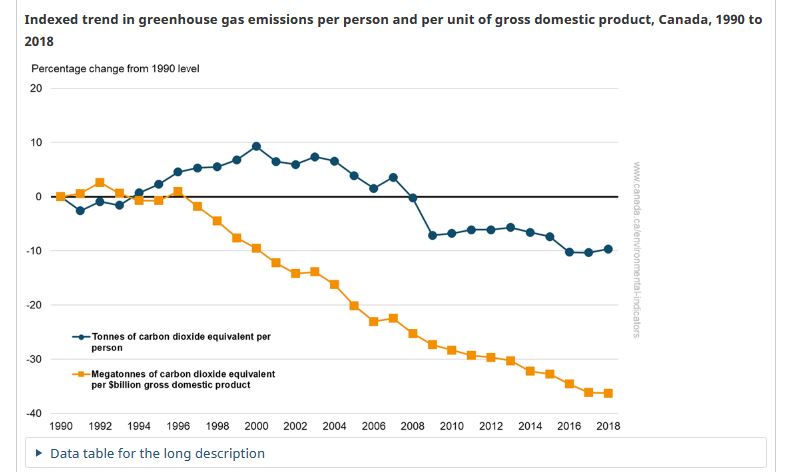
A classic example why looking at simple numbers ends up with a poor understanding of a topic. Since 1990 Canada has led the G7 in both immigration and population growth. Our per capita emissions, meanwhile have dropped by 10% and our emissions per unit of GDP have also decreased https://twitter.com/ElizabethMay/status/1353052557871079425
Moreover, 1990 represents the bottom of a deep recession which is means the emissions in 1990 were not typical of the era....like comparing restaurant sales to the middle of our recent pandemic....
So let's look at the graph from Environment Canada on this and see how we actually performed since 1990 in decreasing our GHGs - 40% less per unit GDP since 1990...not bad at all.
Now let's look at how our competitors did. Well the Europeans negotiated hard to get 1990 as the starting date as that allowed them to get "free" emission reductions thanks to the re-unification of Germany, the closing of Warsaw pact heavy industry and industrial farms.
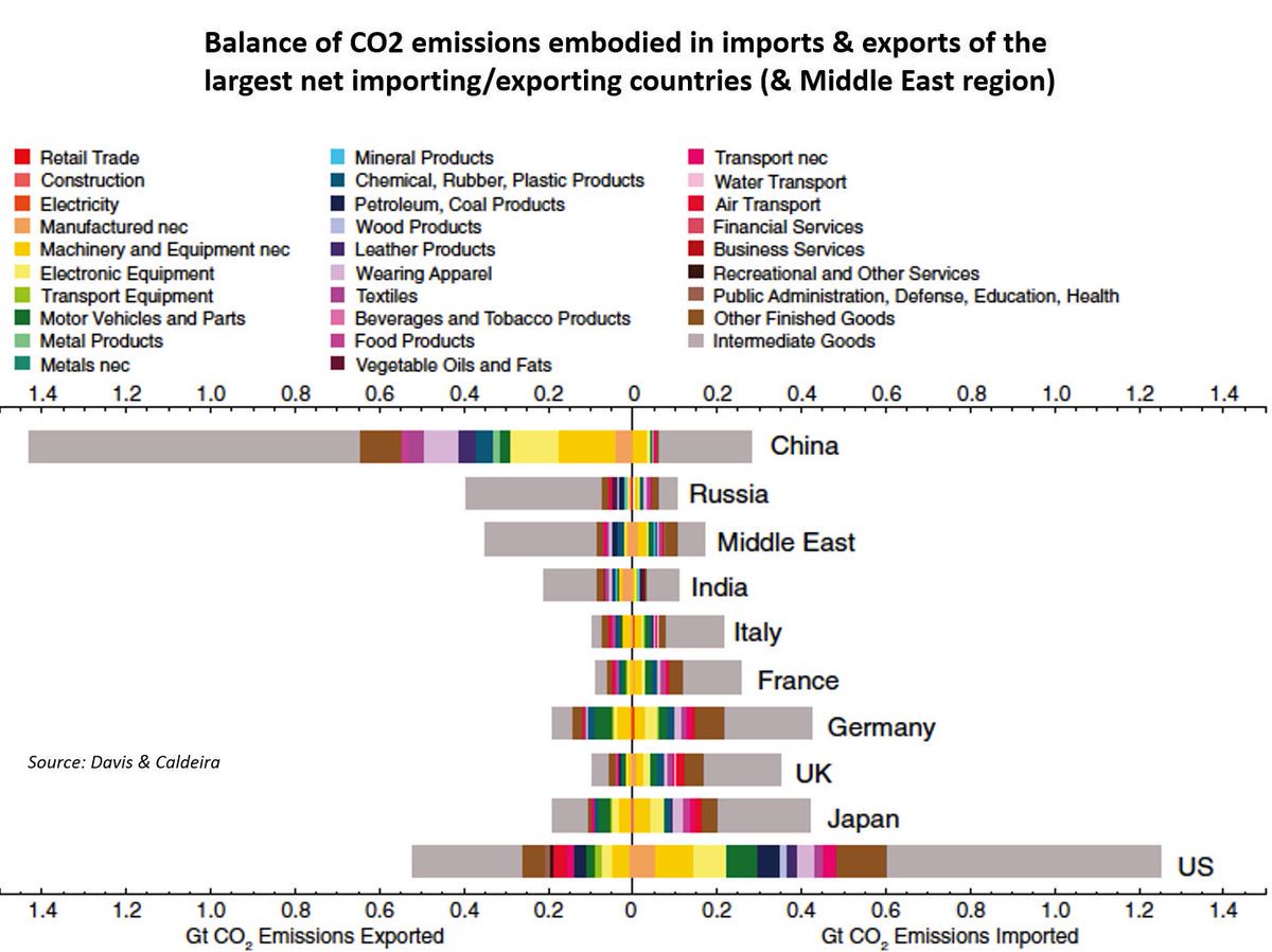
The Americans, meanwhile used a combination of the dash to gas (getting off coal) which was a great way to reduce emissions....and offshoring huge components of their emissions to China...which was not so good...
Canada was less efficient than the US or Europeans at offshoring our emissions because you can't really do that for farming and resource extraction. The emissions are associated with the resource extraction activity....

 Read on Twitter


