The next 3 tweets will show you that all you need is a clean chart (no indicators) a ruler and a pencil to identify a possible trend period to profit from.
Before we start, our template:
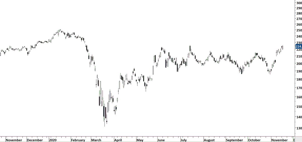
1 year of data on daily scale
Candlestick chart
(my preference white background)
Before we start, our template:
1 year of data on daily scale
Candlestick chart
(my preference white background)
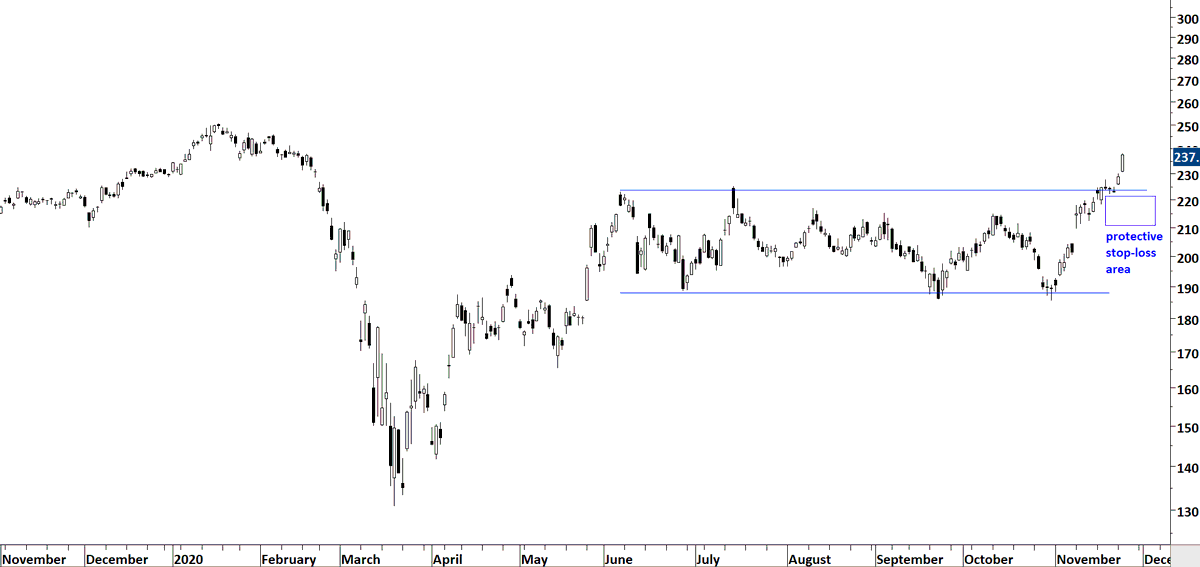
When you open your chart you will see this. Are you able to identify the lengthy and sideways consolidation?
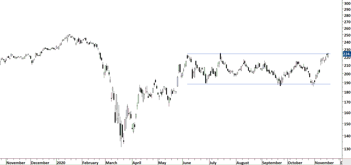
Are you able to draw horizontal boundaries that will be a well-defined rectangle?
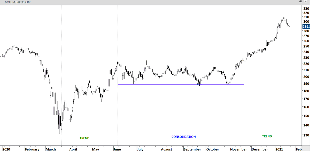
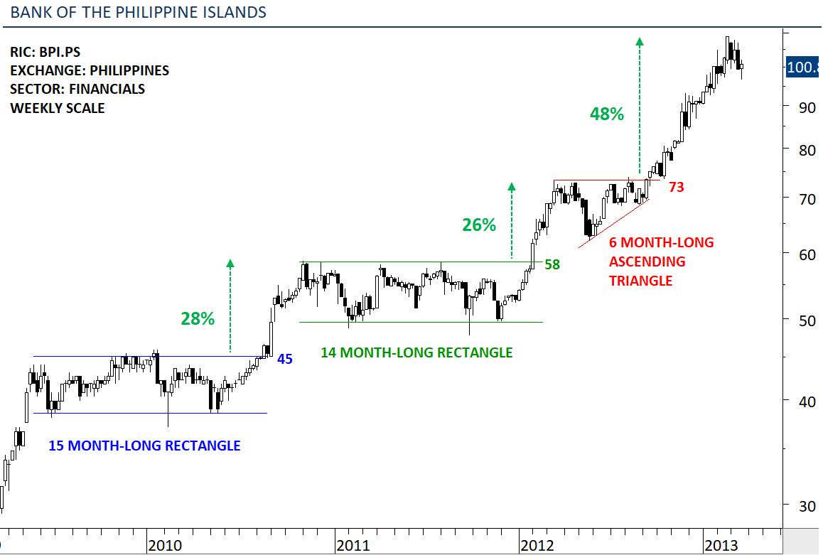
Consolidations are usually followed by trend periods. We want to capture that.
Are you able to draw horizontal boundaries that will be a well-defined rectangle?
Consolidations are usually followed by trend periods. We want to capture that.
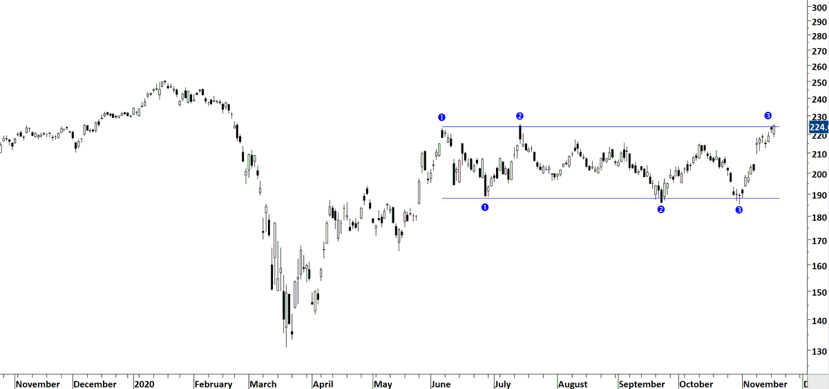
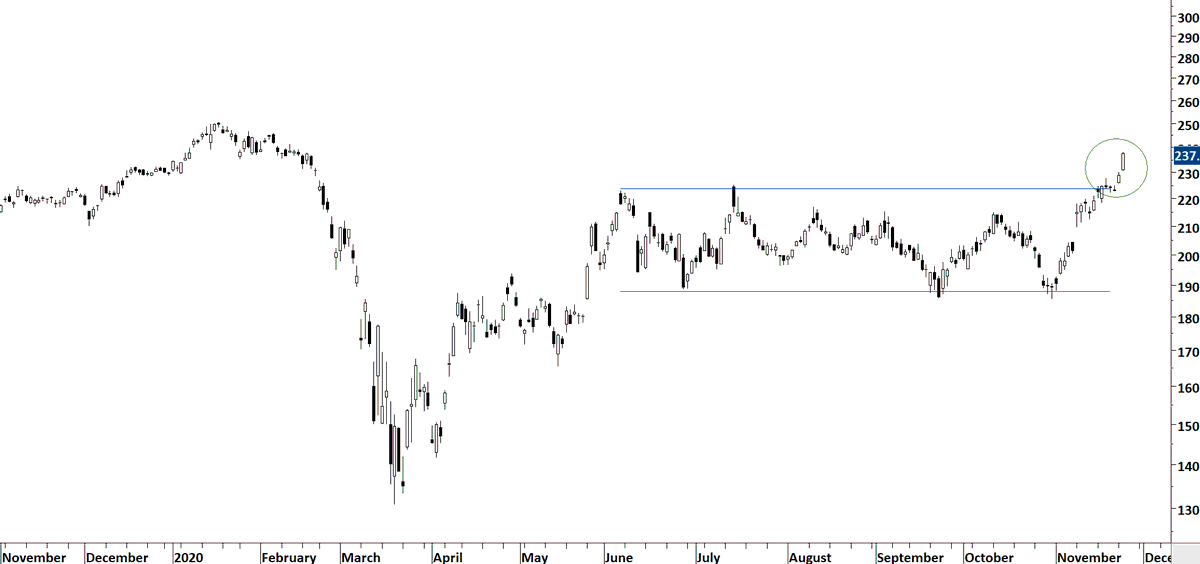
Several touch points to the pattern boundaries. We now want to see a breakout from this consolidation. Leave the worry of a failed breakout to the side. We can't know if a breakout will fail or not. We are now at the "Leap of faith" stage.
Leap of faith is the belief that breakout will work out. A protective stop-loss should be placed below the well-defined chart pattern boundary.

 Read on Twitter