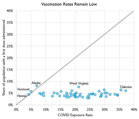
It's death day, but I'm choosing optimism today, so we're going to start with a chart about vaccinations. Here's the likely population share that has had COVID vs. the share who've gotten a 1st dose.
The kind of exciting thing here is we actually already have 3 states where more people probably have COVID antibodies from the vaccines than from the disease itself! Sure, they're Alaska, Vermont, and Hawaii, but, again, choosing optimism.
On the other hand, we also have more and more states determined to show that "herd immunity at 25%" was an extremely weird thing to believe, but.... let's move on from that.
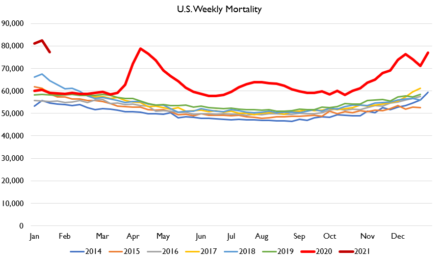
So here's how U.S. deaths look As you can see, deaths remain very high. However, this is actually a modest downward revision from last week's estimates; new data releases came in less bad than I was afraid! See? I told you we were choosing optimism today.
We can now venture pretty high-confidence estimates of total mortality in 2020. Deaths in 2020 rose 15-16% versus 2019.
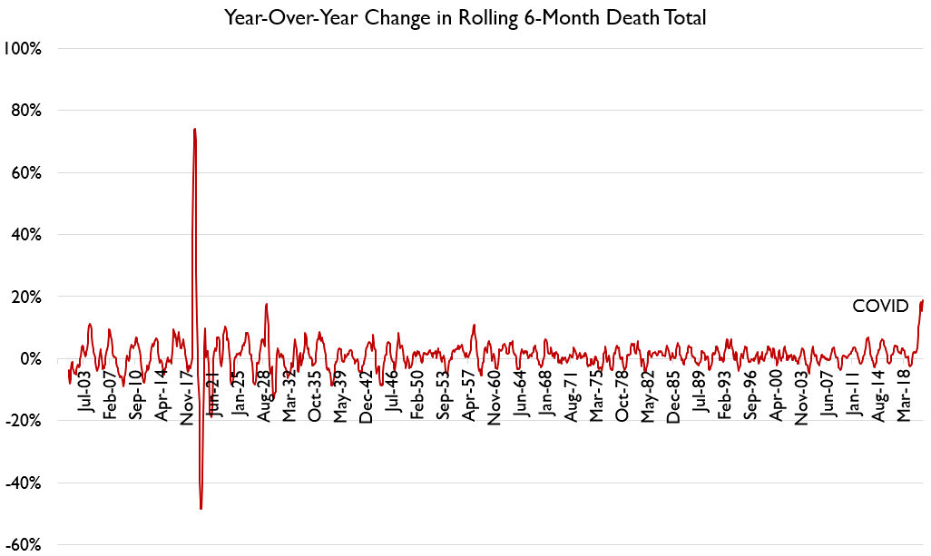
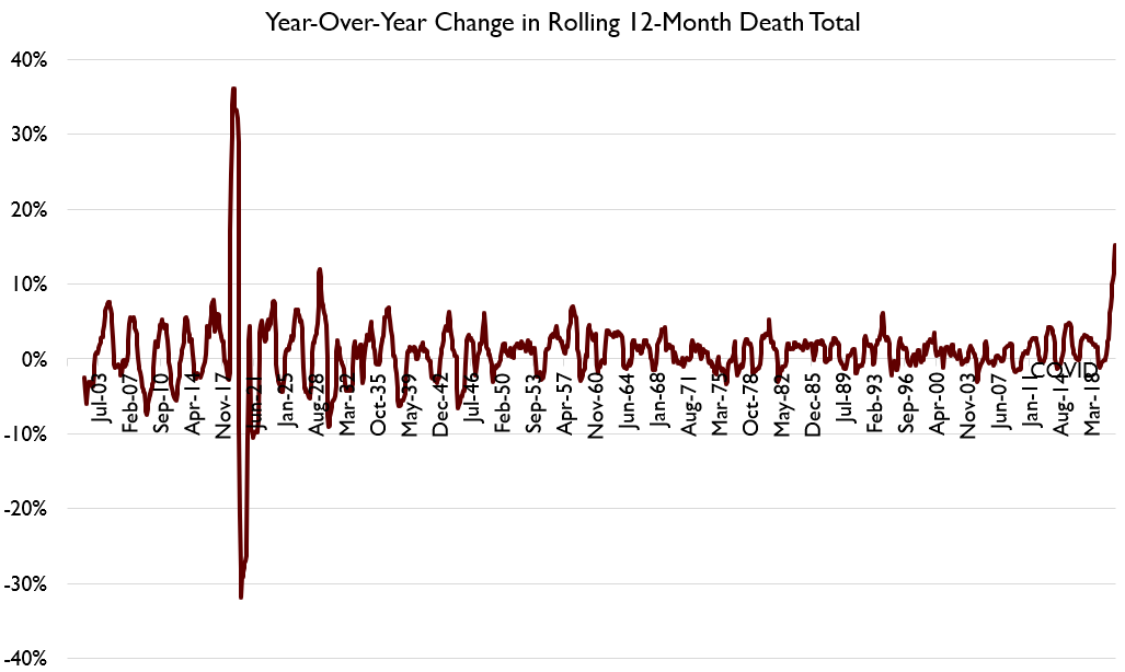
Below I show monthly deaths in the U.S. since 1900, with monthly YoY % change, and also rolling 6- and 12-month sums.
By any measure COVID is huge.
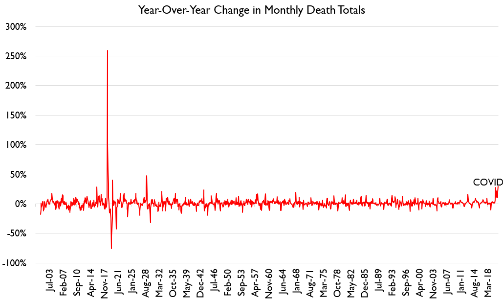
Below I show monthly deaths in the U.S. since 1900, with monthly YoY % change, and also rolling 6- and 12-month sums.
By any measure COVID is huge.
COVID's peak monthly spikes make it the #3 biggest event in the series, and its 6- and 12-month spikes make it #2. #1 of course is the 1918 Spanish flu. Not a comparison anybody wants!
It's the massive influenza wave that hit the US in the winter of 1928/1929, which has been totally memory-holed mostly because of what happened in the fall of 1929. https://twitter.com/mattholm/status/1352667447900463119
But we also have data on deaths by age. Now, this data is a bit dicey. Young peoples' deaths take longer to get reported. So the latest weeks of data probably understate youth deaths, though I've tried to correct for that. But through November should be right.
So we can see that death rates rose in 3 sharp waves for the oldest Americans, but for people ages 25-44, this increase was more smoothed out.
In total, this comes to ~0 excess deaths for under 25s, ~20,000 excess deaths for 25-44, ~80,000 for 45-64, ~80,000 for 65-74, 110,000 for 75-84, and 130,000 for 85+. So about 420,000 excess deaths in 2020 by this very rough approximation.
We can also see what impact this has on life expectancy. We can roll forward 2019's 78.8 year life expectancy to the 2020 base population, and see how things change vs. the age-specific mortality rates we observe.
We end up at about 1.7 life-years lost. Non-trivial decreases in life expectancy show up in the 25-44 age range, but get especially large in the 45+ age range.
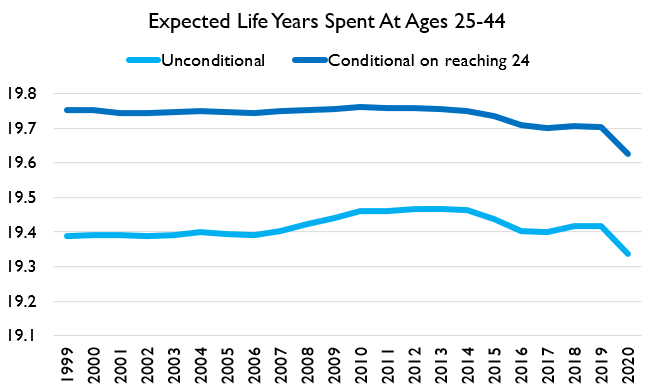
You may wonder how this looks in time series. As an example, here's "expected life years within the 25-44 age bracket," 1999-2020.
The "lost life years" for 25-44 year olds (not including changes in life expectancy after age 44) are *rather large*.
The "lost life years" for 25-44 year olds (not including changes in life expectancy after age 44) are *rather large*.
Losses for 25-44 year olds are comparable to or larger than the worse increases of the "deaths of despair" wave.
I focus on 25-44s because I don't think anybody debates that there's a huge risk for people 65+ for example. My objective here is to note that while effects for prime-age people are MUCH smaller, they remain qualitatively large vs. recent trends and health risks.
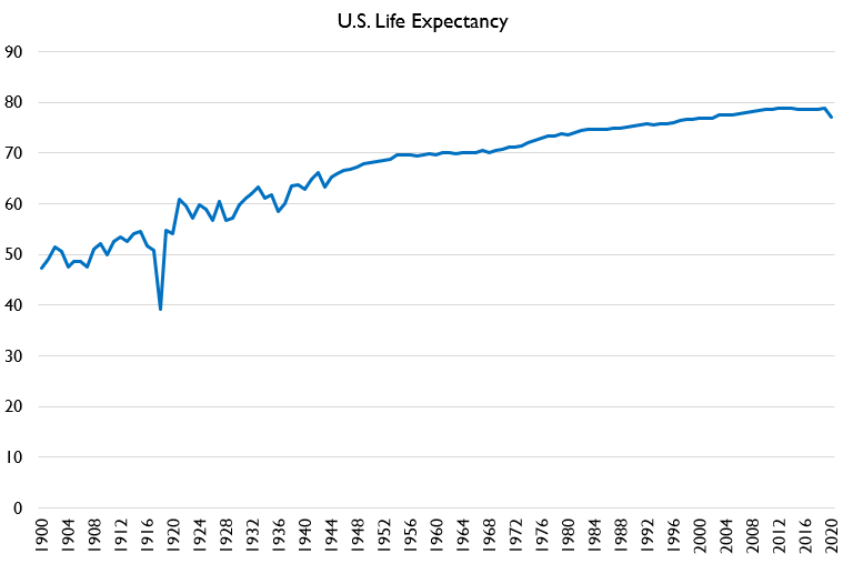
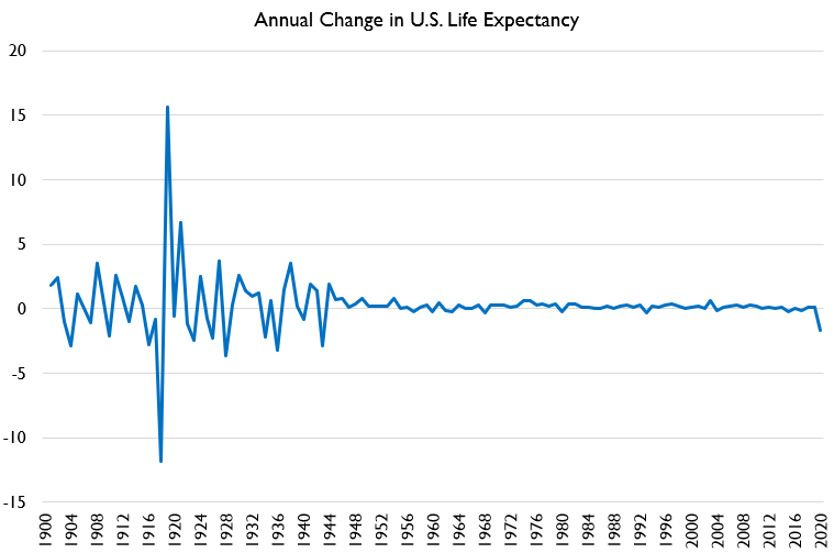
So what does this look like in the long run? Well, the decline in life expectancy is the largest yearly decline since before WWII. And the pre-WWI declines are mostly just YoY volatility due to lack of flu vaccines and antibiotics.
Y'all that's a big decline in life expectancy. That's like falling 20-30 ranks internationally.
Now in fairness, that means life expectancy was only set back to the levels of about 2000. 2000 wasn't the apocalypse. People had nice lives in 2000.
At the same time, rolling back 20 years of medical advancement seems.... pretty bad!
At the same time, rolling back 20 years of medical advancement seems.... pretty bad!
We can look at this using the crude and age-adjusted death rate too. Here's what that looks like. As you can see, the age-adjusted death rate has fallen over time, but 2020 set it back to the 2000 level.
In *crude* per capita deaths tho, 2020 deaths are the worst since *1945*.
In *crude* per capita deaths tho, 2020 deaths are the worst since *1945*.
so idk that seems bad
but we're doing optimism, right?
right???
right guys????
but we're doing optimism, right?
right???
right guys????
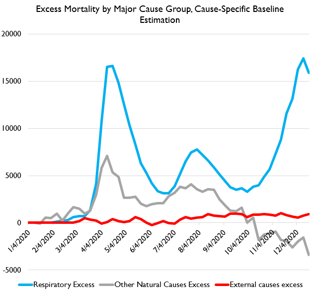
Re-doing my by-cause tweet because the original one had an error for external causes.
HERE is excess deaths by cause category.
HERE is excess deaths by cause category.
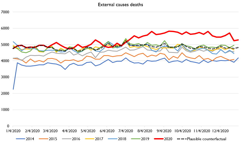
And here's external-causes mortality. You can see there is some very clear external causes excess mortality from July onwards.
But again, you can compare that to the deaths from other causes and see that the overwhelming majority of excess deaths are from COVID.

 Read on Twitter