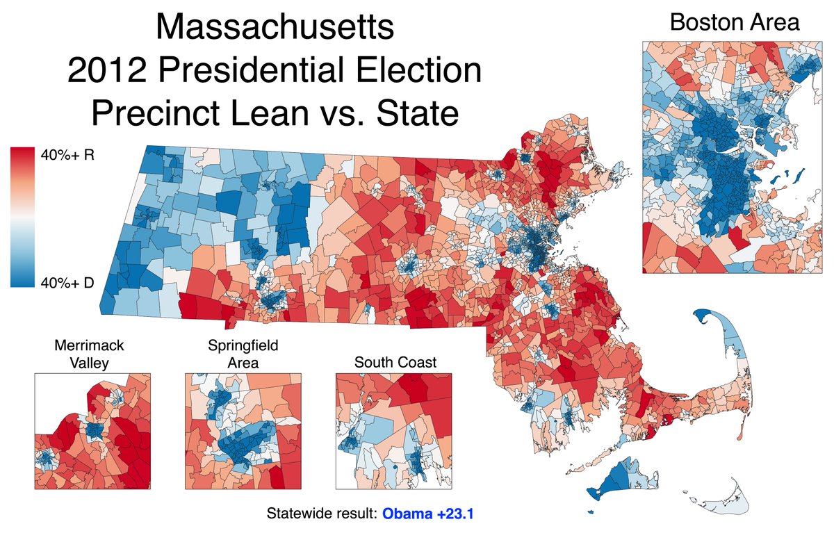
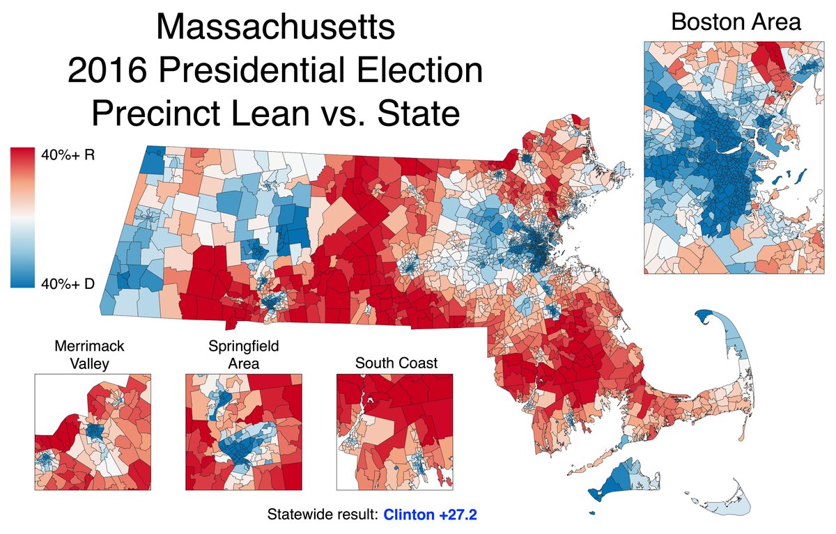
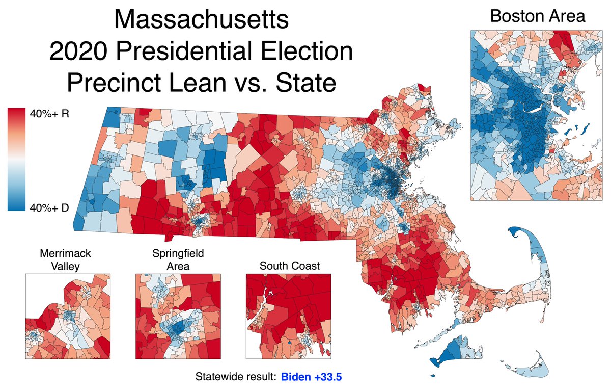
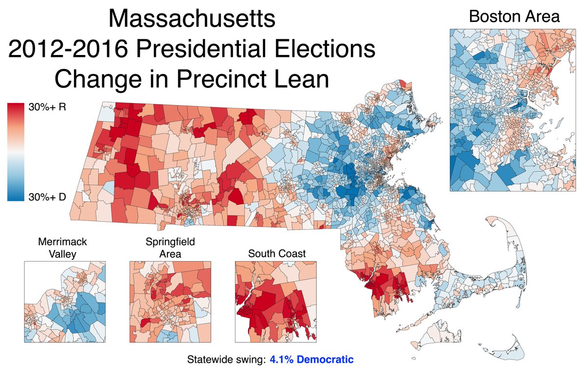
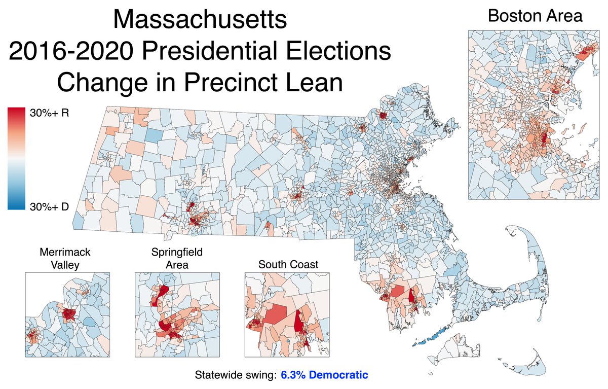
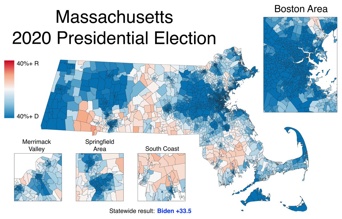
THREAD: These maps show how every precinct in Massachusetts voted relative to the statewide result for the last three presidential elections—a metric called "lean."
Blue precincts were more Democratic than the state; red precincts, more Republican. #mapoli #ElectionTwitter
Blue precincts were more Democratic than the state; red precincts, more Republican. #mapoli #ElectionTwitter
Last year, Biden won MA 65.6% to 32.1% (a 33.5-point margin). Suppose a precinct went 80% Biden, 20% Trump (a 60-point margin). We'd say that precinct voted 26.5 points more Democratic than the state as a whole. In other words, it had a 26.5% Democratic lean.
Mapping the lean is a good way to illustrate internal trends, especially if the raw results are lopsided. For instance, compare the 2012 & 2020 maps. Much of affluent, educated MetroWest was more Republican than the state in 2012; by 2020, nearly all of it was more Democratic.
In contrast, the ancestrally Democratic city of Fall River was firmly to the state's left in 2012. Even though it voted for Biden last year, it was 21% more Republican than the state (before 2016, it had not been more Republican than the state since at least 1896).
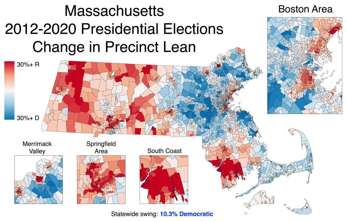
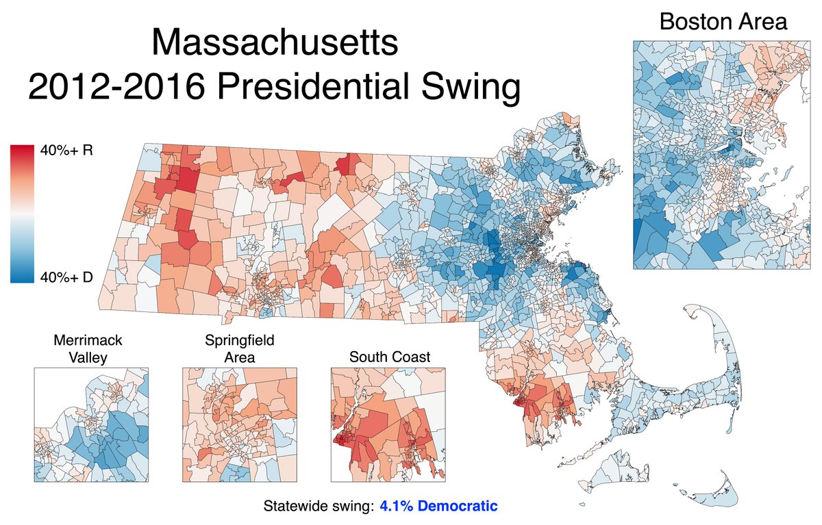
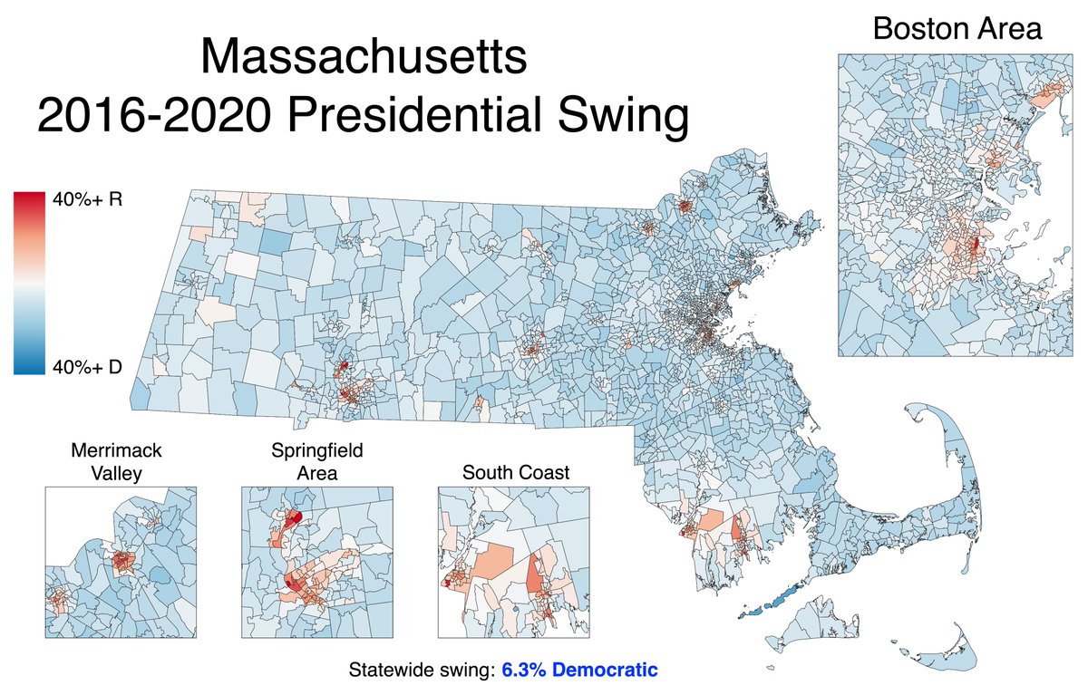
Here are the raw swings by precinct (NOT relative to the state). Most of the movement happened between 2012 and 2016, though some heavily Hispanic areas lurched toward the GOP in 2020.
Massachusetts got 10.3% more Democratic between 2012 and 2020. Now suppose a precinct went from a 5% Democratic win in 2016 to a 10% Democratic win in 2020. It still swung toward the Democrats, but by less than the state did, so it is now *more Republican* relative to the state.
That nuance is what the lean change captures; it's like a second derivative. If you look back at the swing map, you can see some towns (particularly in Western MA) that were more Democratic in 2020 than they were in 2012, but now have a more Republican lean than they did then.
Breaking the 2012-2020 lean change into its two components again illustrates the relative stability of 2020.
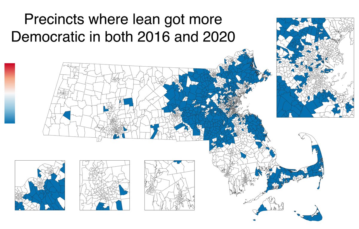
This map shows all of the precincts whose leans got more Democratic both times. Except for the Cape, very few are located outside the I-495 ring. Boston suburbs from the North Shore to the South Shore are clearly visible.
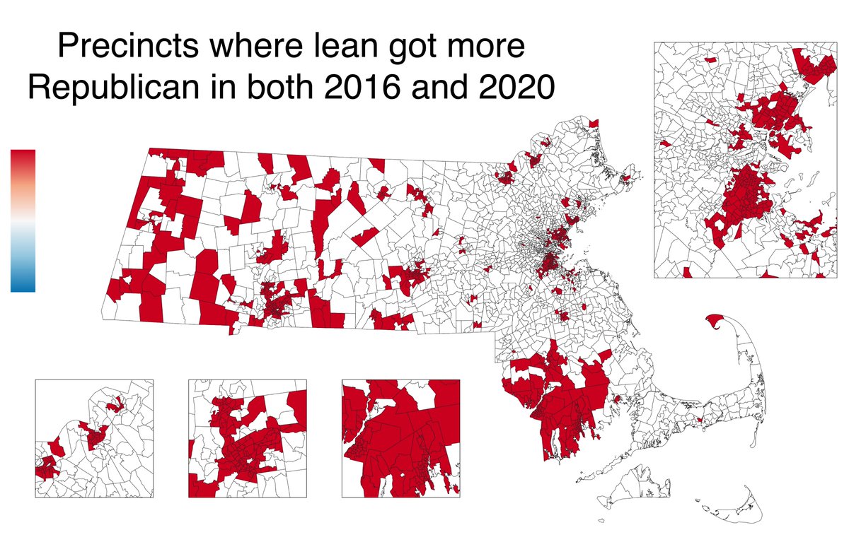
Similarly, this map shows all of the precincts whose leans got more Republican both times. The greatest concentration of these precincts is along the South Coast. The Gateway Cities stand out here, as do majority-minority areas in Boston and its inner metro.

 Read on Twitter