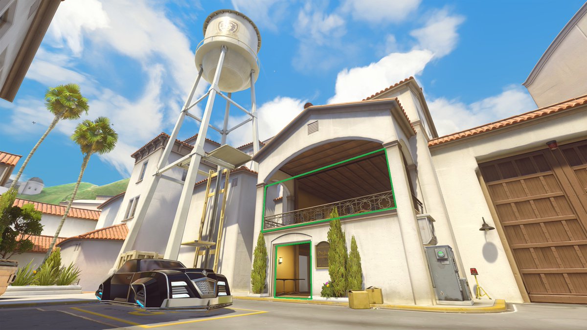
I do like to gently mock the "draw some lines on a screenshot" method of level design commentary... While it can be useful it's just one small aspect of what level design is, and too often those images obfuscate the more important things going on in those spaces.
Does drawing "leading lines" on a screenshot of linear sections from God Of War say much about the design of those spaces? Players are moving in the right direction because there's literally nowhere else to go in some of those examples.
In most games environmental leading lines will be one of the last things players respond to, contrast, colour, motion, and gameplay elements all trump them.
If a fallen tree is "pointing" to the left players aren't going to ignore the two enemies moving to their right, or the health pickup ahead of them.
Refuge and Prospect spaces are also useful design tools, but we should remember they are just a subset of Biophilic Design patterns. https://www.terrapinbrightgreen.com/reports/14-patterns/
And all this is secondary to context. A dark alley next to a bright street with subtle leading lines and colouration directing players toward a specific part of the street is going to have exactly the opposite effect in a stealth game compared to an action game.
Good level designers know all this, it's just that drawing red lines on a screenshot is a good shorthand and propagates well via the internet. I do worry it risks trivialising things that are not as simple as "use these rules created for static visual composition".
The heart of the issue is that it's always going to be a problem to try and highlight the techniques of one medium in another... something, something, dancing about architecture.
Here's a good example of why I have problems with the style of "draw lines on a screenshot" level design criticism.
Take this screenshot from Overwatch's Hollywood map.
Take this screenshot from Overwatch's Hollywood map.
I could perfectly validly say the green indicates refuge spaces: spaces of safety. That makes sense given the architecture, contrast, colouration. Except, that's only partially true. If you're playing Pharah or Echo they are the opposite as you don't want to be that low.
If you're playing a tank those are aren't much of a refuge either as your primary means of safety as a tank is either your own protective abilities or your own movement abilities. Worse than that a Reinhardt taking refuge in those spaces is a net negative to their team.
It's sort of an alright place for Ana or Baptiste to take cover (the upper level more than the lower), but it's still not exactly a refuge because of the space surrounding - which isn't shown in the screenshot.
The elevator by the water tower reads as exposed and risky (bright, low contrast), yet it's a good spot for ranged DPS (at lower ELO at least) because it's away from the main area of combat and difficult to reach. But again you can't see why from one screenshot.
And this is all ignoring that these maps are attacker/defender orientated. So if you’re attacking this space those green areas are high threat given anybody who is using them for cover and refuge has clear sight lines to your approach.

 Read on Twitter


