1/ Kill Your Next Presentation
Research shows an audience checks out after 10 minutes.
That's a small window to make an impact.
I've made hundreds of presentations.
Thought I would share what I've learned.
Hope this will help you make a better pitch or win that next sale.
Research shows an audience checks out after 10 minutes.
That's a small window to make an impact.
I've made hundreds of presentations.
Thought I would share what I've learned.
Hope this will help you make a better pitch or win that next sale.
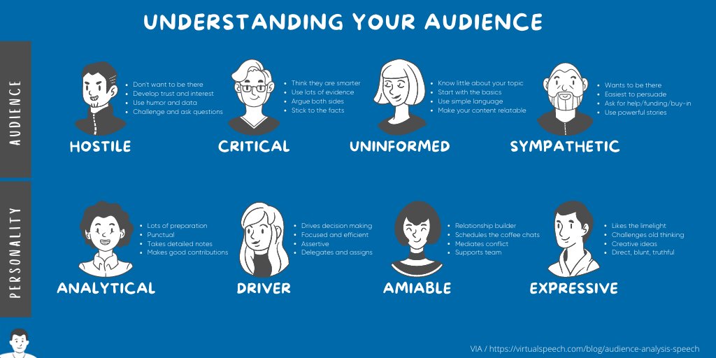
2/ Audience
Always start here!
Your objective is to maximize the value for your audience.
Spend time understanding:
- Personality types
- Levels of knowledge
- Risk tolerances
- Leadership styles
- Levels of influence
Try and understand their perspective!
Always start here!
Your objective is to maximize the value for your audience.
Spend time understanding:
- Personality types
- Levels of knowledge
- Risk tolerances
- Leadership styles
- Levels of influence
Try and understand their perspective!
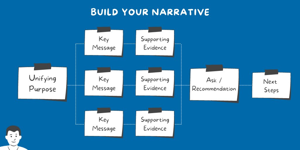
3/ Build Your Narrative
Visualize what you want to say and start writing.
You need to frame your story (beginning, middle, end)
Define your structure.
1. Unifying purpose
2. A few key messages
3. Evidence for key messages
4. Ask/recommendation
5. Next steps/take action
Visualize what you want to say and start writing.
You need to frame your story (beginning, middle, end)
Define your structure.
1. Unifying purpose
2. A few key messages
3. Evidence for key messages
4. Ask/recommendation
5. Next steps/take action
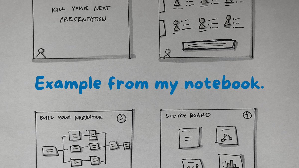
4/ Storyboarding
Spend time storyboarding to decrease time building slides.
Sketch out the best way to communicate your message.
Pay attention to the flow from one slide to the next.
Get away from the computer and use pen and paper (crazy I know)
Spend time storyboarding to decrease time building slides.
Sketch out the best way to communicate your message.
Pay attention to the flow from one slide to the next.
Get away from the computer and use pen and paper (crazy I know)
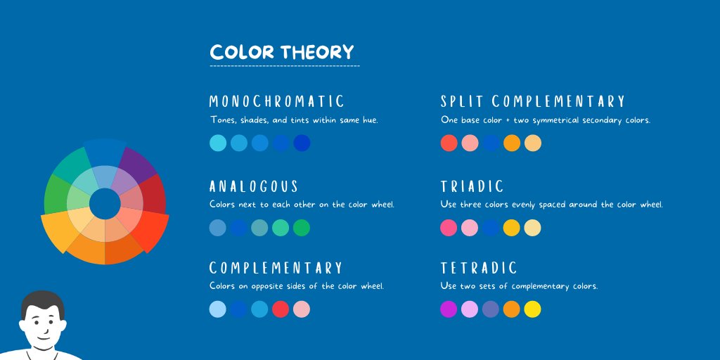
5/ Slide Design | Color
Don't use more than two colors.
Use different shades of the same color (monochromatic).
Eyes prefer black or dark grey text on a white or off-white background.
Avoid high contrast backgrounds and images.
Your content should shine, not your colors.
Don't use more than two colors.
Use different shades of the same color (monochromatic).
Eyes prefer black or dark grey text on a white or off-white background.
Avoid high contrast backgrounds and images.
Your content should shine, not your colors.
6/ Slide Design | Data + Graphs
Keep charts simple.
Remember garbage in = garbage out when choosing data.
Horizontal bar charts are the best. Pie charts not so much.
Let the data speak for itself, don't mess around with the axis.
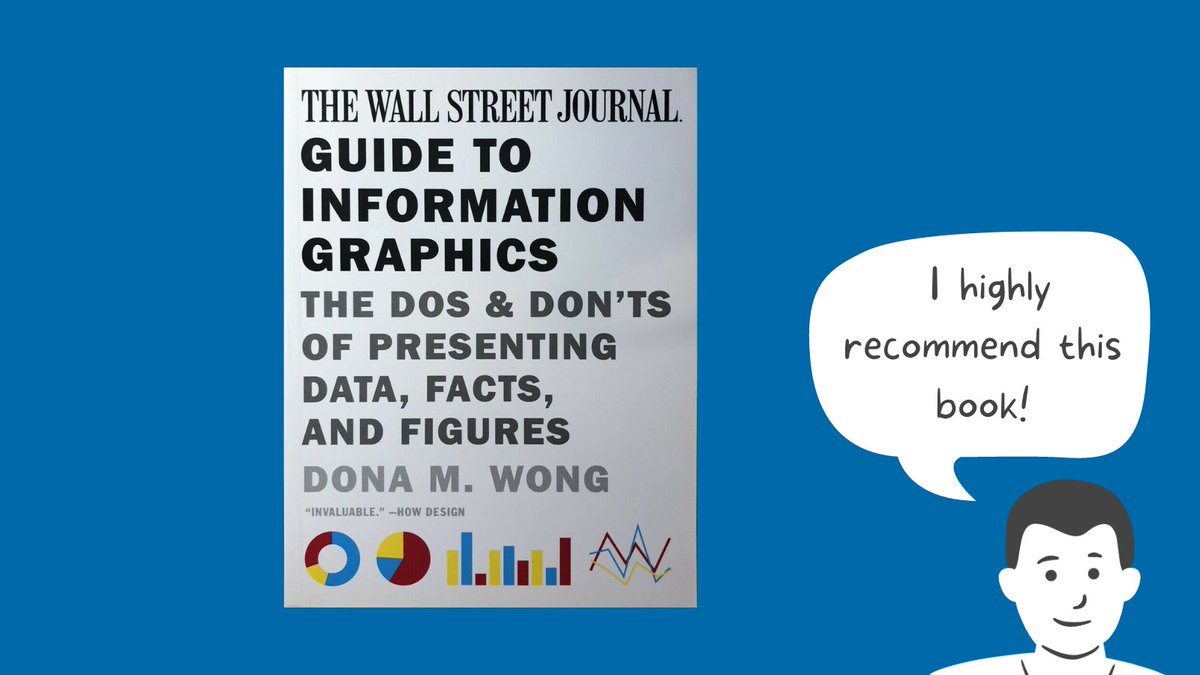
Read this
Keep charts simple.
Remember garbage in = garbage out when choosing data.
Horizontal bar charts are the best. Pie charts not so much.
Let the data speak for itself, don't mess around with the axis.
Read this

7/ Slide Design | Flow
The flow of your slide tells the eyes of the audience where to go.
Left to right.
Up to down.
Stay away from flashy shapes and convoluted diagrams.
Draw attention to the most important content.
The flow of your slide tells the eyes of the audience where to go.
Left to right.
Up to down.
Stay away from flashy shapes and convoluted diagrams.
Draw attention to the most important content.
8/ Slide Design | Graphics + Icons
Don't even think about using clip art
Illustrations and images can work, but make sure they emphasize your content.
What you add should complement your content.
It's why I love using icons. They take up less space and are complimentary.
Don't even think about using clip art

Illustrations and images can work, but make sure they emphasize your content.
What you add should complement your content.
It's why I love using icons. They take up less space and are complimentary.
9/ Slide Design | Fonts
I'm a typography nerd.
There are rules that you should follow.
Just read Butterick's Practical Typography and thank me later. https://twitter.com/espiekermann/status/360087511793549314?s=20
I'm a typography nerd.
There are rules that you should follow.
Just read Butterick's Practical Typography and thank me later. https://twitter.com/espiekermann/status/360087511793549314?s=20
10/ Slide Design | Words
Avoid buzzwords.
Be concise.
Write for your audience.
For writing tips follow @david_perell https://twitter.com/david_perell/status/1037406877926256641?s=20
Avoid buzzwords.
Be concise.
Write for your audience.
For writing tips follow @david_perell https://twitter.com/david_perell/status/1037406877926256641?s=20
11/ Practice, Practice, Practice
Your slides look great and tell a compelling story.
Congrats!
Now you have to deliver them.
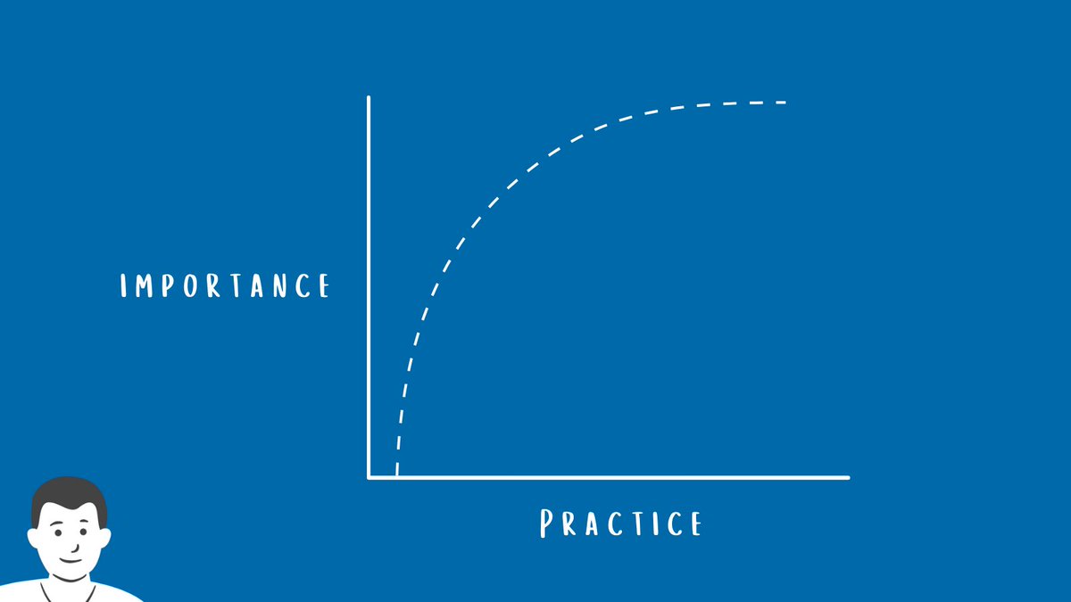
The greater the importance of the presentation, the more you should practice.
Consider:
1. Writing out your speech
2. Recording yourself
Your slides look great and tell a compelling story.
Congrats!
Now you have to deliver them.
The greater the importance of the presentation, the more you should practice.
Consider:
1. Writing out your speech
2. Recording yourself
12/ Delivery
Turn nerves into positive energy.
Good delivery takes practice.
Eye contact, smile, positive body language.
Make sure you pause throughout. It's impactful.
Watch the best:
@TEDTalks
@BreneBrown
@SirKenRobinson
@BarackObama
@garyvee
@TonyRobbins
Turn nerves into positive energy.
Good delivery takes practice.
Eye contact, smile, positive body language.
Make sure you pause throughout. It's impactful.
Watch the best:
@TEDTalks
@BreneBrown
@SirKenRobinson
@BarackObama
@garyvee
@TonyRobbins
13/ Tools | Templates, Inspiration, Software
Search "presentation templates" on:
@envato
@dribbble
@Behance
@Etsy
Software:
@prezi
@VismeApp
@canva
@piktochart (infographics)
Most organizations use @powerpoint or keynote. Use whatever tool works best for you.
Search "presentation templates" on:
@envato
@dribbble
@Behance
@Etsy
Software:
@prezi
@VismeApp
@canva
@piktochart (infographics)
Most organizations use @powerpoint or keynote. Use whatever tool works best for you.
14/ Tools | Icons, Illustrations, Images
Icons:
@flaticon
@icons_8
Illustrations:
@freeillustr
Images:
@unsplash
Mock-ups:
@placeitapp
Fonts:
Butterick's Practical Typography
@typewolf (_typewolf.com/resources)
@googlefonts
@AdobeFonts
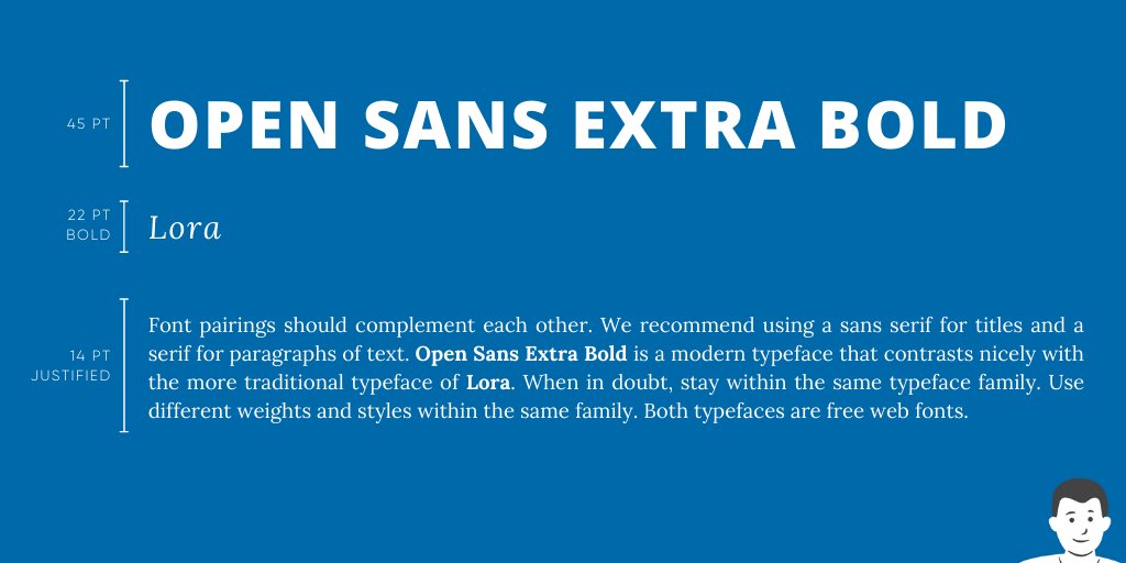
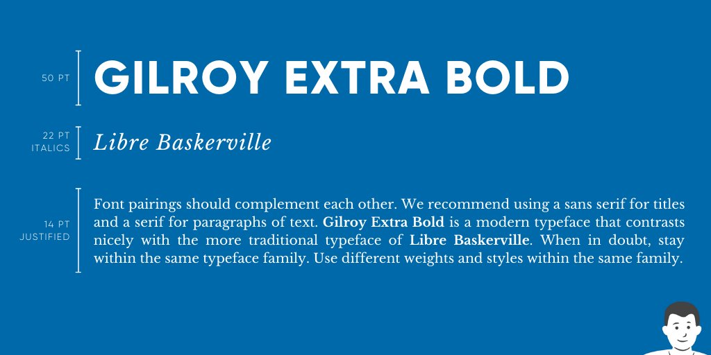
Font combos I like to use
Icons:
@flaticon
@icons_8
Illustrations:
@freeillustr
Images:
@unsplash
Mock-ups:
@placeitapp
Fonts:
Butterick's Practical Typography
@typewolf (_typewolf.com/resources)
@googlefonts
@AdobeFonts
Font combos I like to use

15/ Animations
My rule is to avoid using animations.
1. They are distracting
2. If slides are sent out after the meeting in PDF format, animations are meaningless
If you must use animations, stick with the basics.
My rule is to avoid using animations.
1. They are distracting
2. If slides are sent out after the meeting in PDF format, animations are meaningless
If you must use animations, stick with the basics.
16/ This thread is a culmination of what I have learned over the last 15 years and hundreds of presentations.
I hope you took away a few nuggets.
I will add more if I think of anything else.
Good luck!
I hope you took away a few nuggets.
I will add more if I think of anything else.
Good luck!

 Read on Twitter