THANK YOU for the full house in yesterday stream!
We explored how to create horizontal shots only. We saw a bit of most common aspect ratios and why they exist. Different types of grid, and tried to apply them according to what we aimed for
Breakdown of the results
BIG THREAD
We explored how to create horizontal shots only. We saw a bit of most common aspect ratios and why they exist. Different types of grid, and tried to apply them according to what we aimed for
Breakdown of the results

BIG THREAD
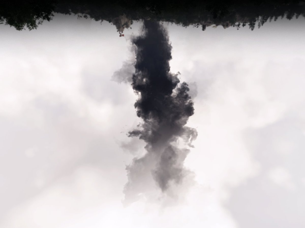
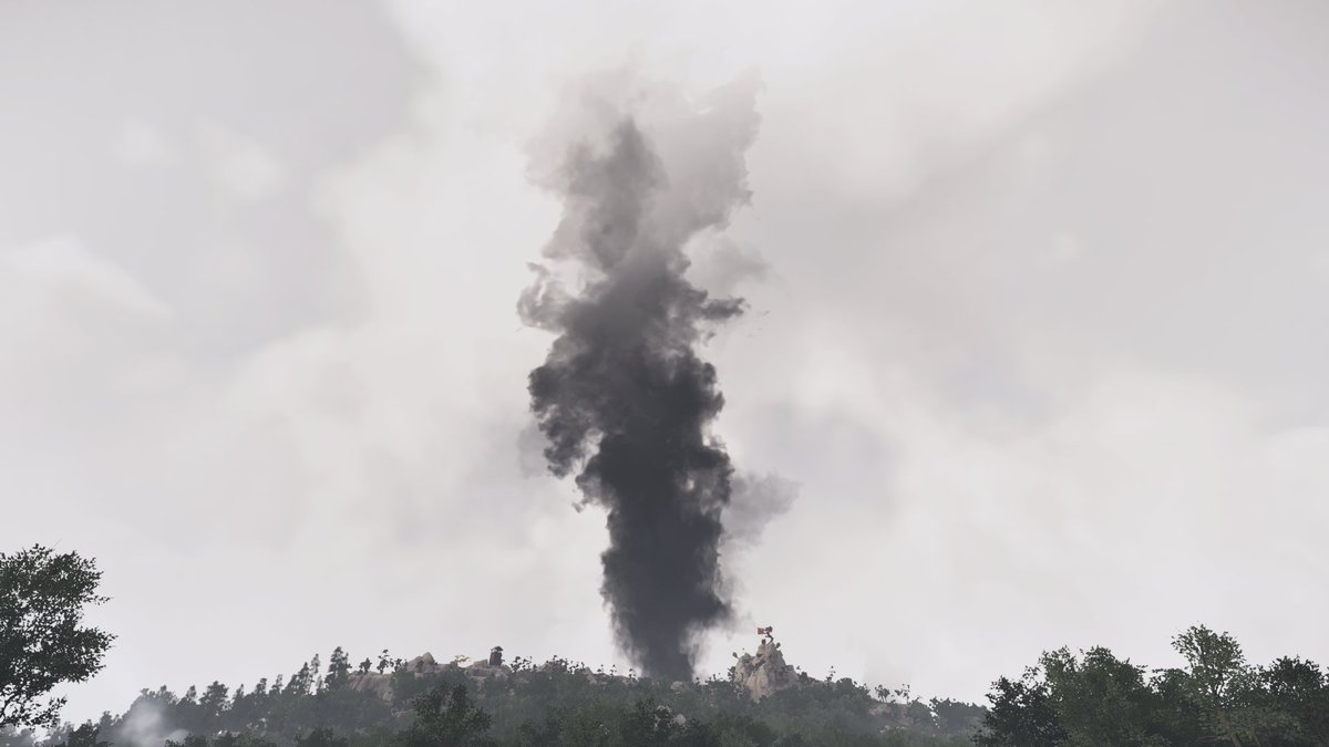
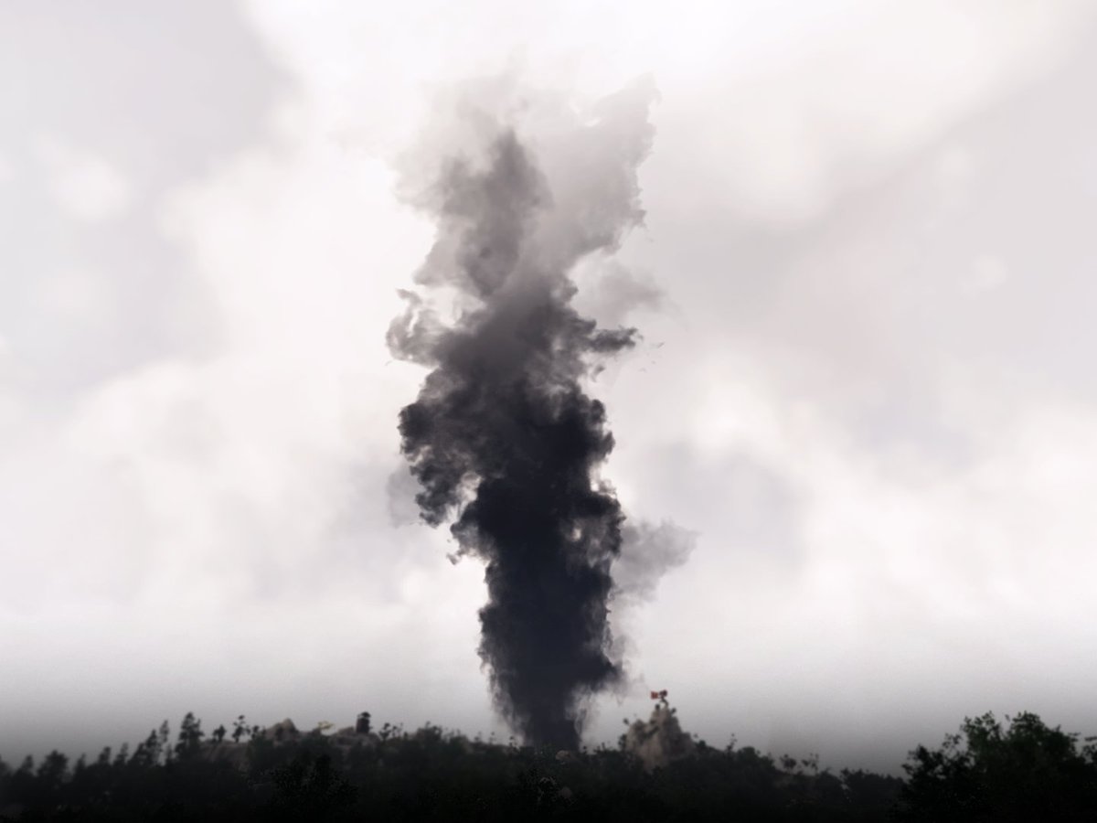
1rst shot was how to create a vertical dynamic in an horizontal shot. We found the 4:3 aspect ratio (with a vertical main subject, of course) quite efficient.
Post edit wise : contrasts, unilateral vignette and horizon blur, then 180° rotation for "painting in water" effect.
Post edit wise : contrasts, unilateral vignette and horizon blur, then 180° rotation for "painting in water" effect.
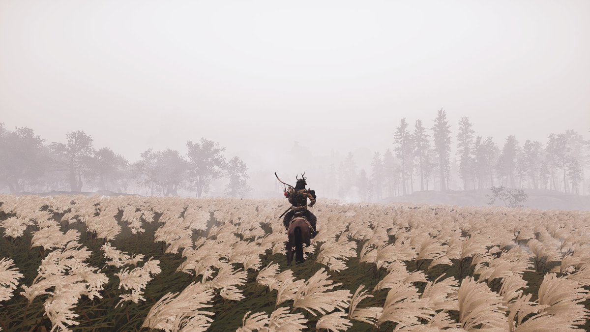
To make him the center of the pic, literally, Phi grid helped us see what dynamic could help. Lines of the trees and field converge to him. I decided to couple this with a rule of third in 21:9 in 3 almost = layers ground/trees/sky. More ground, again cause rider is the subject.
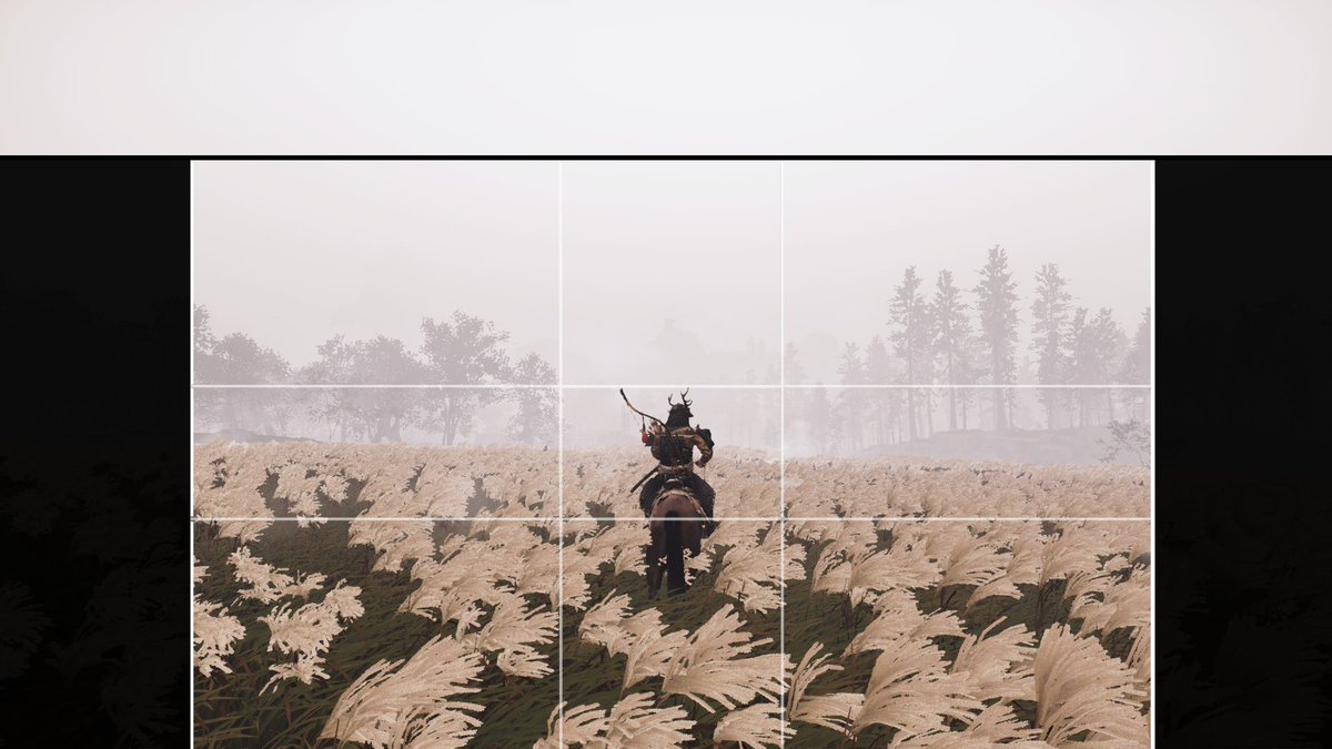
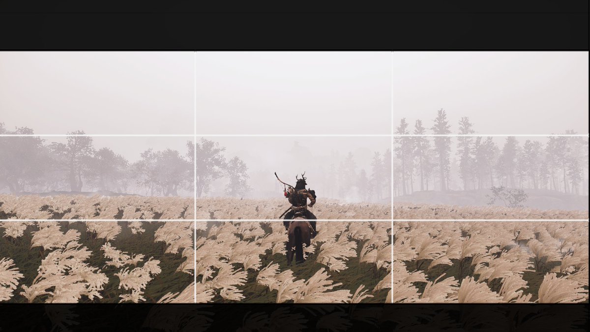
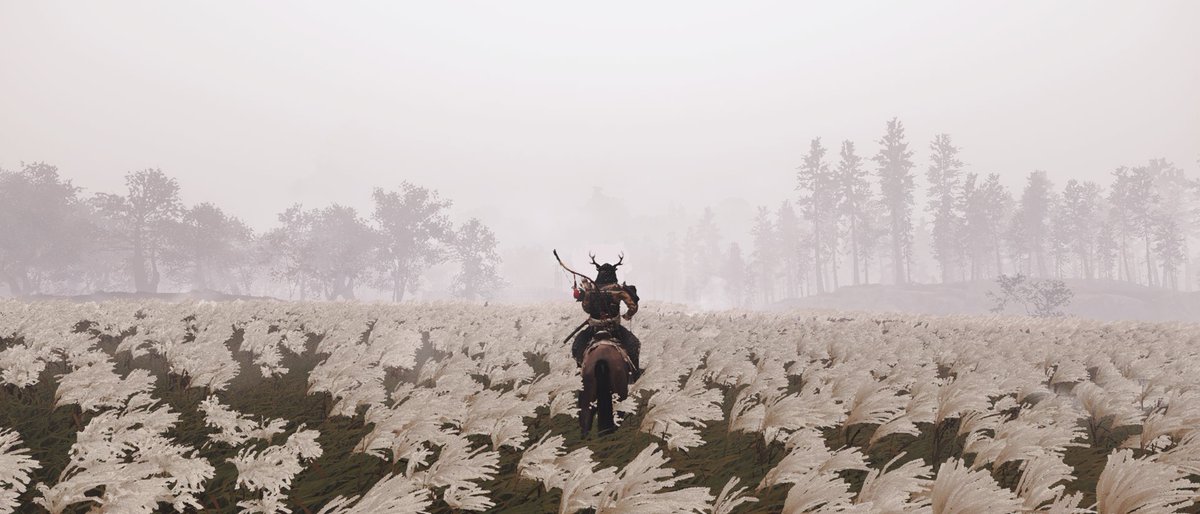
exactly the same idea here, usinf phi grid nd 21:9 again, because it's hard to resist to it.
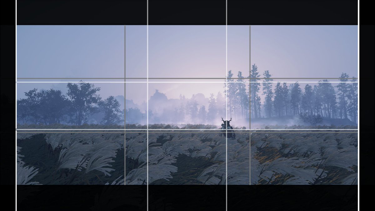
This time, I ex-centered the subject a bit, trying to make it slightly more about the land he's contemplating than himself alone.
See how it went
This time, I ex-centered the subject a bit, trying to make it slightly more about the land he's contemplating than himself alone.
See how it went

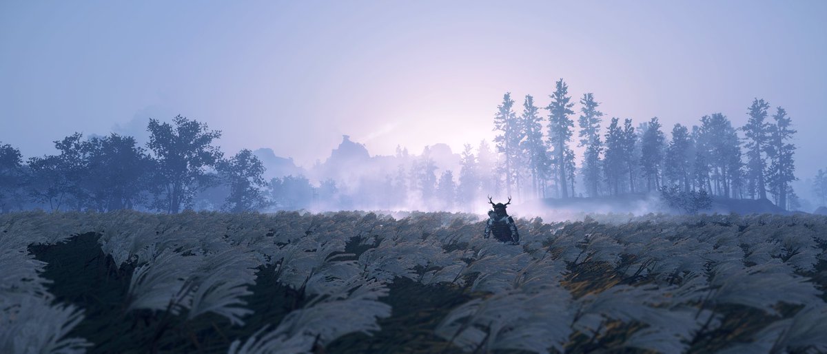
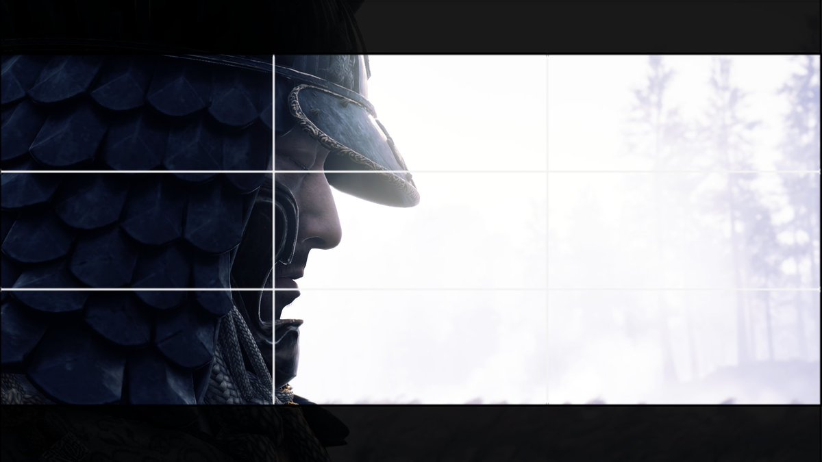
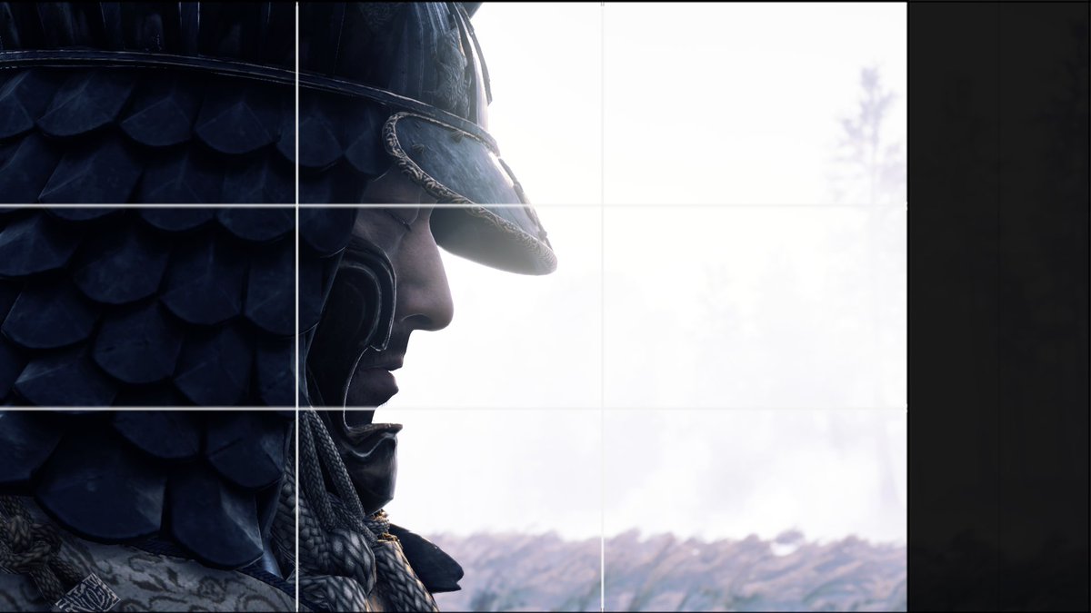
Phi grid is great for strong perspectives, but I found pretty useful as well in those "flat" perspectives. Stretching it through the 21:9 sounded interesting to me. Using the fog to create a strong silhouette with the helmet gives a great eye-catch to the overal scenery.
A big chunk was coming next : horizontal portrait.
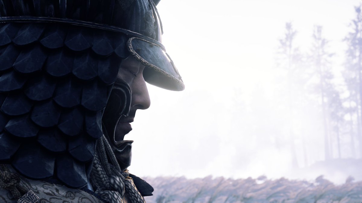
I tried to show how here specifically, the tempting 21:9 or even 16:9 was misleading and almost create an environmental shot rather than a portrait. See the details below.
I tried to show how here specifically, the tempting 21:9 or even 16:9 was misleading and almost create an environmental shot rather than a portrait. See the details below.
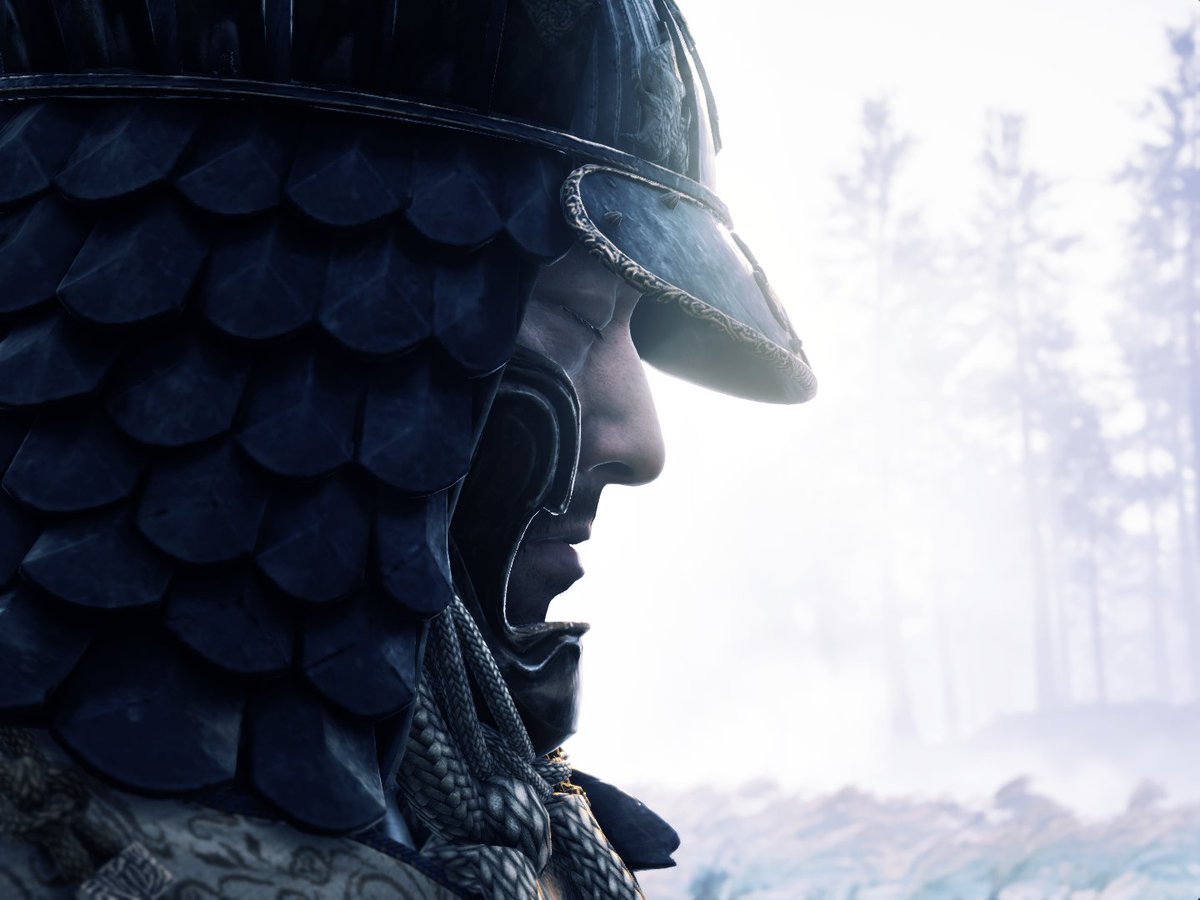
I wanted a portrait. Focus on his meditating face, feeling. I wanted the trees to tell the story of "where" (woods, cold, silent)
21:9 gave too much "story"
3:2 good amount of "feels" but not enough "story"
4:3 right balance for portrait, and I brought back trees in the frame
21:9 gave too much "story"
3:2 good amount of "feels" but not enough "story"
4:3 right balance for portrait, and I brought back trees in the frame

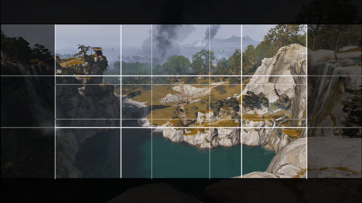
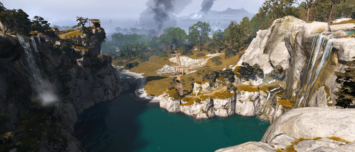
Last shot was a hard one to get. Again aimed at a composition that bring the focus on the torii in the center.
keeping it 16:9 gave too much space around. super wide ratio "crushes" the eye sight and let it be led by the circle of rocks, the shadow and the trails.
keeping it 16:9 gave too much space around. super wide ratio "crushes" the eye sight and let it be led by the circle of rocks, the shadow and the trails.
I thought we didn't need to have the full circle line of rocks to understand the shape of the area. And this torii down there looked too small at first, but all things considered, every element brought the attention to it. In post edit, I made it slightly brighter too.
Alright folks! That's it! If you are interested in a specific shot making, here are the direct links to the process live :
brush stroke :
https://www.twitch.tv/videos/877216771?t=00h39m03s
rider on the susuki field :
https://www.twitch.tv/videos/877216771?t=00h53m56s
My deer samurai : https://www.twitch.tv/videos/877216771?t=01h13m33s
brush stroke :
https://www.twitch.tv/videos/877216771?t=00h39m03s
rider on the susuki field :
https://www.twitch.tv/videos/877216771?t=00h53m56s
My deer samurai : https://www.twitch.tv/videos/877216771?t=01h13m33s
Portrait :
https://www.twitch.tv/videos/877216771?t=01h26m45s
The little Torii in the prairie :
https://www.twitch.tv/videos/877216771?t=02h30m02s
Thanks all again for tuning in or checking this thread out! It's all totally my interpretation of ratio use, and no absolute rule in any shape. Just my own training/thinking/exploring!

 Read on Twitter