Good thread explaining why the smileys’ favourite database of graphs doesn’t give a clear picture of excess deaths. https://twitter.com/victimofmaths/status/1350131598289743875
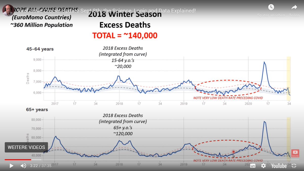
The Euromomo graphs have a bad lag for some reason. They are quite narrow and easy to misinterpret, as Cummins demonstrated when he described rates that were bang on the baseline as being “very low”.
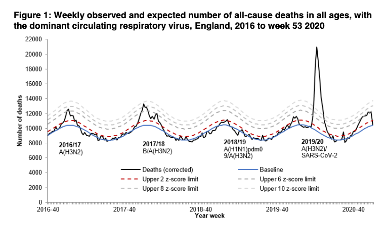
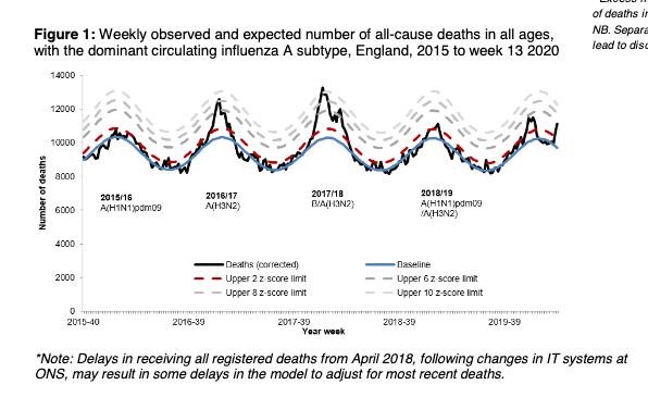
The other preferred source for those who are "just asking questions" is the PHE surveillance report which also has a horrible lag. This graph was being widely circulated last week with the usual claims about the second wave being a "ripple" and so on. 3/ https://assets.publishing.service.gov.uk/government/uploads/system/uploads/attachment_data/file/950313/Weekly_report_mortality__w1.pdf
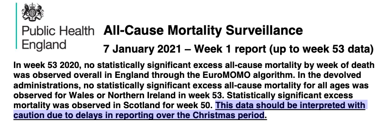
Underneath the graph is a warning to treat the recent weeks' figures with caution. This was also stated at the top and underlined. The smileys chopped those bits out, obvs. 4/
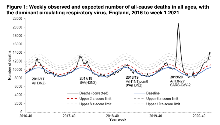
The same report published yesterday tells a rather different picture and, yes, it will go higher. 5/ https://www.gov.uk/government/statistics/weekly-all-cause-mortality-surveillance-2020-to-2021
It's worth noting that the PHE surveillance report on 2 April, close to the peak of the first wave, showed what appeared to be only a small uptick in mortality. You'll never believe what happened next. 6/
Both PHE and Euromomo use ONS data AFAICS, so just look at that. /7 https://www.ons.gov.uk/peoplepopulationandcommunity/birthsdeathsandmarriages/deaths/bulletins/deathsregisteredweeklyinenglandandwalesprovisional/weekending1january2021

 Read on Twitter